
CSS Grid has revolutionized how we create layouts on the web, and one of its most powerful features is the ability to control spacing between grid tracks using grid-column-gap and grid-row-gap properties. These properties allow you to add consistent spacing between your grid items without affecting the items themselves.
Understanding Grid Gap Properties
The grid-column-gap and grid-row-gap properties control the spacing between grid tracks (columns and rows respectively). Think of them as gutters that separate your grid items, creating visual breathing room in your layouts.
Basic Syntax
.grid-container {
  display: grid;
  grid-column-gap: 20px;
  grid-row-gap: 15px;
}
You can also use the shorthand grid-gap property to set both values at once:
.grid-container {
  display: grid;
  grid-gap: 15px 20px; /* row-gap column-gap */
  /* or equal spacing for both */
  grid-gap: 20px;
}
Modern Gap Property
The newer gap property is now the preferred method, as it works with both CSS Grid and Flexbox:
.grid-container {
  display: grid;
  gap: 20px; /* equal spacing */
  /* or */
  gap: 15px 20px; /* row-gap column-gap */
}
Practical Examples
Basic Grid with Equal Spacing
.grid-container {
  display: grid;
  grid-template-columns: repeat(3, 1fr);
  grid-template-rows: repeat(2, 100px);
  gap: 20px;
}
Different Column and Row Gaps
.grid-container {
  display: grid;
  grid-template-columns: repeat(4, 1fr);
  grid-template-rows: repeat(2, 80px);
  gap: 10px 30px; /* row-gap column-gap */
}
Interactive Example: Dynamic Gap Control
Use the sliders above to see how different gap values affect the grid layout in real-time.
Responsive Grid Gaps
Grid gaps can be responsive using media queries or CSS custom properties. Here’s how to create adaptive spacing:
.responsive-grid {
  display: grid;
  grid-template-columns: repeat(auto-fit, minmax(250px, 1fr));
  gap: 15px;
}

@media (min-width: 768px) {
  .responsive-grid {
    gap: 25px;
  }
}

@media (min-width: 1024px) {
  .responsive-grid {
    gap: 35px;
  }
}
Using CSS Custom Properties for Dynamic Gaps
.dynamic-grid {
  --grid-gap: 20px;
  display: grid;
  grid-template-columns: repeat(2, 1fr);
  gap: var(--grid-gap);
  transition: gap 0.3s ease;
}

.dynamic-grid:hover {
  --grid-gap: 30px;
}
Advanced Gap Techniques
Percentage-Based Gaps
You can use percentage values for gaps, which will be relative to the container size:
.percentage-gap-grid {
  display: grid;
  grid-template-columns: repeat(3, 1fr);
  gap: 2% 5%; /* 2% row gap, 5% column gap */
}
Using Viewport Units
Viewport units can create gaps that scale with the screen size:
.viewport-gap-grid {
  display: grid;
  grid-template-columns: repeat(auto-fit, minmax(200px, 1fr));
  gap: 2vw; /* 2% of viewport width */
}
Browser Support and Fallbacks
The gap property has excellent modern browser support. For older browsers, you can provide fallbacks:
.grid-container {
  display: grid;
  grid-template-columns: repeat(3, 1fr);

  /* Fallback for older browsers */
  grid-column-gap: 20px;
  grid-row-gap: 15px;

  /* Modern syntax */
  gap: 15px 20px;
}
Common Use Cases
Photo Gallery Grid
.photo-gallery {
  display: grid;
  grid-template-columns: repeat(auto-fit, minmax(150px, 1fr));
  gap: 12px;
}
Card Layout with Consistent Spacing
Feature 1
Description of the first feature with consistent spacing.
Feature 2
Description of the second feature maintaining visual rhythm.
Feature 3
Description of the third feature with perfect alignment.
.card-layout {
  display: grid;
  grid-template-columns: repeat(auto-fit, minmax(200px, 1fr));
  gap: 24px;
}
Best Practices and Tips
1. Consistent Spacing
Use consistent gap values throughout your design system. Consider creating CSS custom properties for standard spacing values:
:root {
  --gap-small: 8px;
  --gap-medium: 16px;
  --gap-large: 24px;
  --gap-xl: 32px;
}
2. Responsive Considerations
Adjust gap sizes for different screen sizes. Smaller screens typically need smaller gaps to maximize content space:
.grid {
  gap: var(--gap-small);
}

@media (min-width: 768px) {
  .grid {
    gap: var(--gap-medium);
  }
}

@media (min-width: 1024px) {
  .grid {
    gap: var(--gap-large);
  }
}
3. Performance Considerations
Gap properties don’t affect layout performance significantly, but using CSS custom properties allows for easy theme switching and dynamic updates.
Troubleshooting Common Issues
Gap Not Working?
- Ensure the container has
display: grid - Check that you’re not overriding with margin/padding on grid items
- Verify browser support for the gap property
Unexpected Spacing
- Gap applies between tracks, not around the grid container
- Gap doesn’t collapse like margins do
- Gap is in addition to any padding on grid items
Conclusion
CSS Grid’s gap properties provide a clean, efficient way to add spacing between grid items. Whether you use the individual grid-column-gap and grid-row-gap properties or the shorthand gap property, you can create visually appealing layouts with consistent spacing. Remember to consider responsive design and use these properties as part of a cohesive design system for the best results.
The flexibility of gap properties, combined with CSS Grid’s powerful layout capabilities, gives you precise control over spacing in your web designs. Experiment with different values and techniques to find what works best for your specific use cases.
Related Posts
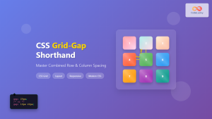
CSS Grid-Gap Shorthand: Master Combined Row and Column Spacing
CSS Grid has revolutionized how we create layouts on the web, and one of its most useful features is the...
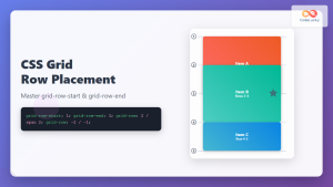
CSS Grid-Row-Start and Grid-Row-End: Complete Guide to Item Row Placement
Understanding CSS Grid Row Placement CSS Grid provides powerful tools for controlling the placement of grid items within your layout....
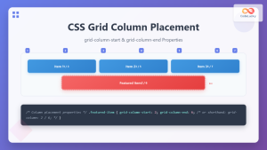
CSS Grid-Column-Start and Grid-Column-End: Complete Guide to Precise Item Column Placement
CSS Grid revolutionized web layout by providing precise control over both rows and columns. Among its most powerful features are...

CSS Align-Content: Master Grid Container Block Axis Alignment
The CSS align-content property is a powerful tool for controlling how grid items are distributed along the block axis (typically...
CSS Style columnGap Property: CSS Column Gap
CSS column-gap Property: Mastering Column Spacing in Multi-Column Layouts The CSS column-gap property is a powerful tool for controlling the...
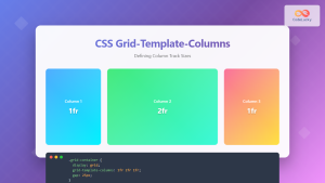
CSS Grid-Template-Columns: Complete Guide to Defining Column Track Sizes
The grid-template-columns property is one of the most fundamental aspects of CSS Grid Layout, allowing developers to define the size...
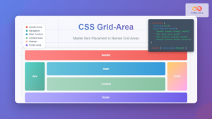
CSS Grid-Area: Master Item Placement in Named Grid Areas
What is CSS Grid-Area? The grid-area property in CSS is a powerful shorthand that allows you to place grid items...

CSS Subgrid: Complete Guide to Inheriting Parent Grid Lines
CSS Subgrid is a powerful feature that extends CSS Grid Layout by allowing child grids to inherit the track sizing...
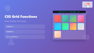
CSS Grid Functions: Complete Guide to repeat(), minmax(), and fit-content()
CSS Grid has revolutionized web layout design, offering developers unprecedented control over two-dimensional layouts. Among its most powerful features are...
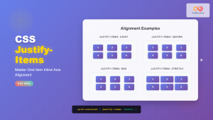
CSS Justify-Items: Complete Guide to Grid Item Inline Axis Alignment
The justify-items property is a powerful CSS Grid feature that controls how grid items are aligned along the inline axis...
CSS Grid Auto Rows: Master Implicit Row Track Sizing for Dynamic Layouts
CSS Grid revolutionized web layout design, offering unprecedented control over both rows and columns. While you explicitly define grid tracks...
CSS Grid-Template-Rows: Master Row Track Sizing with Complete Examples
The grid-template-rows property is a fundamental building block of CSS Grid Layout that allows you to define the size of...


