
CSS Grid revolutionized web layout design, offering unprecedented control over both rows and columns. While you explicitly define grid tracks using grid-template-rows, CSS Grid automatically creates additional rows when content exceeds your defined structure. The grid-auto-rows property gives you precise control over these automatically generated implicit rows.
Understanding CSS Grid Auto Rows
The grid-auto-rows property defines the size of implicitly created row tracks in a CSS Grid container. When grid items are placed outside the explicit grid structure or when content naturally flows beyond defined rows, CSS Grid automatically generates new rows. This property determines how tall these auto-generated rows should be.
grid-template-rows, while implicit rows are automatically created by the browser when needed.
CSS Grid Auto Rows Syntax
The basic syntax for grid-auto-rows is straightforward:
.grid-container {
  display: grid;
  grid-auto-rows: <track-size>;
}
Available Values
The grid-auto-rows property accepts several types of values:
- Length values:
100px,2rem,50vh - Percentage values:
25%,50% - Flexible values:
1fr,2fr - Content-based values:
auto,min-content,max-content - Functions:
minmax(),fit-content() - Multiple values: Space-separated list for different sizing patterns
Basic CSS Grid Auto Rows Examples
Fixed Height Auto Rows
Setting a fixed height ensures all implicit rows have the same consistent size:
.grid-fixed {
  display: grid;
  grid-template-columns: repeat(3, 1fr);
  grid-template-rows: 80px; /* Only one explicit row */
  grid-auto-rows: 120px; /* All implicit rows will be 120px tall */
  gap: 10px;
  padding: 20px;
  background: #f0f4f8;
}

.grid-item {
  background: #4299e1;
  color: white;
  display: flex;
  align-items: center;
  justify-content: center;
  border-radius: 4px;
}In this example, the first row (explicit) is 80px tall, while the second row (implicit) automatically becomes 120px tall due to grid-auto-rows.
Auto-Sizing Based on Content
Using auto value makes rows size themselves based on their content:
.grid-auto {
  display: grid;
  grid-template-columns: repeat(2, 1fr);
  grid-auto-rows: auto;
  gap: 15px;
  padding: 20px;
  background: #f7fafc;
}Advanced Grid Auto Rows Techniques
Using Fractional Units (fr)
Fractional units create flexible rows that share available space proportionally:
.grid-fr {
  display: grid;
  grid-template-columns: repeat(3, 1fr);
  grid-template-rows: 60px;
  grid-auto-rows: 2fr; /* Implicit rows take 2 fractional units */
  height: 400px;
  gap: 10px;
  padding: 20px;
  background: #edf2f7;
}MinMax Function for Flexible Boundaries
The minmax() function provides both minimum and maximum constraints for implicit rows:
.grid-minmax {
  display: grid;
  grid-template-columns: repeat(2, 1fr);
  grid-auto-rows: minmax(100px, auto);
  gap: 15px;
  padding: 20px;
  background: #f0fff4;
}Multiple Track Sizes Pattern
You can define multiple sizes that repeat in a pattern for implicit rows:
.grid-pattern {
  display: grid;
  grid-template-columns: repeat(4, 1fr);
  grid-auto-rows: 80px 120px 100px; /* Pattern repeats */
  gap: 10px;
  padding: 20px;
  background: #fffaf0;
}The pattern (80px, 120px, 100px) repeats for each set of implicit rows, creating a rhythmic visual design.
Interactive Example: Dynamic Grid Auto Rows
Experiment with different grid-auto-rows values using this interactive example:
Real-World Use Cases
Card Layouts with Variable Content
Perfect for blog post previews, product cards, or any content where text length varies:
.blog-grid {
  display: grid;
  grid-template-columns: repeat(auto-fit, minmax(300px, 1fr));
  grid-auto-rows: minmax(200px, auto);
  gap: 20px;
}
Short Article Title
Brief description of the article content.
Much Longer Article Title That Spans Multiple Lines
This article has a much longer description that provides more detailed information about the content, explaining various concepts and providing additional context that makes the card taller than others in the grid layout.
Another Article
Medium-length description that fits comfortably in the card space.
Photo Gallery with Mixed Orientations
When displaying images of different aspect ratios, grid-auto-rows helps maintain visual harmony:
.photo-gallery {
  display: grid;
  grid-template-columns: repeat(auto-fill, minmax(200px, 1fr));
  grid-auto-rows: 200px;
  gap: 15px;
}Browser Support and Considerations
CSS Grid and grid-auto-rows enjoy excellent browser support across all modern browsers. The property works consistently in:
- Chrome: Full support since version 57
- Firefox: Full support since version 52
- Safari: Full support since version 10.1
- Edge: Full support since version 16
Performance and Best Practices
Optimization Tips
Follow these best practices when using grid-auto-rows:
Use appropriate units: Choose units that make sense for your content. Use auto for content-driven layouts, fixed units for consistent designs, and fractional units for flexible spacing.
Consider content flow: Design your grid with implicit row creation in mind. Plan for how content will flow when it exceeds your explicit grid structure.
Test with variable content: Always test your grid layouts with different amounts of content to ensure grid-auto-rows behaves as expected.
Combine with media queries: Adjust grid-auto-rows values for different screen sizes to maintain optimal layouts across devices.
@media (max-width: 768px) {
  .responsive-grid {
    grid-auto-rows: auto; /* Content-based on mobile */
  }
}

@media (min-width: 769px) {
  .responsive-grid {
    grid-auto-rows: 200px; /* Fixed height on desktop */
  }
}
Common Mistakes to Avoid
Forgetting about implicit rows: Not considering how content will behave when it exceeds your explicit grid can lead to unexpected layouts.
Using inappropriate values: Setting fixed heights when content varies significantly can cause overflow or wasted space.
Ignoring responsive behavior: Not adjusting grid-auto-rows for different screen sizes can create poor mobile experiences.
Overcomplicating patterns: While multiple values create interesting patterns, overly complex sequences can be hard to maintain and debug.
Advanced Integration Techniques
Combining with Grid Auto Flow
Use grid-auto-rows together with grid-auto-flow for complete control over implicit grid behavior:
<pre style=”background: #2d3748; color: #e2e8f0; padding: 20px; border-radius: 8px; overflow
Related Posts
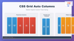
CSS Grid Auto Columns: Master Implicit Column Track Sizing for Dynamic Layouts
CSS Grid Layout revolutionized web design by providing a powerful two-dimensional layout system. While explicit grid tracks defined with grid-template-columns...
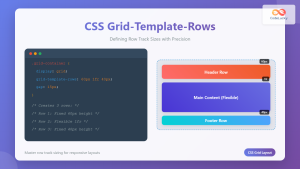
CSS Grid-Template-Rows: Master Row Track Sizing with Complete Examples
The grid-template-rows property is a fundamental building block of CSS Grid Layout that allows you to define the size of...

CSS Grid Auto Flow: Master Item Placement Algorithm Control for Responsive Layouts
Understanding CSS Grid Auto Flow The grid-auto-flow property is a powerful CSS Grid feature that controls how auto-placed items are...
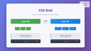
CSS Grid auto-fit vs auto-fill: Master Dynamic Responsive Layouts
CSS Grid's auto-fit and auto-fill are two powerful keywords that enable dynamic track creation in grid layouts. While they might...
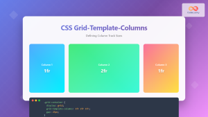
CSS Grid-Template-Columns: Complete Guide to Defining Column Track Sizes
The grid-template-columns property is one of the most fundamental aspects of CSS Grid Layout, allowing developers to define the size...
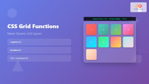
CSS Grid Functions: Complete Guide to repeat(), minmax(), and fit-content()
CSS Grid has revolutionized web layout design, offering developers unprecedented control over two-dimensional layouts. Among its most powerful features are...

CSS Subgrid: Complete Guide to Inheriting Parent Grid Lines
CSS Subgrid is a powerful feature that extends CSS Grid Layout by allowing child grids to inherit the track sizing...

CSS Grid: Display Grid Container Property – Complete Guide with Examples
CSS Grid revolutionized web layout design by providing a two-dimensional grid system that allows developers to create complex, responsive layouts...
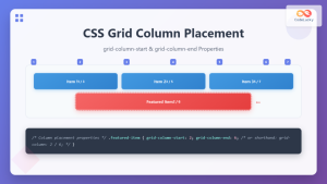
CSS Grid-Column-Start and Grid-Column-End: Complete Guide to Precise Item Column Placement
CSS Grid revolutionized web layout by providing precise control over both rows and columns. Among its most powerful features are...

CSS Style grid Property: CSS Grid Layout
CSS grid Property: Mastering CSS Grid Layout The CSS grid property is a powerful tool for creating two-dimensional layouts on...
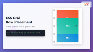
CSS Grid-Row-Start and Grid-Row-End: Complete Guide to Item Row Placement
Understanding CSS Grid Row Placement CSS Grid provides powerful tools for controlling the placement of grid items within your layout....

CSS Align-Content: Master Grid Container Block Axis Alignment
The CSS align-content property is a powerful tool for controlling how grid items are distributed along the block axis (typically...


