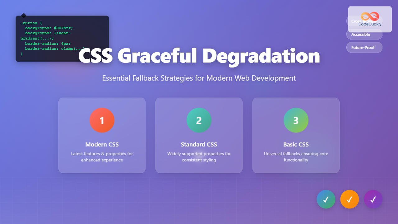
CSS graceful degradation is a fundamental web development strategy that ensures your website remains functional and accessible across all browsers, regardless of their CSS support level. This approach prioritizes core functionality while progressively enhancing the user experience for browsers with advanced capabilities.
In today’s diverse browser landscape, where users access websites through everything from cutting-edge Chrome installations to legacy Internet Explorer versions, implementing proper fallback strategies isn’t just good practice—it’s essential for reaching your entire audience.
Understanding CSS Graceful Degradation
Graceful degradation works by providing multiple layers of CSS declarations, starting with the most advanced features and falling back to simpler, widely-supported alternatives. When a browser encounters a CSS property or value it doesn’t recognize, it simply ignores that declaration and moves to the next one.
This differs from progressive enhancement, which builds up from a basic foundation. While both approaches aim for universal accessibility, graceful degradation starts with the ideal experience and works backward to ensure compatibility.
The CSS Cascade and Fallbacks
The CSS cascade naturally supports graceful degradation through its parsing behavior. When browsers encounter unknown properties or values, they skip them without breaking the entire stylesheet. This fundamental behavior enables us to layer fallbacks effectively.
Basic Fallback Example
.button {
  background-color: #007bff; /* Fallback for older browsers */
  background: linear-gradient(135deg, #007bff 0%, #0056b3 100%); /* Modern gradient */
  color: white;
  padding: 12px 24px;
  border: none;
  border-radius: 4px;
}
Font Fallback Strategies
Typography forms the backbone of web content, making font fallbacks crucial for maintaining readability across all devices and browsers. A well-constructed font stack ensures text remains legible regardless of which fonts are available on the user’s system.
Building Robust Font Stacks
Effective font stacks follow a hierarchy from specific to generic, providing multiple alternatives at each level. This approach ensures graceful degradation from custom web fonts to system defaults.
Complete Font Stack Example
body {
  font-family:
    "Inter", /* Custom web font */
    -apple-system, /* macOS system font */
    BlinkMacSystemFont, /* macOS system font fallback */
    "Segoe UI", /* Windows system font */
    Roboto, /* Android system font */
    "Helvetica Neue", /* macOS fallback */
    Arial, /* Cross-platform fallback */
    sans-serif; /* Generic fallback */
}
Web Font Loading Strategies
Modern web font implementations should include fallback strategies for loading failures or slow connections. The font-display property provides control over font rendering behavior during the loading process.
@font-face {
  font-family: 'CustomFont';
  src: url('font.woff2') format('woff2'),
       url('font.woff') format('woff'),
       url('font.ttf') format('truetype');
  font-display: swap; /* Show fallback font immediately, swap when custom font loads */
}
Color and Background Fallbacks
Color support varies significantly across browsers, especially for newer color functions and transparency features. Implementing proper color fallbacks ensures consistent visual presentation across all platforms.
Hex to Modern Color Function Fallbacks
While modern browsers support advanced color functions like hsl(), rgb() with alpha, and CSS custom properties, older browsers require traditional hex values as fallbacks.
Color Fallback Implementation
.card {
  background-color: #3498db; /* Hex fallback */
  background-color: rgb(52, 152, 219); /* RGB fallback */
  background-color: hsl(204, 70%, 53%); /* Modern HSL */
  background-color: color(display-p3 0.2 0.6 0.86); /* Wide gamut for supported devices */
}
Interactive Color Demonstration
Hex → HSL
Hex → HSLA
Hex → P3
Layout Fallback Techniques
CSS layout has evolved dramatically with Flexbox, Grid, and other modern techniques. However, ensuring layouts work in older browsers requires carefully planned fallback strategies that maintain usability while degrading gracefully.
CSS Grid with Flexbox Fallbacks
CSS Grid provides powerful layout capabilities, but browsers without Grid support need alternative layout methods. Combining Grid with Flexbox fallbacks creates robust, cross-browser layouts.
Grid to Flexbox Fallback
.layout {
  /* Flexbox fallback */
  display: flex;
  flex-wrap: wrap;
  gap: 20px; /* Supported in newer flexbox implementations */
  margin: -10px; /* Fallback spacing */
}

.layout > * {
  flex: 1 1 300px; /* Flexible items with minimum width */
  margin: 10px; /* Fallback spacing */
}

/* Grid enhancement */
@supports (display: grid) {
  .layout {
    display: grid;
    grid-template-columns: repeat(auto-fit, minmax(300px, 1fr));
    margin: 0; /* Reset margin when grid is supported */
  }

  .layout > * {
    margin: 0; /* Reset margin when grid is supported */
  }
}
Feature Query Implementation
The @supports rule enables precise fallback control by testing for specific CSS feature support. This approach provides cleaner code separation between fallback and enhanced styles.
Interactive Layout Demonstration
Flexbox → Grid
Graceful Layout
Cross-browser
Transform and Animation Fallbacks
CSS transforms and animations enhance user experience but require careful fallback planning. Users with older browsers or reduced motion preferences should still receive functional interfaces.
Transform Property Fallbacks
CSS transforms aren’t supported in older browsers, requiring alternative approaches for positioning and scaling effects. Providing fallback styles ensures layout remains intact.
Transform Fallback Strategy
.hover-card {
  /* Base styles that work everywhere */
  background: white;
  border: 1px solid #ddd;
  border-radius: 8px;
  padding: 20px;
  transition: all 0.3s ease; /* Gracefully ignored if unsupported */

  /* Fallback hover effect */
  background: #f8f9fa;
}

.hover-card:hover {
  /* Enhanced hover with transform */
  transform: translateY(-4px) scale(1.02);
  box-shadow: 0 8px 25px rgba(0,0,0,0.15);
  background: white; /* Override fallback background */
}

/* Respect reduced motion preferences */
@media (prefers-reduced-motion: reduce) {
  .hover-card {
    transition: none;
  }

  .hover-card:hover {
    transform: none;
  }
}
Animation Accessibility Considerations
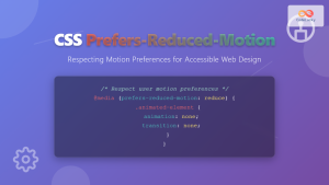
Modern CSS includes media queries for motion preferences, allowing developers to respect user accessibility settings while providing enhanced experiences for those who want them.
Interactive Transform Example
Transform Effect
Rotate + Scale
Custom Property Fallbacks
CSS custom properties (variables) provide powerful theming and maintenance benefits, but older browsers don’t support them. Implementing proper fallbacks ensures consistent styling across all browsers.
Variable Declaration with Fallbacks
When using CSS custom properties, always provide fallback values for browsers that don’t support them. This approach maintains your design integrity while enabling advanced features for modern browsers.
Custom Property Fallback Pattern
:root {
  --primary-color: #3498db;
  --secondary-color: #2ecc71;
  --font-size-large: 1.5rem;
  --border-radius: 8px;
}

.component {
  /* Fallback values first */
  background-color: #3498db;
  color: #ffffff;
  font-size: 1.5rem;
  border-radius: 8px;

  /* Enhanced values with custom properties */
  background-color: var(--primary-color, #3498db);
  color: var(--text-on-primary, #ffffff);
  font-size: var(--font-size-large, 1.5rem);
  border-radius: var(--border-radius, 8px);
}
Dynamic Theme Implementation
Custom properties enable dynamic theming while maintaining fallback support through careful structuring of CSS declarations.
Theme Switching with Fallbacks
Media Query and Viewport Fallbacks
Responsive design relies heavily on media queries, but older browsers may not support all query types. Building fallback strategies ensures your layouts remain functional across all devices and browsers.
Progressive Media Query Enhancement
Start with mobile-first base styles, then enhance for larger screens. This approach ensures functionality on the smallest devices while providing enhanced experiences on larger screens.
Mobile-First Responsive Pattern
/* Base styles for all browsers (mobile-first) */
.navigation {
  width: 100%;
  background: #333;
  padding: 10px;
}

.nav-item {
  display: block;
  width: 100%;
  padding: 10px;
  color: white;
  text-decoration: none;
}

/* Enhanced styles for larger screens */
@media screen and (min-width: 768px) {
  .navigation {
    display: flex;
    justify-content: space-between;
  }

  .nav-item {
    display: inline-block;
    width: auto;
  }
}

/* Modern viewport units with fallbacks */
.hero {
  height: 400px; /* Fallback height */
  height: 50vh; /* Viewport height for supported browsers */
  height: 50svh; /* Small viewport height for modern browsers */
}
Feature Detection and @supports
The @supports rule provides precise control over CSS feature application, enabling clean separation between fallback and enhanced styles. This approach reduces code conflicts and improves maintainability.
Strategic @supports Implementation
Use @supports to progressively enhance layouts and effects while maintaining solid fallback foundations. This technique prevents style conflicts between fallback and enhanced code.
Feature Detection Pattern
/* Fallback styles for all browsers */
.masonry-layout {
  /* Column-based fallback */
  column-count: 3;
  column-gap: 20px;
}

.masonry-item {
  break-inside: avoid;
  margin-bottom: 20px;
}

/* Enhanced Grid layout for supporting browsers */
@supports (display: grid) and (grid-template-rows: masonry) {
  .masonry-layout {
    display: grid;
    grid-template-columns: repeat(auto-fit, minmax(300px, 1fr));
    grid-template-rows: masonry;
    gap: 20px;
    column-count: initial; /* Reset column layout */
  }

  .masonry-item {
    break-inside: initial; /* Reset break behavior */
    margin-bottom: 0; /* Reset margin */
  }
}

/* Intersection of features */
@supports (display: grid) and (aspect-ratio: 1) {
  .image-grid img {
    aspect-ratio: 1 / 1;
    object-fit: cover;
  }
}
Combining Multiple Fallback Strategies
Real-world implementations often require combining multiple fallback techniques. The following example demonstrates a comprehensive approach to creating robust, cross-browser components.
Comprehensive Fallback Component
Robust Design
This component works across all browsers with progressive enhancement.
Fallback Layers
Multiple CSS techniques ensure compatibility and enhanced experiences.
Testing Fallback Strategies
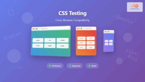
Effective fallback implementation requires thorough testing across different browsers and devices. Establishing a testing workflow ensures your graceful degradation strategies work as intended.
Browser Testing Approach
Test your fallback strategies using browser developer tools, virtual machines, and real devices. Focus on critical user paths and ensure functionality remains intact across all tested environments.
Testing Checklist
- Functionality Test: Core features work without CSS enhancement
- Layout Test: Content remains readable and navigable
- Performance Test: Fallbacks don’t significantly impact load times
- Accessibility Test: Screen readers and keyboard navigation function properly
- Progressive Test: Enhanced features activate correctly in supporting browsers
Performance Considerations
While implementing comprehensive fallback strategies, consider the performance impact of multiple CSS declarations. Optimize your approach to minimize file size while maintaining robust browser support.
Optimization Techniques
Use CSS preprocessing tools to generate optimized fallback code, eliminate unused declarations, and organize styles for better compression. Consider critical CSS techniques for above-the-fold content.
Performance-Optimized Fallbacks
/* Efficient fallback grouping */
.btn, .card, .modal {
  /* Shared fallback properties */
  border-radius: 4px; /* Universal fallback */
}

.btn {
  border-radius: 6px; /* Specific override */
  border-radius: clamp(4px, 1vw, 8px); /* Modern responsive */
}

/* Conditional loading for non-critical enhancements */
@media (min-width: 768px) and (prefers-reduced-motion: no-preference) {
  @supports (backdrop-filter: blur(10px)) {
    .modal-backdrop {
      backdrop-filter: blur(10px);
    }
  }
}
Best Practices and Common Pitfalls
Successful graceful degradation requires following established patterns while avoiding common mistakes that can break the fallback chain or create poor user experiences.
Implementation Best Practices
Always test with CSS disabled to ensure basic functionality. Order your CSS declarations from most to least supported, and use feature detection rather than browser detection when possible.
✅ Do This
- Provide fallback values before enhanced properties
- Test with JavaScript and CSS disabled
- Use semantic HTML as your foundation
- Implement progressive enhancement alongside graceful degradation
- Consider accessibility at every fallback level
❌ Avoid This
- Relying solely on modern CSS without fallbacks
- Using browser detection instead of feature detection
- Ignoring performance impact of multiple declarations
- Forgetting to test on actual older browsers
- Making fallback experiences significantly inferior
Future-Proofing Your CSS
As CSS continues to evolve with new properties and capabilities, building flexible fallback systems ensures your websites remain functional as browser support changes. Focus on creating maintainable code that can adapt to future developments.
By implementing these graceful degradation strategies, you create websites that work for everyone while taking advantage of modern CSS capabilities. This approach builds trust with users, improves accessibility, and ensures your content reaches the widest possible audience regardless of their browser choice or device capabilities.
Remember that graceful degradation isn’t about creating identical experiences across all browsers—it’s about ensuring functional, accessible experiences that progressively enhance based on browser capabilities. This philosophy creates more inclusive web experiences while allowing you to leverage cutting-edge CSS features responsibly.

