
CSS general sibling selectors provide a powerful way to target elements that share the same parent and appear after a specific element in the document structure. Unlike adjacent sibling selectors that only target the immediate next sibling, general sibling selectors can target all following siblings that match the specified criteria.
Understanding General Sibling Selectors
The general sibling selector uses the tilde (~) symbol to select all sibling elements that follow a specified element. The syntax follows this pattern:
element1 ~ element2 {
    /* CSS properties */
}
This selector targets all element2 elements that are siblings of element1 and appear after it in the HTML document flow.
Basic Syntax and Structure
The general sibling selector consists of two parts separated by the tilde (~):
- First element: The reference element that establishes the selection context
- Tilde (~): The general sibling combinator
- Second element: The target element(s) to be styled
Example: Basic General Sibling Selection
<div>
    <h2>Main Heading</h2>
    <p>First paragraph</p>
    <p>Second paragraph</p>
    <p>Third paragraph</p>
</div>
h2 ~ p {
color: #666;
font-style: italic;
}Main Heading
First paragraph
Second paragraph
Third paragraph
Practical Examples and Use Cases
Form Field Styling
General sibling selectors excel at styling form elements based on their state or type. Here’s how to style labels that follow specific input types:
input[type="checkbox"]:checked ~ label {
    color: #28a745;
    font-weight: bold;
}

input[type="radio"]:checked ~ label {
    background-color: #007bff;
    color: white;
    padding: 5px 10px;
    border-radius: 4px;
}Navigation Menu Enhancement
Create dynamic navigation effects where selecting one item affects all subsequent items:
.nav-item:hover ~ .nav-item {
    opacity: 0.5;
    transform: translateX(10px);
    transition: all 0.3s ease;
}Advanced Techniques and Combinations
Combining with Pseudo-classes
General sibling selectors become more powerful when combined with pseudo-classes like :hover, :focus, and :checked:
/* Hide content until checkbox is checked */
input[type="checkbox"]:not(:checked) ~ .content {
    display: none;
}

/* Style all paragraphs after a focused input */
input:focus ~ p {
    background-color: #fff3cd;
    border-left: 4px solid #ffc107;
    padding-left: 15px;
}
Multiple Selector Chains
Create complex selection patterns by chaining multiple general sibling selectors:
h2 ~ p ~ ul {
    margin-left: 20px;
    border-left: 2px solid #dee2e6;
    padding-left: 15px;
}

.highlight ~ p ~ .note {
    background-color: #e7f3ff;
    border: 1px solid #b8daff;
    padding: 10px;
    border-radius: 4px;
}
Interactive Demo: Toggle Content Visibility
Try this interactive example: Click the checkbox to toggle the visibility of all content sections below it.
Section 1: Introduction
This is the first content section that will be affected by the checkbox state.
Section 2: Details
This is the second content section demonstrating the general sibling selector.
Section 3: Conclusion
This is the final content section showing the cascading effect.
CSS Code for the demo:
.toggle-checkbox:not(:checked) ~ .content-section {
    opacity: 0.3;
    transform: translateY(-10px);
    transition: all 0.3s ease;
}

.toggle-checkbox:checked ~ .content-section {
    opacity: 1;
    transform: translateY(0);
    transition: all 0.3s ease;
}
Common Pitfalls and Solutions
Specificity Issues
General sibling selectors have the same specificity as other combinators. When styles conflict, use more specific selectors or adjust your CSS order:
⚠️ Problem: Styles not applying due to specificity conflicts.
✅ Solution: Increase specificity by adding class names or IDs to your selectors.
/* Less specific - might not work */
h2 ~ p { color: blue; }

/* More specific - will work */
.content h2 ~ p { color: blue; }
.article-content h2 ~ p.highlight { color: blue; }
Browser Compatibility
General sibling selectors are well-supported across all modern browsers, including:
- Chrome 1+
- Firefox 1+
- Safari 3+
- Internet Explorer 7+
- Opera 9.5+
Performance Considerations
While general sibling selectors are powerful, they can impact performance when used extensively. Here are optimization tips:
Best Practices for Performance
- Limit scope: Use specific parent containers to reduce the number of elements checked
- Avoid deep nesting: Complex selector chains can slow down rendering
- Use classes when possible: Class-based selectors are faster than complex combinators
💡 Pro Tip: Use general sibling selectors for interactive states and progressive enhancement, but rely on classes for basic styling.
Real-world Applications
Accordion Interfaces
Create collapsible content sections without JavaScript:
.accordion-header:checked ~ .accordion-content {
    max-height: 200px;
    opacity: 1;
    padding: 15px;
}

.accordion-header:not(:checked) ~ .accordion-content {
    max-height: 0;
    opacity: 0;
    padding: 0 15px;
    overflow: hidden;
}
Step-by-step Tutorials
Guide users through sequential content by showing completed steps:
.step:checked ~ .step {
    border-color: #28a745;
}

.step:checked ~ .step .step-content {
    background-color: #d4edda;
}

.step:not(:checked) ~ .step .step-content {
    background-color: #f8f9fa;
    opacity: 0.7;
}
Accessibility Considerations
When using general sibling selectors for interactive elements, ensure accessibility:
- Keyboard navigation: Ensure all interactive elements are keyboard accessible
- Screen readers: Use appropriate ARIA labels and roles
- Focus indicators: Provide clear visual feedback for focused elements
- Alternative text: Include descriptive text for visual-only cues
/* Accessible focus styles */
input:focus ~ label {
    outline: 2px solid #007bff;
    outline-offset: 2px;
}

/* High contrast mode support */
@media (prefers-contrast: high) {
    .toggle:checked ~ .content {
        border: 2px solid currentColor;
    }
}
Comparison with Other Selectors
Understanding when to use general sibling selectors versus alternatives:
| Selector Type | Symbol | Targets | Use Case |
|---|---|---|---|
| Adjacent Sibling | + |
Immediate next sibling | Styling single following element |
| General Sibling | ~ |
All following siblings | Styling multiple following elements |
| Child | > |
Direct children | Styling immediate descendants |
| Descendant | (space) | All descendants | Styling nested elements |
Conclusion
CSS general sibling selectors offer a powerful and flexible way to create dynamic, interactive web interfaces without relying on JavaScript. By understanding their syntax, capabilities, and limitations, you can build more efficient and maintainable stylesheets.
The key to mastering general sibling selectors lies in practice and understanding the document structure. Start with simple examples and gradually build complexity as you become more comfortable with the selector’s behavior.
Remember to always consider accessibility, performance, and browser compatibility when implementing these selectors in production environments. With proper planning and implementation, general sibling selectors can significantly enhance your CSS toolkit and improve user experience across your web projects.
Related Posts
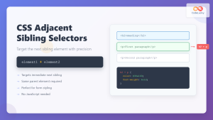
CSS Adjacent Sibling Selectors: Complete Guide to Next Element Targeting
CSS adjacent sibling selectors are powerful tools that allow you to target elements based on their relationship to other elements...
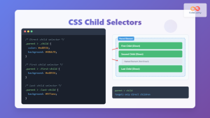
CSS Child Selectors: Master Direct Child Element Targeting for Better Web Design
CSS child selectors are essential tools for targeting specific child elements within parent containers. Unlike descendant selectors that target all...

CSS Attribute Selectors: Master Targeting Elements by Attribute Values
What Are CSS Attribute Selectors? CSS attribute selectors allow you to target HTML elements based on their attributes and attribute...
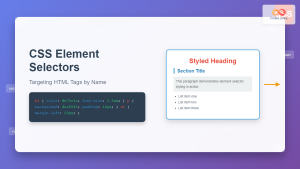
CSS Element Selectors: Complete Guide to Targeting HTML Tags by Name
CSS element selectors are the foundation of web styling, allowing developers to target HTML elements directly by their tag names....

HTML Element nextElementSibling Property: Next Sibling Element
Understanding the nextElementSibling Property in HTML The nextElementSibling property is a read-only property of the HTMLElement interface. It returns the...
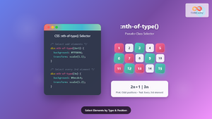
CSS :nth-of-type() Pseudo-Class: Complete Guide to Selecting Elements by Type
The CSS :nth-of-type() pseudo-class is a powerful selector that allows you to target specific elements based on their position among...

CSS Class Selectors: Master Targeting Elements with Class Attributes
What Are CSS Class Selectors? CSS class selectors are fundamental tools that allow you to target and style HTML elements...
CSS Descendant Selectors: Master Targeting Nested Elements with Practical Examples
CSS descendant selectors are fundamental tools that allow you to target elements nested within other elements in your HTML structure....
HTML Element closest() Method: Getting Closest Matching Element
HTML Element closest() Method: Getting Closest Matching Element The closest() method in JavaScript is a powerful tool for traversing the...
CSS :first-child and :last-child Pseudo-Classes: Complete Guide with Examples
CSS pseudo-classes are powerful tools that allow developers to select and style elements based on their position, state, or relationship...
HTML Node nextSibling Property: Node Next Sibling
HTML Node nextSibling Property: Understanding Node Next Sibling The nextSibling property in the HTML DOM (Document Object Model) is a...
CSS :nth-child() Pseudo-Class: Master Child Element Selection with Advanced Techniques
The :nth-child() pseudo-class is one of CSS's most powerful selectors for targeting specific child elements within a parent container. This...


