The CSS float property is a fundamental layout tool that allows elements to be positioned to the left or right of their container, enabling text and other elements to wrap around them. Understanding float is essential for web developers, even in the modern era of Flexbox and CSS Grid.
What is the CSS Float Property?
The float property removes an element from the normal document flow and positions it to the left or right side of its containing element. Originally designed for wrapping text around images, float became a cornerstone of CSS layouts before modern layout methods emerged.
Float Property Syntax
selector {
  float: value;
}
CSS Float Values
The float property accepts four main values:
- left – Floats the element to the left
- right – Floats the element to the right
- none – Default value, no floating
- inherit – Inherits the float value from parent element
Float Left Example
When you apply float: left to an element, it moves to the left side of its container, allowing other content to flow around its right side.
Visual Example: Float Left
This text wraps around the floated element. Lorem ipsum dolor sit amet, consectetur adipiscing elit. Sed do eiusmod tempor incididunt ut labore et dolore magna aliqua. Ut enim ad minim veniam, quis nostrud exercitation ullamco laboris nisi ut aliquip ex ea commodo consequat.
.float-left {
  float: left;
  width: 200px;
  background-color: #4CAF50;
  color: white;
  padding: 20px;
  margin-right: 15px;
}
Float Right Example
The float: right value positions an element to the right side of its container, with content flowing around its left side.
Visual Example: Float Right
This text flows around the right-floated element. Lorem ipsum dolor sit amet, consectetur adipiscing elit. Sed do eiusmod tempor incididunt ut labore et dolore magna aliqua. Ut enim ad minim veniam, quis nostrud exercitation ullamco laboris nisi ut aliquip ex ea commodo consequat.
.float-right {
  float: right;
  width: 200px;
  background-color: #FF5722;
  color: white;
  padding: 20px;
  margin-left: 15px;
}
Float None (Default)
The float: none value is the default state where elements follow the normal document flow without floating.
Visual Example: Float None
This text appears below the non-floated element, following normal document flow. The element takes up the full width of its container and other elements stack vertically.
.no-float {
  float: none; /* Default value */
  width: 200px;
  background-color: #2196F3;
  color: white;
  padding: 20px;
}
Interactive Float Demonstration
Try Different Float Values:
This is sample text that will wrap around the floated element. Click the buttons above to see how different float values affect the layout. Notice how the text flows around the floated element.
Clearing Floats
One of the most important concepts when working with floated elements is clearing. The clear property prevents elements from wrapping around floated elements.
Clear Property Values
- left – Clears left-floated elements
- right – Clears right-floated elements
- both – Clears both left and right floated elements
- none – Default, allows wrapping around floated elements
Clear Both Example
.clear-both {
  clear: both;
  background-color: #2196F3;
  color: white;
  padding: 15px;
}
Common Float Issues and Solutions
1. Collapsed Parent Container
When all child elements are floated, the parent container can collapse to zero height. This is solved using clearfix techniques.
Clearfix Solution
The red border shows the parent container properly contains the floated children using overflow: auto.
.clearfix {
  overflow: auto; /* Simple clearfix */
}

/* Modern clearfix method */
.clearfix::after {
  content: "";
  display: table;
  clear: both;
}
2. Float Stacking
Multiple floated elements stack horizontally until they run out of space, then wrap to the next line.
Multiple Float Left Elements
Float vs Modern Layout Methods
While float is still useful for specific scenarios like text wrapping around images, modern CSS provides better alternatives for general layout:
Flexbox Alternative
/* Instead of float for horizontal layout */
.container {
  display: flex;
  gap: 10px;
}

.item {
  flex: 1; /* Equal width items */
}
CSS Grid Alternative
/* Instead of float for complex layouts */
.grid-container {
  display: grid;
  grid-template-columns: repeat(auto-fit, minmax(200px, 1fr));
  gap: 20px;
}
Best Practices for Using Float
- Use float primarily for text wrapping around images or media elements
- Always clear floats to prevent layout issues
- Consider modern alternatives like Flexbox and Grid for complex layouts
- Test responsiveness as floated elements can cause issues on smaller screens
- Use clearfix methods to contain floated children within parent elements
Browser Support
The float property has excellent browser support and works in all modern browsers, including:
- Chrome (all versions)
- Firefox (all versions)
- Safari (all versions)
- Edge (all versions)
- Internet Explorer 4+
Conclusion
The CSS float property remains an important tool for specific layout scenarios, particularly when you need text to wrap around elements. While modern layout methods like Flexbox and CSS Grid are preferred for complex layouts, understanding float is essential for maintaining legacy code and implementing text-wrapping designs.
Remember to always clear your floats, consider the impact on responsive design, and choose the most appropriate layout method for your specific use case. Float works best when used for its original purpose: creating magazine-style layouts with text flowing around images or other media elements.
Related Posts
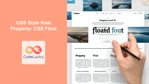
CSS Style float Property: CSS Float
CSS float Property: A Comprehensive Guide The CSS float property is a fundamental tool for controlling the layout of elements...
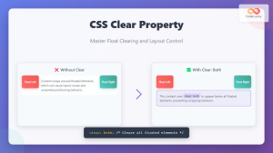
CSS Clear Property: Master Float Clearing and Layout Control
The CSS clear property is a fundamental tool for controlling how elements interact with floated content. When working with CSS...
CSS Style left Property: CSS Left
CSS left Property: A Comprehensive Guide The CSS left property is a fundamental tool for web developers, enabling precise horizontal...
CSS clear Property: Mastering CSS Clear for Layout Control
Understanding the CSS clear Property: Mastering Layout Control The clear property in CSS is a powerful tool for controlling the...
CSS Style marginRight Property: CSS Margin Right
Understanding the CSS marginRight Property The marginRight property in CSS is used to set the right margin of an element....

CSS Style right Property: CSS Right
Understanding the CSS right Property The CSS right property plays a crucial role in positioning elements within a web page....
CSS Display Property: Complete Guide to Block, Inline, and Inline-Block Elements
The CSS display property is one of the most fundamental concepts in web development, controlling how elements are rendered and...

CSS Style grid Property: CSS Grid Layout
CSS grid Property: Mastering CSS Grid Layout The CSS grid property is a powerful tool for creating two-dimensional layouts on...

CSS position Property: Mastering Layouts in CSS
Understanding the CSS position Property: A Comprehensive Guide The position property in CSS is a fundamental tool for controlling the...
CSS Style marginLeft Property: CSS Margin Left
CSS marginLeft Property: Mastering the Left Margin The CSS marginLeft property is a fundamental tool for controlling the spacing around...
HTML Block and Inline Elements: Understanding Display Properties
Introduction Have you ever wondered why some HTML elements stack vertically while others flow horizontally? Understanding the difference between block-level...
CSS Style paddingRight Property: CSS Padding Right
Understanding the CSS padding-right Property The padding-right property in CSS is used to set the amount of space between the...


