
CSS Flexbox revolutionized web layout by providing a powerful, flexible way to arrange elements within containers. The display: flex property transforms any element into a flex container, enabling sophisticated layout control with minimal code. This comprehensive guide explores every aspect of flex container properties with practical examples and interactive demonstrations.
What is CSS Flexbox?
Flexbox, short for Flexible Box Layout, is a CSS layout method designed for one-dimensional layouts. When you apply display: flex to an element, it becomes a flex container, and its direct children become flex items. This relationship forms the foundation of flexbox layouts.
Key Flexbox Concepts:
- Flex Container: The parent element with
display: flex - Flex Items: Direct children of the flex container
- Main Axis: Primary axis along which flex items are arranged
- Cross Axis: Perpendicular axis to the main axis
Basic Flexbox Syntax
Creating a flex container is straightforward. Simply apply the display: flex property to any element:
.container {
  display: flex;
}

/* Alternative inline-flex for inline behavior */
.inline-container {
  display: inline-flex;
}
Visual Example: Basic Flex Container
Result: Items automatically arrange horizontally in a row, which is the default flex behavior.
Essential Flex Container Properties
1. flex-direction
The flex-direction property controls the direction of the main axis, determining how flex items are arranged within the container.
.container {
  display: flex;
  flex-direction: row;        /* Default: left to right */
  flex-direction: row-reverse; /* Right to left */
  flex-direction: column;      /* Top to bottom */
  flex-direction: column-reverse; /* Bottom to top */
}
Visual Comparison of flex-direction Values:
flex-direction: row (default)
flex-direction: column
2. justify-content
The justify-content property aligns flex items along the main axis, controlling how extra space is distributed.
.container {
  display: flex;
  justify-content: flex-start;    /* Default: start of container */
  justify-content: flex-end;      /* End of container */
  justify-content: center;        /* Center of container */
  justify-content: space-between; /* Equal space between items */
  justify-content: space-around;  /* Equal space around items */
  justify-content: space-evenly;  /* Equal space everywhere */
}
Interactive justify-content Examples:
justify-content: center
justify-content: space-between
3. align-items
The align-items property controls how flex items are aligned along the cross axis (perpendicular to the main axis).
.container {
  display: flex;
  align-items: stretch;    /* Default: stretch to fill container */
  align-items: flex-start; /* Align to start of cross axis */
  align-items: flex-end;   /* Align to end of cross axis */
  align-items: center;     /* Center on cross axis */
  align-items: baseline;   /* Align to text baseline */
}
align-items Visual Examples:
align-items: center
4. flex-wrap
The flex-wrap property determines whether flex items should wrap to new lines when they don’t fit in the container.
.container {
  display: flex;
  flex-wrap: nowrap;      /* Default: items stay on one line */
  flex-wrap: wrap;        /* Items wrap to new lines */
  flex-wrap: wrap-reverse; /* Items wrap in reverse order */
}
flex-wrap Demonstration:
flex-wrap: wrap
5. align-content
The align-content property aligns wrapped lines of flex items along the cross axis. This property only works when flex-wrap is set to wrap or wrap-reverse.
.container {
  display: flex;
  flex-wrap: wrap;
  align-content: stretch;      /* Default: stretch lines */
  align-content: flex-start;   /* Pack lines to start */
  align-content: flex-end;     /* Pack lines to end */
  align-content: center;       /* Center lines */
  align-content: space-between; /* Space between lines */
  align-content: space-around; /* Space around lines */
}
Shorthand Properties
flex-flow
The flex-flow property is a shorthand for flex-direction and flex-wrap:
/* Instead of writing both properties separately */
.container {
  flex-direction: row;
  flex-wrap: wrap;
}

/* Use the shorthand */
.container {
  flex-flow: row wrap;
}
Practical Real-World Examples
Related Posts
CSS Style flexDirection Property: CSS Flex Direction
CSS flexDirection Property: Mastering Flex Item Arrangement The CSS flexDirection property is a crucial aspect of Flexbox layout, determining the...

CSS Style flexFlow Property: CSS Flex Flow
CSS flex-flow Property: A Comprehensive Guide The CSS flex-flow property is a shorthand property for setting both the flex-direction and...

CSS Justify-Content: Complete Guide to Flexbox Main Axis Alignment
The justify-content property is one of the most powerful tools in CSS Flexbox for controlling how flex items are distributed...

CSS Grid: Display Grid Container Property – Complete Guide with Examples
CSS Grid revolutionized web layout design by providing a two-dimensional grid system that allows developers to create complex, responsive layouts...

CSS Flex-Basis: Complete Guide to Initial Item Sizing in Flexbox
The flex-basis property is a fundamental component of CSS Flexbox that defines the initial main size of a flex item...
CSS Flex-Flow: Master Direction and Wrap Properties in One Line
The flex-flow property is a powerful CSS shorthand that combines two fundamental flexbox properties: flex-direction and flex-wrap. This single property...
CSS Flex-Direction: Complete Guide to Row, Column, Row-Reverse & Column-Reverse
The flex-direction property is one of the most fundamental aspects of CSS Flexbox, determining how flex items are arranged within...
HTML Layout: Mastering Divs, Float, Position, Flexbox, and Grid
Introduction Creating a well-structured and visually appealing website requires a strong understanding of HTML layout techniques. While HTML provides the...
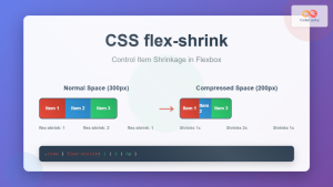
CSS Flex-Shrink: Complete Guide to Flexible Item Shrinkage Control
The CSS flex-shrink property is a fundamental component of the flexbox layout system that determines how flex items shrink when...

CSS Align-Items: Master Cross-Axis Alignment in Flexbox and Grid
The CSS align-items property is a fundamental tool for controlling cross-axis alignment in both flexbox and CSS Grid layouts. Understanding...

CSS Flex-Grow: Complete Guide to Flexible Item Growth Properties
The CSS flex-grow property is a fundamental component of the flexbox layout model that controls how flex items grow to...
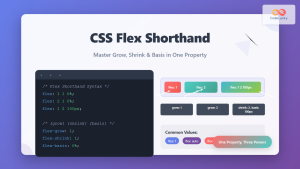
CSS Flex Shorthand: Master Grow, Shrink, and Basis in One Property
The CSS flex shorthand property is one of the most powerful tools in flexbox layouts, combining three essential properties into...


