
The CSS flex-shrink property is a fundamental component of the flexbox layout system that determines how flex items shrink when there isn’t enough space in the flex container. Understanding this property is crucial for creating responsive and flexible web layouts that adapt gracefully to different screen sizes and content lengths.
What is CSS Flex-Shrink?
The flex-shrink property defines the ability of a flex item to shrink relative to other flex items when the flex container’s size is smaller than the total size of all flex items. It accepts a unitless number that serves as a shrinkage factor, determining how much the item should shrink compared to other items in the container.
CSS Flex-Shrink Syntax
The basic syntax for the flex-shrink property is straightforward:
flex-shrink: <number> | initial | inherit;Property Values
- Number: A positive number (including 0) that represents the shrink factor
- Initial: Sets the property to its default value (1)
- Inherit: Inherits the value from the parent element
Default Behavior
By default, all flex items have a flex-shrink value of 1, meaning they will shrink equally when space is constrained. When you set flex-shrink: 0, the item will not shrink and will maintain its original size regardless of available space.
Example 1: Default Flex-Shrink Behavior
Container width: 300px | Each item’s basis: 150px | All items shrink equally
How Flex-Shrink Values Work
The flex-shrink value determines the proportion of shrinkage each item receives. Here’s how different values affect the shrinking behavior:
flex-shrink: 0 (No Shrinking)
When set to 0, the flex item will not shrink and maintains its original size, potentially causing overflow if the container is too small.
Example 2: Preventing Shrinkage
First item: flex-shrink: 0 | Others: flex-shrink: 1 (default)
flex-shrink: 1 (Default Shrinking)
This is the default value where items shrink proportionally based on their content and available space.
flex-shrink: 2+ (Higher Shrinking)
Values greater than 1 make items shrink more than others. An item with flex-shrink: 2 will shrink twice as much as an item with flex-shrink: 1.
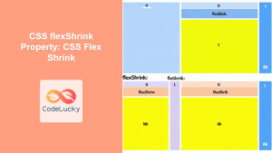
Example 3: Different Shrink Values
Items shrink proportionally: 1:2:3 ratio
Interactive Flex-Shrink Demonstration
Interactive Example: Adjust Container Width
Practical Use Cases
Navigation Bars
Create responsive navigation bars where certain items can shrink while others maintain their minimum size:
Example 4: Responsive Navigation
Logo and Contact don’t shrink | Navigation items shrink proportionally
Card Layouts
Control how cards shrink in a responsive card layout:
Example 5: Card Layout
Card 1
This card can shrink
Card 2
This card won’t shrink
Card 3
This card shrinks more
Mathematical Calculation of Shrinkage
Understanding how browsers calculate shrinkage helps in predicting layout behavior. The formula involves:
- Negative free space: Total item sizes minus container size
- Weighted shrinkage: Each item’s flex-basis × flex-shrink value
- Proportional reduction: Distribute negative space based on weighted values
Calculation Example
Container: 300px width
Items: 3 items, each 150px basis (total: 450px)
Negative space: 450px – 300px = 150px to remove
Shrink values: Item 1: 1, Item 2: 2, Item 3: 1
Weighted totals: (150×1) + (150×2) + (150×1) = 600
Final sizes:
- Item 1: 150px – (150px × 1/600 × 150px) = 112.5px
- Item 2: 150px – (150px × 2/600 × 150px) = 75px
- Item 3: 150px – (150px × 1/600 × 150px) = 112.5px
Common Gotchas and Best Practices
Minimum Content Size
Flex items have an implicit minimum size based on their content. Even with flex-shrink, items won’t shrink smaller than their content requires unless you explicitly set min-width: 0.
Example 6: Minimum Content Size Issue
First item can’t shrink below its content width
With min-width: 0, items can shrink below content size
Performance Considerations
Using flex-shrink can trigger layout recalculations. For better performance in animations, consider using transforms instead of changing flex properties dynamically.
Browser Support
The flex-shrink property is well-supported across modern browsers. For older browsers, consider using appropriate vendor prefixes or fallback layouts.
Advanced Techniques
Combining with Other Flex Properties
The flex-shrink property works in conjunction with flex-grow and flex-basis. You can use the shorthand flex property to set all three values:
/* flex: grow shrink basis */
.item {
  flex: 1 2 200px; /* grow: 1, shrink: 2, basis: 200px */
}
Responsive Design Applications
Combine flex-shrink with media queries for responsive layouts that adapt to different screen sizes:
.sidebar {
  flex: 0 0 300px; /* Don't grow or shrink */
}

.main-content {
  flex: 1 1 auto; /* Grow and shrink as needed */
}

@media (max-width: 768px) {
  .sidebar {
    flex: 1 1 100%; /* Allow shrinking on mobile */
  }
}
Conclusion
The CSS flex-shrink property is essential for creating flexible, responsive layouts that gracefully handle space constraints. By understanding how shrinkage factors work and applying them strategically, you can build interfaces that adapt seamlessly to different container sizes and content lengths.
Remember that flex-shrink works best when combined with proper flex-basis values and consideration for minimum content sizes. Practice with different values and scenarios to master this powerful layout tool and create more robust, responsive web designs.
Whether you’re building navigation bars, card layouts, or complex dashboard interfaces, mastering flex-shrink will give you precise control over how your elements behave when space becomes limited, resulting in better user experiences across all device sizes.
Related Posts
CSS flexShrink Property: CSS Flex Shrink
CSS flexShrink Property: Controlling the Shrink Factor of Flex Items The CSS flexShrink property is a crucial component of the...

CSS Flex-Grow: Complete Guide to Flexible Item Growth Properties
The CSS flex-grow property is a fundamental component of the flexbox layout model that controls how flex items grow to...
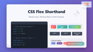
CSS Flex Shorthand: Master Grow, Shrink, and Basis in One Property
The CSS flex shorthand property is one of the most powerful tools in flexbox layouts, combining three essential properties into...

CSS Flex-Basis: Complete Guide to Initial Item Sizing in Flexbox
The flex-basis property is a fundamental component of CSS Flexbox that defines the initial main size of a flex item...
CSS Style flex Property: CSS Flex
Understanding the CSS flex Property: A Comprehensive Guide The CSS flex property is a shorthand property used to set the...
CSS Flexbox: Complete Guide to display: flex Container Properties and Layout Control
CSS Flexbox revolutionized web layout by providing a powerful, flexible way to arrange elements within containers. The display: flex property...

CSS Style minWidth Property: CSS Min Width
CSS min-width Property: Controlling Element Size The CSS min-width property sets the minimum width of an element. It prevents the...
CSS Style flexDirection Property: CSS Flex Direction
CSS flexDirection Property: Mastering Flex Item Arrangement The CSS flexDirection property is a crucial aspect of Flexbox layout, determining the...

CSS Style flexFlow Property: CSS Flex Flow
CSS flex-flow Property: A Comprehensive Guide The CSS flex-flow property is a shorthand property for setting both the flex-direction and...

CSS Resize Property: Controlling Element Resizability
Understanding the CSS Resize Property: Controlling Element Resizability The resize property in CSS allows you to control whether (and how)...
CSS Order Property: Complete Guide to Reordering Flex Items Visually
The CSS order property is a powerful flexbox feature that allows you to change the visual order of flex items...
CSS minHeight Property: CSS Min Height
Understanding the CSS minHeight Property The CSS minHeight property sets the minimum height of an element. It prevents the element's...


