
The flex-flow property is a powerful CSS shorthand that combines two fundamental flexbox properties: flex-direction and flex-wrap. This single property gives you complete control over how flex items flow within their container, making your CSS more concise and maintainable.
What is CSS Flex-Flow?
CSS flex-flow is a shorthand property that sets both the direction of flex items and whether they should wrap to new lines. Instead of writing two separate properties, you can define both behaviors in one declaration.
Syntax
flex-flow: <flex-direction> <flex-wrap>;Understanding the Component Properties
Flex-Direction Values
The flex-direction component controls the main axis direction:
- row (default): Items flow horizontally from left to right
- row-reverse: Items flow horizontally from right to left
- column: Items flow vertically from top to bottom
- column-reverse: Items flow vertically from bottom to top
Flex-Wrap Values
The flex-wrap component determines wrapping behavior:
- nowrap (default): Items stay on one line
- wrap: Items wrap to new lines as needed
- wrap-reverse: Items wrap to new lines in reverse order
Complete Flex-Flow Property Values
Here are all possible combinations of flex-flow values:
/* Direction only */
flex-flow: row;
flex-flow: column;
flex-flow: row-reverse;
flex-flow: column-reverse;

/* Wrap only */
flex-flow: wrap;
flex-flow: nowrap;
flex-flow: wrap-reverse;

/* Direction and wrap combined */
flex-flow: row wrap;
flex-flow: column nowrap;
flex-flow: row-reverse wrap;
flex-flow: column-reverse wrap-reverse;
Interactive Examples
Example 1: Basic Flex-Flow Demonstration
Example 2: Responsive Card Layout
Card 1
This card demonstrates how flex-flow: row wrap creates a responsive layout that adapts to container width.
Card 2
Cards automatically wrap to new lines when there isn’t enough horizontal space.
Card 3
Each card maintains its minimum width while growing to fill available space.
Card 4
This creates a flexible, responsive grid without media queries.
.card-container {
  display: flex;
  flex-flow: row wrap;
  gap: 20px;
}

.card {
  flex: 1 1 250px;
  min-width: 250px;
}
Practical Use Cases
1. Navigation Menu
.nav-menu {
  display: flex;
  flex-flow: row wrap;
}
2. Image Gallery
.gallery {
  display: flex;
  flex-flow: row wrap;
  gap: 10px;
}

.gallery-item {
  flex: 1 1 200px;
}
Comparison: Flex-Flow vs Individual Properties
Traditional Approach
/* Using separate properties */
.container {
  display: flex;
  flex-direction: row;
  flex-wrap: wrap;
}
Shorthand Approach
/* Using flex-flow shorthand */
.container {
  display: flex;
  flex-flow: row wrap;
}
Benefits of using flex-flow:
- Reduces CSS code length
- Improves code readability
- Ensures consistency between direction and wrap properties
- Easier to maintain and update
Common Patterns and Best Practices
1. Responsive Design Pattern
/* Mobile-first approach */
.container {
  display: flex;
  flex-flow: column nowrap;
}

/* Tablet and desktop */
@media (min-width: 768px) {
  .container {
    flex-flow: row wrap;
  }
}
2. Form Layout Pattern
.form-container {
  display: flex;
  flex-flow: column wrap;
}

.form-row {
  display: flex;
  flex-flow: row wrap;
}
Browser Support and Compatibility
The flex-flow property enjoys excellent browser support:
- Chrome: 29+ (full support)
- Firefox: 28+ (full support)
- Safari: 9+ (full support)
- Edge: 12+ (full support)
- Internet Explorer: 11+ (full support)
Troubleshooting Common Issues
Issue 1: Items Not Wrapping
Problem: Flex items overflow container instead of wrapping.
Solution: Ensure you’re using wrap in your flex-flow value:
/* Wrong */
flex-flow: row nowrap;

/* Correct */
flex-flow: row wrap;
Issue 2: Unexpected Direction
Problem: Items flow in wrong direction.
Solution: Check the order of values in flex-flow:
/* Direction comes first, then wrap */
flex-flow: column wrap; /* Correct */
flex-flow: wrap column; /* This won't work as expected */
Performance Considerations
Using flex-flow shorthand offers several performance benefits:
- Reduced CSS Size: Shorthand properties result in smaller CSS files
- Faster Parsing: Browsers can parse shorthand properties more efficiently
- Better Caching: Smaller CSS files improve caching performance
- Maintenance: Single property changes are easier to track and debug
Advanced Techniques
Dynamic Flex-Flow with CSS Variables
:root {
  --flex-direction: row;
  --flex-wrap: wrap;
}

.dynamic-container {
  display: flex;
  flex-flow: var(--flex-direction) var(--flex-wrap);
}

/* Change layout with media queries */
@media (max-width: 768px) {
  :root {
    --flex-direction: column;
    --flex-wrap: nowrap;
  }
}
Flex-Flow with Container Queries
@container (min-width: 400px) {
  .responsive-container {
    flex-flow: row wrap;
  }
}

@container (max-width: 399px) {
  .responsive-container {
    flex-flow: column nowrap;
  }
}
Conclusion
The CSS flex-flow property is an essential tool for modern web developers, offering a clean and efficient way to control flexbox layouts. By combining flex-direction and flex-wrap into a single property, it simplifies your CSS while providing powerful layout control.
Key takeaways:
- Use
flex-flowto set both direction and wrap behavior in one declaration - Most common patterns are
row wrapfor responsive layouts andcolumn nowrapfor vertical stacking - Combine with other flex properties for complete layout control
- Test across different screen sizes to ensure responsive behavior
- Consider using CSS variables for dynamic layouts
Master the flex-flow property, and you’ll have a powerful tool for creating flexible, responsive layouts that adapt beautifully to any screen size or container width.
Related Posts

CSS Style flexFlow Property: CSS Flex Flow
CSS flex-flow Property: A Comprehensive Guide The CSS flex-flow property is a shorthand property for setting both the flex-direction and...

CSS Flex-Wrap: Master Nowrap, Wrap, and Wrap-Reverse for Perfect Responsive Layouts
The CSS flex-wrap property is a fundamental flexbox feature that controls whether flex items are forced onto a single line...
CSS flexWrap Property: CSS Flex Wrap
CSS flex-wrap Property: Mastering Flex Item Wrapping The flex-wrap property in CSS is a powerful tool for controlling how flex...
CSS Flexbox: Complete Guide to display: flex Container Properties and Layout Control
CSS Flexbox revolutionized web layout by providing a powerful, flexible way to arrange elements within containers. The display: flex property...
CSS Style flexDirection Property: CSS Flex Direction
CSS flexDirection Property: Mastering Flex Item Arrangement The CSS flexDirection property is a crucial aspect of Flexbox layout, determining the...

CSS Align-Content: Complete Guide to Cross-Axis Multi-Line Alignment
The align-content property is a powerful CSS tool that controls how multiple lines of content are distributed along the cross-axis...
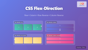
CSS Flex-Direction: Complete Guide to Row, Column, Row-Reverse & Column-Reverse
The flex-direction property is one of the most fundamental aspects of CSS Flexbox, determining how flex items are arranged within...

CSS Justify-Content: Complete Guide to Flexbox Main Axis Alignment
The justify-content property is one of the most powerful tools in CSS Flexbox for controlling how flex items are distributed...

CSS Place-Self: Master Grid and Flexbox Item Positioning with One Property
The CSS place-self property is a powerful shorthand that combines justify-self and align-self into a single declaration, making it easier...
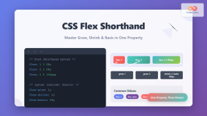
CSS Flex Shorthand: Master Grow, Shrink, and Basis in One Property
The CSS flex shorthand property is one of the most powerful tools in flexbox layouts, combining three essential properties into...

CSS Align-Items: Master Cross-Axis Alignment in Flexbox and Grid
The CSS align-items property is a fundamental tool for controlling cross-axis alignment in both flexbox and CSS Grid layouts. Understanding...
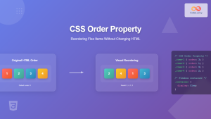
CSS Order Property: Complete Guide to Reordering Flex Items Visually
The CSS order property is a powerful flexbox feature that allows you to change the visual order of flex items...


