
The flex-basis property is a fundamental component of CSS Flexbox that defines the initial main size of a flex item before any available space is distributed. Understanding this property is crucial for creating responsive and flexible layouts that adapt to different screen sizes and content requirements.
What is CSS Flex-Basis?
The flex-basis property sets the initial main size of a flex item along the main axis before free space is distributed according to the flex factors. It acts as the starting point for flex calculations and determines how much space an item should take up before growing or shrinking.
Syntax and Values
flex-basis: <length> | <percentage> | auto | content | initial | inherit;Available Values:
- auto – Uses the item’s main size property (width/height)
- content – Based on the item’s content size
- <length> – Absolute units (px, em, rem, etc.)
- <percentage> – Relative to the flex container’s main size
- 0 – Sets the initial size to zero
How Flex-Basis Works
The flex-basis property works in conjunction with flex-grow and flex-shrink to determine the final size of flex items. Here’s the calculation process:
- Calculate the initial size using
flex-basis - Determine available space in the container
- Distribute extra space using
flex-grow - Reduce space if needed using
flex-shrink
Visual Examples
Example 1: Basic Flex-Basis Values
Demo: Different Flex-Basis Values
Notice how each item starts with a different initial size based on its flex-basis value.
Example 2: Flex-Basis vs Width
Understanding the difference between flex-basis and width is crucial for effective flexbox usage:
Using Width (gets overridden by flex-grow):
Using Flex-Basis (respects the initial size):
Interactive Example: Flex-Basis Calculator
Experiment with different flex-basis values to see how they affect item sizing:
flex-basis: 100px
flex-basis: 200px
flex-basis: auto
Common Use Cases
1. Creating Equal-Width Items
.equal-items {
  display: flex;
}

.equal-items > * {
  flex-basis: 0;
  flex-grow: 1;
  /* Shorthand: flex: 1; */
}
2. Setting Minimum Item Sizes
.sidebar {
  flex-basis: 250px;
  flex-shrink: 0; /* Prevents shrinking below 250px */
}

.main-content {
  flex-basis: 0;
  flex-grow: 1;
}
3. Responsive Grid Alternative
Resize the window to see responsive behavior with flex-basis.
Best Practices
1. Use Percentage Values for Responsive Design
Percentage values make your layout more flexible and responsive to different screen sizes:
/* Good for responsive design */
.column {
  flex-basis: 50%;
}

/* Less flexible */
.column {
  flex-basis: 400px;
}
2. Combine with Flex-Grow and Flex-Shrink
Use the shorthand flex property for better control:
/* flex: grow shrink basis */
.flexible-item {
  flex: 1 1 200px; /* Can grow, can shrink, starts at 200px */
}

.fixed-item {
  flex: 0 0 150px; /* No grow, no shrink, fixed at 150px */
}
3. Consider Content Size
When using flex-basis: 0, items will be sized based on their flex-grow ratio rather than content size, which can be useful for equal-width layouts regardless of content length.
Common Pitfalls to Avoid
⚠️ Warning: Common Mistakes
- Mixing width and flex-basis: Use flex-basis instead of width for flex items
- Forgetting about content size: Remember that content can override flex-basis in some cases
- Not accounting for gaps: Include gaps in your percentage calculations
- Ignoring min/max constraints: flex-basis can be overridden by min-width/max-width
Browser Support
The flex-basis property has excellent browser support across all modern browsers. It’s supported in:
- Chrome 29+
- Firefox 28+
- Safari 9+
- Edge 12+
- Internet Explorer 11+ (with -ms- prefix for IE 10)
Conclusion
The flex-basis property is a powerful tool for controlling the initial size of flex items before they grow or shrink. By understanding how it works with flex-grow and flex-shrink, you can create flexible, responsive layouts that adapt to different screen sizes and content requirements.
Remember to use percentage values for responsive design, combine flex properties using the shorthand syntax, and always consider the relationship between content size and your flex-basis values. With these techniques, you’ll be able to create sophisticated layouts that work across all devices and screen sizes.
Practice with the interactive examples above to get comfortable with how flex-basis affects your layouts, and don’t hesitate to experiment with different values to achieve the exact behavior you need for your projects.
Related Posts

CSS Flex-Grow: Complete Guide to Flexible Item Growth Properties
The CSS flex-grow property is a fundamental component of the flexbox layout model that controls how flex items grow to...
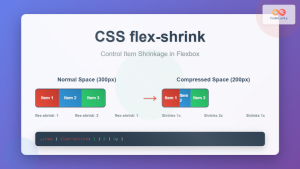
CSS Flex-Shrink: Complete Guide to Flexible Item Shrinkage Control
The CSS flex-shrink property is a fundamental component of the flexbox layout system that determines how flex items shrink when...
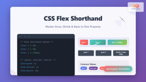
CSS Flex Shorthand: Master Grow, Shrink, and Basis in One Property
The CSS flex shorthand property is one of the most powerful tools in flexbox layouts, combining three essential properties into...
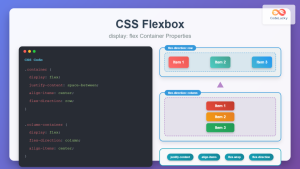
CSS Flexbox: Complete Guide to display: flex Container Properties and Layout Control
CSS Flexbox revolutionized web layout by providing a powerful, flexible way to arrange elements within containers. The display: flex property...
CSS Style flex Property: CSS Flex
Understanding the CSS flex Property: A Comprehensive Guide The CSS flex property is a shorthand property used to set the...
CSS flexShrink Property: CSS Flex Shrink
CSS flexShrink Property: Controlling the Shrink Factor of Flex Items The CSS flexShrink property is a crucial component of the...
CSS Style flexDirection Property: CSS Flex Direction
CSS flexDirection Property: Mastering Flex Item Arrangement The CSS flexDirection property is a crucial aspect of Flexbox layout, determining the...

CSS Justify-Content: Complete Guide to Flexbox Main Axis Alignment
The justify-content property is one of the most powerful tools in CSS Flexbox for controlling how flex items are distributed...
CSS minHeight Property: CSS Min Height
Understanding the CSS minHeight Property The CSS minHeight property sets the minimum height of an element. It prevents the element's...
CSS Order Property: Complete Guide to Reordering Flex Items Visually
The CSS order property is a powerful flexbox feature that allows you to change the visual order of flex items...

CSS Style flexFlow Property: CSS Flex Flow
CSS flex-flow Property: A Comprehensive Guide The CSS flex-flow property is a shorthand property for setting both the flex-direction and...
CSS Flex-Direction: Complete Guide to Row, Column, Row-Reverse & Column-Reverse
The flex-direction property is one of the most fundamental aspects of CSS Flexbox, determining how flex items are arranged within...


