
The critical rendering path represents the sequence of steps browsers take to convert HTML, CSS, and JavaScript into pixels on the screen. CSS critical path optimization focuses on prioritizing the CSS needed to render above-the-fold content, dramatically reducing page load times and improving user experience.
Understanding the Critical Rendering Path
When a browser loads a webpage, it follows a specific sequence: parsing HTML, building the DOM tree, parsing CSS to create the CSSOM (CSS Object Model), combining both to form the render tree, calculating layout, and finally painting pixels. CSS is render-blocking by default, meaning the browser won’t display content until all CSS is downloaded and parsed.
Critical Path Timeline
Traditional rendering blocks on all CSS
Identifying Above-Fold Content
Above-the-fold content refers to the portion of a webpage visible without scrolling. This typically includes the header, navigation, hero section, and initial content blocks. The goal is to identify and prioritize CSS that styles these elements.
Tools for Critical CSS Identification
Several tools can help identify critical CSS:
- Chrome DevTools Coverage Tab: Shows which CSS rules are used during initial page load
- Critical CSS generators: Tools like Penthouse, Critical, or online generators
- Lighthouse audits: Provides suggestions for render-blocking resources
- Manual analysis: Examining viewport dimensions and content structure
Manual Critical CSS Extraction Example
Let’s examine a typical webpage structure and identify critical CSS:
<!-- HTML Structure -->
<header class="main-header">
  <nav class="navbar">...</nav>
</header>
<main>
  <section class="hero-section">...</section>
  <section class="content-section">...</section>
</main>
For this structure, critical CSS would include styles for .main-header, .navbar, and .hero-section, while .content-section styles could be deferred if they’re below the fold.
CSS Critical Path Implementation Strategies
1. Inline Critical CSS
The most effective approach is inlining critical CSS directly in the HTML head. This eliminates the render-blocking request for above-fold styles:
<head>
  <style>
    /* Critical CSS - Inlined */
    .main-header {
      background: #fff;
      box-shadow: 0 2px 4px rgba(0,0,0,0.1);
      position: fixed;
      top: 0;
      width: 100%;
      z-index: 1000;
    }

    .navbar {
      display: flex;
      justify-content: space-between;
      align-items: center;
      padding: 1rem 2rem;
      max-width: 1200px;
      margin: 0 auto;
    }

    .hero-section {
      background: linear-gradient(135deg, #667eea 0%, #764ba2 100%);
      color: white;
      text-align: center;
      padding: 8rem 2rem 4rem;
      margin-top: 80px; /* Account for fixed header */
    }
  </style>
</head>
2. Asynchronous CSS Loading
Load non-critical CSS asynchronously to prevent render blocking:
<!-- Preload non-critical CSS -->
<link rel="preload" href="styles.css" as="style" onload="this.onload=null;this.rel='stylesheet'">
<noscript><link rel="stylesheet" href="styles.css"></noscript>

<!-- Alternative: Load with JavaScript -->
<script>
  function loadCSS(href) {
    const link = document.createElement('link');
    link.rel = 'stylesheet';
    link.href = href;
    document.head.appendChild(link);
  }

  // Load after critical path
  window.addEventListener('load', () => {
    loadCSS('non-critical.css');
  });
</script>
3. Media Query Optimization
Use media queries to conditionally load CSS based on device characteristics:
<!-- Critical CSS for all devices -->
<style>
  /* Base critical styles */
  .header { display: block; }
</style>

<!-- Device-specific non-critical CSS -->
<link rel="stylesheet" href="mobile.css" media="(max-width: 768px)">
<link rel="stylesheet" href="desktop.css" media="(min-width: 769px)">
<link rel="stylesheet" href="print.css" media="print">
Interactive Critical Path Analyzer
Here’s an interactive tool to demonstrate critical path optimization:
Critical Path Simulator
Timeline Visualization
Performance Metrics
Advanced Optimization Techniques
Resource Hints
Leverage browser resource hints to optimize CSS loading:
<!-- DNS prefetch for external CSS -->
<link rel="dns-prefetch" href="//fonts.googleapis.com">

<!-- Preconnect to establish early connection -->
<link rel="preconnect" href="https://fonts.gstatic.com" crossorigin>

<!-- Prefetch non-critical resources -->
<link rel="prefetch" href="secondary-styles.css">

<!-- Preload critical resources -->
<link rel="preload" href="critical-fonts.woff2" as="font" type="font/woff2" crossorigin>
CSS Containment
Use CSS containment to optimize rendering performance:
/* Contain layout and style changes */
.article-section {
  contain: layout style;
}

/* Contain paint operations */
.carousel-item {
  contain: paint;
}

/* Strict containment for isolated components */
.widget {
  contain: strict;
}
Performance Measurement and Monitoring
Core Web Vitals Impact
Critical path optimization directly affects Core Web Vitals:
- First Contentful Paint (FCP): Reduced by inlining critical CSS
- Largest Contentful Paint (LCP): Improved through faster above-fold rendering
- Cumulative Layout Shift (CLS): Minimized by including layout-affecting styles in critical CSS
Measurement Tools
Essential Performance Tools
Built-in performance profiling and coverage analysis
Automated performance testing in CI/CD pipelines
Detailed waterfall analysis and filmstrip view
Track actual user experience metrics
Build Process Integration
Automated Critical CSS Extraction
Integrate critical CSS extraction into your build process:
// webpack.config.js with critical CSS plugin
const HtmlCriticalWebpackPlugin = require('html-critical-webpack-plugin');

module.exports = {
  plugins: [
    new HtmlCriticalWebpackPlugin({
      base: path.resolve(__dirname, 'dist'),
      src: 'index.html',
      dest: 'index.html',
      inline: true,
      minify: true,
      extract: true,
      width: 1300,
      height: 900,
      penthouse: {
        blockJSRequests: false,
      }
    })
  ]
};
Gulp Task Example
const gulp = require('gulp');
const critical = require('critical');

gulp.task('critical', () => {
  return critical.generate({
    inline: true,
    base: 'dist/',
    src: 'index.html',
    dest: 'index-critical.html',
    dimensions: [
      { width: 320, height: 480 },
      { width: 768, height: 1024 },
      { width: 1280, height: 960 }
    ],
    penthouse: {
      timeout: 30000,
      pageLoadSkipTimeout: 5000
    }
  });
});
Common Pitfalls and Solutions
Over-Inlining CSS
Avoid inlining too much CSS, which can increase HTML size and hurt caching. Keep critical CSS under 14KB for optimal performance.
Dynamic Content Considerations
For dynamic content, consider using CSS custom properties for critical values:
:root {
  --hero-bg: url('default-hero.jpg');
  --brand-color: #007bff;
}

.hero-section {
  background-image: var(--hero-bg);
  background-color: var(--brand-color);
}

/* Update via JavaScript when content loads */
document.documentElement.style.setProperty('--hero-bg', 'url("dynamic-hero.jpg")');
Font Loading Optimization
Include font-face declarations in critical CSS with proper fallbacks:
@font-face {
  font-family: 'CustomFont';
  src: url('font.woff2') format('woff2');
  font-display: swap;
}

body {
  font-family: 'CustomFont', 'Helvetica Neue', Arial, sans-serif;
}

/* Optional: Preload critical font */
<link rel="preload" href="font.woff2" as="font" type="font/woff2" crossorigin>
Best Practices Summary
Critical Path Optimization Checklist
Identification
- ✓ Analyze above-fold content
- ✓ Use coverage tools
- ✓ Measure viewport dimensions
- ✓ Test on multiple devices
Implementation
- ✓ Inline critical CSS
- ✓ Defer non-critical CSS
- ✓ Use resource hints
- ✓ Optimize font loading
Monitoring
- ✓ Track Core Web Vitals
- ✓ Monitor FCP and LCP
- ✓ Set performance budgets
- ✓ Automate testing
Conclusion
CSS critical path optimization is essential for modern web performance. By identifying and prioritizing above-the-fold CSS, implementing proper loading strategies, and continuously monitoring performance metrics, you can significantly improve user experience and search engine rankings. The techniques covered in this guide provide a comprehensive approach to mastering critical path optimization, from basic inlining to advanced build process integration.
Remember that optimization is an iterative process. Regularly audit your critical path, measure performance impacts, and adjust your strategy based on real-world usage patterns. The investment in critical path optimization pays dividends in user satisfaction, conversion rates, and overall site performance.
Related Posts
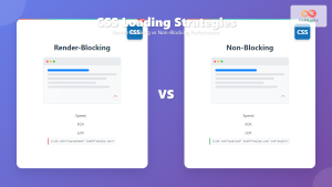
CSS Loading Strategies: Complete Guide to Render-Blocking and Non-Blocking Performance Optimization
CSS loading strategies are fundamental to web performance optimization, directly impacting user experience and search engine rankings. Understanding how different...
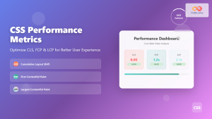
CSS Performance Metrics: Complete Guide to CLS, FCP, LCP Optimization
Website performance directly impacts user experience, search rankings, and conversion rates. CSS plays a crucial role in three critical performance...

CSS Containment: Mastering the contain Property for Optimal Web Performance
CSS containment is a powerful performance optimization technique that allows developers to isolate parts of the DOM tree, preventing unnecessary...

CSS Graceful Degradation: Essential Fallback Strategies for Modern Web Development
CSS graceful degradation is a fundamental web development strategy that ensures your website remains functional and accessible across all browsers,...

CSS display Property: CSS Display
Understanding the CSS display Property: A Comprehensive Guide The display property in CSS is a cornerstone for controlling the layout...

HTML File Paths: Mastering Relative and Absolute Paths
Introduction Ever wondered how your HTML page knows where to find that stylish CSS file or that engaging image? The...

CSS Purge: Ultimate Guide to Removing Unused CSS for Lightning-Fast Performance
Website performance is crucial for user experience and SEO rankings. One of the most effective ways to improve loading times...

CSS Preprocessors: Sass Variables and Nesting – Complete Guide for Modern Web Development
CSS preprocessors have revolutionized how developers write and maintain stylesheets. Among the most popular preprocessors, Sass (Syntactically Awesome StyleSheets) stands...

HTML CSS: Styling Your Web Pages with Selectors, Properties, and the Cascade
Introduction Ever wondered how websites go from plain text to visually stunning experiences? The magic lies in CSS (Cascading Style...

CSS Progressive Enhancement: Build Resilient Web Experiences Layer by Layer
Progressive enhancement in CSS is a fundamental approach that ensures your web applications remain functional and accessible across all devices,...

JavaScript DOM CSS: Modifying Element Styles with JavaScript
JavaScript's ability to manipulate the Document Object Model (DOM) extends beyond just changing content and structure. It also provides powerful...

CSS Specificity: Complete Guide to Style Priority and Cascade Resolution
CSS specificity is one of the most crucial concepts every web developer must master. It determines which styles the browser...


