
The animation-name property is the bridge that connects your carefully crafted keyframe animations to HTML elements. Without this crucial CSS property, your animations would remain dormant code, never bringing life to your web pages. Understanding how to properly use animation-name is essential for any developer looking to create engaging, interactive web experiences.
What is CSS Animation-Name?
The animation-name property specifies the name of the @keyframes rule that defines the animation sequence. It tells the browser which animation to apply to an element, acting as the crucial link between your animation definition and the element that will perform it.
Basic Syntax
animation-name: none | keyframe-name | initial | inherit;Animation-Name Values Explained
none (Default Value)
When set to none, no animation is applied to the element. This is useful for conditionally disabling animations or resetting animation states.
keyframe-name
This is the name you assign to your @keyframes rule. The name can contain letters, numbers, hyphens, and underscores, but cannot start with a number.
Multiple Animation Names
You can specify multiple animation names separated by commas to apply multiple animations simultaneously to a single element.
Creating Your First Animation with Animation-Name
Let’s start with a simple example to demonstrate how animation-name connects animations to elements:
/* Define the keyframes */
@keyframes slideIn {
  from {
    transform: translateX(-100%);
    opacity: 0;
  }
  to {
    transform: translateX(0);
    opacity: 1;
  }
}

/* Apply the animation to an element */
.slide-element {
  animation-name: slideIn;
  animation-duration: 1s;
}
Live Example:
Advanced Animation-Name Techniques
Multiple Animations on Single Element
You can apply multiple animations to a single element by listing multiple animation names separated by commas:
@keyframes rotate {
  from { transform: rotate(0deg); }
  to { transform: rotate(360deg); }
}

@keyframes colorChange {
  0% { background-color: #ff6b6b; }
  50% { background-color: #4ecdc4; }
  100% { background-color: #45b7d1; }
}

.multi-animation {
  animation-name: rotate, colorChange;
  animation-duration: 3s, 2s;
  animation-iteration-count: infinite;
}
Live Example:
This circle rotates and changes colors simultaneously
Conditional Animation Names
You can use CSS classes and JavaScript to dynamically change animation names based on user interactions or application states:
@keyframes bounceIn {
  0% {
    transform: scale(0.3);
    opacity: 0;
  }
  50% {
    transform: scale(1.05);
  }
  100% {
    transform: scale(1);
    opacity: 1;
  }
}

@keyframes fadeOut {
  from {
    opacity: 1;
  }
  to {
    opacity: 0;
  }
}

.element {
  animation-duration: 0.6s;
}

.element.entering {
  animation-name: bounceIn;
}

.element.leaving {
  animation-name: fadeOut;
}
Interactive Animation Example
Here’s an interactive example that demonstrates how to change animation names dynamically:
Click the box or use the buttons to change animations!
Animation-Name Best Practices
1. Use Descriptive Names
Choose meaningful names for your animations that describe what they do:
slideInFromLeft, fadeOutUp, bounceInDown
anim1, myAnimation, test
2. Follow Naming Conventions
Establish consistent naming patterns across your project:
- Action-based:
slideIn,fadeOut,rotateClockwise - Direction-based:
moveLeft,enterFromTop,exitToRight - State-based:
showContent,hideModal,highlightButton
3. Group Related Animations
Use prefixes to group related animations:
/* Modal animations */
@keyframes modal-slideIn { /* ... */ }
@keyframes modal-slideOut { /* ... */ }

/* Button animations */
@keyframes button-hover { /* ... */ }
@keyframes button-click { /* ... */ }

/* Loading animations */
@keyframes loading-spin { /* ... */ }
@keyframes loading-pulse { /* ... */ }
Performance Considerations
Animation-Name and Browser Performance
When using animation-name, consider these performance tips:
- Limit simultaneous animations: Too many animations running at once can impact performance
- Use transform and opacity: These properties are GPU-accelerated for smoother animations
- Consider animation-fill-mode: Use appropriate fill modes to prevent layout shifts
will-change property to hint the browser about upcoming animations for better performance optimization.
Responsive Animation Names
You can create responsive animations by changing animation names based on screen size:
@keyframes desktop-slideIn {
  from { transform: translateX(-300px); }
  to { transform: translateX(0); }
}

@keyframes mobile-slideIn {
  from { transform: translateX(-150px); }
  to { transform: translateX(0); }
}

.responsive-element {
  animation-name: desktop-slideIn;
  animation-duration: 1s;
}

@media (max-width: 768px) {
  .responsive-element {
    animation-name: mobile-slideIn;
  }
}
Common Mistakes and Troubleshooting
Animation Not Working?
If your animation isn’t working, check these common issues:
- Typo in animation name: Ensure the
animation-nameexactly matches your@keyframesname - Missing animation-duration: Without duration, animations won’t run
- Case sensitivity:
slideInandslideinare different names - Invalid characters: Don’t use spaces or special characters in animation names
Animation Name Conflicts
When working with multiple CSS files or frameworks, animation name conflicts can occur. Use namespacing to avoid issues:
/* Instead of generic names */
@keyframes fadeIn { /* ... */ }

/* Use namespaced names */
@keyframes myApp-fadeIn { /* ... */ }
@keyframes myComponent-slideUp { /* ... */ }
CSS Animation-Name with CSS Variables
Modern CSS allows you to use custom properties with animation names for more dynamic control:
:root {
  --enter-animation: slideInFromLeft;
  --exit-animation: slideOutToRight;
}

.dynamic-element {
  animation-name: var(--enter-animation);
  animation-duration: 0.5s;
}

.dynamic-element.leaving {
  animation-name: var(--exit-animation);
}

/* Change animations based on theme */
[data-theme="dark"] {
  --enter-animation: fadeInUp;
  --exit-animation: fadeOutDown;
}
Browser Support and Fallbacks
The animation-name property has excellent browser support across all modern browsers. For older browsers, consider providing fallbacks:
/* Fallback for older browsers */
.animated-element {
  /* Static state for browsers without animation support */
  opacity: 1;
  transform: translateX(0);

  /* Animation for supported browsers */
  animation-name: slideIn;
  animation-duration: 1s;
}
Real-World Animation Examples
Page Loading Animation
@keyframes pageLoad {
  0% {
    opacity: 0;
    transform: translateY(20px);
  }
  100% {
    opacity: 1;
    transform: translateY(0);
  }
}

.page-content {
  animation-name: pageLoad;
  animation-duration: 0.8s;
  animation-timing-function: ease-out;
}
Notification Toast
@keyframes toastSlideIn {
  from {
    transform: translateX(100%);
    opacity: 0;
  }
  to {
    transform: translateX(0);
    opacity: 1;
  }
}

@keyframes toastSlideOut {
  from {
    transform: translateX(0);
    opacity: 1;
  }
  to {
    transform: translateX(100%);
    opacity: 0;
  }
}

.toast {
  animation-duration: 0.3s;
  animation-timing-function: cubic-bezier(0.4, 0, 0.2, 1);
}

.toast.entering {
  animation-name: toastSlideIn;
}

.toast.leaving {
  animation-name: toastSlideOut;
}
Conclusion
The animation-name property is your gateway to bringing static web pages to life. By understanding how to properly connect keyframe animations to elements, you can create engaging user experiences that guide attention, provide feedback, and enhance the overall usability of your web applications.
Remember to use descriptive names, consider performance implications, and test your animations across different devices and browsers. With practice, you’ll master the art of using animation-name to create smooth, professional animations that delight your users.
Start experimenting with different animation names and combinations to discover the endless possibilities that CSS animations offer. The key is to practice regularly and always keep user experience at the forefront of your animation decisions.
Related Posts
CSS Style animationName Property: CSS Animation Name
CSS animationName Property: A Comprehensive Guide The CSS animationName property specifies the name of the @keyframes at-rule that defines the...
CSS Animation Property: Complete Guide to Keyframe-Based Animations
CSS animations bring life to web pages by allowing elements to transition smoothly between different states over time. The animation...

CSS Style animation Property: CSS Animation
CSS animation Property: A Comprehensive Guide to CSS Animations The animation property in CSS is a shorthand property used to...
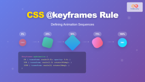
CSS @keyframes Rule: Complete Guide to Creating Smooth Animation Sequences
CSS animations bring life to web interfaces, and the @keyframes rule is the foundation that makes complex animation sequences possible....

CSS Style animationDuration Property: CSS Animation Duration
Understanding the animationDuration Property in CSS The animationDuration property in CSS specifies the length of time that an animation should...

JavaScript AnimationEvent animationName Property: Getting Animation Names
JavaScript AnimationEvent animationName Property: Retrieving Animation Names The animationName property of the JavaScript AnimationEvent interface is a crucial tool for...
CSS Style transition Property: CSS Transition
CSS transition Property: A Comprehensive Guide The CSS transition property is a powerful tool for creating smooth animations when CSS...
CSS Animation-Delay: Master Timing Control for Perfect Web Animations
What is CSS Animation-Delay? The animation-delay property in CSS controls when an animation starts after it's been applied to an...

CSS Style animationDelay Property: CSS Animation Delay
Understanding the CSS animationDelay Property The CSS animationDelay property specifies the amount of time to wait from when the element...
CSS Style animationTimingFunction Property: CSS Animation Timing Function
CSS Style animationTimingFunction Property: A Comprehensive Guide The animation-timing-function property in CSS is a crucial component for controlling the pace...
JavaScript animationstart Event: Triggered on Animation Start
The JavaScript animationstart Event: Understanding Animation Beginnings The animationstart event in JavaScript is a crucial tool for web developers working...
JavaScript DOM Animations: Creating Dynamic Visual Effects
In the world of web development, animations play a crucial role in enhancing user experience and bringing life to static...
- What is CSS Animation-Name?
- Animation-Name Values Explained
- Creating Your First Animation with Animation-Name
- Advanced Animation-Name Techniques
- Interactive Animation Example
- Animation-Name Best Practices
- Performance Considerations
- Responsive Animation Names
- Common Mistakes and Troubleshooting
- CSS Animation-Name with CSS Variables
- Browser Support and Fallbacks
- Real-World Animation Examples
- Conclusion


