
The animation-fill-mode property is one of the most powerful yet underutilized features in CSS animations. It determines how an element should be styled before the animation starts and after it ends, giving you complete control over the visual state transitions of your animated elements.
What is CSS Animation-Fill-Mode?
The animation-fill-mode property specifies how CSS animations apply styles to their target elements before and after they execute. By default, animations don’t affect an element’s appearance outside their active duration, but this property changes that behavior.
Syntax
animation-fill-mode: none | forwards | backwards | both;Understanding the Four Values
1. none (Default Value)
The none value is the default behavior where the animation doesn’t apply any styles to the element when it’s not executing. The element returns to its original state after the animation completes.
Example: none Value
.element {
  animation: moveRight 2s ease-in-out;
  animation-fill-mode: none;
}

@keyframes moveRight {
  0% { transform: translateX(0); background: #007bff; }
  100% { transform: translateX(200px); background: #28a745; }
}
2. forwards
The forwards value makes the element retain the styles from the last keyframe after the animation completes. This is particularly useful when you want permanent changes to persist.
Example: forwards Value
.element {
  animation: moveRight 2s ease-in-out;
  animation-fill-mode: forwards;
}

@keyframes moveRight {
  0% { transform: translateX(0); background: #007bff; }
  100% { transform: translateX(200px); background: #28a745; }
}
3. backwards
The backwards value applies the styles from the first keyframe to the element during the animation delay period (if any) and before the animation starts.
Example: backwards Value
.element {
  animation: moveRight 2s ease-in-out 1s; /* 1s delay */
  animation-fill-mode: backwards;
}

@keyframes moveRight {
  0% { transform: translateX(0); background: #dc3545; }
  100% { transform: translateX(200px); background: #28a745; }
}
4. both
The both value combines the effects of both forwards and backwards, applying first keyframe styles before the animation and retaining last keyframe styles after completion.
Example: both Value
.element {
  animation: moveRight 2s ease-in-out 1s; /* 1s delay */
  animation-fill-mode: both;
}

@keyframes moveRight {
  0% { transform: translateX(0); background: #dc3545; }
  100% { transform: translateX(200px); background: #28a745; }
}
Interactive Demo: Compare All Values
Animation Fill Mode Comparison
none
forwards
backwards
both
Practical Use Cases
1. Loading Spinners with Persistent End State
When creating loading animations, you often want the spinner to remain in its final state once loading completes:
.loading-spinner {
  animation: spin 1s linear infinite;
  animation-fill-mode: forwards;
}

.loading-spinner.complete {
  animation: fadeOut 0.5s ease-out;
  animation-fill-mode: forwards;
}

@keyframes spin {
  from { transform: rotate(0deg); }
  to { transform: rotate(360deg); }
}

@keyframes fadeOut {
  from { opacity: 1; }
  to { opacity: 0; }
}
2. Hover Effects with Smooth Transitions
Use animation-fill-mode to create smooth hover effects that maintain their end state:
.button {
  transition: all 0.3s ease;
  animation-fill-mode: forwards;
}

.button:hover {
  animation: buttonHover 0.3s ease-out;
  animation-fill-mode: forwards;
}

@keyframes buttonHover {
  from {
    transform: scale(1);
    box-shadow: 0 2px 4px rgba(0,0,0,0.1);
  }
  to {
    transform: scale(1.05);
    box-shadow: 0 8px 16px rgba(0,0,0,0.2);
  }
}
3. Sequential Animations
When chaining multiple animations, animation-fill-mode ensures smooth transitions between states:
.sequence-item {
  animation:
    slideIn 0.5s ease-out,
    pulse 1s ease-in-out 0.5s,
    slideOut 0.5s ease-in 1.5s;
  animation-fill-mode: both;
}

@keyframes slideIn {
  from { transform: translateX(-100%); opacity: 0; }
  to { transform: translateX(0); opacity: 1; }
}

@keyframes pulse {
  0%, 100% { transform: scale(1); }
  50% { transform: scale(1.1); }
}

@keyframes slideOut {
  from { transform: translateX(0); opacity: 1; }
  to { transform: translateX(100%); opacity: 0; }
}
Common Pitfalls and Solutions
1. Conflicting CSS Properties
When using animation-fill-mode: forwards, ensure that conflicting CSS properties don’t override your animation’s end state:
/* ❌ Problematic */
.element {
  transform: translateX(0); /* This will override the animation */
  animation: moveRight 2s forwards;
}

/* ✅ Correct */
.element {
  animation: moveRight 2s forwards;
  /* Remove conflicting transform property */
}
2. Animation Delay Considerations
Remember that backwards and both only affect elements during the delay period:
/* With delay - backwards has effect */
.element-with-delay {
  animation: slideIn 1s ease-out 0.5s backwards;
}

/* Without delay - backwards has no effect */
.element-no-delay {
  animation: slideIn 1s ease-out backwards;
}
Browser Support and Performance
The animation-fill-mode property enjoys excellent browser support across all modern browsers. It’s been supported since:
- Chrome 43+
- Firefox 16+
- Safari 9+
- Edge 12+
- Internet Explorer 10+
Performance Considerations
Using animation-fill-mode doesn’t significantly impact performance, but consider these tips:
- Use
transformandopacityproperties for better performance - Avoid animating layout-triggering properties like
widthorheight - Consider using
will-changeproperty for complex animations
Advanced Techniques
1. Combining with CSS Variables
Create dynamic animations by combining animation-fill-mode with CSS custom properties:
.dynamic-element {
  --end-position: 200px;
  --end-color: #28a745;
  animation: dynamicMove 2s ease-out forwards;
  animation-fill-mode: forwards;
}

@keyframes dynamicMove {
  from {
    transform: translateX(0);
    background: #007bff;
  }
  to {
    transform: translateX(var(--end-position));
    background: var(--end-color);
  }
}
2. Responsive Animation States
Use media queries to control animation fill modes based on screen size:
.responsive-animation {
  animation: mobileSlide 1s ease-out;
  animation-fill-mode: forwards;
}

@media (min-width: 768px) {
  .responsive-animation {
    animation: desktopSlide 1s ease-out;
    animation-fill-mode: both;
  }
}

@keyframes mobileSlide {
  from { transform: translateY(-20px); }
  to { transform: translateY(0); }
}

@keyframes desktopSlide {
  from { transform: translateX(-50px); }
  to { transform: translateX(0); }
}
Testing and Debugging
When working with animation-fill-mode, use browser developer tools to:
- Inspect the computed styles during different animation phases
- Use the animation panel to control playback speed
- Check for conflicting CSS properties
- Verify that the expected styles are applied before and after animations
Conclusion
The animation-fill-mode property is essential for creating polished, professional animations in CSS. By understanding how none, forwards, backwards, and both work, you can control exactly how your elements behave before, during, and after animations.
Remember to consider the specific needs of your animation: use forwards when you want changes to persist, backwards for pre-animation styling during delays, and both when you need complete control over the entire animation lifecycle. With these techniques, you’ll create more engaging and visually appealing web experiences.
Related Posts

CSS Style animationFillMode Property: CSS Animation Fill Mode
CSS animation-fill-mode: Controlling Styles Before and After Animation The animation-fill-mode property in CSS specifies how a CSS animation should apply...

CSS Style animationDuration Property: CSS Animation Duration
Understanding the animationDuration Property in CSS The animationDuration property in CSS specifies the length of time that an animation should...
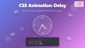
CSS Animation-Delay: Master Timing Control for Perfect Web Animations
What is CSS Animation-Delay? The animation-delay property in CSS controls when an animation starts after it's been applied to an...
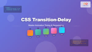
CSS Transition-Delay: Master Animation Timing and Sequencing
The transition-delay property in CSS is a powerful tool that allows you to control when a transition animation begins. Unlike...
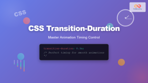
CSS Transition-Duration: Complete Guide to Animation Timing Control
What is CSS Transition-Duration? The transition-duration property in CSS defines how long a transition animation should take to complete. It's...
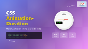
CSS Animation-Duration: Complete Guide to Controlling Animation Timing and Speed
The animation-duration property is a fundamental CSS animation property that controls how long an animation takes to complete one full...
CSS Animation Property: Complete Guide to Keyframe-Based Animations
CSS animations bring life to web pages by allowing elements to transition smoothly between different states over time. The animation...

CSS Style animationDelay Property: CSS Animation Delay
Understanding the CSS animationDelay Property The CSS animationDelay property specifies the amount of time to wait from when the element...

CSS Style animation Property: CSS Animation
CSS animation Property: A Comprehensive Guide to CSS Animations The animation property in CSS is a shorthand property used to...
CSS Style animationTimingFunction Property: CSS Animation Timing Function
CSS Style animationTimingFunction Property: A Comprehensive Guide The animation-timing-function property in CSS is a crucial component for controlling the pace...

CSS Style animationName Property: CSS Animation Name
CSS animationName Property: A Comprehensive Guide The CSS animationName property specifies the name of the @keyframes at-rule that defines the...
CSS Animation Timing Function: Complete Guide to Animation Easing Functions
The animation-timing-function property in CSS controls how an animation progresses through its duration, determining the acceleration and deceleration patterns that...


