
The CSS align-content property is a powerful tool for controlling how grid items are distributed along the block axis (typically vertical) within their grid container. Unlike align-items which aligns individual items, align-content aligns the entire grid as a unit when there’s extra space in the container.
Understanding CSS Align-Content
The align-content property works exclusively with multi-line flex containers and CSS Grid containers. It controls the alignment of grid tracks (rows) when the grid container has more space than needed to display all tracks.
Key Concepts
- Block Axis: The perpendicular axis to the inline axis, typically vertical in left-to-right writing modes
- Grid Tracks: The rows and columns formed by grid lines
- Free Space: Extra space available when grid content doesn’t fill the entire container
Align-Content Values and Their Effects
The align-content property accepts several values, each creating different alignment behaviors:
Basic Alignment Values
1. start (default)
Aligns grid tracks to the start of the block axis.
.grid-container {
  display: grid;
  align-content: start;
}2. end
Aligns grid tracks to the end of the block axis.
.grid-container {
  display: grid;
  align-content: end;
}3. center
Centers grid tracks along the block axis.
.grid-container {
  display: grid;
  align-content: center;
}Distribution Values
4. space-between
Distributes tracks evenly with space between them, but not at the edges.
.grid-container {
  display: grid;
  grid-template-rows: repeat(3, 40px);
  align-content: space-between;
}5. space-around
Distributes tracks with equal space around each track.
.grid-container {
  display: grid;
  grid-template-rows: repeat(3, 40px);
  align-content: space-around;
}6. space-evenly
Distributes tracks with equal space between and around them.
.grid-container {
  display: grid;
  grid-template-rows: repeat(3, 40px);
  align-content: space-evenly;
}Interactive Demo
Try different align-content values with this interactive demo:
Real-World Use Cases
Card Layout with Centered Content
Perfect for creating card layouts where you want content centered vertically:
.card-container {
  display: grid;
  grid-template-columns: repeat(auto-fit, minmax(250px, 1fr));
  gap: 20px;
  min-height: 400px;
  align-content: center;
  padding: 20px;
}
Card 1
Content here
Card 2
Content here
Dashboard Layout
Ideal for dashboard widgets that need equal distribution:
.dashboard {
  display: grid;
  grid-template-columns: repeat(2, 1fr);
  grid-template-rows: repeat(3, 120px);
  gap: 15px;
  height: 500px;
  align-content: space-evenly;
}Browser Support and Compatibility
The align-content property enjoys excellent browser support:
- Chrome: Full support since version 57
- Firefox: Full support since version 52
- Safari: Full support since version 10.1
- Edge: Full support since version 16
Note: For older browsers, consider using flexbox as a fallback or implement feature detection to provide alternative layouts.
Common Mistakes and Solutions
Mistake 1: Using align-content without sufficient container height
Problem: align-content won’t work if the container height equals the content height.
/* Wrong - no extra space to distribute */
.container {
  display: grid;
  align-content: center; /* Won't work */
}

/* Correct - container has defined height */
.container {
  display: grid;
  height: 400px; /* Creates extra space */
  align-content: center; /* Now works */
}
Mistake 2: Confusing align-content with align-items
Remember: align-content aligns the entire grid, while align-items aligns individual items within their cells.
Advanced Techniques
Combining with CSS Custom Properties
Create dynamic layouts using CSS custom properties:
.dynamic-grid {
  display: grid;
  grid-template-columns: repeat(3, 1fr);
  height: 300px;
  align-content: var(--alignment, start);
  transition: all 0.3s ease;
}

.centered { --alignment: center; }
.spaced { --alignment: space-between; }
Media Query Responsive Alignment
Adapt alignment based on screen size:
.responsive-grid {
  display: grid;
  grid-template-columns: repeat(2, 1fr);
  height: 400px;
  align-content: start;
}

@media (min-width: 768px) {
  .responsive-grid {
    align-content: space-between;
  }
}

@media (min-width: 1024px) {
  .responsive-grid {
    align-content: center;
  }
}
Performance Considerations
The align-content property is performance-friendly as it only affects layout calculation, not paint or composite layers. However, consider these optimization tips:
- Avoid frequent changes to
align-contentvalues during animations - Use
will-change: contentssparingly and only when necessary - Combine with
contain: layoutfor better performance in complex layouts
Conclusion
The CSS align-content property provides powerful control over grid container alignment along the block axis. From basic centering to complex space distribution, it enables creating sophisticated layouts with minimal code.
Key takeaways for mastering align-content:
- Ensure your container has extra space for the property to take effect
- Choose the right distribution method based on your design needs
- Combine with other grid properties for comprehensive layout control
- Test across different screen sizes for responsive designs
By understanding these concepts and practicing with the examples provided, you’ll be able to create more flexible and visually appealing grid layouts that adapt beautifully to different content and screen sizes.
Related Posts
CSS Align-Items: Complete Guide to Grid Item Block Axis Alignment
Understanding CSS Align-Items in Grid Context The CSS align-items property is a powerful tool for controlling how grid items align...
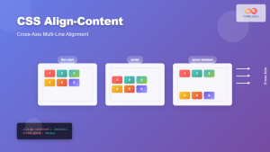
CSS Align-Content: Complete Guide to Cross-Axis Multi-Line Alignment
The align-content property is a powerful CSS tool that controls how multiple lines of content are distributed along the cross-axis...
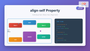
CSS Align-Self: Master Individual Grid Item Block Axis Alignment
The CSS align-self property provides granular control over individual grid items' alignment along the block axis (vertical direction in horizontal...

CSS Align-Items: Master Cross-Axis Alignment in Flexbox and Grid
The CSS align-items property is a fundamental tool for controlling cross-axis alignment in both flexbox and CSS Grid layouts. Understanding...
CSS Style alignItems Property: CSS Align Items
Understanding the CSS align-items Property The align-items property in CSS is a powerful tool that defines how items are aligned...
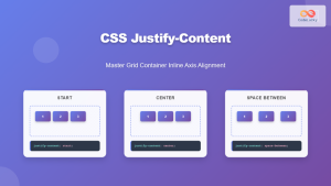
CSS Justify-Content: Master Grid Container Inline Axis Alignment with Examples
The justify-content property is a powerful CSS tool for controlling how grid items are aligned along the inline axis (horizontal...
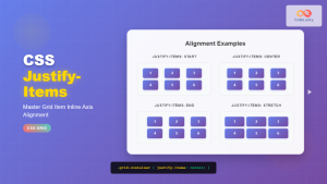
CSS Justify-Items: Complete Guide to Grid Item Inline Axis Alignment
The justify-items property is a powerful CSS Grid feature that controls how grid items are aligned along the inline axis...
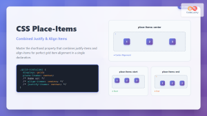
CSS Place-Items: Master Combined Justify and Align Items in One Property
The CSS place-items property is a powerful shorthand that combines justify-items and align-items into a single declaration. This property revolutionizes...
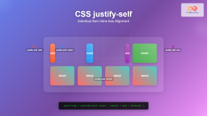
CSS Justify-Self: Master Individual Item Inline Axis Alignment
The justify-self property in CSS is a powerful alignment tool that allows you to control how individual items align themselves...
CSS align-content Property: CSS Align Content
CSS align-content Property: Mastering Content Alignment in Flexbox and Grid Layouts The CSS align-content property is a powerful tool for...
CSS Place-Self: Master Grid and Flexbox Item Positioning with One Property
The CSS place-self property is a powerful shorthand that combines justify-self and align-self into a single declaration, making it easier...
CSS Place-Content: Complete Guide to Combined Justify and Align Content Properties
The place-content property in CSS is a powerful shorthand that combines both justify-content and align-content properties into a single declaration....


