
The align-content property is a powerful CSS tool that controls how multiple lines of content are distributed along the cross-axis in flexbox and grid layouts. Unlike align-items which aligns individual items, align-content works specifically with wrapped content and multiple rows or columns.
Understanding CSS Align-Content
The align-content property only takes effect when there are multiple lines of flex items or grid tracks. It distributes space between and around these lines along the cross-axis (perpendicular to the main axis).
Key Points:
- Works only with multi-line layouts (flex-wrap: wrap or grid)
- Controls cross-axis alignment of entire lines, not individual items
- Has no effect on single-line flex containers
- Applies to both flexbox and CSS Grid
CSS Align-Content Values
The align-content property accepts several values that determine how lines are distributed:
Basic Values
1. flex-start (start)
Lines are packed toward the start of the cross-axis.
.container {
  display: flex;
  flex-wrap: wrap;
  align-content: flex-start;
  height: 200px;
}
2. center
Lines are centered along the cross-axis.
.container {
  display: flex;
  flex-wrap: wrap;
  align-content: center;
  height: 200px;
}
3. flex-end (end)
Lines are packed toward the end of the cross-axis.
.container {
  display: flex;
  flex-wrap: wrap;
  align-content: flex-end;
  height: 200px;
}
Space Distribution Values
4. space-between
Lines are evenly distributed with the first line at the start and last line at the end.
.container {
  display: flex;
  flex-wrap: wrap;
  align-content: space-between;
  height: 200px;
}
5. space-around
Lines are evenly distributed with equal space around each line.
.container {
  display: flex;
  flex-wrap: wrap;
  align-content: space-around;
  height: 200px;
}
6. space-evenly
Lines are evenly distributed with equal space between and around them.
.container {
  display: flex;
  flex-wrap: wrap;
  align-content: space-evenly;
  height: 200px;
}
7. stretch (default)
Lines stretch to fill the remaining space in the container.
.container {
  display: flex;
  flex-wrap: wrap;
  align-content: stretch; /* default value */
  height: 200px;
}
Interactive Demo
Try different align-content values with this interactive demo:
Current value: stretch
Effect: Lines stretch to fill the remaining space in the container.
CSS Grid and Align-Content
The align-content property also works with CSS Grid, controlling how grid tracks are aligned within the grid container:
Grid Example
.grid-container {
  display: grid;
  grid-template-columns: repeat(3, 80px);
  grid-auto-rows: 60px;
  align-content: center;
  height: 200px;
  gap: 10px;
}
Common Use Cases
1. Card Layouts
Perfect for creating responsive card grids where cards wrap to new lines:
Card 1
Sample card content with some text.
Card 2
Another card with different content length.
Card 3
Third card in the layout.
.card-container {
  display: flex;
  flex-wrap: wrap;
  align-content: flex-start;
  gap: 15px;
}

.card {
  width: 150px;
  padding: 15px;
  border: 1px solid #dee2e6;
  border-radius: 8px;
}
2. Image Gallery
Center multiple rows of images within a container:
.gallery {
  display: flex;
  flex-wrap: wrap;
  align-content: center;
  justify-content: center;
  height: 280px;
  gap: 10px;
}
Browser Support
The align-content property has excellent browser support:
| Browser | Support | Notes |
|---|---|---|
| Chrome | 21+ | Full support |
| Firefox | 28+ | Full support |
| Safari | 9+ | Full support |
| Edge | 12+ | Full support |
| Internet Explorer | 11 | Partial support |
Common Mistakes and Solutions
<div style=”background: #fff3cd; border: 1px solid #ffe
Related Posts

CSS Align-Items: Master Cross-Axis Alignment in Flexbox and Grid
The CSS align-items property is a fundamental tool for controlling cross-axis alignment in both flexbox and CSS Grid layouts. Understanding...

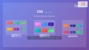
CSS Align-Content: Master Grid Container Block Axis Alignment
The CSS align-content property is a powerful tool for controlling how grid items are distributed along the block axis (typically...

CSS align-content Property: CSS Align Content
CSS align-content Property: Mastering Content Alignment in Flexbox and Grid Layouts The CSS align-content property is a powerful tool for...
CSS Align-Items: Complete Guide to Grid Item Block Axis Alignment
Understanding CSS Align-Items in Grid Context The CSS align-items property is a powerful tool for controlling how grid items align...
CSS Style alignItems Property: CSS Align Items
Understanding the CSS align-items Property The align-items property in CSS is a powerful tool that defines how items are aligned...
CSS Align-Self: Master Individual Flexbox Item Alignment
The CSS align-self property is a powerful flexbox feature that allows you to override the default cross-axis alignment for individual...
CSS Place-Items: Master Combined Justify and Align Items in One Property
The CSS place-items property is a powerful shorthand that combines justify-items and align-items into a single declaration. This property revolutionizes...
CSS Align-Self: Master Individual Grid Item Block Axis Alignment
The CSS align-self property provides granular control over individual grid items' alignment along the block axis (vertical direction in horizontal...
CSS Place-Self: Master Grid and Flexbox Item Positioning with One Property
The CSS place-self property is a powerful shorthand that combines justify-self and align-self into a single declaration, making it easier...
CSS Justify-Content: Complete Guide to Flexbox Main Axis Alignment
The justify-content property is one of the most powerful tools in CSS Flexbox for controlling how flex items are distributed...
CSS Place-Content: Complete Guide to Combined Justify and Align Content Properties
The place-content property in CSS is a powerful shorthand that combines both justify-content and align-content properties into a single declaration....
CSS Justify-Self: Master Individual Item Inline Axis Alignment
The justify-self property in CSS is a powerful alignment tool that allows you to control how individual items align themselves...


