
Understanding CSS Accessibility and Screen Reader Compatibility
CSS accessibility forms the foundation of inclusive web design, ensuring that websites remain usable for people with disabilities. Screen readers, assistive technologies that convert text to speech or braille, rely heavily on proper CSS implementation to provide meaningful navigation experiences for visually impaired users.
Modern web accessibility isn’t just about compliance—it’s about creating digital experiences that work for everyone. With over 1 billion people worldwide living with disabilities, accessible CSS practices directly impact user engagement, legal compliance, and overall user experience quality.
The Critical Role of Semantic HTML in CSS Accessibility
Before diving into CSS-specific techniques, understanding the relationship between semantic HTML and accessible styling is essential. Screen readers interpret content based on HTML structure, while CSS controls the visual presentation without affecting the underlying semantic meaning.
Semantic HTML Foundation Example
<article>
  <header>
    <h1>Main Article Title</h1>
    <p>Published on <time datetime="2025-01-15">January 15, 2025</time></p>
  </header>

  <section>
    <h2>Section Heading</h2>
    <p>Article content with proper heading hierarchy</p>

    <aside>
      <p>Related information or sidebar content</p>
    </aside>
  </section>

  <footer>
    <p>Article metadata and additional information</p>
  </footer>
</article>
This semantic structure provides screen readers with clear content hierarchy and navigation landmarks, which CSS can then style without disrupting accessibility.
Essential CSS Properties for Screen Reader Compatibility
Visual Content Hiding vs. Screen Reader Hiding
One of the most crucial distinctions in accessible CSS involves understanding when content should be hidden from screen readers versus when it should remain accessible but visually hidden.
Screen Reader Friendly Hiding Techniques
/* Visually hidden but accessible to screen readers */
.sr-only {
  position: absolute;
  width: 1px;
  height: 1px;
  padding: 0;
  margin: -1px;
  overflow: hidden;
  clip: rect(0, 0, 0, 0);
  white-space: nowrap;
  border: 0;
}

/* Skip to main content link */
.skip-link {
  position: absolute;
  top: -40px;
  left: 6px;
  background: #000;
  color: #fff;
  padding: 8px;
  text-decoration: none;
  z-index: 1000;
  transition: top 0.3s;
}

.skip-link:focus {
  top: 6px;
}
Avoid These Screen Reader Hostile Techniques
/* ❌ WRONG: These hide content from screen readers */
.hidden-wrong {
  display: none; /* Completely removes from accessibility tree */
  visibility: hidden; /* Also removes from screen readers */
}

/* ✅ CORRECT: Visual hiding that maintains accessibility */
.hidden-correct {
  position: absolute;
  left: -10000px;
  width: 1px;
  height: 1px;
  overflow: hidden;
}
Focus Management and Keyboard Navigation
Proper focus management ensures that keyboard and screen reader users can navigate through interactive elements efficiently. CSS plays a vital role in providing clear visual focus indicators.
Enhanced Focus Styles
/* Custom focus indicator with high contrast */
button:focus,
a:focus,
input:focus,
select:focus,
textarea:focus {
  outline: 3px solid #005fcc;
  outline-offset: 2px;
  box-shadow: 0 0 0 1px #fff, 0 0 0 4px #005fcc;
}

/* Focus within for complex components */
.card:focus-within {
  transform: scale(1.02);
  box-shadow: 0 4px 20px rgba(0, 95, 204, 0.3);
  transition: all 0.2s ease;
}

/* Skip outline only for mouse users */
.js-focus-visible button:focus:not(.focus-visible),
.js-focus-visible a:focus:not(.focus-visible) {
  outline: none;
  box-shadow: none;
}
Color Contrast and Visual Accessibility
WCAG 2.1 guidelines specify minimum contrast ratios of 4.5:1 for normal text and 3:1 for large text (18pt or 14pt bold). However, achieving higher contrast ratios improves readability for all users.
High Contrast Color Schemes
/* CSS Custom Properties for accessible color system */
:root {
  --primary-bg: #ffffff;
  --primary-text: #212529;
  --secondary-text: #6c757d;
  --accent-color: #0d6efd;
  --success-color: #198754;
  --warning-color: #ffc107;
  --error-color: #dc3545;

  /* High contrast alternatives */
  --high-contrast-bg: #000000;
  --high-contrast-text: #ffffff;
  --focus-ring: #005fcc;
}

/* Automatic dark mode support */
@media (prefers-color-scheme: dark) {
  :root {
    --primary-bg: #212529;
    --primary-text: #ffffff;
    --secondary-text: #adb5bd;
  }
}

/* High contrast mode detection */
@media (prefers-contrast: high) {
  :root {
    --primary-bg: var(--high-contrast-bg);
    --primary-text: var(--high-contrast-text);
    --accent-color: #4dabf7;
  }
}
Advanced Screen Reader Optimization Techniques
ARIA Labels and CSS Integration
While ARIA attributes are HTML-based, CSS can enhance their effectiveness through proper styling and visual correlation with screen reader announcements.
ARIA-Enhanced Component Styling
/* Progress bar with ARIA support */
.progress-bar {
  width: 100%;
  height: 20px;
  background-color: #e9ecef;
  border-radius: 10px;
  overflow: hidden;
  position: relative;
}

.progress-bar::before {
  content: '';
  position: absolute;
  top: 0;
  left: 0;
  height: 100%;
  width: var(--progress-value, 0%);
  background: linear-gradient(90deg, #28a745, #20c997);
  transition: width 0.3s ease;
}

/* Screen reader text for progress */
.progress-bar .sr-only {
  position: absolute;
  width: 1px;
  height: 1px;
  padding: 0;
  margin: -1px;
  overflow: hidden;
  clip: rect(0, 0, 0, 0);
  white-space: nowrap;
  border: 0;
}

/* Form field states */
input[aria-invalid="true"] {
  border-color: var(--error-color);
  box-shadow: 0 0 0 2px rgba(220, 53, 69, 0.25);
}

input[aria-describedby] + .field-description {
  color: var(--secondary-text);
  font-size: 0.875rem;
  margin-top: 0.25rem;
}
Interactive Components and State Management
Screen readers need clear indication of interactive element states. CSS should visually reinforce ARIA states for sighted users while maintaining screen reader compatibility.
Accessible Button and Toggle States
/* Toggle button with clear states */
.toggle-button {
  background: #6c757d;
  border: 2px solid transparent;
  color: white;
  padding: 0.5rem 1rem;
  border-radius: 0.25rem;
  cursor: pointer;
  transition: all 0.2s ease;
  position: relative;
}

.toggle-button[aria-pressed="true"] {
  background: #28a745;
  border-color: #1e7e34;
}

.toggle-button[aria-pressed="true"]::after {
  content: '✓';
  position: absolute;
  right: 0.5rem;
  top: 50%;
  transform: translateY(-50%);
  font-weight: bold;
}

/* Dropdown menu states */
.dropdown[aria-expanded="false"] .dropdown-menu {
  opacity: 0;
  visibility: hidden;
  transform: translateY(-10px);
  pointer-events: none;
}

.dropdown[aria-expanded="true"] .dropdown-menu {
  opacity: 1;
  visibility: visible;
  transform: translateY(0);
  pointer-events: auto;
}

/* Loading state indication */
.button-loading {
  position: relative;
  color: transparent;
}

.button-loading::after {
  content: '';
  position: absolute;
  width: 20px;
  height: 20px;
  top: 50%;
  left: 50%;
  margin-left: -10px;
  margin-top: -10px;
  border: 2px solid #ffffff;
  border-radius: 50%;
  border-top-color: transparent;
  animation: spin 1s ease-in-out infinite;
}

@keyframes spin {
  to { transform: rotate(360deg); }
}
Responsive Design and Accessibility
Accessible responsive design ensures that content remains usable across all devices and screen sizes while maintaining screen reader compatibility and keyboard navigation.
Accessible Mobile-First Approach
/* Base mobile styles with accessibility */
.container {
  width: 100%;
  max-width: 1200px;
  margin: 0 auto;
  padding: 1rem;
}

/* Minimum touch target size (44px) */
.interactive-element {
  min-height: 44px;
  min-width: 44px;
  display: inline-flex;
  align-items: center;
  justify-content: center;
  padding: 0.75rem;
}

/* Responsive typography with accessibility */
body {
  font-size: clamp(1rem, 2.5vw, 1.125rem);
  line-height: 1.6;
  font-family: system-ui, -apple-system, sans-serif;
}

h1 { font-size: clamp(1.75rem, 4vw, 2.5rem); }
h2 { font-size: clamp(1.5rem, 3.5vw, 2rem); }
h3 { font-size: clamp(1.25rem, 3vw, 1.75rem); }

/* Tablet and up */
@media (min-width: 768px) {
  .container {
    padding: 2rem;
  }

  /* Enhanced focus for larger screens */
  button:focus,
  a:focus {
    outline-offset: 4px;
  }
}

/* Desktop and up */
@media (min-width: 1024px) {
  /* Larger interactive areas for mouse users */
  .interactive-element {
    padding: 1rem 1.5rem;
  }
}
Animation and Motion Accessibility
CSS animations can enhance user experience but may cause issues for users with vestibular disorders or motion sensitivity. The prefers-reduced-motion media query allows users to control animation behavior.
Respectful Animation Implementation
/* Default animations */
.fade-in {
  opacity: 0;
  transform: translateY(20px);
  animation: fadeInUp 0.6s ease forwards;
}

.slide-transition {
  transition: transform 0.3s cubic-bezier(0.4, 0, 0.2, 1);
}

@keyframes fadeInUp {
  to {
    opacity: 1;
    transform: translateY(0);
  }
}

/* Reduced motion preferences */
@media (prefers-reduced-motion: reduce) {
  *,
  *::before,
  *::after {
    animation-duration: 0.01ms !important;
    animation-iteration-count: 1 !important;
    transition-duration: 0.01ms !important;
    scroll-behavior: auto !important;
  }

  .fade-in {
    opacity: 1;
    transform: none;
    animation: none;
  }

  .slide-transition {
    transition: none;
  }
}

/* Essential animations that should remain */
@media (prefers-reduced-motion: reduce) {
  .loading-spinner {
    animation: spin 1s linear infinite;
  }

  /* Focus indicators should always animate */
  button:focus,
  a:focus {
    transition: outline 0.15s ease;
  }
}
Testing and Validation Tools
Effective accessibility testing requires both automated tools and manual testing with actual assistive technologies. Here are essential approaches for validating your CSS accessibility implementation:
CSS Accessibility Testing Checklist
- Color Contrast: Use tools like WebAIM’s Contrast Checker or browser dev tools to verify WCAG compliance
- Focus Management: Tab through all interactive elements to ensure proper focus order and visibility
- Screen Reader Testing: Test with NVDA (Windows), VoiceOver (Mac), or JAWS to verify content accessibility
- Responsive Testing: Verify accessibility across different screen sizes and zoom levels (up to 200%)
- Motion Testing: Enable reduced motion preferences and verify animations behave appropriately
- High Contrast Mode: Test in Windows High Contrast mode and browser high contrast extensions
Advanced CSS Accessibility Patterns
Custom Form Controls
Creating accessible custom form controls requires careful attention to both visual design and screen reader compatibility.
Accessible Custom Checkbox
/* Custom checkbox with full accessibility */
.custom-checkbox {
  position: relative;
  display: inline-flex;
  align-items: center;
  cursor: pointer;
  user-select: none;
}

.custom-checkbox input[type="checkbox"] {
  position: absolute;
  opacity: 0;
  width: 1px;
  height: 1px;
}

.custom-checkbox .checkmark {
  width: 20px;
  height: 20px;
  border: 2px solid #6c757d;
  border-radius: 3px;
  margin-right: 0.5rem;
  position: relative;
  background: #fff;
  transition: all 0.2s ease;
}

.custom-checkbox input:checked + .checkmark {
  background: #007bff;
  border-color: #007bff;
}

.custom-checkbox input:checked + .checkmark::after {
  content: '✓';
  position: absolute;
  top: 50%;
  left: 50%;
  transform: translate(-50%, -50%);
  color: white;
  font-weight: bold;
  font-size: 14px;
}

.custom-checkbox input:focus + .checkmark {
  outline: 2px solid #007bff;
  outline-offset: 2px;
  box-shadow: 0 0 0 3px rgba(0, 123, 255, 0.25);
}

.custom-checkbox:hover .checkmark {
  border-color: #007bff;
  background: rgba(0, 123, 255, 0.1);
}

.custom-checkbox input:disabled + .checkmark {
  opacity: 0.5;
  cursor: not-allowed;
}
Accessible Data Tables
Data tables require specific CSS considerations to maintain readability and screen reader navigation capabilities.
Enhanced Table Accessibility
/* Accessible table styling */
.accessible-table {
  width: 100%;
  border-collapse: collapse;
  border-spacing: 0;
  margin: 1rem 0;
  font-family: system-ui, sans-serif;
}

.accessible-table th,
.accessible-table td {
  padding: 0.75rem;
  text-align: left;
  border: 1px solid #dee2e6;
  vertical-align: top;
}

.accessible-table th {
  background: #f8f9fa;
  font-weight: 600;
  color: #495057;
  position: sticky;
  top: 0;
  z-index: 10;
}

/* Row highlighting for better scanning */
.accessible-table tbody tr:nth-child(even) {
  background: rgba(0, 0, 0, 0.02);
}

.accessible-table tbody tr:hover {
  background: rgba(0, 123, 255, 0.1);
}

/* Focus management for keyboard navigation */
.accessible-table th:focus,
.accessible-table td:focus {
  outline: 2px solid #007bff;
  outline-offset: -2px;
  background: rgba(0, 123, 255, 0.1);
}

/* Responsive table with horizontal scroll */
.table-responsive {
  overflow-x: auto;
  -webkit-overflow-scrolling: touch;
}

/* Mobile table adjustments */
@media (max-width: 768px) {
  .accessible-table {
    font-size: 0.875rem;
  }

  .accessible-table th,
  .accessible-table td {
    padding: 0.5rem;
    min-width: 120px;
  }
}
Performance Considerations for Accessible CSS
Accessible CSS should not compromise website performance. Optimizing for both accessibility and speed ensures the best possible user experience across all user groups.
Performance-Optimized Accessible Styles
/* Efficient CSS custom properties */
:root {
  --focus-ring: 0 0 0 3px rgba(0, 123, 255, 0.4);
  --transition-base: 0.15s ease;
  --border-radius: 0.25rem;
  --spacing-unit: 0.25rem;
}

/* Use efficient selectors */
.btn {
  border-radius: var(--border-radius);
  transition: box-shadow var(--transition-base);
  will-change: box-shadow;
}

.btn:focus {
  box-shadow: var(--focus-ring);
}

/* Avoid expensive properties in animations */
@keyframes accessible-fade {
  from { opacity: 0; }
  to { opacity: 1; }
}

/* Use transform for animations instead of layout properties */
.slide-in {
  transform: translateX(-100%);
  animation: slideIn 0.3s ease forwards;
}

@keyframes slideIn {
  to { transform: translateX(0); }
}

/* Critical CSS inlining for accessibility */
.skip-link,
.sr-only,
button:focus,
a:focus {
  /* These styles should be inlined for immediate accessibility */
}
Future-Proofing Accessible CSS
Web accessibility standards continue to evolve. Writing future-proof accessible CSS involves embracing modern CSS features while maintaining backward compatibility and progressive enhancement principles.
Modern CSS Features for Accessibility
/* Container queries for accessible components */
@container (min-width: 400px) {
  .card .interactive-element {
    min-height: 48px;
    padding: 0.75rem 1rem;
  }
}

/* Logical properties for international accessibility */
.content {
  margin-block: 1rem;
  margin-inline: auto;
  padding-inline: 1rem;
  border-inline-start: 4px solid #007bff;
}

/* CSS Grid with accessibility considerations */
.accessible-grid {
  display: grid;
  grid-template-columns: repeat(auto-fit, minmax(280px, 1fr));
  gap: 1.5rem;
  align-items: start;
}

/* Subgrid for maintaining alignment */
.grid-item {
  display: grid;
  grid-template-rows: subgrid;
  grid-row: span 3;
}

/* Modern focus management */
:focus-visible {
  outline: 2px solid #007bff;
  outline-offset: 2px;
}

/* CSS nesting with accessibility context */
.navigation {
  & ul {
    list-style: none;
    padding: 0;
    margin: 0;
  }

  & a {
    display: block;
    padding: 0.75rem 1rem;
    text-decoration: none;

    &:hover,
    &:focus {
      background: rgba(0, 123, 255, 0.1);
      outline: 2px solid transparent;
    }
  }
}
Conclusion: Building Truly Inclusive Web Experiences
CSS accessibility extends far beyond basic compliance requirements. It represents a fundamental approach to web development that prioritizes inclusivity, usability, and equal access to information. By implementing the techniques covered in this guide—from semantic styling and proper focus management to advanced ARIA integration and performance optimization—developers can create web experiences that work seamlessly for all users, regardless of their abilities or assistive technology needs.
Remember that accessibility is not a one-time implementation but an ongoing commitment to inclusive design. Regular testing with actual users, staying updated with WCAG guidelines, and continuously refining your CSS practices will ensure your websites remain accessible as web technologies evolve.
The investment in accessible CSS pays dividends not only in expanded user reach and legal compliance but also in improved overall code quality, better SEO performance, and enhanced user experiences for everyone. As the web continues to mature, accessible design principles will become increasingly central to successful web development practices.
Related Posts
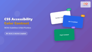
CSS Accessibility: Complete Guide to WCAG Color Contrast Requirements
Web accessibility is not just a legal requirement—it's a fundamental principle of inclusive design that ensures your website can be...

HTML CSS: Styling Your Web Pages with Selectors, Properties, and the Cascade
Introduction Ever wondered how websites go from plain text to visually stunning experiences? The magic lies in CSS (Cascading Style...
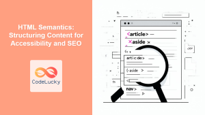
HTML Semantics: Structuring Content for Accessibility and SEO
Introduction Have you ever looked at a website and wondered how the browser knows what's a header, what's a navigation...
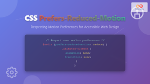
CSS Prefers-Reduced-Motion: Building Accessible Web Animations for All Users
Web animations can enhance user experience, but they can also cause serious problems for users with vestibular disorders, motion sensitivity,...
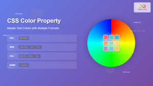
CSS Color Property: Complete Guide to Text Colors with Hex, RGB, HSL Values
The CSS color property is one of the most fundamental styling properties in web development, allowing you to control the...
CSS :disabled and :enabled Pseudo-Classes: Complete Guide to Form Element States
Form elements are the backbone of user interaction on the web, and managing their visual states is crucial for creating...
CSS Font-Style: Complete Guide to Italic, Oblique and Normal Text Styling
The CSS font-style property is a fundamental typography tool that controls how text appears on your web pages. Whether you...

CSS Graceful Degradation: Essential Fallback Strategies for Modern Web Development
CSS graceful degradation is a fundamental web development strategy that ensures your website remains functional and accessible across all browsers,...

CSS Style fontSize Property: CSS Font Size
CSS fontSize Property: Controlling Text Size The fontSize property in CSS specifies the size of the font. This property is...
CSS Style color Property: CSS Color
Understanding the CSS color Property: A Comprehensive Guide The CSS color property is fundamental for styling web pages. It specifies...

CSS Syntax: Complete Guide to Rules, Selectors, Properties and Values
CSS (Cascading Style Sheets) is the cornerstone of web design, transforming plain HTML into visually stunning websites. Understanding CSS syntax...
CSS Style font Property: CSS Font
CSS font Property: A Comprehensive Guide The CSS font property is a shorthand property used to set several font-related styles...


