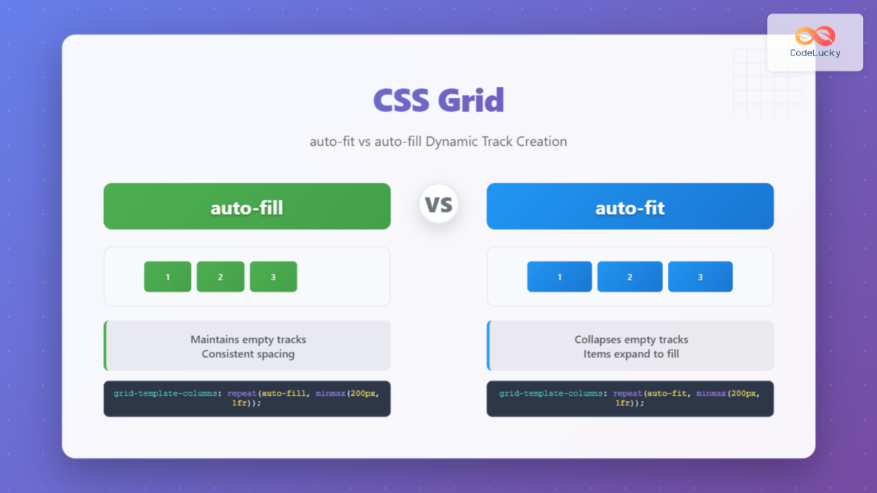
CSS Grid auto-fit vs auto-fill: Master Dynamic Responsive Layouts
Learn the key differences between CSS Grid auto-fit and auto-fill for creating dynamic responsive layouts. Complete guide with examples and interactive demos.
Learn the key differences between CSS Grid auto-fit and auto-fill for creating dynamic responsive layouts. Complete guide with examples and interactive demos.
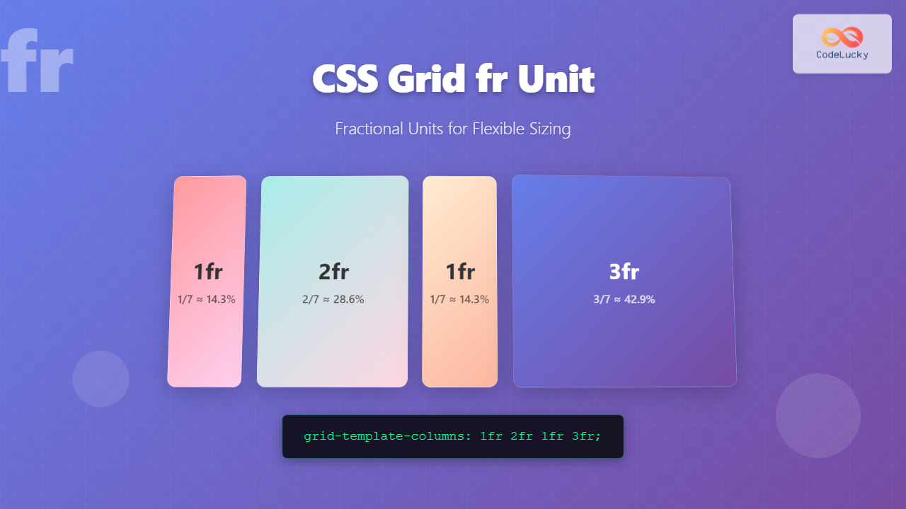
Master CSS Grid's fr unit for creating flexible, responsive layouts. Learn fractional units with practical examples, best practices, and interactive demos.
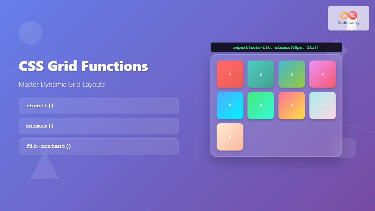
Master CSS Grid functions repeat(), minmax(), and fit-content() with practical examples and interactive demos. Learn to create flexible, responsive layouts efficiently.
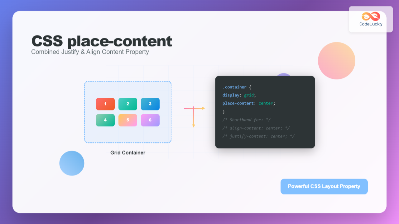
Master CSS place-content property to efficiently combine justify-content and align-content in a single declaration. Complete guide with examples and interactive demos.
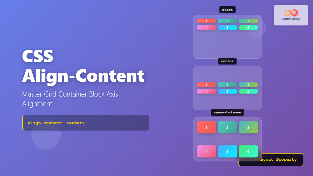
Master CSS align-content property for perfect grid container alignment. Learn block axis positioning with practical examples and interactive demos.
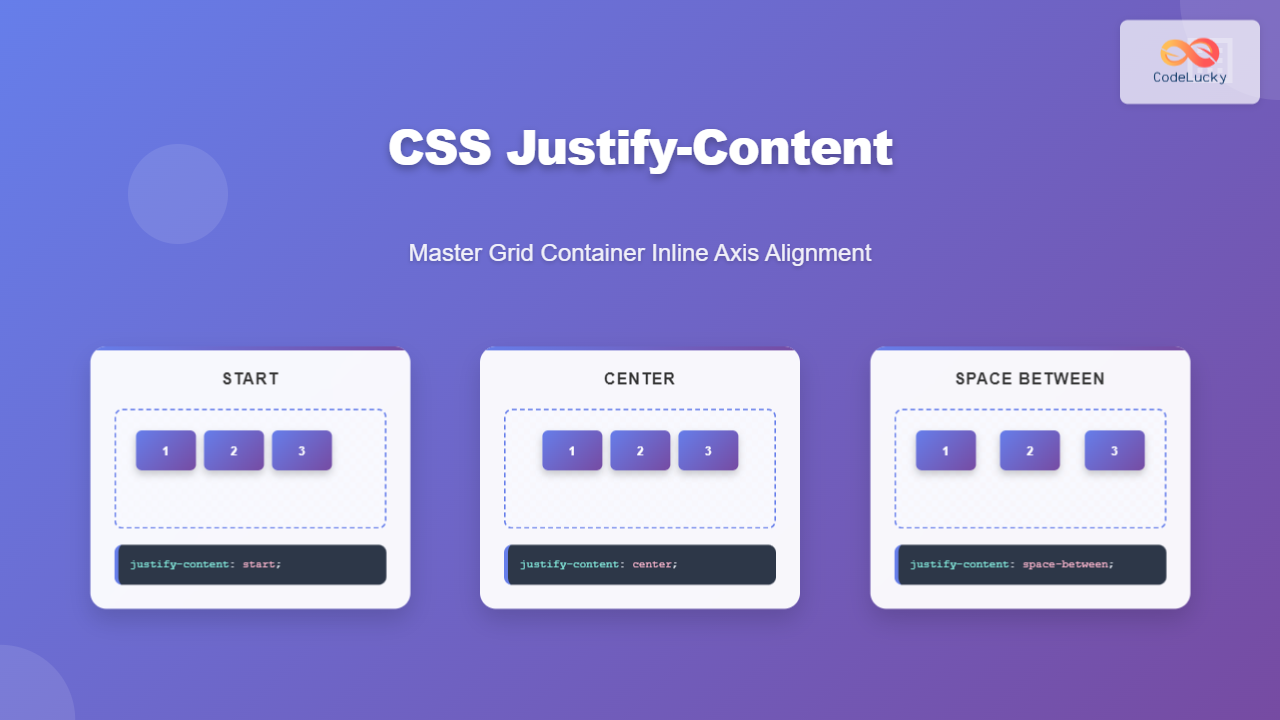
Master CSS justify-content property for grid containers. Learn inline axis alignment with practical examples, interactive demos, and best practices for responsive web design.
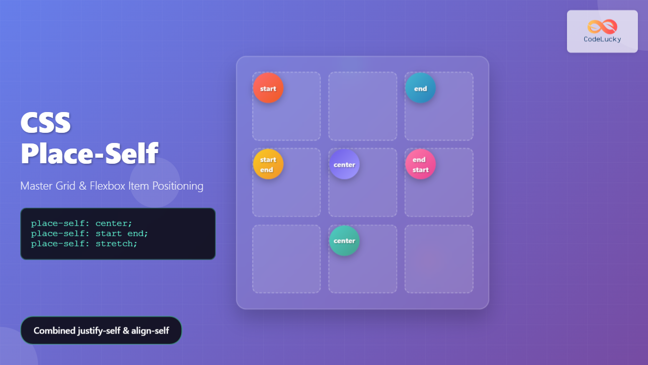
Learn how CSS place-self combines justify-self and align-self into one powerful property for precise grid and flexbox item positioning. Complete guide with examples.
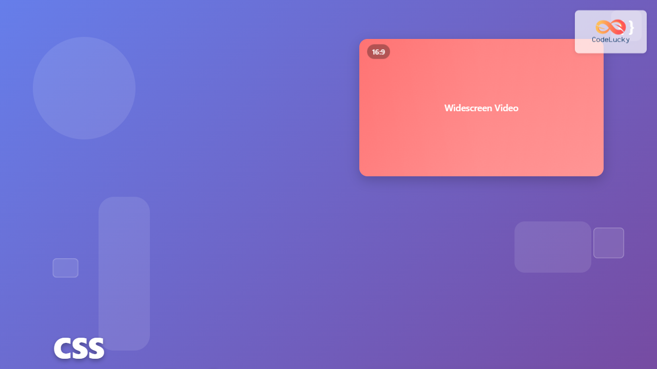
Master the CSS aspect-ratio property to maintain perfect width/height ratios in responsive designs. Complete guide with examples, browser support, and practical use cases.
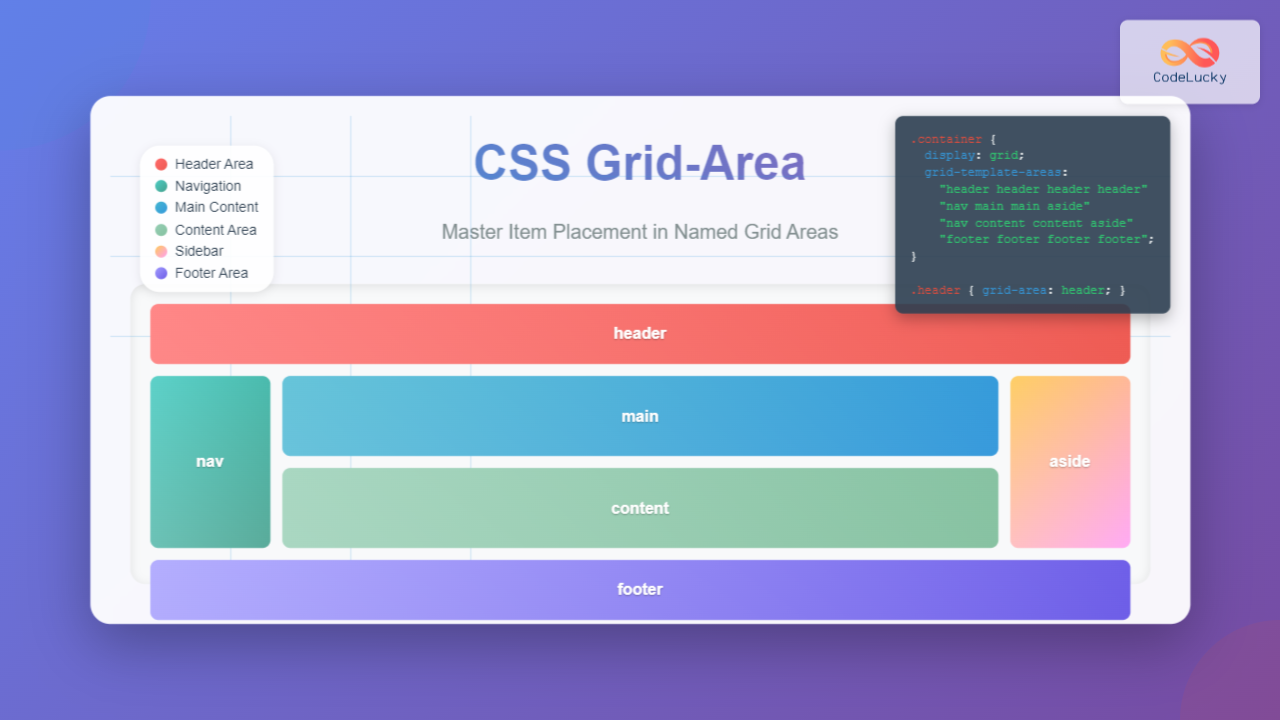
Learn how to use CSS grid-area property to place items in named grid areas. Complete guide with examples, syntax, and interactive demos for mastering grid item placement.
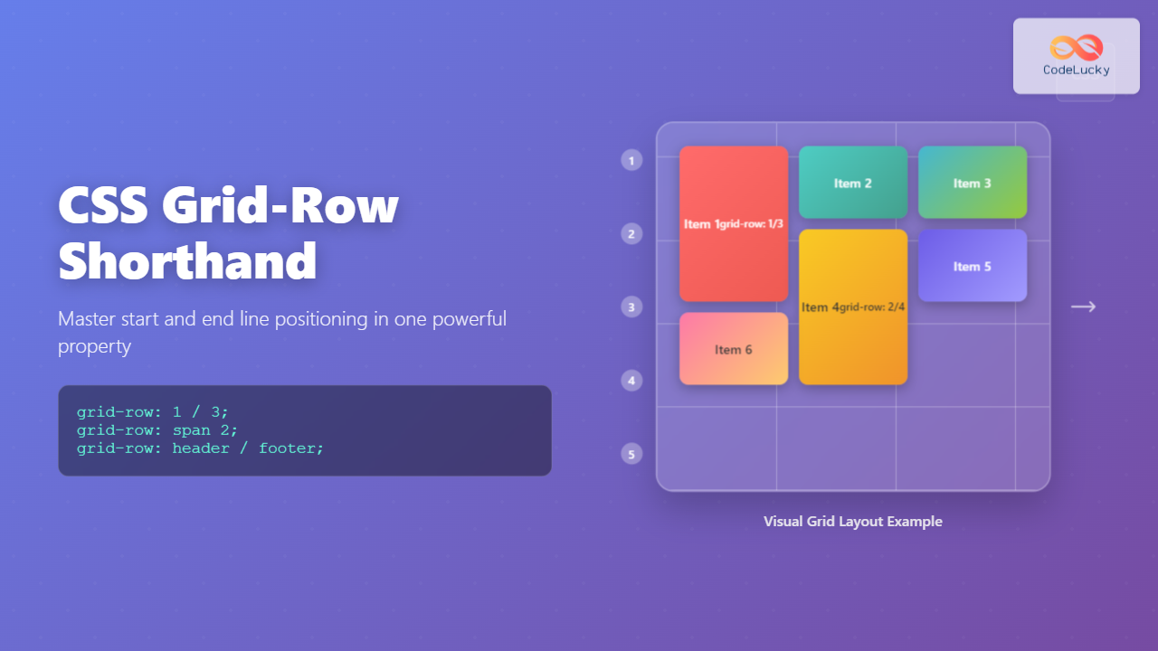
Learn how to use CSS grid-row shorthand property to efficiently position grid items by combining grid-row-start and grid-row-end in a single declaration with practical examples.