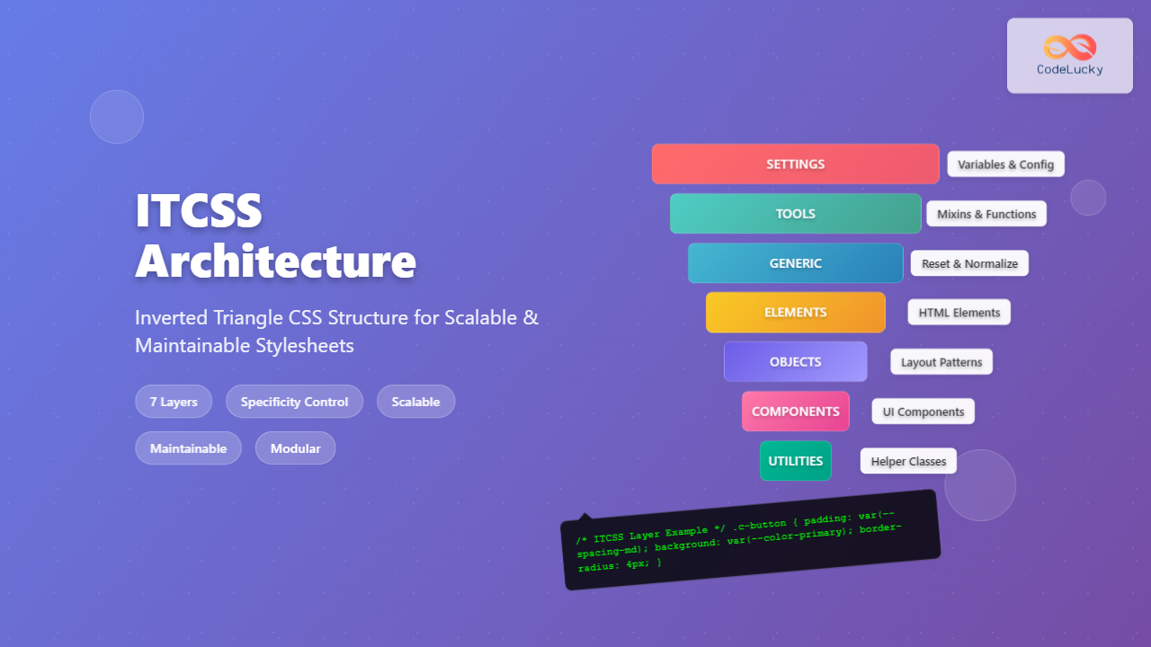
ITCSS Inverted Triangle CSS: Complete Guide to Scalable CSS Architecture
Master ITCSS (Inverted Triangle CSS) architecture for building scalable, maintainable CSS. Learn the 7-layer structure with practical examples and implementation strategies.
Master ITCSS (Inverted Triangle CSS) architecture for building scalable, maintainable CSS. Learn the 7-layer structure with practical examples and implementation strategies.
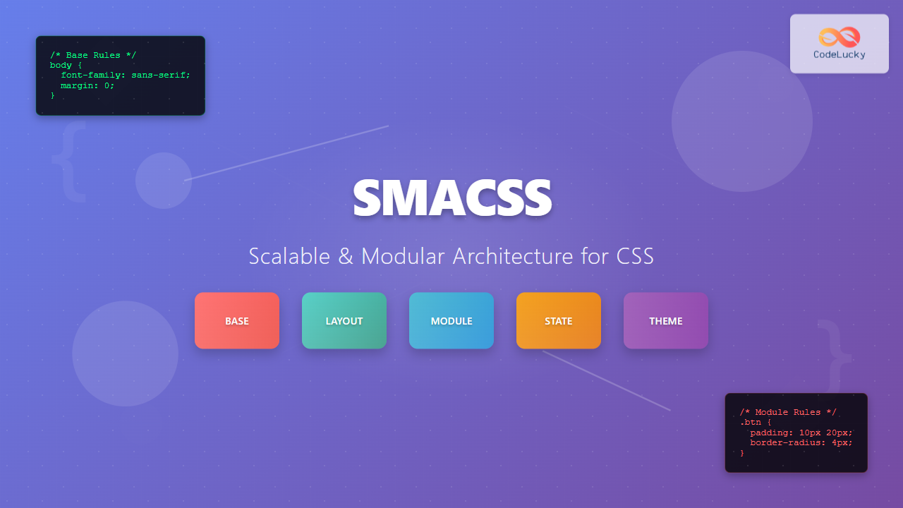
Master SMACSS (Scalable and Modular Architecture for CSS) methodology with practical examples, best practices, and real-world implementations for maintainable stylesheets.
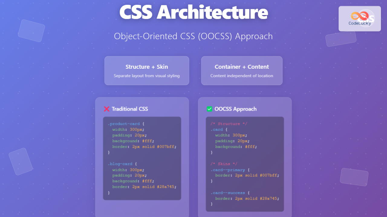
Master Object-Oriented CSS (OOCSS) methodology to write scalable, maintainable CSS. Learn principles, implementation strategies, and real-world examples.
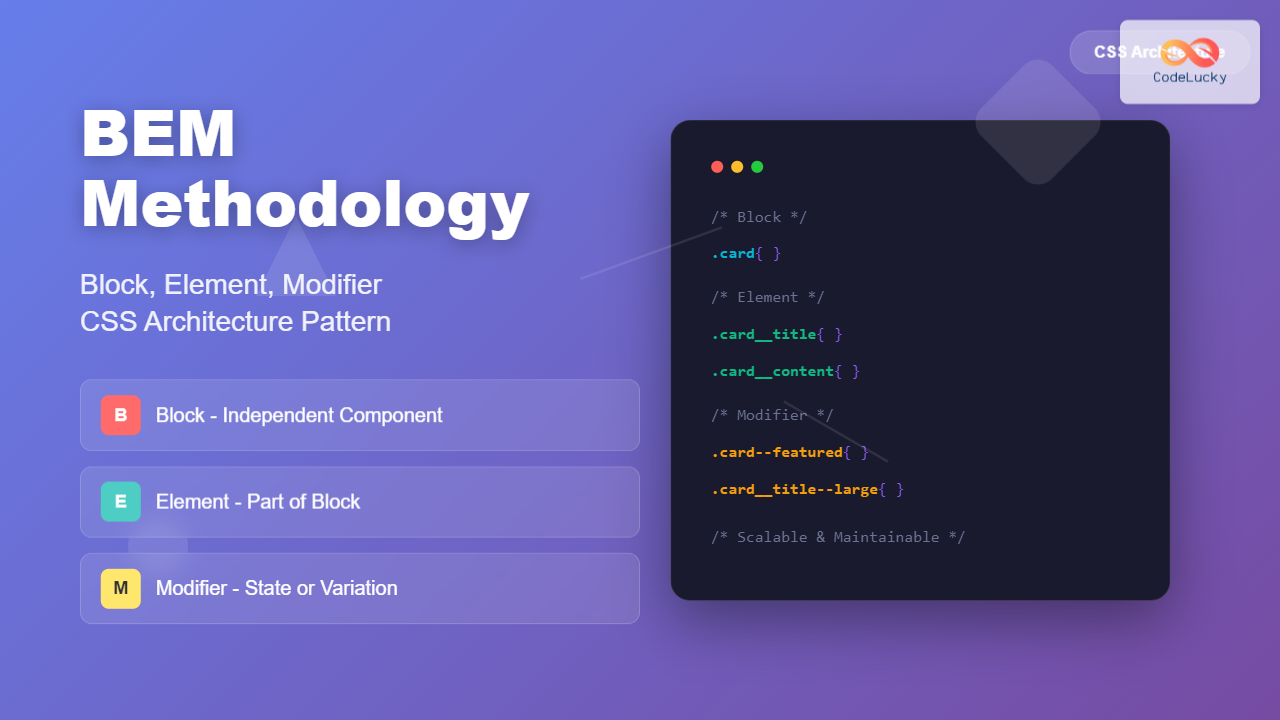
Master BEM methodology for scalable CSS architecture. Learn Block, Element, Modifier patterns with practical examples, naming conventions, and implementation strategies for maintainable stylesheets.
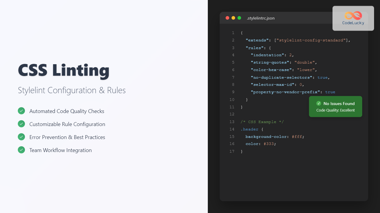
Master CSS linting with Stylelint configuration, rules, and best practices. Learn to set up automated CSS code quality checks with practical examples and interactive demos.
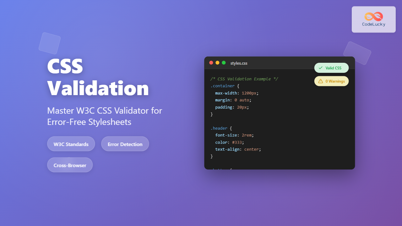
Master CSS validation with W3C CSS Validator. Learn to identify errors, fix validation issues, and write standards-compliant CSS code with practical examples and interactive tools.
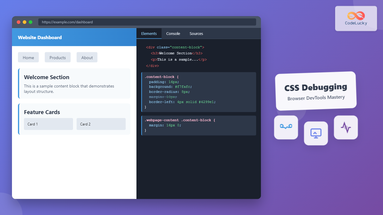
Master CSS debugging with comprehensive browser DevTools techniques. Learn inspection methods, live editing, performance analysis, and advanced debugging strategies for efficient web development.
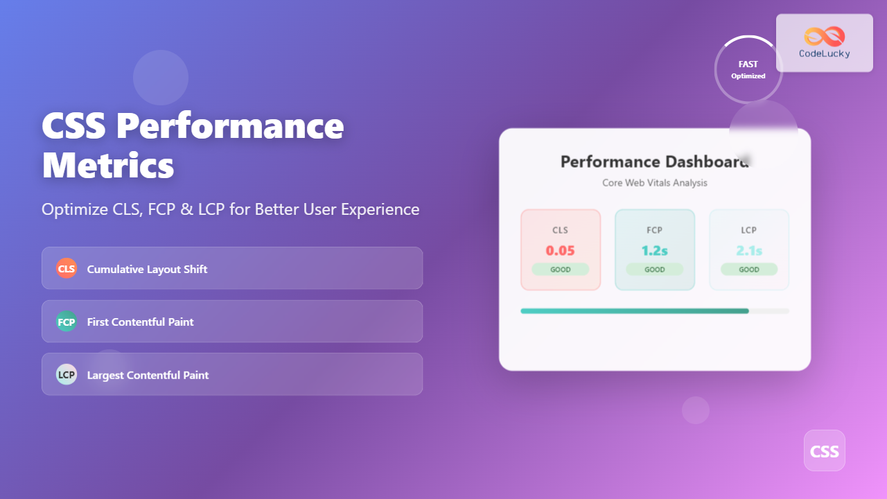
Master CSS performance optimization with detailed guide on Cumulative Layout Shift, First Contentful Paint, and Largest Contentful Paint metrics for better user experience.
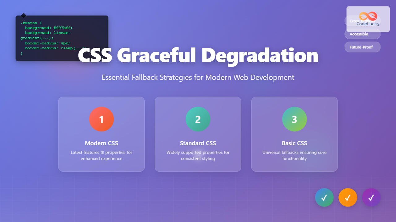
Master CSS graceful degradation with practical fallback strategies. Learn how to ensure your websites work across all browsers while delivering enhanced experiences to modern ones.
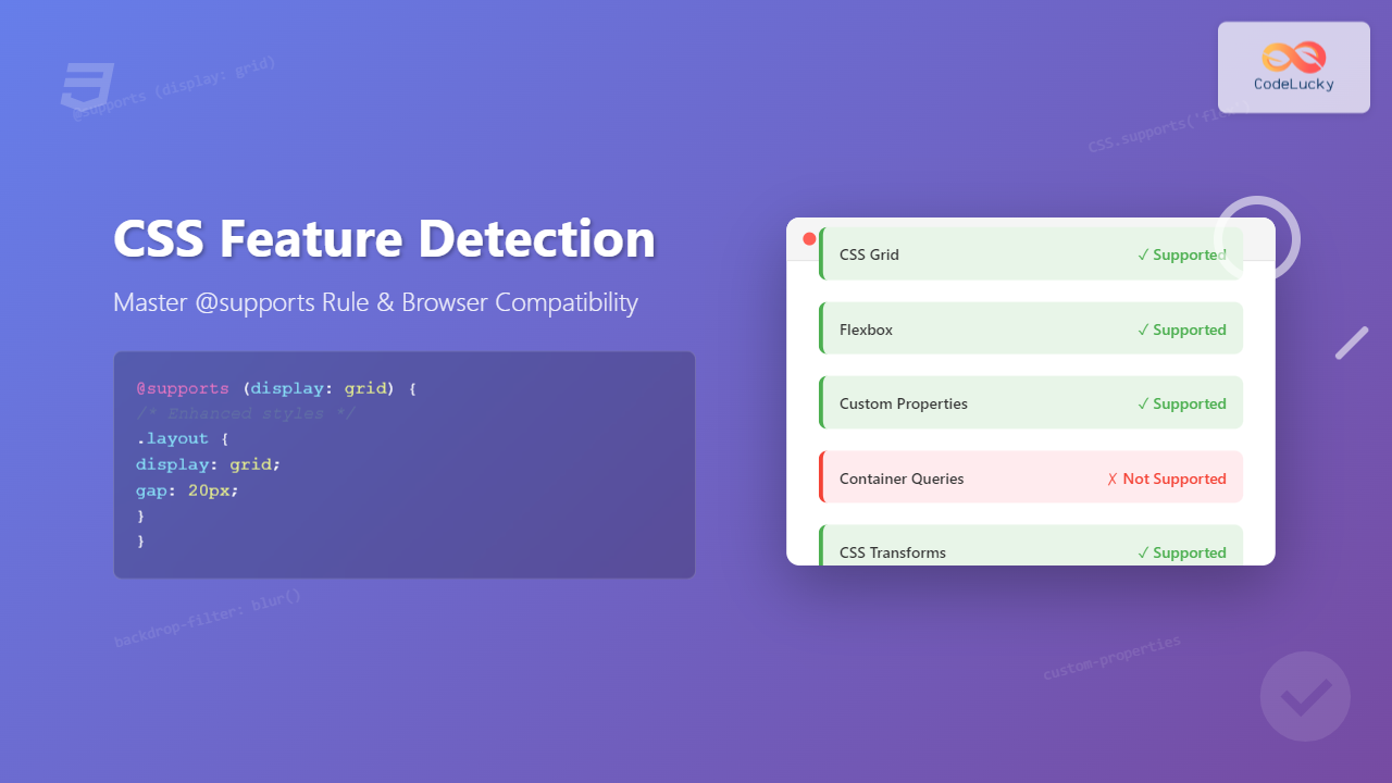
Master CSS feature detection with @supports rule. Learn how to write future-proof CSS code, handle browser compatibility gracefully, and implement progressive enhancement strategies.