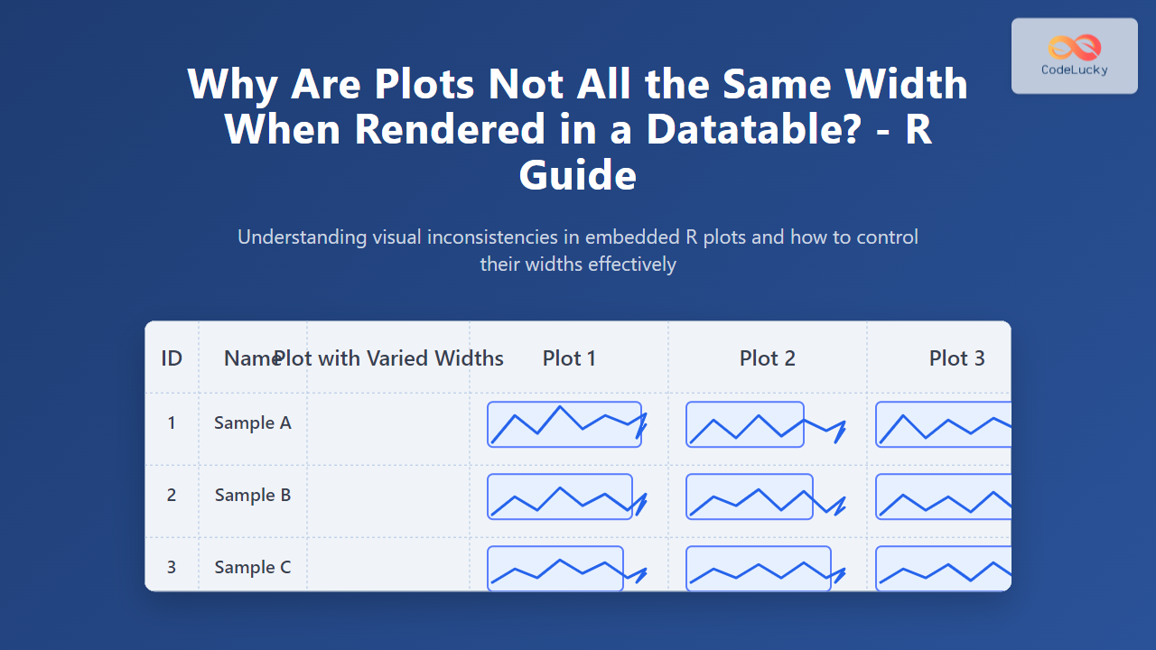
Rendering plots within tables is a popular technique to compactly display multiple graphical summaries of data side by side. In R, embedding plots inside datatable outputs (such as those generated by the DT package) is frequently used to create interactive data presentations. However, many R users encounter a common issue: plots inside the datatable cells do not share the same width, resulting in a visually inconsistent and cluttered table. This article explores the reasons behind differing plot widths in datatables, explains where the problem originates, and offers practical solutions with detailed examples.
Understanding the Problem: Why Plot Widths Vary in Datatable Cells
At first glance, plotting inside a datatable seems straightforward—render a plot in each cell, and the table handles layout. Yet the behavior of HTML tables and the constraints of rendering graphics inside cells reveal several causes why plot widths differ:
- HTML Table Cell Behavior: Table cells adjust their width based on their content and other cells in the same column. Plots with varying size attributes or aspect ratios can cause uneven widths.
- Image/Grid Output Differences: Plots rendered as images (e.g., PNG, SVG) have intrinsic width properties. If each plot is generated with different width dimensions, the cells adjust accordingly.
- Responsive Interaction: When using interactive datatables (DT or Shiny), the responsive resizing logic can make some columns narrower or wider depending on content, padding, and scroll settings.
- Plot Rendering Methods: When plots are embedded as base64 encoded images or HTML widgets (like plotly), their container sizes can be inconsistent without explicit CSS control.
Example Setup: Creating Plots in a DT Datatable in R
Before diving deeper, here is a simple example that generates plots and embeds them as images inside a DT datatable using base R plotting. Note the default behavior.
library(DT)
# Simple data frame with values to plot
df <- data.frame(
id = 1:3,
values = list(
rnorm(10),
runif(10),
rpois(10, lambda = 3)
)
)
# Function to create base64 plot images from numeric vectors
plot_to_base64 <- function(values) {
tmp_file <- tempfile(fileext = ".png")
png(tmp_file, width = 200, height = 120)
plot(values, type = "b", col = "blue", main = "Sample Plot", xlab = "", ylab = "")
dev.off()
data_uri <- paste0("data:image/png;base64,", base64enc::base64encode(tmp_file))
unlink(tmp_file)
return(paste0(' '))
}
# Add plot column to the data frame as html
df$plot <- sapply(df$values, plot_to_base64)
# Render datatable with escape = FALSE to allow html
datatable(df[, c("id", "plot")], escape = FALSE, options = list(autoWidth = TRUE))
In this example, each cell in the plot column contains a plot rendered as a base64-encoded PNG image. The autoWidth option lets the datatable columns adjust their widths automatically.
Result You Might Notice
Though each plot image is created with a fixed width of 200 pixels, the actual rendered widths of the plot cells may differ slightly depending on the browser and table layout. This happens because:
- The datatable column itself doesn’t enforce a fixed width unless specified explicitly.
- Browser table rendering engines can shrink or stretch columns if other columns have larger or smaller content.
- Margins or padding inside cells affect overall spacing.
Technical Explanation of Width Disparity
The HTML table layout algorithm adjusts column widths dynamically based on content. If a plot in one cell has slightly different styling or the adjacent columns have content of varying widths, this can cause cells with similar fixed-width plots to appear with different widths.
How to Fix or Control Plot Widths in Datatables
Several approaches help ensure consistent plot widths inside datatables:
- Fix Column Widths with DT Options: Use the
columnDefsoption in DT to set explicit widths for the plot columns. Example:
datatable(df[, c("id", "plot")], escape = FALSE, options = list(
  columnDefs = list(list(width = '220px', targets = 1)),
  autoWidth = FALSE
))- Set CSS Styling for Images and Cells: Apply CSS rules to fix image width and ensure no extra padding or margin inflates the width:
- Use HTML Widgets with Fixed Container Dimensions: Interactive plots like
plotlyorhtmlwidgetscan be wrapped inside divs with explicit width and height to prevent resizing by the datatable.
Example Using DT with plotly Plots and Fixed Width Container
library(plotly)
library(DT)

df$interactive_plot <- sapply(df$values, function(vals) {
  p <- plot_ly(x = 1:length(vals), y = vals, type = 'scatter', mode = 'lines+markers') %>%
    layout(width = 220, height = 140, margin = list(l=30, r=20, b=30, t=30))
  htmltools::as.tags(p) |> as.character()
})

datatable(df[, c("id", "interactive_plot")], escape = FALSE, options = list(
   columnDefs = list(list(width = '240px', targets = 1)),
   autoWidth = FALSE
))
Additional CSS & HTML Tips for Uniform Widths
table-layout: fixed;: Setting this style on the table or container forces columns to strictly obey width rules, preventing auto-adjustment.- White-space handling: Use
white-space: nowrap;on cells containing plots to avoid width shrinkage due to line breaks. - Container div for plots: Wrap plots in fixed width div containers to ensure same width allocation.
Why Not Just Use Equal Width Parameters in Plotting Functions?
Many plotting functions (e.g., png(), ggplot2 with ggsave()) accept width and height parameters, but there are important notes:
- Output width controls the image size, but the datatable cell can still resize the display on the client side.
- Different devices and browsers apply pixel scaling (zoom, dpi) differently, sometimes causing small variations.
- Without CSS and DT column width control, rendered images alone can’t guarantee uniform cell display widths.
Summary of Best Practices
- Always specify plot output size incrementally if embedding as images.
- Use the
DTpackage’scolumnDefsandautoWidth = FALSEoptions to fix column widths explicitly. - Apply CSS styling to control image width inside table cells.
- Wrap interactive plots in fixed width containers to avoid dynamic resizing.
- Consider forcing the datatable’s overall
table-layout: fixed;CSS property for strict column width adherence.
With these techniques, R users can create professional-looking datatables with embedded plots that are visually balanced, improving readability and user experience.


