JavaScript Window outerHeight Property: A Comprehensive Guide
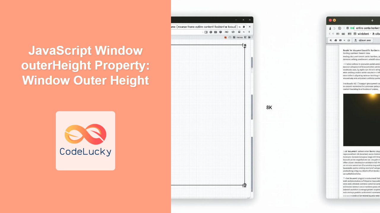
The JavaScript window.outerHeight property returns the height of the entire browser window, including all interface elements such as toolbars, scrollbars, and window borders. Understanding and utilizing this property is essential for web developers who need to determine the overall size of the browser window for responsive design, dynamic layouts, and various window-related functionalities.
What is the outerHeight Property?
The window.outerHeight property provides the total height of the browser window in pixels. This includes:
- The height of the document display area (the webpage content).
- The height of any browser toolbars (e.g., address bar, bookmarks bar).
- The height of the window borders.
- Scrollbars, if present.
This property is read-only, meaning you can only retrieve the height value and not modify it directly.
Purpose of the outerHeight Property
The primary purposes of the outerHeight property are:
- Responsive Design: Determine the available screen space to adjust the layout of web content.
- Dynamic Layouts: Create dynamic layouts that adapt to the user’s browser window size.
- Window Management: Manage and position child windows or elements relative to the main browser window.
- User Experience: Optimize user experience by providing content that fits well within the user’s window size.
Syntax and Usage
The syntax for accessing the outerHeight property is straightforward:
let height = window.outerHeight;
Here, height will be assigned the total height of the browser window in pixels.
Return Value
- Number: An integer representing the height of the browser window in pixels.
Practical Examples
Let’s explore some practical examples of how to use the window.outerHeight property in JavaScript.
Example 1: Displaying the Window Height
This example demonstrates how to display the outerHeight of the window in an alert box.
<!DOCTYPE html>
<html>
<head>
    <title>outerHeight Example 1</title>
</head>
<body>
    <button id="getHeightBtn1">Get Window Height</button>

    <script>
        const getHeightBtn1 = document.getElementById('getHeightBtn1');

        getHeightBtn1.addEventListener('click', function() {
            let height1 = window.outerHeight;
            alert("Window outerHeight: " + height1 + "px");
        });
    </script>
</body>
</html>
When the button is clicked, an alert box will display the current outerHeight of the browser window.
Example 2: Dynamically Adjusting Content Height
This example shows how to dynamically adjust the height of a <div> element based on the outerHeight of the window.
<!DOCTYPE html>
<html>
<head>
    <title>outerHeight Example 2</title>
    <style>
        #content2 {
            background-color: #f0f0f0;
            border: 1px solid #ddd;
            overflow: auto;
        }
    </style>
</head>
<body>
    <div id="content2">
        <p>This is some content in the div.</p>
    </div>

    <script>
        const contentDiv2 = document.getElementById('content2');

        function adjustContentHeight2() {
            let windowHeight2 = window.outerHeight;
            contentDiv2.style.height = (windowHeight2 - 100) + "px"; // Adjust as needed
        }

        // Adjust height on load and resize
        adjustContentHeight2();
        window.addEventListener('resize', adjustContentHeight2);
    </script>
</body>
</html>
In this example, the adjustContentHeight2() function sets the height of the content2 div based on the window’s outerHeight, subtracting 100 pixels for other elements like headers or footers. This function is called on page load and whenever the window is resized.
Example 3: Using outerHeight in a Responsive Design
This example demonstrates how to use outerHeight in combination with media queries to create a responsive design that adjusts based on the window’s height.
<!DOCTYPE html>
<html>
<head>
    <title>outerHeight Example 3</title>
    <style>
        #responsiveContent3 {
            padding: 20px;
            text-align: center;
            background-color: #e6e6e6;
            border: 1px solid #ccc;
        }

        /* Default style */
        #responsiveContent3 {
            font-size: 16px;
        }

        /* Adjust font size for smaller screens */
        @media (max-height: 600px) {
            #responsiveContent3 {
                font-size: 14px;
            }
        }

        /* Adjust font size for larger screens */
        @media (min-height: 800px) {
            #responsiveContent3 {
                font-size: 18px;
            }
        }
    </style>
</head>
<body>
    <div id="responsiveContent3">
        <p>This content's font size will change based on the window outerHeight.</p>
        <p>Try resizing the window height to see the effect.</p>
    </div>
</body>
</html>
Here, CSS media queries are used to adjust the font size of the responsiveContent3 div based on the window’s outerHeight. If the outerHeight is less than 600px, the font size is reduced to 14px. If it’s greater than 800px, the font size is increased to 18px.
Example 4: Detecting Small Screens
This example shows how to use outerHeight to detect small screens (like mobile devices in portrait mode) and provide a different layout or functionality.
<!DOCTYPE html>
<html>
<head>
    <title>outerHeight Example 4</title>
</head>
<body>
    <div id="smallScreenAlert4" style="display: none; background-color: #ffcccc; padding: 10px; border: 1px solid red;">
        <p>This site might not be fully optimized for small screens.</p>
    </div>

    <script>
        const smallScreenAlert4 = document.getElementById('smallScreenAlert4');

        function checkScreenSize4() {
            let windowHeight4 = window.outerHeight;
            if (windowHeight4 < 500) {
                smallScreenAlert4.style.display = 'block';
            } else {
                smallScreenAlert4.style.display = 'none';
            }
        }

        // Check screen size on load and resize
        checkScreenSize4();
        window.addEventListener('resize', checkScreenSize4);
    </script>
</body>
</html>
In this example, the checkScreenSize4() function checks if the outerHeight is less than 500px. If it is, a warning message is displayed, indicating that the site might not be fully optimized for small screens. This function is called on page load and whenever the window is resized.
Example 5: Creating a Full-Screen Canvas
This example demonstrates how to create a full-screen canvas that adapts to the outerHeight and outerWidth of the window.
<!DOCTYPE html>
<html>
<head>
    <title>outerHeight Example 5</title>
    <style>
        body, html {
            margin: 0;
            padding: 0;
            overflow: hidden; /* Prevent scrollbars */
        }

        #fullscreenCanvas5 {
            display: block; /* Make sure canvas is not inline */
        }
    </style>
</head>
<body>
    <canvas id="fullscreenCanvas5"></canvas>

    <script>
        const canvas5 = document.getElementById('fullscreenCanvas5');
        const ctx5 = canvas5.getContext('2d');

        function resizeCanvas5() {
            canvas5.width = window.outerWidth;
            canvas5.height = window.outerHeight;

            // Redraw content here
            ctx5.fillStyle = 'lightblue';
            ctx5.fillRect(0, 0, canvas5.width, canvas5.height);

            ctx5.fillStyle = 'black';
            ctx5.font = '20px Arial';
            ctx5.textAlign = 'center';
            ctx5.fillText('Full-Screen Canvas', canvas5.width / 2, canvas5.height / 2);
        }

        // Initial resize and on window resize
        resizeCanvas5();
        window.addEventListener('resize', resizeCanvas5);
    </script>
</body>
</html>
In this example, the resizeCanvas5() function sets the width and height of the canvas to match the window’s outerWidth and outerHeight, respectively. This creates a full-screen canvas that automatically resizes when the window is resized. The canvas is then filled with a light blue color and some text is added to indicate that it’s a full-screen canvas.
Tips and Best Practices
- Use with Caution: Be aware that
window.outerHeightincludes the height of toolbars and borders, which can vary between browsers and operating systems. - Responsive Design: Utilize
outerHeightin conjunction with CSS media queries to create responsive designs that adapt to different screen sizes. - Event Listeners: Attach event listeners to the
resizeevent to dynamically adjust layouts or content when the window size changes. - Testing: Always test your implementation across different browsers and devices to ensure consistent behavior.
Browser Support
The window.outerHeight property is widely supported across modern web browsers:
- Chrome
- Firefox
- Safari
- Edge
- Opera
Conclusion
The window.outerHeight property is a valuable tool for web developers who need to determine the total height of the browser window. By understanding and utilizing this property, you can create responsive designs, dynamic layouts, and enhance the user experience by providing content that fits well within the user’s window size. Whether you’re adjusting content heights, detecting small screens, or creating full-screen canvases, outerHeight provides the information you need to build adaptable and user-friendly web applications.


