JavaScript Screen availWidth Property: Available Width
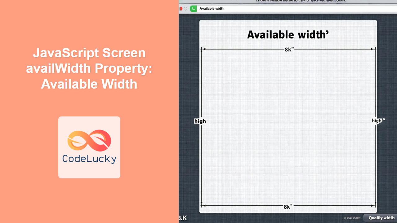
The availWidth property of the JavaScript Screen object returns the available horizontal space (in pixels) of the user’s screen, excluding interface elements like the Windows taskbar or macOS dock. This is useful for web developers who want to adapt their web page layout to fit the screen size without being covered by operating system UI elements.
Definition and Purpose
The availWidth property is a read-only property that provides the width of the screen available to the browser window. It’s particularly useful when creating responsive web designs that adapt to different screen sizes and resolutions. By using availWidth, you can ensure your web content is displayed within the visible area, avoiding any obstruction by system toolbars or docks.
Syntax
The syntax to access the availWidth property is straightforward:
let availableWidth = screen.availWidth;
Return Value
- Type: Number
- Description: The available width of the screen in pixels.
Practical Examples
Let’s explore some practical examples of how to use the availWidth property in JavaScript.
Basic Example: Displaying Available Width
This example demonstrates how to retrieve the available width of the screen and display it on a web page.
<!DOCTYPE html>
<html>
<head>
    <title>Screen Available Width Example</title>
</head>
<body>
    <h1>Screen Available Width</h1>
    <p id="availWidthDisplay"></p>

    <script>
        const availableWidthEx1 = screen.availWidth;
        document.getElementById("availWidthDisplay").textContent = "Available Width: " + availableWidthEx1 + " pixels";
    </script>
</body>
</html>
Output:
The output will display the available width of the screen in pixels, for example:
Available Width: 1920 pixels
Responsive Design: Adjusting Content Width
This example shows how to use availWidth to adjust the width of a <div> element to fit the available screen width.
<!DOCTYPE html>
<html>
<head>
    <title>Responsive Design with availWidth</title>
    <style>
        #content {
            background-color: #f0f0f0;
            padding: 20px;
            border: 1px solid #ccc;
        }
    </style>
</head>
<body>
    <h1>Responsive Design Example</h1>
    <div id="content">
        This content will adjust to the available screen width.
    </div>

    <script>
        const availableWidthEx2 = screen.availWidth;
        const contentDiv = document.getElementById("content");
        contentDiv.style.width = (availableWidthEx2 - 60) + "px"; // Subtract 60 for padding and borders
    </script>
</body>
</html>
Output:
The content div will adjust its width to fit the available screen width, minus 60 pixels for padding and borders.
Canvas Adaptation: Setting Canvas Width
In this example, we’ll create a canvas element and dynamically set its width based on the available screen width.
<!DOCTYPE html>
<html>
<head>
    <title>Canvas Width Adaptation</title>
    <style>
        canvas {
            border: 1px solid black;
        }
    </style>
</head>
<body>
    <h1>Canvas Width Adaptation</h1>
    <canvas id="myCanvasAdapt" width="100" height="100"></canvas>

    <script>
        const availableWidthEx3 = screen.availWidth;
        const canvasElem = document.getElementById("myCanvasAdapt");
        canvasElem.width = availableWidthEx3 - 20; // Subtract 20 for border

        const ctxAdapt = canvasElem.getContext("2d");
        ctxAdapt.fillStyle = "lightblue";
        ctxAdapt.fillRect(10, 10, 100, 50);
    </script>
</body>
</html>
Output:
The canvas width will adapt to the available screen width, and a light blue rectangle will be drawn on it.
Dynamic Adjustment on Resize
This advanced example demonstrates how to dynamically adjust the width of a <div> element whenever the window is resized, ensuring it always fits the available screen width.
<!DOCTYPE html>
<html>
<head>
    <title>Dynamic Adjustment on Resize</title>
    <style>
        #dynamicContent {
            background-color: #e0e0e0;
            padding: 20px;
            border: 1px solid #999;
        }
    </style>
</head>
<body>
    <h1>Dynamic Adjustment on Resize</h1>
    <div id="dynamicContent">
        This content will dynamically adjust its width on window resize.
    </div>

    <script>
        const dynamicContentDiv = document.getElementById("dynamicContent");

        function adjustWidth() {
            const availableWidthEx4 = screen.availWidth;
            dynamicContentDiv.style.width = (availableWidthEx4 - 60) + "px"; // Subtract 60 for padding and borders
        }

        // Initial adjustment
        adjustWidth();

        // Adjust on window resize
        window.addEventListener("resize", adjustWidth);
    </script>
</body>
</html>
Output:
The dynamicContent div will adjust its width dynamically whenever the window is resized, ensuring it always fits the available screen width.
Notes and Tips
- Cross-Browser Compatibility: The
screen.availWidthproperty is widely supported across all major browsers, ensuring consistent behavior. - Subtraction for Padding and Borders: When setting the width of an element, remember to subtract any padding, borders, or margins to ensure it fits within the available screen width.
- Testing on Multiple Devices: Always test your responsive designs on various devices and screen resolutions to ensure optimal display.
Browser Support
The screen.availWidth property is supported by all major browsers, including:
- Chrome
- Firefox
- Safari
- Edge
- Opera
Conclusion
The screen.availWidth property is an essential tool for creating responsive web designs that adapt to different screen sizes. By understanding its purpose and usage, you can ensure your web content is always displayed correctly, providing a better user experience across various devices.


