JavaScript MediaQueryList API: Crafting Dynamic Responsive Designs
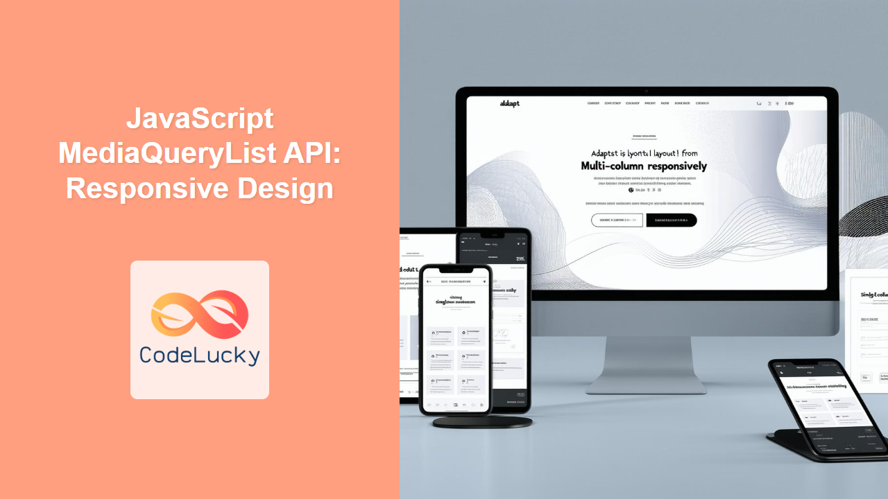
The JavaScript MediaQueryList API provides a powerful mechanism for web developers to dynamically respond to changes in CSS media queries. Unlike relying solely on CSS for responsive design, this API allows you to execute JavaScript code based on whether a specific media query matches the current state of the browser or device. This opens up opportunities for enhanced interactivity and tailored user experiences based on the user's environment. This article will dive deep into understanding and effectively using the MediaQueryList API.
Understanding the MediaQueryList API
The MediaQueryList API centers around the MediaQueryList interface, which represents the result of evaluating a CSS media query. This interface allows you to monitor whether the given media query matches the current state, enabling JavaScript-driven actions based on these changes. It's particularly useful for:
- Dynamic Interactions: Triggering JavaScript functions when a media query matches (or unmatches).
- Enhanced Responsiveness: Adapting functionality and UI components based on screen size or device orientation.
- Optimized Performance: Loading or unloading specific scripts based on the device's capabilities.
- Adaptive UI/UX: Providing unique interactions and content based on device-specific characteristics.
Purpose of the MediaQueryList API
The core purpose of the MediaQueryList API is to allow JavaScript to:
- Listen for changes in media query states.
- Programmatically execute actions based on these changes.
- Provide better customization by integrating JavaScript with responsive designs.
- Craft more dynamic and robust web applications that can adapt to various user contexts.
Getting Started with MediaQueryList API
To start working with the MediaQueryList API, you typically begin by creating a MediaQueryList object using window.matchMedia(), passing in the desired CSS media query.
const mediaQuery = window.matchMedia('(max-width: 768px)');
This creates a MediaQueryList object representing the state of the (max-width: 768px) media query.
Key Properties and Methods
Understanding the key properties and methods of the MediaQueryList interface is crucial:
| Property/Method | Type | Description |
|---|---|---|
media |
String (Read-Only) | The media query string that the MediaQueryList object represents. |
matches |
Boolean (Read-Only) | Indicates whether the media query matches the current browsing context. Returns true if it matches and false if it does not. |
onchange |
Event Handler | An event handler that is triggered whenever the media query state changes. It is better to use addEventListener('change', ...) to register the change event listener. |
addListener(callback) |
Deprecated Function | Adds a listener to the MediaQueryList object, triggering the callback function on media query state changes. Use addEventListener('change', ...) instead. |
removeListener(callback) |
Deprecated Function | Removes a listener from the MediaQueryList object. Use removeEventListener('change', ...) instead. |
addEventListener(type, listener, options) |
Function | Attaches an event listener to the specified type of event for the object. For MediaQueryList object, type is change. The listener is a callback that executes when the event occurs. Options can control the event capturing or firing options. |
removeEventListener(type, listener, options) |
Function | Removes an event listener for the specified type from the object. The listener and options parameters should match the one set by addEventListener() to be correctly removed. |
Note: The addListener() and removeListener() methods are deprecated. Use addEventListener('change', callback) and removeEventListener('change', callback) for better compatibility and maintainability. ⚠️
Using the MediaQueryList API
Let's look at some examples of how to effectively use the MediaQueryList API.
Checking Initial State
You can check the initial state of the media query using the matches property immediately after creating the MediaQueryList object.
const mediaQuery = window.matchMedia('(max-width: 768px)');
if (mediaQuery.matches) {
    console.log('Media query matches initially.');
    // Perform actions when the viewport width is less than or equal to 768px
} else {
    console.log('Media query does not match initially.');
    // Perform actions when the viewport width is greater than 768px
}
Responding to Changes
Use the addEventListener to listen for changes in the media query state.
const mediaQuery = window.matchMedia('(max-width: 768px)');

const handleMediaQueryChange = (event) => {
    if (event.matches) {
        console.log('Media query matches: Viewport is 768px or less.');
        // Perform actions when the media query matches
    } else {
        console.log('Media query does not match: Viewport is greater than 768px.');
        // Perform actions when the media query does not match
    }
};

mediaQuery.addEventListener('change', handleMediaQueryChange);

// To remove the listener later:
// mediaQuery.removeEventListener('change', handleMediaQueryChange);
Note: Make sure to remove event listeners when they are no longer needed to avoid memory leaks and improve performance. 📝
Real-World Examples
Adapting Navigation Menus
One common use case is adapting a navigation menu. For example, you might want to collapse a full navigation bar into a hamburger menu on smaller screens:
<nav id="mainNav">
    <ul class="nav-links">
        <li><a href="#">Home</a></li>
        <li><a href="#">About</a></li>
        <li><a href="#">Services</a></li>
        <li><a href="#">Contact</a></li>
    </ul>
    <button id="menuBtn" style="display: none;">☰</button>
</nav>
<script>
 const nav = document.getElementById('mainNav');
    const navLinks = nav.querySelector('.nav-links');
    const menuBtn = document.getElementById('menuBtn');
    const mediaQuery = window.matchMedia('(max-width: 768px)');
    const toggleMenu = () => {
     navLinks.style.display = navLinks.style.display === 'block' ? 'none' : 'block';
    };
    menuBtn.addEventListener('click', toggleMenu);

    const handleNav = (e) => {
        if(e.matches) {
            navLinks.style.display = 'none';
            menuBtn.style.display = 'block';
        } else {
            navLinks.style.display = 'flex';
            menuBtn.style.display = 'none';
        }
    }
     handleNav(mediaQuery);
     mediaQuery.addEventListener('change', handleNav);

</script>
<style>
    #mainNav {
        display: flex;
        justify-content: space-between;
        align-items: center;
        padding: 10px;
    }
    .nav-links {
        display: flex;
        list-style: none;
        padding: 0;
        margin: 0;
    }
    .nav-links li {
        margin-right: 20px;
    }
    .nav-links a {
        text-decoration: none;
    }
</style>
In this code, the navigation menu switches to a mobile-friendly toggle button when the viewport is 768 pixels wide or less.
Loading Scripts Dynamically
Another useful scenario is to conditionally load JavaScript scripts. For instance, you might load a heavy library only for larger screens if it is not required for mobile devices.
<script>
   const mediaQuery = window.matchMedia('(min-width: 992px)');
    const loadExtraFeatures = (e) => {
       if (e.matches) {
          console.log("loading extra features");
          // Load the large script
        const script = document.createElement('script');
        script.src = 'large-script.js';
        document.head.appendChild(script);
       } else {
            console.log("removing extra features");
            const script = document.querySelector('script[src="large-script.js"]');
          if (script) {
           document.head.removeChild(script);
           }
        }
    }

    loadExtraFeatures(mediaQuery);
     mediaQuery.addEventListener('change', loadExtraFeatures);
</script>
This script loads a large JavaScript file (large-script.js) only when the screen width is 992px or more.
Browser Compatibility
The MediaQueryList API enjoys widespread support across all modern browsers. However, be sure to test across all the browsers that you want to support.
Note: Testing in various browsers is crucial to guarantee consistency in the behavior of your responsive designs. 🧐
Advanced Considerations
Using Multiple Media Queries
You can create multiple MediaQueryList objects to respond to different media queries, allowing for more complex responsive behaviors.
const mobileQuery = window.matchMedia('(max-width: 768px)');
const tabletQuery = window.matchMedia('(min-width: 769px) and (max-width: 1024px)');
const desktopQuery = window.matchMedia('(min-width: 1025px)');

const handleMediaQuery = (event) => {
    if (event.matches) {
        console.log('Matched: ', event.media);
        // perform action based on which media query matched.
    }
}

mobileQuery.addEventListener('change', handleMediaQuery);
tabletQuery.addEventListener('change', handleMediaQuery);
desktopQuery.addEventListener('change', handleMediaQuery);

handleMediaQuery(mobileQuery);
handleMediaQuery(tabletQuery);
handleMediaQuery(desktopQuery);
Debouncing
When dealing with rapid window resize events, the change event on a MediaQueryList can fire frequently. Consider using debouncing to optimize performance and avoid unnecessary executions of your JavaScript logic.
let timeoutId;
const handleMediaQueryChange = (event) => {
    if(timeoutId) {
        clearTimeout(timeoutId);
    }
    timeoutId = setTimeout(()=>{
        if (event.matches) {
            console.log('Media query matches: Viewport is 768px or less.');
            // Perform actions when the media query matches
        } else {
            console.log('Media query does not match: Viewport is greater than 768px.');
            // Perform actions when the media query does not match
        }
    }, 100);

};
const mediaQuery = window.matchMedia('(max-width: 768px)');
mediaQuery.addEventListener('change', handleMediaQueryChange);
Note: Debouncing can help reduce the number of times your responsive logic executes during rapid resize events. ✅
Full HTML and JavaScript Code Example
Here is the full example code including all the elements:
<!DOCTYPE html>
<html lang="en">
<head>
    <meta charset="UTF-8">
    <meta name="viewport" content="width=device-width, initial-scale=1.0">
    <title>MediaQueryList Example</title>
    <style>
        #mainNav {
            display: flex;
            justify-content: space-between;
            align-items: center;
            padding: 10px;
        }
        .nav-links {
            display: flex;
            list-style: none;
            padding: 0;
            margin: 0;
        }
        .nav-links li {
            margin-right: 20px;
        }
        .nav-links a {
            text-decoration: none;
        }
    </style>
</head>
<body>
    <nav id="mainNav">
        <ul class="nav-links">
            <li><a href="#">Home</a></li>
            <li><a href="#">About</a></li>
            <li><a href="#">Services</a></li>
            <li><a href="#">Contact</a></li>
        </ul>
        <button id="menuBtn" style="display: none;">☰</button>
    </nav>
 <script>
 const nav = document.getElementById('mainNav');
    const navLinks = nav.querySelector('.nav-links');
    const menuBtn = document.getElementById('menuBtn');
    const mediaQuery = window.matchMedia('(max-width: 768px)');
    const toggleMenu = () => {
     navLinks.style.display = navLinks.style.display === 'block' ? 'none' : 'block';
    };
    menuBtn.addEventListener('click', toggleMenu);

    const handleNav = (e) => {
        if(e.matches) {
            navLinks.style.display = 'none';
            menuBtn.style.display = 'block';
        } else {
            navLinks.style.display = 'flex';
            menuBtn.style.display = 'none';
        }
    }
     handleNav(mediaQuery);
     mediaQuery.addEventListener('change', handleNav);
 </script>
</body>
</html>
Conclusion
The JavaScript MediaQueryList API is a crucial part of modern web development, allowing for powerful and dynamic responsive designs. By combining CSS media queries with JavaScript logic, you can create websites and web applications that adapt seamlessly to different screen sizes and device characteristics. This guide should help you effectively implement and leverage the MediaQueryList API in your web development projects.

