HTML Source media Property: Source Media Query
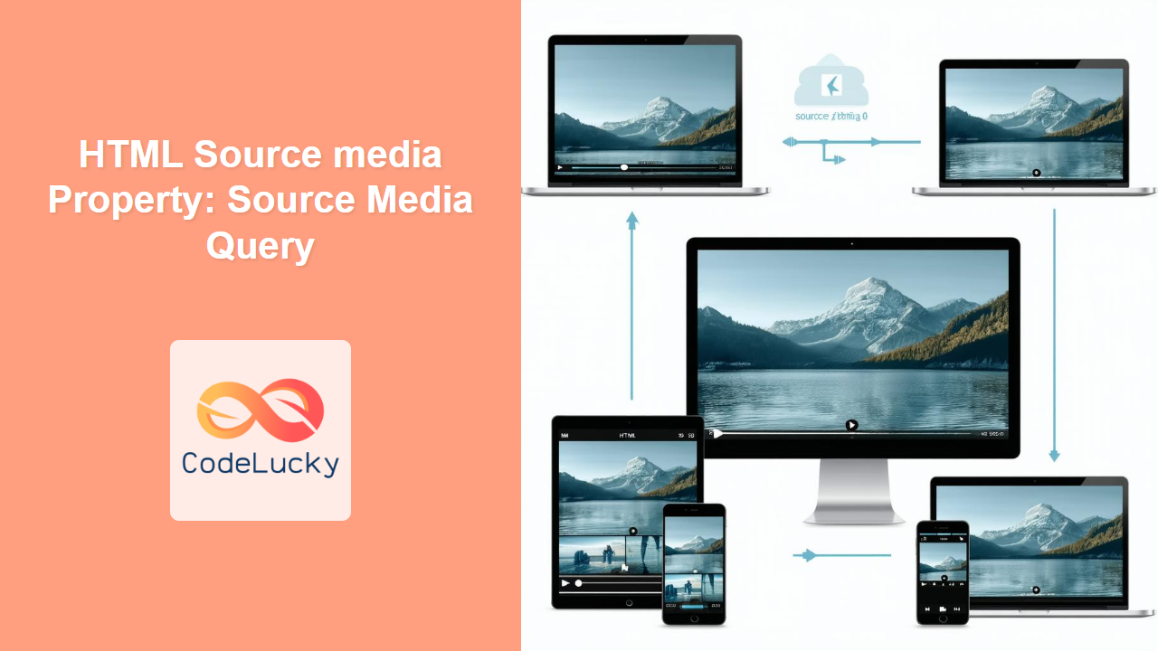
The HTML <source> element is used within <picture> and <video> elements to provide multiple media resources. The media attribute of the <source> element specifies a media query that determines which source to use based on the device’s characteristics, such as screen size, resolution, and orientation. This allows for responsive media delivery, ensuring optimal viewing experiences across different devices. 📱💻
What is the media Property?
The media property allows you to define media queries for each <source> element. The browser will select the first <source> element whose media query matches the current device’s characteristics. If no media query matches, the source specified in the src attribute of the parent <picture> or <video> element is used.
Purpose of the media Property
The primary purpose of the media property is to:
- Provide different media resources based on device characteristics.
- Optimize media delivery for various screen sizes and resolutions.
- Enhance user experience by delivering appropriate media content.
- Improve website performance by loading only the necessary media resources. 🚀
Syntax
The media attribute accepts a media query string. Media queries consist of one or more expressions that evaluate to either true or false. The browser selects the <source> element with the first matching media query.
<source media="(media query)" srcset="url">
Attributes
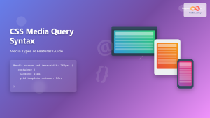
The media attribute takes a string value representing a media query. Common media features include width, height, orientation, resolution, and aspect-ratio.
| Attribute | Type | Description |
|---|---|---|
| `media` | String | Specifies a media query that determines when the source should be used. |
Note: Use valid media query syntax to ensure proper functionality. Invalid syntax may cause unexpected behavior. ⚠️
Examples
Let’s explore several practical examples demonstrating the use of the media property with both <picture> and <video> elements.
Using the media Property with the <picture> Element
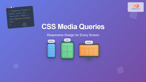
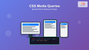
The <picture> element allows you to display different images based on the device’s screen size.
<picture>
  <source media="(max-width: 600px)" srcset="small.jpg">
  <source media="(max-width: 1200px)" srcset="medium.jpg">
  <img src="large.jpg" alt="Large Image">
</picture>
In this example:
- If the screen width is 600px or less,
small.jpgis displayed. - If the screen width is 1200px or less,
medium.jpgis displayed. - Otherwise,
large.jpgis displayed.
Using the media Property with the <video> Element
The <video> element allows you to provide different video sources based on the device’s capabilities.
<video width="640" height="360" controls>
  <source media="screen and (max-width: 600px)" src="small.mp4" type="video/mp4">
  <source media="screen and (max-width: 1200px)" src="medium.mp4" type="video/mp4">
  <source src="large.mp4" type="video/mp4">
  Your browser does not support the video tag.
</video>
In this example:
- If the screen width is 600px or less,
small.mp4is used. - If the screen width is 1200px or less,
medium.mp4is used. - Otherwise,
large.mp4is used.
Complex Media Queries
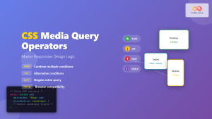
You can combine multiple media features using logical operators such as and, or, and not to create more complex media queries.
<picture>
  <source media="(min-width: 600px) and (orientation: landscape)" srcset="landscape.jpg">
  <img src="default.jpg" alt="Default Image">
</picture>
In this example, landscape.jpg is used only if the screen width is at least 600px and the device is in landscape orientation.
Real-World Use Case: Responsive Images
Consider a scenario where you want to display different versions of an image based on the device’s pixel density and screen size.
<picture>
  <source media="(max-width: 480px)" srcset="image_small.jpg">
  <source media="(max-width: 768px)" srcset="image_medium.jpg">
  <source media="(min-resolution: 2dppx)" srcset="image_highres.jpg">
  <img src="image_default.jpg" alt="Responsive Image">
</picture>
This example ensures that smaller devices receive smaller images, and high-resolution devices receive higher resolution images, optimizing both performance and visual quality.
Creating a Dynamic Media Switcher
Let’s create a dynamic example using JavaScript to switch between different image sources based on screen size. This example involves setting up a <picture> element with multiple <source> elements and using JavaScript to dynamically update the image source.
<!DOCTYPE html>
<html lang="en">
<head>
    <meta charset="UTF-8">
    <meta name="viewport" content="width=device-width, initial-scale=1.0">
    <title>Dynamic Media Switcher</title>
    <style>
        #dynamicImage {
            max-width: 100%;
            height: auto;
            border: 1px solid #ddd;
        }
    </style>
</head>
<body>

    <picture>
        <source id="smallSource" media="(max-width: 480px)" srcset="https://via.placeholder.com/480x270/007BFF/FFFFFF?text=Small">
        <source id="mediumSource" media="(max-width: 768px)" srcset="https://via.placeholder.com/768x432/007BFF/FFFFFF?text=Medium">
        <img id="dynamicImage" src="https://via.placeholder.com/1200x675/007BFF/FFFFFF?text=Large" alt="Dynamic Image">
    </picture>

    <script>
        function checkMedia() {
            const smallSourceDyn = document.getElementById('smallSource');
            const mediumSourceDyn = document.getElementById('mediumSource');
            const dynamicImageDyn = document.getElementById('dynamicImage');

            const screenWidth = window.innerWidth;

            if (screenWidth <= 480) {
                dynamicImageDyn.src = smallSourceDyn.srcset;
            } else if (screenWidth <= 768) {
                dynamicImageDyn.src = mediumSourceDyn.srcset;
            } else {
                dynamicImageDyn.src = "https://via.placeholder.com/1200x675/007BFF/FFFFFF?text=Large";
            }
        }

        // Initial check
        checkMedia();

        // Update on window resize
        window.addEventListener('resize', checkMedia);
    </script>

</body>
</html>
This example dynamically adjusts the image source based on the screen width, providing a responsive image experience.
Browser Support
The media attribute is widely supported across modern web browsers, ensuring consistent behavior across different platforms.
| Browser | Version | Support |
| ————– | ——- | ——- |
| Chrome | Yes | Yes |
| Edge | Yes | Yes |
| Firefox | Yes | Yes |
| Safari | Yes | Yes |
| Opera | Yes | Yes |
| Internet Explorer | 9+ | Yes |
Note: Always test your media queries across different browsers and devices to ensure compatibility and optimal performance. 🧐
Conclusion
The media property of the HTML <source> element is a powerful tool for delivering responsive media content. By using media queries, you can tailor the media resources to the device’s characteristics, providing an optimal viewing experience for all users. Whether you are working with images or videos, the media property is an essential part of modern web development. Happy coding! 🚀

