HTML Select disabled Property: Select Disabled
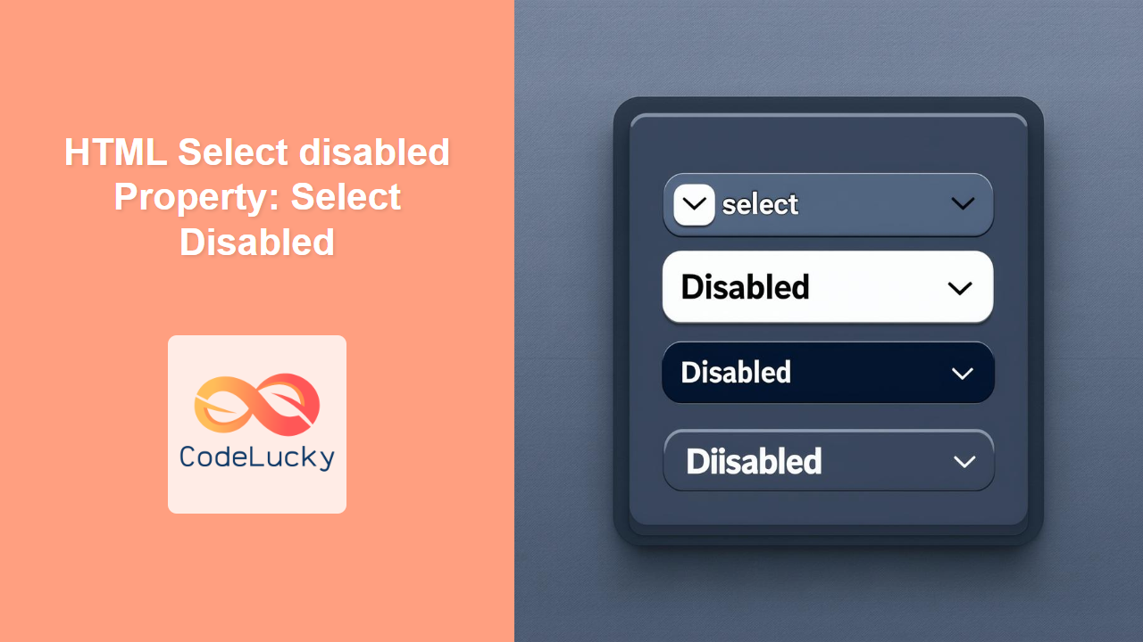
The disabled property in HTML’s <select> element is used to prevent the user from interacting with the dropdown list. When a <select> element is disabled, it becomes unclickable and its options are unselectable, effectively making the dropdown inactive. This feature is crucial for controlling user input in forms, ensuring that certain fields are only modifiable under specific conditions.
Purpose of the disabled Property
The primary purpose of the disabled property is to:
- Prevent users from interacting with a dropdown list.
- Indicate that a
<select>element is currently unavailable or not applicable. - Ensure data integrity by restricting modifications under specific conditions.
Syntax
The disabled property is a boolean attribute. Its presence (or absence) determines whether the <select> element is disabled or enabled.
<select disabled>
  <!-- Options here -->
</select>
There is no value associated with the disabled attribute. Its presence alone disables the <select> element.
Attributes
The disabled attribute does not take any specific values. Its mere presence indicates that the select element should be disabled.
| Attribute | Value | Description |
|---|---|---|
| `disabled` | None | Disables the ` |
Examples
Let’s explore several examples to illustrate the use of the disabled property in HTML <select> elements.
Basic Disabled Select
The following example demonstrates a basic disabled <select> element.
<label for="country">Country:</label>
<select id="country" disabled>
  <option value="usa">USA</option>
  <option value="canada">Canada</option>
  <option value="uk">UK</option>
</select>
The dropdown list will appear grayed out, and users will not be able to select any options. 🚫
Dynamically Disabling a Select Element with JavaScript
You can dynamically disable a <select> element using JavaScript based on certain conditions.
<label for="age">Age:</label>
<input type="number" id="age" min="18" />
<label for="membership">Membership:</label>
<select id="membership">
  <option value="basic">Basic</option>
  <option value="premium">Premium</option>
</select>

<script>
  const ageInput = document.getElementById("age");
  const membershipSelect = document.getElementById("membership");

  ageInput.addEventListener("input", function () {
    if (ageInput.value < 18) {
      membershipSelect.disabled = true;
    } else {
      membershipSelect.disabled = false;
    }
  });
</script>
In this example, the membership <select> element is disabled if the age is less than 18. This ensures that only eligible users can select a membership option.
Disabling a Select Based on Another Select’s Value
In this example, we’ll disable a second select element based on the selection made in the first.
<label for="product">Product:</label>
<select id="product">
  <option value="">Select Product</option>
  <option value="software">Software</option>
  <option value="hardware">Hardware</option>
</select>

<label for="version">Version:</label>
<select id="version" disabled>
  <option value="">Select Version</option>
  <option value="v1">Version 1.0</option>
  <option value="v2">Version 2.0</option>
</select>

<script>
  const productSelect = document.getElementById("product");
  const versionSelect = document.getElementById("version");

  productSelect.addEventListener("change", function () {
    if (productSelect.value === "software") {
      versionSelect.disabled = false;
    } else {
      versionSelect.disabled = true;
    }
  });
</script>
Here, the “Version” <select> is initially disabled and only becomes enabled when “Software” is selected from the “Product” <select>.
Using disabled in a Form
The disabled property is often used in forms to conditionally enable or disable input fields.
<form id="myForm">
  <label for="username">Username:</label>
  <input type="text" id="username" name="username" required /><br /><br />

  <label for="email">Email:</label>
  <input type="email" id="email" name="email" required /><br /><br />

  <label for="subscription">Subscription Type:</label>
  <select id="subscription" disabled name="subscription">
    <option value="monthly">Monthly</option>
    <option value="yearly">Yearly</option>
  </select>
  <br /><br />

  <button type="submit">Submit</button>
</form>

<script>
  document.addEventListener("DOMContentLoaded", function () {
    const usernameInput = document.getElementById("username");
    const emailInput = document.getElementById("email");
    const subscriptionSelect = document.getElementById("subscription");
    const form = document.getElementById("myForm");

    form.addEventListener("submit", function (event) {
      if (usernameInput.value === "" || emailInput.value === "") {
        event.preventDefault();
        alert("Please fill in all required fields.");
      } else {
        subscriptionSelect.disabled = false;
      }
    });
  });
</script>
In this example, the “Subscription Type” <select> is initially disabled. When the form is submitted and the required fields are filled, the <select> element is enabled, allowing the user to choose a subscription type.
Styling Disabled Select Elements
You can use CSS to style disabled <select> elements to provide a visual indication of their state.
<style>
  select:disabled {
    background-color: #e9e9e9;
    color: #aaa;
    border: 1px solid #ccc;
    cursor: not-allowed;
  }
</style>

<label for="city">City:</label>
<select id="city" disabled>
  <option value="newyork">New York</option>
  <option value="london">London</option>
  <option value="paris">Paris</option>
</select>
This CSS will change the background color, text color, border, and cursor of the disabled <select> element, making it visually distinct.
Accessibility Considerations
- Provide clear visual cues to indicate that a
<select>element is disabled. - Use appropriate
aria-disabledattributes for assistive technologies. - Ensure that disabled elements do not interfere with keyboard navigation.
Browser Support
The disabled property is widely supported across all major browsers, including:
- Chrome
- Firefox
- Safari
- Edge
- Opera
Tips and Best Practices
- Always provide a clear visual indication when a
<select>element is disabled. - Use JavaScript to dynamically enable or disable
<select>elements based on user interactions or conditions. - Validate user input before enabling disabled
<select>elements to ensure data integrity. - Consider accessibility implications when using the
disabledproperty. ♿
Conclusion
The disabled property in HTML <select> elements is a powerful tool for controlling user interaction and ensuring data integrity in forms. By strategically using the disabled property and providing clear visual cues, you can create a more user-friendly and robust web application. 🚀

