Introduction
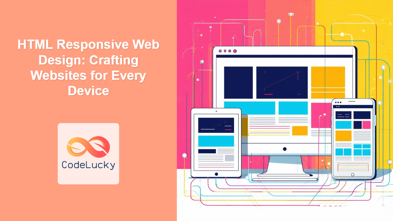
In today's digital landscape, users access the internet through a plethora of devices, from large desktop monitors to small mobile phones. This diversity necessitates that websites are not only functional but also visually appealing and usable across all screen sizes. That's where responsive web design comes into play. Responsive design is not just a trend; it’s a fundamental requirement for modern web development. This article will explore the core concepts of responsive web design using HTML, focusing on techniques that allow your website to adapt seamlessly to different screen sizes.
By the end of this guide, you’ll understand the significance of responsive design, how to use the viewport meta tag to control layout on different devices, how to implement media queries to apply different styles based on screen size, and the mobile-first approach. These skills will enable you to create websites that provide a consistent and enjoyable user experience, regardless of the device being used. Understanding these concepts is crucial for any web developer aiming to build modern, accessible websites.
Understanding Responsive Design
Responsive web design is an approach to web development where a single website adapts its layout and content to fit various screen sizes and devices. Instead of building separate websites for desktops, tablets, and smartphones, you create one flexible website that responds to the user's environment. This is achieved by using HTML to structure the content and CSS to style it, with special techniques to handle different viewport sizes. This approach not only enhances the user experience but also simplifies the development and maintenance process.
Key Components of Responsive Design
Three primary components constitute responsive design: flexible grids, flexible images, and media queries. Flexible grids allow for elements to scale dynamically based on available screen space. Flexible images resize to fit their containers without distorting. Media queries enable the application of different styles based on specific device characteristics like screen width, height, and orientation. The key is to build fluid websites that can seamlessly adjust to any screen resolution.
The Viewport Meta Tag
The viewport meta tag is a crucial element in responsive web design. It instructs the browser on how to control the page's dimensions and scaling. Without this tag, mobile browsers might render pages at a desktop width, which could lead to the content being too small to read or interact with effectively.
How to Use the Viewport Meta Tag
The most common usage of the viewport meta tag is:
<meta name="viewport" content="width=device-width, initial-scale=1.0">
width=device-width: This sets the width of the viewport to match the device's screen width, ensuring that your layout fits the screen.initial-scale=1.0: This sets the initial zoom level when the page is first loaded, typically set to 1.0 to prevent initial zooming.
By including this meta tag in the <head> section of your HTML document, you enable your website to adapt to the size of different devices.
Media Queries: Adapting Styles Based on Screen Size
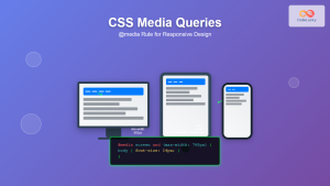
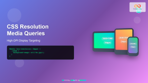
Media queries in CSS allow you to apply styles conditionally based on the characteristics of the device, such as screen width, height, orientation, and resolution. They form the backbone of responsive design, enabling you to change the layout and appearance of your content for different devices.
How Media Queries Work
A basic media query follows this syntax:
@media (condition) {
  /* Styles to be applied when the condition is true */
}
For example, to apply different styles when the screen width is 768px or less, you might use the following:
@media (max-width: 768px) {
    body {
      font-size: 14px;
    }
    .container {
      width: 90%;
    }
  }
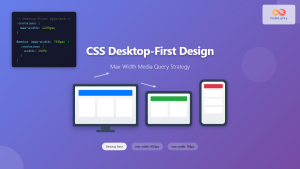
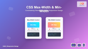
This example changes the body's font size to 14px and reduces the container’s width to 90% of the screen when the viewport width is 768px or less. This can be done using min-width and max-width, depending on your requirement.
Common Media Query Breakpoints
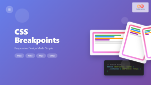
While you can choose any breakpoints that best suit your design, some common ones include:
- Small phones:
max-width: 576px - Tablets:
min-width: 577pxandmax-width: 768px - Small Desktops:
min-width: 769pxandmax-width: 992px - Large Desktops:
min-width: 993pxandmax-width: 1200px - Extra Large Desktops:
min-width: 1201px
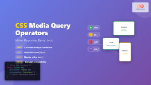
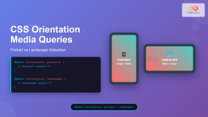
You can also use min-width, orientation: landscape, and many other features to make the site responsive.
Mobile-First Design
Mobile-first design is a development approach that prioritizes designing for smaller screens (mobile devices) first, and then enhancing the design for larger screens (tablets, desktops). This ensures that your website’s core functionality and content are accessible on smaller devices, which are often used in situations where connections are less reliable.
Benefits of Mobile-First
- Improved Performance: By focusing on the smallest screen first, you prioritize essential content and reduce unnecessary bloat, leading to faster load times on all devices.
- Enhanced Accessibility: Mobile-first forces you to prioritize content, making it more accessible and user-friendly.
- More Flexible Design: It is easier to adapt a simple design to larger screens than vice versa.
- Better User Experience: Ensures the basic design is always functional on the smallest screens which has more diverse use cases.
Implementing Mobile-First
Start by creating a basic layout for mobile using CSS, and then use media queries to add styles for larger screens, ensuring the layout adapts appropriately.
/* Default styles for mobile */
body {
    font-size: 16px;
}
.container {
    width: 100%;
    padding: 10px;
}

/* Styles for larger screens */
@media (min-width: 768px) {
    body {
        font-size: 18px;
    }
    .container {
        width: 80%;
        padding: 20px;
    }
}
In this example, default styles are set for mobile and then updated for larger screens.
Practical Examples
Let's combine all concepts to create a simple responsive website layout.
<!DOCTYPE html>
<html lang="en">
<head>
    <meta charset="UTF-8">
    <meta name="viewport" content="width=device-width, initial-scale=1.0">
    <title>Responsive Web Design Example</title>
    <style>
        /* Default styles (for mobile) */
        body {
            font-family: sans-serif;
            margin: 0;
            padding: 0;
        }
        .container {
            width: 100%;
            padding: 10px;
            box-sizing: border-box;
        }
        header {
            background-color: #333;
            color: white;
            text-align: center;
            padding: 1em 0;
        }
        main {
            padding: 10px;
        }
        .box {
            background-color: #eee;
            padding: 20px;
            margin-bottom: 10px;
        }

         /* Media query for tablets and larger screens */
        @media (min-width: 768px) {
            .container {
                width: 80%;
                margin: 0 auto;
            }
            main {
                display: flex;
                flex-wrap: wrap;
                padding: 20px;
            }
           .box{
              width: calc(50% - 20px);
               margin-right: 20px;
            }
            .box:nth-child(2n){
                margin-right: 0;
            }
             .box:last-child{
                margin-bottom: 0;
            }
        }

        @media (min-width: 992px){
            .box{
              width: calc(33.33% - 20px);
            }
            .box:nth-child(2n){
                margin-right: 20px;
            }
              .box:nth-child(3n){
                margin-right: 0;
            }
        }
    </style>
</head>
<body>
    <header>
        <h1>Responsive Web Design Example</h1>
    </header>
    <div class="container">
        <main>
            <div class="box">Box 1</div>
            <div class="box">Box 2</div>
            <div class="box">Box 3</div>
            <div class="box">Box 4</div>
            <div class="box">Box 5</div>
        </main>
    </div>
</body>
</html>
This example uses a basic layout, which adapts to different screen sizes. On smaller screens, the boxes will be full width, while on larger screens they will be shown on multiple columns.
Best Practices and Tips
- Test Across Devices: Thoroughly test your designs on different browsers and devices.
- Use a Grid System: Grid systems like CSS Grid or Flexbox can help you create flexible layouts.
- Optimize Images: Ensure your images are compressed and responsive, consider using responsive image techniques.
- Keep it Simple: Prioritize clarity and simplicity in your designs, avoid unnecessarily complex layouts.
- Use Relative Units: Use relative units like
em,rem, or percentages instead of fixed pixels to allow content to scale properly. - Regularly update your knowledge: Web technologies evolve quickly, so stay up-to-date with new features and practices.
Conclusion
Responsive web design is a crucial skill for any web developer today. By understanding the importance of the viewport meta tag, media queries, and mobile-first design principles, you can create websites that are accessible, user-friendly, and visually appealing across all devices. Keep experimenting with different breakpoints and layouts to see how they respond to varying screen sizes. By following the best practices, and staying current with new techniques, you can deliver the best user experience, making the user's visit valuable.

