HTML Range disabled Property: Making Range Inputs Uninteractive
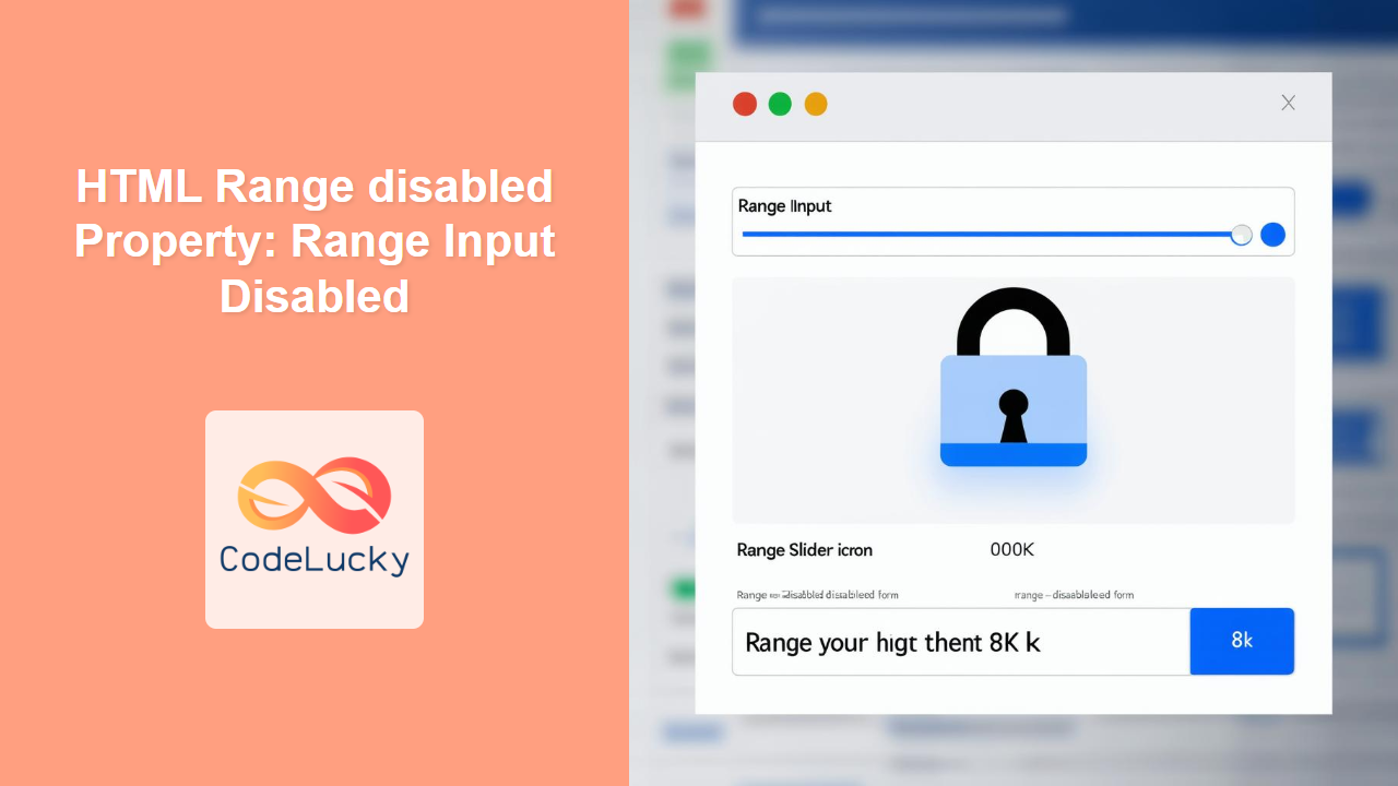
The disabled attribute in HTML is a boolean attribute that, when present, prevents the user from interacting with the range input element. A disabled range input is un-editable and un-submittable. This property is useful when you want to temporarily prevent users from changing a value, or when a range input’s value is not relevant in the current state of the form.
Purpose of the disabled Property
The primary purpose of the disabled property is to:
- Make a range input element non-interactive.
- Visually indicate to the user that the range input is unavailable.
- Prevent the range input from being submitted with the form.
Syntax
The syntax for using the disabled attribute is straightforward:
<input type="range" id="myRange" disabled>
- The
disabledattribute does not require a value. Its presence alone indicates that the range input is disabled.
Attributes
The disabled attribute is a boolean attribute, which means it doesn’t take any specific values. The presence of the attribute is enough to disable the element.
| Attribute | Value | Description |
|---|---|---|
| `disabled` | None (boolean attribute) | When present, disables the range input element, making it non-interactive and un-submittable. |
Examples
Let’s explore several examples to demonstrate how the disabled property works in various scenarios.
Basic Usage
This example demonstrates how to disable a range input element using the disabled attribute.
<label for="volume">Volume:</label>
<input type="range" id="volume" name="volume" min="0" max="100" value="50" disabled>
The range input will appear grayed out and will not respond to user input.
Toggling the disabled Property with JavaScript
This example shows how to use JavaScript to dynamically enable or disable a range input.
<label for="brightness">Brightness:</label>
<input type="range" id="brightness" name="brightness" min="0" max="100" value="50">
<br><br>
<button id="toggleButton">Disable</button>

<script>
  const brightnessRange = document.getElementById('brightness');
  const toggleButton = document.getElementById('toggleButton');

  toggleButton.addEventListener('click', function() {
    if (brightnessRange.disabled) {
      brightnessRange.disabled = false;
      toggleButton.textContent = 'Disable';
    } else {
      brightnessRange.disabled = true;
      toggleButton.textContent = 'Enable';
    }
  });
</script>
In this example, clicking the button toggles the disabled property of the range input.
Disabling Based on Form State
This example demonstrates how to disable a range input based on the state of another form element, such as a checkbox.
<label for="enableControl">Enable Control:</label>
<input type="checkbox" id="enableControl">
<br><br>
<label for="contrast">Contrast:</label>
<input type="range" id="contrast" name="contrast" min="0" max="100" value="50" disabled>

<script>
  const enableControlCheckbox = document.getElementById('enableControl');
  const contrastRange = document.getElementById('contrast');

  enableControlCheckbox.addEventListener('change', function() {
    contrastRange.disabled = !this.checked;
  });
</script>
Here, the range input is initially disabled and only becomes enabled when the checkbox is checked.
Using disabled with Form Submission
When a range input is disabled, its value is not submitted with the form. This example illustrates this behavior.
<form id="myForm">
  <label for="sensitivity">Sensitivity:</label>
  <input type="range" id="sensitivity" name="sensitivity" min="0" max="100" value="50" disabled>
  <br><br>
  <button type="submit">Submit</button>
</form>

<script>
  const myForm = document.getElementById('myForm');

  myForm.addEventListener('submit', function(event) {
    event.preventDefault();
    const formData = new FormData(myForm);
    for (let pair of formData.entries()) {
      console.log(pair[0]+ ': ' + pair[1]);
    }
  });
</script>
In this example, the form submission will not include the sensitivity field because it is disabled.
Styling Disabled Range Inputs
You can use CSS to style disabled range inputs to provide a clear visual indication to the user.
<style>
  input[type="range"]:disabled {
    opacity: 0.5;
    cursor: not-allowed;
  }
</style>

<label for="setting">Setting:</label>
<input type="range" id="setting" name="setting" min="0" max="100" value="50" disabled>
This CSS reduces the opacity and changes the cursor to indicate that the range input is disabled.
Real-World Applications
The disabled property for range inputs can be applied in various real-world scenarios:
- Conditional Form Fields: Disabling a range input based on the selection of other form elements, ensuring only relevant inputs are active.
- Permissions Control: Disabling a range input for users without the necessary permissions to modify a setting.
- Game Settings: Disabling advanced settings until a user reaches a certain level or unlocks them.
- Read-Only Mode: Disabling all form elements in a read-only mode, preventing any modifications.
Tips and Best Practices
- Provide Clear Visual Feedback: Use CSS to style disabled range inputs so users can easily identify them.
- Accessibility: Ensure disabled range inputs are still accessible to users with disabilities, providing alternative ways to convey the information.
- Form Logic: Use JavaScript to dynamically enable or disable range inputs based on the state of the form or user interactions.
Browser Support
The disabled attribute is widely supported across all major browsers, including:
- Chrome
- Edge
- Firefox
- Safari
- Opera
Conclusion
The disabled property is a crucial tool for controlling the interactivity of range input elements in HTML forms. By using the disabled attribute effectively, you can create more user-friendly and robust forms that adapt to different scenarios and user interactions.

