HTML <picture> Tag
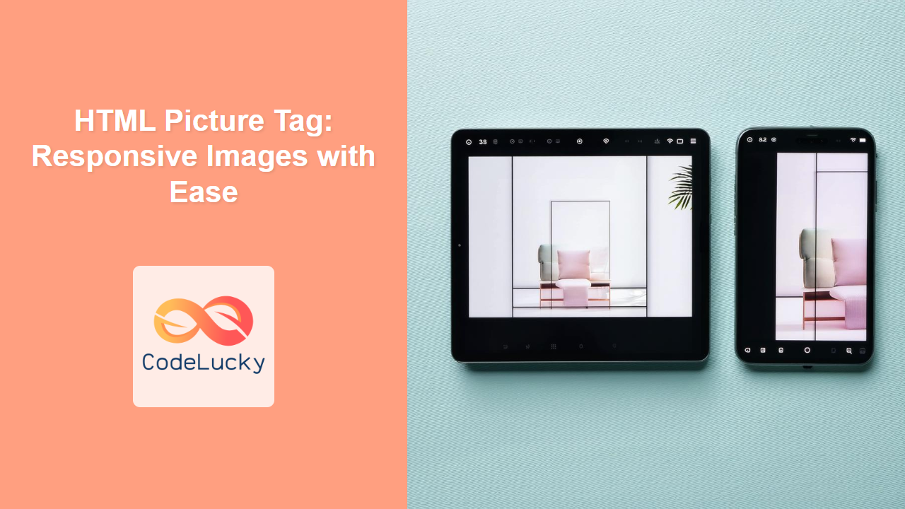
The <picture> tag in HTML acts as a container for multiple <source> tags and one <img> tag, enabling the browser to choose the most suitable image to display based on various criteria. This is primarily used for creating responsive images that adapt to different screen sizes, resolutions, and formats.
Syntax
<picture>
  <source srcset="image1.jpg" media="(condition)">
  <source srcset="image2.jpg" media="(condition)">
  <img src="fallback-image.jpg" alt="Alternative text">
</picture>
Attributes
| Attribute | Value | Description |
|---|---|---|
srcset |
URL | Specifies the path to the image source. Used within <source> tags. |
media |
CSS media query | Defines the condition under which the corresponding image should be used. Used within <source> tags. |
sizes |
A list of sizes | Specifies the image sizes for different layouts. Used within <source> tag. |
type |
MIME type | Specifies the MIME type of the image resource in the srcset. Used within <source> tag. |
src |
URL | Specifies the fallback image source if no <source> matches. Used within the <img> tag inside <picture>. |
alt |
text | Alternative text for the image; crucial for accessibility. Used within the <img> tag inside <picture>. |
Example
<picture>
  <source srcset="small.jpg" media="(max-width: 600px)">
  <source srcset="medium.jpg" media="(min-width: 601px) and (max-width: 1200px)">
  <img src="large.jpg" alt="A responsive image">
</picture>
More Examples
Example 1: Simple responsive image with different sizes
<picture>
  <source srcset="images/small.jpg" media="(max-width: 480px)">
  <source srcset="images/medium.jpg" media="(min-width: 481px) and (max-width: 1024px)">
  <img src="images/large.jpg" alt="A mountain landscape">
</picture>
In this example, the browser will load small.jpg for screens with a width of 480px or less, medium.jpg for screens between 481px and 1024px, and large.jpg for larger screens if none of the <source> conditions match. The <img> tag acts as the fallback.
Example 2: Using type attribute for different image formats
<picture>
    <source type="image/webp" srcset="images/image.webp">
    <source type="image/jpeg" srcset="images/image.jpg">
   <img src="images/fallback.jpg" alt="An example image">
</picture>
Here the browser will attempt to load a WebP version of the image if it's supported; otherwise, it will try the JPEG. If the browser doesn't support either it falls back to the img tag. This allows for modern image formats that provide better compression.
Example 3: Combining media and sizes for detailed control
<picture>
    <source media="(max-width: 600px)" srcset="small.jpg" sizes="100vw">
    <source media="(min-width: 601px)" srcset="medium.jpg" sizes="50vw">
    <img src="large.jpg" alt="A detailed image" sizes="30vw">
</picture>
This example demonstrates the use of sizes attribute in addition to media. When the screen width is less than or equal to 600px, the image takes the full viewport width (100vw). For screen widths above 600px, the image takes half the viewport (50vw), and the fallback image takes 30% of the viewport width if no <source> matches.
Example 4: Art Direction with the <picture> tag.
  <picture>
    <source media="(min-width: 800px)" srcset="wide-image.jpg">
    <source media="(max-width: 799px)" srcset="square-image.jpg">
    <img src="fallback.jpg" alt="Fallback Image">
  </picture>
This example demonstrates a common use-case for the <picture> tag for changing the image composition based on the screen size, often referred as "art direction"
Browser Support
The <picture> tag is widely supported across modern browsers:
- Chrome: Full support
- Edge: Full support
- Firefox: Full support
- Safari: Full support
- Opera: Full support
- IE: Not Supported (Consider a polyfill for older browsers)
Notes and Tips
- The
<img>tag inside<picture>is mandatory. It acts as a fallback in case none of the source tags match. - Make sure to provide
alttext to the<img>tag for accessibility and SEO. - The order of
<source>tags matters. The browser selects the first matching source based on provided media queries. - Use the
typeattribute to provide the correct MIME type to ensure correct rendering of image formats like webp. - Consider using
srcsetandsizeswithin<source>tag for more granular control over the images displayed on different screen sizes. - Use
<picture>tag in combination with image compression and optimization tools to ensure your images load quickly. - When using the
sizesattribute it's helpful to use viewport units (vw) and potentially use calc() to calculate widths based on columns of a layout. For example sizes="(min-width: 1200px) 400px, 33.3vw" would render a 400px wide image on screens over 1200px wide and on smaller screens will render an image that takes up a third of the screen width. - The
<picture>tag can also be useful for switching to different formats based on browser support (e.g., WebP). - Always test your responsive images on various devices and browsers to ensure they are working correctly.

