Introduction
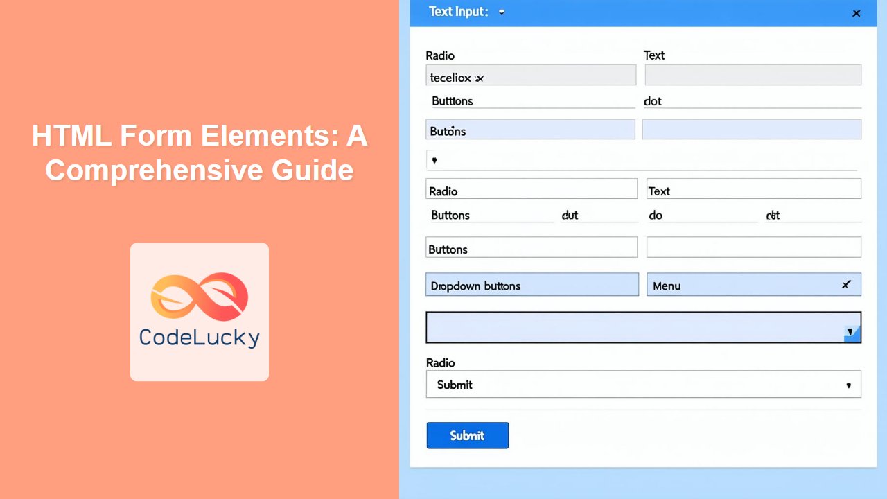
Forms are the backbone of user interaction on the web. They allow users to input data, make selections, and communicate with web applications. Without forms, our web experiences would be limited to passive content consumption. Understanding HTML form elements is crucial for any web developer, whether you are building a simple contact form or a complex e-commerce checkout page. This article will walk you through each essential form element, explaining their purpose, usage, and best practices.
This article will dissect the core HTML elements that power forms, providing examples and insights into how to construct user-friendly and functional interfaces. We’ll cover everything from the foundational <form> tag to the specialized <datalist> and <output> elements. Understanding these elements is not just about knowing the syntax, but about building accessible, robust, and user-centric web forms. Let's dive in and start building better forms.
Core Form Elements
At the heart of every HTML form lies the <form> element. This tag serves as a container for all other form elements and defines how the form data will be submitted. Within this container, you'll use various elements to collect user input. Here are the essential form elements that we will cover in this section:
<form>: Defines an HTML form for user input.<label>: Provides a label for a form element, enhancing accessibility.<input>: Creates various interactive controls for data input.<textarea>: Defines a multi-line text input control.<select>: Creates a dropdown list for users to choose from.<option>: Represents an option within a<select>,<datalist>, or<optgroup>element.<optgroup>: Groups related options in a dropdown list.<button>: Creates a clickable button, often used to submit forms.<fieldset>: Groups related form elements together.<legend>: Provides a caption for the<fieldset>element.<datalist>: Provides a list of predefined options for an input element.<output>: Displays the result of a calculation or user action.
The <form> Element
The <form> tag is the root of any form. It defines the form and sets attributes such as where the data should be sent (action) and how (method – usually GET or POST).
<form action="/submit-form" method="post">
  <!-- Form elements go here -->
</form>
Here, the action attribute specifies where the form data will be sent, in this case to /submit-form, and method="post" is used as the data is sent as a request body.
The <label> Element
The <label> tag is essential for accessibility. It associates a text label with a form control, allowing users to click the label to focus on the associated control. This is particularly helpful for users who use assistive technologies.
<label for="username">Username:</label>
<input type="text" id="username" name="username">
In this example, the for attribute of the <label> matches the id attribute of the <input> element.
The <input> Element
The <input> tag is the workhorse of HTML forms. It creates various interactive elements for users to input data. The type attribute defines the kind of control that will be displayed: text fields, checkboxes, radio buttons, date pickers, and more. We will delve deeper into input types in a separate article.
<input type="text" name="fullName" placeholder="Enter your full name">
<input type="email" name="email" required>
<input type="checkbox" name="subscribe" id="subscribe">
<label for="subscribe">Subscribe to Newsletter</label>
The <textarea> Element
The <textarea> tag defines a multi-line text input area, ideal for long-form text.
<label for="message">Message:</label><br>
<textarea id="message" name="message" rows="4" cols="50"></textarea>
The <select> and <option> Elements
The <select> tag creates a dropdown list of options, and each <option> tag within the <select> defines an available choice for the user.
<label for="country">Country:</label>
<select id="country" name="country">
  <option value="us">United States</option>
  <option value="ca">Canada</option>
  <option value="uk">United Kingdom</option>
</select>
The <optgroup> Element
The <optgroup> element allows you to group related options in a <select> element, making it easier for users to navigate lengthy dropdowns.
<label for="os">Operating System:</label>
<select id="os" name="os">
  <optgroup label="Desktop">
    <option value="windows">Windows</option>
    <option value="macos">MacOS</option>
    <option value="linux">Linux</option>
  </optgroup>
  <optgroup label="Mobile">
    <option value="android">Android</option>
    <option value="ios">iOS</option>
  </optgroup>
</select>
The <button> Element
The <button> tag creates a clickable button, often used to submit forms. You can control behavior by setting it's type attribute, for example submit, reset or just a normal button.
<button type="submit">Submit</button>
<button type="reset">Reset</button>
<button type="button">Click Me</button>
The <fieldset> and <legend> Elements
The <fieldset> element groups related form elements visually and logically. The <legend> element provides a caption (title) for the group defined by the <fieldset>.
<fieldset>
  <legend>Personal Information</legend>
    <label for="firstName">First Name:</label><br>
    <input type="text" id="firstName" name="firstName"><br>
    <label for="lastName">Last Name:</label><br>
    <input type="text" id="lastName" name="lastName"><br>
</fieldset>
The <datalist> Element
The <datalist> element provides a list of predefined options for an <input> element. It’s like a combo box, allowing users to select from suggested options or enter their own values.
<label for="browser">Browser:</label>
<input type="text" list="browsers" id="browser" name="browser">
<datalist id="browsers">
  <option value="Chrome"></option>
  <option value="Firefox"></option>
  <option value="Safari"></option>
  <option value="Edge"></option>
</datalist>
The <output> Element
The <output> element represents the result of a calculation performed by the form, often using client-side scripting.
<form oninput="result.value = parseInt(num1.value) + parseInt(num2.value)">
  <input type="number" id="num1" name="num1" value="0"> +
  <input type="number" id="num2" name="num2" value="0"> =
  <output name="result" for="num1 num2"></output>
</form>
Practical Examples
Let's look at some examples to see how these elements work together in real-world scenarios.
A Simple Contact Form:
<form action="/submit-contact" method="post">
    <label for="name">Name:</label><br>
    <input type="text" id="name" name="name" required><br><br>
    <label for="email">Email:</label><br>
    <input type="email" id="email" name="email" required><br><br>
    <label for="message">Message:</label><br>
    <textarea id="message" name="message" rows="5" required></textarea><br><br>
    <button type="submit">Send Message</button>
</form>
A User Registration Form with Fieldsets:
<form action="/register" method="post">
  <fieldset>
    <legend>Account Information</legend>
    <label for="username">Username:</label><br>
    <input type="text" id="username" name="username" required><br>
    <label for="password">Password:</label><br>
    <input type="password" id="password" name="password" required><br>
  </fieldset>

  <fieldset>
      <legend>Personal Details</legend>
      <label for="fullName">Full Name:</label><br>
      <input type="text" id="fullName" name="fullName" required><br>
        <label for="email">Email:</label><br>
    <input type="email" id="email" name="email" required><br>
  </fieldset>
  <button type="submit">Register</button>
</form>
Best Practices and Tips
- Always use
<label>tags: Improve accessibility by associating labels with form controls. - Use fieldsets and legends: Group related elements and provide clear context for each group, making the form more structured.
- Choose appropriate input types: Use the correct input type for each data type. For example, use
type="email"for email fields andtype="number"for numeric input. - Add placeholders for hints: Use placeholder attributes to provide inline hints to the user on what is expected in input fields.
- Use
requiredattribute for required fields: Improve the user experience by guiding the user effectively when the form is incomplete. - Validate form data: Implement both client-side and server-side validation to ensure data integrity.
- Optimize forms for mobile: Make sure your forms are responsive and work well on different screen sizes, use different attributes of input element to achieve best results.
- Consider browser compatibility: Test your forms across different browsers to ensure they render correctly.
Conclusion
Mastering HTML form elements is fundamental to building interactive and user-friendly web applications. By understanding how each element works and following best practices, you can create robust forms that enhance user experience and ensure data quality. Remember that effective form design is about more than just functionality, it is about creating an intuitive, accessible, and efficient way for users to interact with your web applications. In subsequent articles, we will explore more advanced techniques for building complex forms.

