HTML Dialog showModal() Method: Showing Modal Dialog
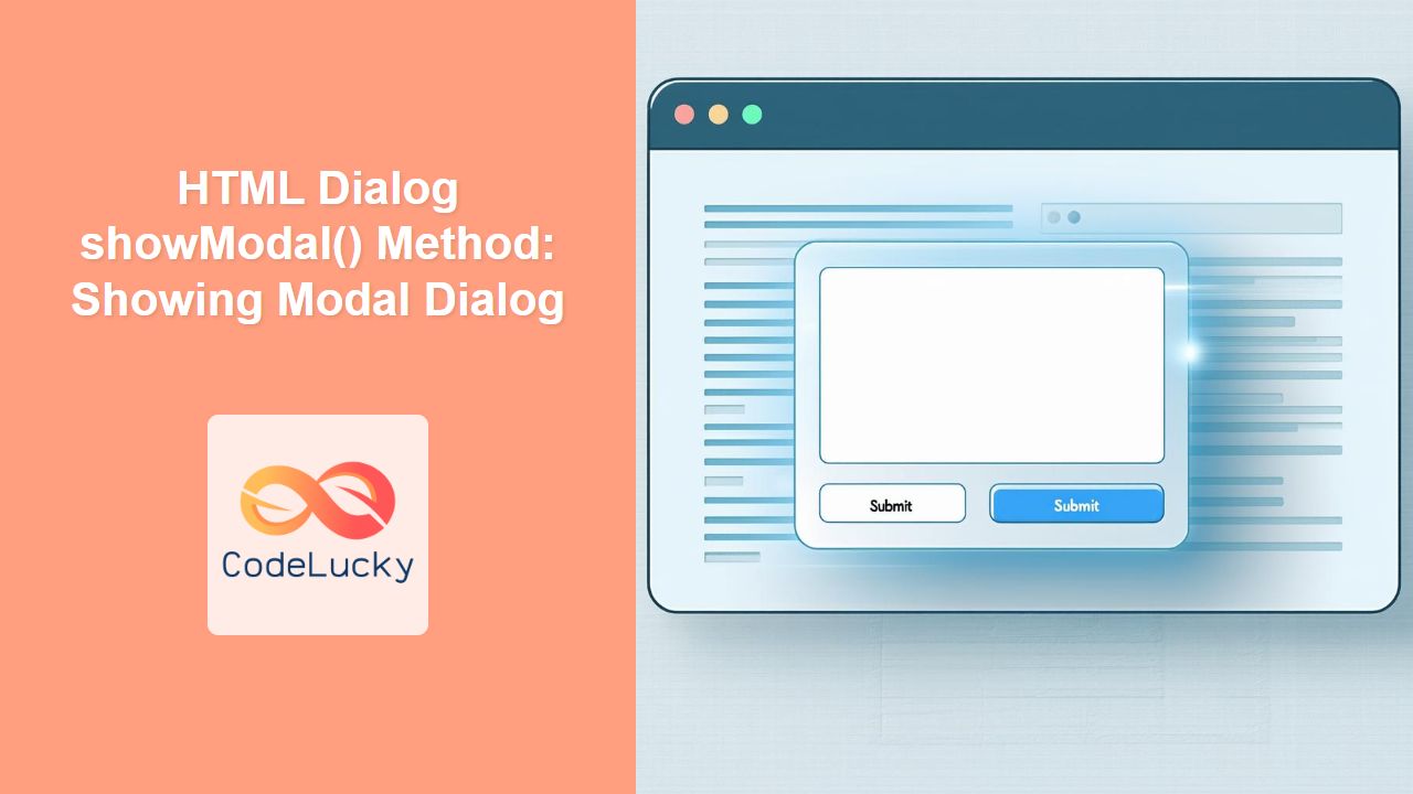
The HTML <dialog> element, combined with the showModal() method, provides a straightforward way to create modal dialogs in web applications. Modal dialogs are crucial for capturing user attention and ensuring they interact with critical information or actions before proceeding. This guide delves into the showModal() method, offering syntax details, attributes, and practical examples.
What is the showModal() Method?
The showModal() method of the HTML <dialog> element displays the dialog as a modal window. When a dialog is shown as modal:
- It appears on top of all other content.
- It prevents interaction with the rest of the page until the dialog is closed.
- It automatically manages focus, ensuring keyboard users can interact with the dialog content.
Purpose of the showModal() Method
The primary purpose of the showModal() method is to:
- Create a modal dialog that demands user interaction.
- Ensure the dialog is accessible by managing focus and keyboard interactions.
- Provide a standardized way to display dialogs, improving user experience across different browsers.
Syntax
The syntax for using the showModal() method is simple:
dialogElement.showModal();
Here, dialogElement is a reference to the HTML <dialog> element obtained using JavaScript.
Parameters
The showModal() method does not take any parameters.
Return Value
The showModal() method does not return any value. Its effect is to display the dialog modally.
Basic Usage
Let’s start with a basic example to illustrate how to use the showModal() method.
<dialog id="myDialog1">
    <p>This is a modal dialog!</p>
    <button id="closeBtn1">Close</button>
</dialog>

<button id="openBtn1">Open Dialog</button>

<script>
    const dialog1 = document.getElementById('myDialog1');
    const openBtn1 = document.getElementById('openBtn1');
    const closeBtn1 = document.getElementById('closeBtn1');

    openBtn1.addEventListener('click', () => {
        dialog1.showModal();
    });

    closeBtn1.addEventListener('click', () => {
        dialog1.close();
    });
</script>
In this example:
- A
<dialog>element with the IDmyDialog1is defined. - An “Open Dialog” button is used to trigger the
showModal()method. - A “Close” button inside the dialog triggers the
close()method to close the dialog.
When you click the “Open Dialog” button, the dialog will appear as a modal, preventing interaction with the rest of the page until it is closed.
Advanced Examples
Creating a Form Inside a Modal Dialog
Modal dialogs are often used to present forms for user input. Let’s create a dialog with a simple form.
<dialog id="myDialog2">
    <form method="dialog">
        <label for="name">Name:</label>
        <input type="text" id="name" name="name"><br><br>
        <button value="cancel">Cancel</button>
        <button value="default">Submit</button>
    </form>
</dialog>

<button id="openBtn2">Open Form Dialog</button>

<script>
    const dialog2 = document.getElementById('myDialog2');
    const openBtn2 = document.getElementById('openBtn2');

    openBtn2.addEventListener('click', () => {
        dialog2.showModal();
    });

    dialog2.addEventListener('close', () => {
        console.log('Dialog closed with value:', dialog2.returnValue);
    });
</script>
In this example:
- The
<dialog>element contains a<form>with input fields and buttons. - The
method="dialog"attribute on the form ensures that the dialog is closed when the form is submitted, and thereturnValueis set. - The
closeevent listener on the dialog logs thereturnValueto the console.
Using a Backdrop Click to Close the Dialog
You can add functionality to close the modal dialog when the backdrop (the area outside the dialog) is clicked.
<dialog id="myDialog3">
    <p>Click outside the dialog to close it.</p>
</dialog>

<button id="openBtn3">Open Backdrop Dialog</button>

<script>
    const dialog3 = document.getElementById('myDialog3');
    const openBtn3 = document.getElementById('openBtn3');

    openBtn3.addEventListener('click', () => {
        dialog3.showModal();
    });

    dialog3.addEventListener('click', (event) => {
        if (event.target === dialog3) {
            dialog3.close();
        }
    });
</script>
In this example:
- An event listener is added to the dialog to detect clicks.
- If the click target is the dialog itself (i.e., the backdrop), the dialog is closed.
Accessibility Considerations
When using the showModal() method, accessibility is automatically enhanced, but it’s important to keep the following in mind:
- Focus Management: The browser automatically manages focus within the modal, ensuring that tabbing stays within the dialog.
- Keyboard Support: Ensure that users can close the dialog using the Escape key.
- ARIA Attributes: Use ARIA attributes to further enhance accessibility, such as
aria-labelledbyto associate a label with the dialog.
Example: Enhancing Accessibility with ARIA Attributes and Escape Key
<dialog id="myDialog4" aria-labelledby="dialogTitle">
    <h2 id="dialogTitle">Confirmation</h2>
    <p>Are you sure you want to proceed?</p>
    <button id="confirmBtn4">Yes</button>
    <button id="cancelBtn4">No</button>
</dialog>

<button id="openBtn4">Open Confirmation Dialog</button>

<script>
    const dialog4 = document.getElementById('myDialog4');
    const openBtn4 = document.getElementById('openBtn4');
    const confirmBtn4 = document.getElementById('confirmBtn4');
    const cancelBtn4 = document.getElementById('cancelBtn4');

    openBtn4.addEventListener('click', () => {
        dialog4.showModal();
    });

    confirmBtn4.addEventListener('click', () => {
        console.log('Confirmed!');
        dialog4.close();
    });

    cancelBtn4.addEventListener('click', () => {
        console.log('Cancelled!');
        dialog4.close();
    });

    document.addEventListener('keydown', (event) => {
        if (event.key === 'Escape' && dialog4.open) {
            dialog4.close();
        }
    });
</script>
In this enhanced example:
- The dialog is given an
aria-labelledbyattribute that points to theh2element inside the dialog, providing an accessible name. - An event listener is added to the document to detect when the Escape key is pressed, closing the dialog if it is open.
Browser Support
The <dialog> element and the showModal() method are supported by all modern browsers:
- Chrome
- Edge
- Firefox
- Safari
- Opera
For older browsers, consider using a polyfill to ensure consistent behavior.
Conclusion
The showModal() method of the HTML <dialog> element is a powerful tool for creating accessible modal dialogs in web applications. By understanding its syntax, attributes, and accessibility considerations, you can effectively use modal dialogs to enhance user interaction and provide a better user experience.

