
Understanding the HTML Button autofocus Property
The autofocus property in HTML is a boolean attribute that, when present on an HTML <button> element, specifies that the button should automatically receive focus when the page loads. This feature enhances the user experience by directing the user’s attention to the button, especially in forms or dialogs where a specific action is primary.
Purpose of the autofocus Property
The primary goal of the autofocus property is to improve usability by:
- Directing the user’s attention to the most important action on page load.
- Reducing the need for users to manually click or tab to the button.
- Enhancing accessibility by making key actions immediately available.
Syntax
The autofocus property is a boolean attribute. Its presence indicates that the button should be focused on page load.
<button autofocus>Click Me</button>
This is equivalent to:
<button autofocus="autofocus">Click Me</button>
| Attribute | Value | Description |
|---|---|---|
| `autofocus` | `autofocus` (or no value) | Specifies that the button should automatically get focus when the page loads. |
Note: Only one element in a document should have the autofocus attribute to avoid confusing the user. ⚠️
Practical Examples
Let’s explore some practical examples of how to use the autofocus property in HTML buttons.
Basic Autofocus Example
In this basic example, a button is set to automatically gain focus when the page loads.
<!DOCTYPE html>
<html>
  <head>
    <title>Basic Autofocus Example</title>
  </head>
  <body>
    <button autofocus>Click Me First</button>
    <button>Click Me Second</button>
  </body>
</html>
When the page loads, the “Click Me First” button will automatically be focused, allowing the user to press Enter or Space to activate it without needing to click on it first.
Autofocus in a Form
Here’s how to use autofocus in a form to highlight the primary action.
<!DOCTYPE html>
<html>
  <head>
    <title>Autofocus in Form</title>
  </head>
  <body>
    <form>
      <label for="username">Username:</label>
      <input type="text" id="username" name="username" /><br /><br />
      <label for="password">Password:</label>
      <input type="password" id="password" name="password" /><br /><br />
      <button autofocus>Login</button>
      <button type="reset">Reset</button>
    </form>
  </body>
</html>
In this example, the “Login” button will be focused when the page loads, prompting the user to quickly submit the form after entering their credentials.
Autofocus in a Modal Dialog
Using autofocus in a modal dialog can direct the user’s attention to the primary action within the dialog.
<!DOCTYPE html>
<html>
  <head>
    <title>Autofocus in Modal Dialog</title>
    <style>
      .modal {
        display: none;
        position: fixed;
        top: 0;
        left: 0;
        width: 100%;
        height: 100%;
        background-color: rgba(0, 0, 0, 0.5);
        justify-content: center;
        align-items: center;
      }

      .modal-content {
        background-color: white;
        padding: 20px;
        border-radius: 5px;
      }

      .modal.show {
        display: flex;
      }
    </style>
  </head>
  <body>
    <button id="openModal">Open Modal</button>

    <div class="modal" id="myModal">
      <div class="modal-content">
        <h2>Confirmation</h2>
        <p>Are you sure you want to proceed?</p>
        <button autofocus>Yes, Proceed</button>
        <button id="closeModal">Cancel</button>
      </div>
    </div>

    <script>
      const openModalButton_auto = document.getElementById("openModal");
      const closeModalButton_auto = document.getElementById("closeModal");
      const modal_auto = document.getElementById("myModal");

      openModalButton_auto.addEventListener("click", () => {
        modal_auto.classList.add("show");
      });

      closeModalButton_auto.addEventListener("click", () => {
        modal_auto.classList.remove("show");
      });
    </script>
  </body>
</html>
When the modal dialog is opened, the “Yes, Proceed” button will automatically be focused, making it easy for the user to confirm the action.
Accessibility Considerations
- Use Sparingly: Only one element per page should have the
autofocusattribute. - Consider User Context: Ensure that autofocus does not disrupt the user’s workflow or cause accessibility issues for users with disabilities.
- Test with Assistive Technologies: Always test your implementation with screen readers and other assistive technologies to ensure a seamless experience.
Tips and Best Practices
- Avoid Overuse: Overusing
autofocuscan be disorienting for users. Reserve it for primary actions that benefit from immediate focus. - Ensure Logical Focus Order: The
autofocusattribute should not disrupt the natural tab order of elements on the page. - Provide Visual Cues: Ensure that the focused button has a clear visual indication, such as a border or background color change, to help users identify the active element.
Browser Support
The autofocus property is supported by all major browsers, including:
- Chrome
- Firefox
- Safari
- Edge
- Opera
Conclusion
The autofocus property in HTML buttons is a valuable tool for enhancing user experience and accessibility by directing the user’s attention to important actions on page load. When used thoughtfully and sparingly, it can significantly improve the usability of forms, dialogs, and other interactive elements. Always consider the user’s context and test with assistive technologies to ensure a seamless and inclusive experience. 🚀
Related Posts
HTML PushButton autofocus Property: Button Autofocus
HTML PushButton autofocus Property: Button Autofocus The HTML autofocus property, when applied to a <button> element, specifies that the button...
HTML Submit autofocus Property: Submit Button Autofocus
HTML Submit autofocus Property: Enhancing Form Usability The HTML autofocus attribute, when applied to a submit button, automatically sets the...
HTML Text autofocus Property: Text Input Autofocus
HTML Text autofocus Property: Text Input Autofocus Explained The HTML autofocus property is a boolean attribute that, when present, specifies...
HTML Select autofocus Property: Select Autofocus
HTML Select autofocus Property: Automatically Focus Dropdowns The autofocus property in HTML, when used with the <select> element, specifies that...
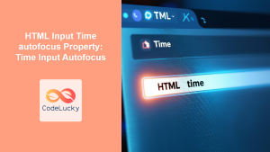
HTML Input Time autofocus Property: Time Input Autofocus
HTML Input Time autofocus Property: Time Input Autofocus The HTML Input Time autofocus property is a boolean attribute that, when...

HTML Email autofocus Property: Email Input Autofocus
HTML Email autofocus Property: Email Input Autofocus The HTML autofocus property is a boolean attribute that specifies whether an email...
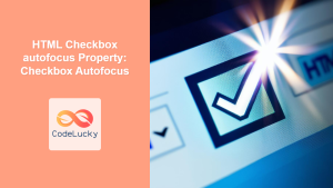
HTML Checkbox autofocus Property: Checkbox Autofocus
HTML Checkbox autofocus Property: Enhancing Form Accessibility The HTML autofocus property, when applied to a checkbox, automatically gives focus to...

HTML TextArea autofocus Property: Textarea Autofocus
HTML TextArea autofocus Property: A Comprehensive Guide The HTML <textarea> element is used to create multi-line text input controls, essential...
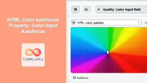
HTML Color autofocus Property: Color Input Autofocus
HTML Color autofocus Property: Color Input Autofocus The autofocus attribute in HTML is a boolean attribute that specifies that an...

JavaScript onfocus Event: Element Gained Focus
JavaScript onfocus Event: Detecting When an Element Gains Focus The JavaScript onfocus event is triggered when an element receives focus,...

HTML Element focus() Method: Focusing Element
HTML Element focus() Method: Focusing Element The focus() method in HTML is a powerful tool that allows you to programmatically...
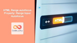
HTML Range autofocus Property: Range Input Autofocus
HTML Range autofocus Property: Range Input Autofocus The HTML autofocus property, when used with the <input type="range"> element, specifies that...


