Introduction
Have you ever wondered why some HTML elements stack vertically while others flow horizontally? Understanding the difference between block-level and inline elements is crucial for mastering HTML and CSS layout. These two categories of elements dictate how elements behave on a webpage, influencing everything from spacing to overall structure. Knowing their default behavior and how to manipulate them with CSS allows developers to create sophisticated and well-structured websites. This article will break down these concepts, offering clear explanations, practical examples, and best practices to empower both novice and seasoned web developers.
This topic matters because it's foundational to all web development work. Without a solid understanding of block and inline elements, you'll struggle to control the layout and spacing of your HTML elements. Furthermore, manipulating these elements using the CSS display property opens up a wide array of design possibilities, paving the way for advanced layouts such as flexbox and grid. This fundamental concept is vital for ensuring your web designs are predictable and adaptable to different screen sizes and devices.
Block-Level Elements
Block-level elements, such as <div>, <p>, <h1> to <h6>, <ul>, <ol>, <li> and <form>, always start on a new line and occupy the full width available to them. Think of them as building blocks of your web pages, each taking its own vertical space and pushing subsequent elements down. They respect their surrounding elements, and usually have vertical margins.
Default Behavior
By default, block elements are rectangular boxes that fill up the available horizontal space and typically use a full row in a document. They can contain other block elements and inline elements inside them, making them great for structuring your site content.
Common Examples
<p>(Paragraphs): Each paragraph will take up a new line and fill horizontal width.<div>(Division): A generic container for other elements, useful for creating sections or blocks within a page.<h1>–<h6>(Headings): Each heading will start on a new line and take the full width.<ul>,<ol>,<li>(Lists): List items and the lists themselves form block elements.<form>: Represents a form, starting on a new line.
Real-world Applications
Block-level elements are the workhorses of web layouts. They're used for headers, footers, navigation menus, paragraphs, and other large sections of content that require their own distinct space.
Inline Elements
Inline elements, like <span>, <a>, <img>, <strong>, and <em>, only take up as much width as necessary to fit their content and flow horizontally within a line. They do not force a new line and typically sit within a block-level element. They only occupy the necessary horizontal space and can have left and right margins but not vertical ones.
Default Behavior
By default, inline elements flow alongside each other, like words in a sentence. They respect the height of their containing block-level element. They do not influence the vertical layout of other elements in general.
Common Examples
<span>: A generic inline container for text or other inline elements, often used for styling.<a>(Links): Clickable links for navigation.<img>(Images): Images are inline elements (but can be set as block).<strong>and<em>: For emphasizing text.
Real-world Applications
Inline elements are often used for small details within text, like links, bolded words, or images within a paragraph. They allow for fine-grained control of formatting and content flow within blocks.
The display Property in CSS
The display property in CSS is key for controlling whether an element behaves as block, inline, or something else entirely. You can change the inherent behavior of any element using display.
display: block;
Setting an element's display to block forces it to behave like a block element, even if it was originally inline. This will make the element take up the full width available and start a new line.
display: inline;
Setting an element's display to inline forces it to behave like an inline element, making it only take up as much width as needed and flow within the line.
display: inline-block;
display: inline-block is a hybrid. It allows an element to behave inline by flowing horizontally, but also allows setting width and height like a block element. This is useful for horizontal navigation or items in a row.
Other Values
Other values of the display property include none (hides element), flex and grid, which are used to create advanced layout.
Practical Examples
Let’s dive into some code examples to see block and inline elements in action.
Example 1: Default Behavior
<!DOCTYPE html>
<html lang="en">
<head>
    <meta charset="UTF-8">
    <meta name="viewport" content="width=device-width, initial-scale=1.0">
    <title>Block and Inline Elements</title>
    <style>
        body {
            font-family: sans-serif;
        }
        .container{
          border: 2px solid blue;
        }
        .block-element{
            border: 1px solid green;
        }
        .inline-element{
            border: 1px solid red;
        }
    </style>
</head>
<body>
    <div class="container">
        <p class="block-element">This is a paragraph, a block-level element.</p>
        <h2 class="block-element">This is a heading, another block-level element.</h2>
        <span class="inline-element">This is a span, an inline element.</span>
        <a class="inline-element" href="#">This is a link, also an inline element.</a>
    </div>
</body>
</html>
In this example, the <p> and <h2> elements each occupy a full line, while the <span> and <a> elements flow inline.
Example 2: Changing Behavior with CSS
<!DOCTYPE html>
<html lang="en">
<head>
    <meta charset="UTF-8">
    <meta name="viewport" content="width=device-width, initial-scale=1.0">
    <title>Block and Inline Elements</title>
    <style>
        body {
            font-family: sans-serif;
        }
        .container{
          border: 2px solid blue;
        }
        .block-element{
            border: 1px solid green;
        }
        .inline-element{
            border: 1px solid red;
        }
        .make-inline {
            display: inline; /* forces the paragraph to act inline */
        }

        .make-block {
            display: block; /* forces the span to act like a block */
        }
         .make-inline-block {
            display: inline-block; /* forces the span to act like a inline block */
            width: 200px; /* Can be set like a block */
            height: 50px;  /* Can be set like a block */
            border: 1px solid black;
            text-align:center;
        }
    </style>
</head>
<body>
    <div class="container">
        <p class="block-element make-inline">This paragraph is set to display: inline;</p>
        <span class="inline-element make-block">This span is set to display: block;</span>
        <span class="inline-element make-inline-block">This span is set to display: inline-block;</span>
    </div>
</body>
</html>
Here, we use CSS to modify the display properties of elements, showing how you can change the default behavior with display property.
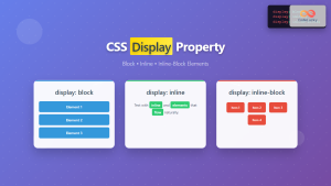
Diagrammatic Example
Best Practices and Tips
- Semantic HTML: Use the right HTML element for the correct content. Block elements should be used for sections and content blocks, while inline elements should be used within the text.
- CSS for Layout: Use CSS, particularly the
displayproperty to control layout and spacing, rather than relying on the default behavior of elements. - Understanding Context: Consider the context of your elements and how they interact with their parents.
- Cross-browser Compatibility: Test your layouts in different browsers to ensure they display as expected.
- Responsive Design: Use media queries to adapt layouts for various screen sizes. The
displayproperty, often used withflexandgridmakes responsive design more manageable. - Debugging: Use your browser's developer tools to inspect elements and their display properties to troubleshoot layout problems.
Conclusion
Understanding the distinction between block and inline elements is a cornerstone of front-end development. With a firm grasp on their default behavior and the power of the CSS display property, you can achieve fine-grained control over the structure and layout of your websites. This knowledge is essential for building complex interfaces and ensuring consistent, responsive designs across various devices. Remember to apply the best practices, always consider the semantic usage of the element, and use developer tools to diagnose and fix layout issues. You're now equipped to handle these foundational concepts, making your code more robust and flexible.

