
CSS Custom Properties, commonly known as CSS variables, revolutionized how we write maintainable and dynamic stylesheets. The var() function serves as the gateway to accessing these variables, providing powerful features like fallback values and inheritance that make your CSS more robust and flexible.
Understanding CSS Variables and the var() Function
CSS variables are custom properties that allow you to store values and reuse them throughout your stylesheet. Unlike preprocessor variables (Sass, Less), CSS variables are dynamic and can be modified at runtime using JavaScript, making them incredibly powerful for creating interactive and responsive designs.
Basic Syntax and Declaration
CSS variables are declared using the double-dash prefix (--) and accessed using the var() function:
/* Declaration */
:root {
  --primary-color: #3498db;
  --font-size: 16px;
  --margin: 20px;
}

/* Usage */
.element {
  color: var(--primary-color);
  font-size: var(--font-size);
  margin: var(--margin);
}
Interactive Example: Basic CSS Variables
Code:
.demo {
  --demo-color: #e74c3c;
  --demo-size: 18px;
}

.card {
  background: var(--demo-color);
  font-size: var(--demo-size);
}

.card:hover {
  --demo-color: #c0392b;
}
The var() Function Syntax
The var() function accepts two parameters:
var(custom-property-name, fallback-value)- custom-property-name: The name of the CSS custom property (required)
- fallback-value: The value to use if the custom property is not defined (optional)
Fallback Values: Your Safety Net
Fallback values are crucial for creating robust CSS that gracefully handles missing or undefined variables. They provide a default value when the primary variable is unavailable:
/* Simple fallback */
.element {
  color: var(--primary-color, #333);
  font-size: var(--font-size, 16px);
}

/* Nested fallbacks */
.element {
  color: var(--theme-color, var(--brand-color, #000));
}

/* Complex fallback with calculations */
.element {
  width: var(--container-width, calc(100% - 40px));
}
Interactive Fallback Demonstration
Code:
/* Fallback examples */
.box-1 {
  background: var(--undefined-color, #27ae60);
}

.box-2 {
  --defined-color: #8e44ad;
  background: var(--defined-color, #27ae60);
}

.box-3 {
  background: var(--missing-primary, var(--missing-secondary, #e67e22));
}
Variable Inheritance and Scope
CSS variables follow the cascade and inheritance rules, making them incredibly flexible for creating theme systems and component-based designs.
Global vs Local Variables
/* Global variables (available everywhere) */
:root {
  --global-color: #333;
  --global-font: 'Arial, sans-serif';
}

/* Local variables (scoped to specific elements) */
.card {
  --local-padding: 20px;
  --local-shadow: 0 2px 4px rgba(0,0,0,0.1);

  padding: var(--local-padding);
  box-shadow: var(--local-shadow);
  color: var(--global-color); /* Inherits from :root */
}

.card.large {
  --local-padding: 30px; /* Overrides parent value */
}
Inheritance Example
Container Level: Uses container variables
Parent Level: Defines new variables
Code:
.container {
  --demo-bg: #ecf0f1;
  --demo-text: #2c3e50;
}

.parent {
  --demo-bg: #3498db;
  --demo-text: white;
  background: var(--demo-bg);
  color: var(--demo-text);
}

.child {
  /* Inherits from parent */
  background: var(--demo-bg);
  color: var(--demo-text);
}

.child.override {
  --demo-bg: #e74c3c; /* Overrides */
}
Advanced Usage Patterns
Dynamic Theming
CSS variables excel at creating dynamic themes that can be switched at runtime:
Dynamic Theme Example
This demo showcases how CSS variables enable seamless theme switching.
Code:
/* Light theme (default) */
.theme-container {
  --primary: #007bff;
  --background: #ffffff;
  --text: #212529;
}

/* Dark theme */
.theme-container.dark {
  --primary: #0d6efd;
  --background: #212529;
  --text: #ffffff;
}

/* Components use variables */
.btn {
  background: var(--primary);
  color: var(--background);
}
Responsive Design with CSS Variables
CSS variables work seamlessly with media queries, enabling responsive design patterns:
:root {
  --container-padding: 15px;
  --font-size: 14px;
  --grid-columns: 1;
}

@media (min-width: 768px) {
  :root {
    --container-padding: 30px;
    --font-size: 16px;
    --grid-columns: 2;
  }
}

@media (min-width: 1200px) {
  :root {
    --container-padding: 40px;
    --font-size: 18px;
    --grid-columns: 3;
  }
}

.container {
  padding: var(--container-padding);
  font-size: var(--font-size);
  display: grid;
  grid-template-columns: repeat(var(--grid-columns), 1fr);
}
Calculations with CSS Variables
CSS variables integrate perfectly with the calc() function for dynamic calculations:
20px
1.5
10px
Code:
.element {
  --base-size: 20px;
  --multiplier: 1.5;
  --gap: 10px;

  width: calc(var(--base-size) * var(--multiplier) * 4);
  height: calc(var(--base-size) * var(--multiplier) * 2);
  margin: calc(var(--gap) * 2);
  padding: calc(var(--gap) / 2);
}
Best Practices and Performance Tips
Naming Conventions
Establish consistent naming conventions for your CSS variables to improve maintainability:
/* Good naming practices */
:root {
  /* Color system */
  --color-primary: #007bff;
  --color-secondary: #6c757d;
  --color-success: #28a745;
  --color-danger: #dc3545;

  /* Typography */
  --font-family-base: -apple-system, BlinkMacSystemFont, 'Segoe UI', Roboto;
  --font-size-sm: 0.875rem;
  --font-size-base: 1rem;
  --font-size-lg: 1.25rem;

  /* Spacing */
  --spacing-xs: 0.25rem;
  --spacing-sm: 0.5rem;
  --spacing-md: 1rem;
  --spacing-lg: 1.5rem;
  --spacing-xl: 3rem;

  /* Breakpoints */
  --breakpoint-sm: 576px;
  --breakpoint-md: 768px;
  --breakpoint-lg: 992px;
}
Error Handling and Validation
Always provide meaningful fallback values and consider edge cases:
/* Robust error handling */
.component {
  /* Always provide fallbacks for critical properties */
  color: var(--text-color, #333);
  background: var(--bg-color, #fff);

  /* Validate numeric values */
  font-size: var(--font-size, 1rem);
  margin: var(--margin, 0);

  /* Handle complex fallbacks */
  border: var(--border-width, 1px) solid var(--border-color, #ddd);

  /* Nested fallbacks for theme systems */
  box-shadow: var(--component-shadow, var(--global-shadow, none));
}
Performance Considerations
While CSS variables are performant, following these guidelines ensures optimal performance:
- Define variables at the appropriate scope: Use
:rootfor global variables, component-level for local ones - Minimize deep nesting: Avoid excessive inheritance chains that can impact performance
- Use meaningful fallbacks: Provide fallbacks that maintain visual consistency
- Leverage browser caching: CSS variables are cached efficiently by modern browsers
Browser Support and Compatibility
CSS Custom Properties have excellent browser support across all modern browsers:
- Chrome: 49+ (March 2016)
- Firefox: 31+ (July 2014)
- Safari: 9.1+ (March 2016)
- Edge: 16+ (October 2017)
For legacy browser support, consider using PostCSS plugins or CSS preprocessors as fallbacks, though the need for this decreases as browser support improves.
Common Pitfalls and Troubleshooting
Invalid Property Names
/* ❌ Invalid - doesn't start with -- */
.element {
  primary-color: #007bff;
  color: var(primary-color); /* Won't work */
}

/* ✅ Valid */
.element {
  --primary-color: #007bff;
  color: var(--primary-color);
}
Scope Issues
/* ❌ Variable not accessible outside its scope */
.parent {
  --local-var: #007bff;
}

.sibling {
  color: var(--local-var); /* Undefined - not inherited */
}

/* ✅ Use appropriate scope */
.container {
  --shared-var: #007bff;
}

.container .child1,
.container .child2 {
  color: var(--shared-var); /* Inherited from container */
}
Conclusion
CSS variables and the var() function represent a fundamental shift in how we approach CSS architecture. They provide the flexibility of preprocessor variables with the dynamic capabilities of runtime modification, making them essential tools for modern web development.
Key takeaways for mastering CSS variables:
- Always use fallback values to ensure robust designs
- Leverage inheritance to create scalable design systems
- Combine with calc() for dynamic calculations
- Follow naming conventions for maintainable codebases
- Consider scope carefully when defining variables
By mastering these concepts, you’ll be able to create more maintainable, flexible, and dynamic stylesheets that adapt to changing requirements and provide excellent user experiences across all devices and themes.
Related Posts

CSS Variable Declaration: Master :root and Local Scope for Better Styling
CSS Variables, also known as CSS Custom Properties, revolutionize how we manage and reuse values in our stylesheets. Understanding variable...

CSS Custom Properties: Complete Guide to CSS Variables and Dynamic Styling
CSS Custom Properties, commonly known as CSS Variables, revolutionize how we write and maintain stylesheets by introducing dynamic values that...
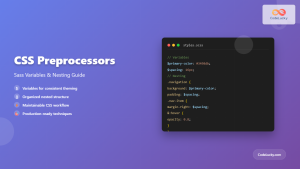
CSS Preprocessors: Sass Variables and Nesting – Complete Guide for Modern Web Development
CSS preprocessors have revolutionized how developers write and maintain stylesheets. Among the most popular preprocessors, Sass (Syntactically Awesome StyleSheets) stands...
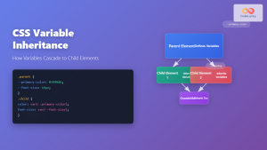
CSS Variable Inheritance: Complete Guide to Cascading Custom Properties
CSS variables, also known as custom properties, revolutionized how we write maintainable stylesheets. One of their most powerful features is...

CSS Style cssText Property: CSS Text
CSS Style cssText Property: Comprehensive Guide The CSS cssText property in JavaScript is a powerful way to get or set...

CSS Syntax: Complete Guide to Rules, Selectors, Properties and Values
CSS (Cascading Style Sheets) is the cornerstone of web design, transforming plain HTML into visually stunning websites. Understanding CSS syntax...

HTML style Property: Element Style
HTML style Property: Element Style The HTML style property allows you to apply inline CSS styles directly to individual HTML...

CSS Style background Property: CSS Background
CSS background Property: A Comprehensive Guide to Styling Web Page Backgrounds The CSS background property is a versatile shorthand property...
CSS Style color Property: CSS Color
Understanding the CSS color Property: A Comprehensive Guide The CSS color property is fundamental for styling web pages. It specifies...

JavaScript var Keyword: Declaring Variables
JavaScript var Keyword: Declaring Variables In JavaScript, the var keyword is used to declare variables. Understanding how var works is...

JavaScript CSSStyleDeclaration Object: CSS Style Manipulation
JavaScript CSSStyleDeclaration Object: CSS Style Manipulation The CSSStyleDeclaration object in JavaScript represents a collection of CSS properties applied to an...

CSS Attribute Selectors: Master Targeting Elements by Attribute Values
What Are CSS Attribute Selectors? CSS attribute selectors allow you to target HTML elements based on their attributes and attribute...


