CSS transformOrigin Property: Mastering Element Transformation Origins
The transformOrigin property in CSS is a fundamental tool for controlling how transformations (like rotate, scale, translate, and skew) are applied to an element. By specifying the origin point, you define the center around which these transformations occur, allowing for precise and creative visual effects. This comprehensive guide will explore the syntax, values, and practical examples of the transformOrigin property, empowering you to master element transformations in your web projects.
What is the transformOrigin Property?
The transformOrigin property sets the origin for an element’s transformations. The origin is the point around which a transformation is applied. If you don’t set this property, the origin will be the center of the element by default.
Purpose of the transformOrigin Property
The primary purpose of the transformOrigin property is to:
- Control the point around which an element rotates, scales, or skews.
- Create diverse and visually appealing effects by changing the transformation origin.
- Achieve precise transformations tailored to specific design requirements.
- Allows complex and creative animations.
Syntax of transformOrigin
The transformOrigin property accepts one, two, or three values. The values represent the x-coordinate, y-coordinate, and (optionally) z-coordinate of the transformation origin.
transform-origin: x-offset | y-offset | z-offset;
transform-origin: x-offset | y-offset;
transform-origin: x-offset; /* y-offset defaults to 'center' */
Possible Values
| Value | Description |
|---|---|
| `x-offset` | Specifies the horizontal (x-axis) coordinate of the origin. Can be a length (e.g., `10px`, `50%`, `2em`), or a keyword (`left`, `center`, `right`). |
| `y-offset` | Specifies the vertical (y-axis) coordinate of the origin. Can be a length (e.g., `10px`, `50%`, `2em`), or a keyword (`top`, `center`, `bottom`). |
| `z-offset` | Specifies the depth (z-axis) coordinate of the origin. Can only be a length (e.g., `10px`, `50px`). Only applicable for 3D transforms. |
| `top`, `left`, `center`, `bottom`, `right` | Keywords that specify common positions for the origin. |
| `length` | A numeric value (with or without a unit) that specifies the offset from the top-left corner. |
| `percentage` | A percentage value that specifies the offset relative to the element’s dimensions. |
| `initial` | Sets this property to its default value. |
| `inherit` | Inherits this property from its parent element. |
Default Value
The default value of transformOrigin is center. This means that, by default, transformations are applied from the center of the element.
Examples of transformOrigin
Let’s dive into some practical examples to illustrate how the transformOrigin property works.
Basic Example: Rotating with Different Origins
This example demonstrates how changing the transformOrigin affects the rotation of a square.
<!DOCTYPE html>
<html>
  <head>
    <title>transformOrigin Example</title>
    <style>
      .square {
        width: 100px;
        height: 100px;
        background-color: lightblue;
        border: 1px solid black;
        margin: 20px;
        transition: transform 0.5s ease-in-out;
      }

      .square:hover {
        transform: rotate(45deg);
      }

      .origin-top-left {
        transform-origin: top left;
      }

      .origin-top-right {
        transform-origin: top right;
      }

      .origin-bottom-left {
        transform-origin: bottom left;
      }

      .origin-bottom-right {
        transform-origin: bottom right;
      }
    </style>
  </head>
  <body>
    <div class="square origin-top-left">Top Left</div>
    <div class="square origin-top-right">Top Right</div>
    <div class="square origin-bottom-left">Bottom Left</div>
    <div class="square origin-bottom-right">Bottom Right</div>
  </body>
</html>
In this example, hovering over each square applies a 45-degree rotation. Each square has a different transformOrigin, resulting in distinct rotation behaviors.
Rotating an Element Around a Custom Point
You can also use pixel or percentage values to set a custom transformation origin:
<!DOCTYPE html>
<html>
  <head>
    <title>Custom transformOrigin Example</title>
    <style>
      .square-custom {
        width: 100px;
        height: 100px;
        background-color: lightcoral;
        border: 1px solid black;
        margin: 20px;
        transition: transform 0.5s ease-in-out;
        transform-origin: 30px 70px; /* Custom origin */
      }

      .square-custom:hover {
        transform: rotate(45deg);
      }
    </style>
  </head>
  <body>
    <div class="square-custom">Custom Origin</div>
  </body>
</html>
Here, the transformOrigin is set to 30px 70px, causing the square to rotate around that specific point.
Example: Scaling with Different Transform Origins
This demonstrates how the scaling behavior changes based on the transform origin.
<!DOCTYPE html>
<html>
  <head>
    <title>Scaling transformOrigin Example</title>
    <style>
      .scale-box {
        width: 100px;
        height: 100px;
        background-color: lightgreen;
        border: 1px solid black;
        margin: 20px;
        transition: transform 0.3s ease-in-out;
      }

      .scale-box:hover {
        transform: scale(1.5);
      }

      .scale-top-left {
        transform-origin: top left;
      }

      .scale-center {
        transform-origin: center;
      }
    </style>
  </head>
  <body>
    <div class="scale-box scale-top-left">Scale Top Left</div>
    <div class="scale-box scale-center">Scale Center</div>
  </body>
</html>
The Scale Top Left box scales from its top-left corner, while the Scale Center box scales from its center.
Using transformOrigin with 3D Transforms
For 3D transforms, you can specify a z-axis value for the transformOrigin.
<!DOCTYPE html>
<html>
  <head>
    <title>3D transformOrigin Example</title>
    <style>
      .cube {
        width: 100px;
        height: 100px;
        background-color: lightskyblue;
        border: 1px solid black;
        margin: 50px;
        transform-style: preserve-3d;
        transition: transform 1s ease-in-out;
      }

      .cube:hover {
        transform: rotateX(60deg) rotateY(60deg);
      }

      .origin-3d {
        transform-origin: 50% 50% 50px;
      }
    </style>
  </head>
  <body>
    <div class="cube origin-3d">3D Cube</div>
  </body>
</html>
Here, transform-style: preserve-3d is crucial for enabling 3D transformations. The transformOrigin is set with a z-axis offset of 50px.
Real-World Applications of transformOrigin
The transformOrigin property is utilized in a variety of scenarios, including:
- Interactive UI Elements: Creating engaging hover effects on buttons and menus.
- Animation Effects: Building complex animations with precise control over element movements.
- Image Galleries: Implementing creative transitions and scaling effects in image galleries.
- Data Visualization: Enhancing charts and graphs with dynamic transformations.
- Game Development: Animating game characters and environments.
Browser Support
The transformOrigin property is widely supported across modern web browsers. Here’s a general overview:
- Chrome: Supported
- Edge: Supported
- Firefox: Supported
- Safari: Supported
- Opera: Supported
- iOS Safari: Supported
- Android Browser: Supported
Always test your implementations across different browsers to ensure compatibility and consistent rendering. 🧐
Tips and Best Practices
- Understand the Coordinate System: The
transformOriginis relative to the element’s box model. - Use Keywords for Simplicity:
top,left,center,bottom, andrightcan simplify common origin placements. - Combine with Transitions and Animations: Use CSS transitions and animations to create smooth and dynamic effects.
- Test Thoroughly: Always test your transformations in different browsers to ensure consistent behavior.
- Consider Performance: Complex transformations can impact performance, so optimize your code and use hardware acceleration where possible.
Conclusion
The transformOrigin property is a vital tool for achieving precise and creative transformations in CSS. By mastering its syntax, values, and practical applications, you can create visually stunning and engaging web experiences. Experiment with different values and combinations to unlock the full potential of element transformations in your projects. Happy styling! 🎨
Related Posts
CSS Style transform Property: CSS Transform
CSS transform Property: A Comprehensive Guide The CSS transform property is a powerful tool that allows you to modify the...
CSS Transform-Origin: Master Element Transformation Reference Points
The transform-origin property is a powerful CSS feature that determines the reference point for element transformations. Whether you're rotating, scaling,...
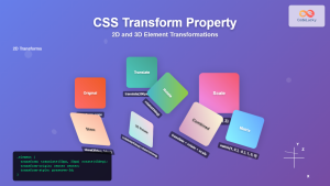
CSS Transform Property: Complete Guide to 2D and 3D Element Transformations
The CSS transform property is one of the most powerful tools in modern web development, allowing developers to manipulate HTML...
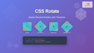
CSS Rotate: Complete Guide to Rotating Elements with Transform
CSS rotation is one of the most powerful and visually striking transformation effects available to web developers. The transform: rotate()...
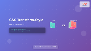
CSS Transform-Style: Complete Guide to Flat vs Preserve-3d for 3D Transformations
The CSS transform-style property is a powerful tool that controls how child elements are rendered in 3D space when their...

CSS Skew: Distorting Elements Along Axes for Dynamic Visual Effects
CSS skew transforms allow you to distort elements by slanting them along the X and Y axes, creating dynamic visual...

CSS perspective Property: CSS Perspective
Understanding the CSS perspective Property The CSS perspective property allows you to give a 3D-positioned element some perspective. It defines...
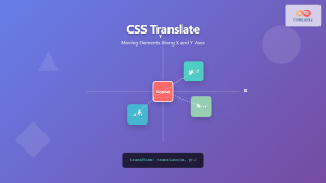
CSS Translate: Complete Guide to Moving Elements Along X and Y Axes
The CSS translate() function is one of the most powerful and versatile tools for moving elements on a webpage. Unlike...

CSS position Property: Mastering Layouts in CSS
Understanding the CSS position Property: A Comprehensive Guide The position property in CSS is a fundamental tool for controlling the...

CSS Style perspectiveOrigin Property: CSS Perspective Origin
CSS perspective-origin Property: A Comprehensive Guide The perspective-origin property in CSS is used to set the vanishing point for 3D...
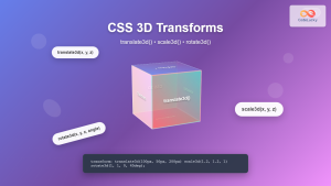
CSS 3D Transforms: Complete Guide to Translate3d, Scale3d, and Rotate3d Functions
CSS 3D transforms revolutionize how we create interactive and visually stunning web interfaces. By utilizing the power of translate3d(), scale3d(),...
CSS Style transition Property: CSS Transition
CSS transition Property: A Comprehensive Guide The CSS transition property is a powerful tool for creating smooth animations when CSS...


