CSS transform Property: A Comprehensive Guide
The CSS transform property is a powerful tool that allows you to modify the coordinate space of visual formatting. It enables you to rotate, scale, skew, and translate elements, creating dynamic and visually appealing effects on your web pages. This guide will walk you through the intricacies of the transform property, including its syntax, values, and practical examples.
What is the CSS transform Property?
The transform property in CSS applies a 2D or 3D transformation to an element. This is done without disrupting the normal document flow, meaning the transformed element may overlap other elements, or have other elements overlap it. Transformations can be used to create animations, visual effects, and interactive elements on a webpage.
Purpose of the transform Property
The main purposes of the transform property are to:
- Modify Element Appearance: Alter the shape, size, and orientation of elements.
- Create Visual Effects: Produce dynamic and engaging visual effects.
- Enhance User Experience: Add interactive and animated elements to improve user interaction.
- Implement Complex Layouts: Achieve complex layouts and designs that are otherwise difficult to create.
Syntax and Values
The transform property accepts a list of transform functions, which are applied in the order they appear. Here’s the basic syntax:
transform: transform-function1 transform-function2 ...;
Here’s a table of commonly used transform values and their descriptions:
| Value | Description |
|---|---|
| `none` | Specifies that no transformation should be applied. This is the default value. |
| `matrix(a, b, c, d, tx, ty)` | Defines a 2D transformation using a 6-value transformation matrix. |
| `translate(tx, ty)` | Moves the element along the X and Y axes. |
| `translateX(tx)` | Moves the element along the X axis. |
| `translateY(ty)` | Moves the element along the Y axis. |
| `scale(sx, sy)` | Changes the size of the element. |
| `scaleX(sx)` | Changes the width of the element. |
| `scaleY(sy)` | Changes the height of the element. |
| `rotate(angle)` | Rotates the element clockwise around its origin. |
| `skew(ax, ay)` | Skews the element along the X and Y axes. |
| `skewX(ax)` | Skews the element along the X axis. |
| `skewY(ay)` | Skews the element along the Y axis. |
| `perspective(length)` | Specifies the distance from the user to the z=0 plane. Used for 3D transformations. |
| `translateZ(tz)` | Moves the element along the Z axis. |
| `translate3d(tx, ty, tz)` | Moves the element in 3D space. |
| `scaleZ(sz)` | Changes the scale of the element along the Z axis. |
| `scale3d(sx, sy, sz)` | Changes the size of the element in 3D space. |
| `rotateX(angle)` | Rotates the element around the X axis. |
| `rotateY(angle)` | Rotates the element around the Y axis. |
| `rotateZ(angle)` | Rotates the element around the Z axis. |
| `rotate3d(x, y, z, angle)` | Rotates the element in 3D space. |
| `matrix3d(a1, b1, c1, d1, a2, b2, c2, d2, a3, b3, c3, d3, a4, b4, c4, d4)` | Defines a 3D transformation using a 16-value transformation matrix. |
Basic 2D Transformations
Translate
The translate() function moves an element from its current position.
<div id="translateExample" style="width: 100px; height: 100px; background-color: lightblue; position: relative;">
  Original
</div>

<div id="translateTransformed" style="width: 100px; height: 100px; background-color: lightblue; position: relative; transform: translate(50px, 20px);">
  Transformed
</div>

<style>
  #translateTransformed {
    margin-top: 20px;
  }
</style>
const translateElement = document.getElementById('translateExample');
const translateTransformedElement = document.getElementById('translateTransformed');
Rotate
The rotate() function rotates an element clockwise.
<div id="rotateExample" style="width: 100px; height: 100px; background-color: lightgreen;">
  Original
</div>

<div id="rotateTransformed" style="width: 100px; height: 100px; background-color: lightgreen; transform: rotate(45deg); margin-top: 20px;">
  Transformed
</div>
const rotateElement = document.getElementById('rotateExample');
const rotateTransformedElement = document.getElementById('rotateTransformed');
Scale
The scale() function changes the size of an element.
<div id="scaleExample" style="width: 50px; height: 50px; background-color: lightcoral;">
  Original
</div>

<div id="scaleTransformed" style="width: 50px; height: 50px; background-color: lightcoral; transform: scale(2, 1.5); margin-top: 20px;">
  Transformed
</div>
const scaleElement = document.getElementById('scaleExample');
const scaleTransformedElement = document.getElementById('scaleTransformed');
Skew
The skew() function skews an element along the X and Y axes.
<div id="skewExample" style="width: 100px; height: 100px; background-color: lightseagreen;">
  Original
</div>

<div id="skewTransformed" style="width: 100px; height: 100px; background-color: lightseagreen; transform: skew(20deg, 10deg); margin-top: 20px;">
  Transformed
</div>
const skewElement = document.getElementById('skewExample');
const skewTransformedElement = document.getElementById('skewTransformed');
3D Transformations
To enable 3D transformations, you might need to set a perspective value on the parent element.
RotateX
The rotateX() function rotates an element around the X axis.
<div id="perspectiveContainerX" style="perspective: 300px;">
  <div id="rotateXExample" style="width: 100px; height: 100px; background-color: plum; transform-style: preserve-3d;">
    Original
  </div>
</div>

<div id="perspectiveContainerXTransformed" style="perspective: 300px; margin-top: 20px;">
  <div id="rotateXTransformed" style="width: 100px; height: 100px; background-color: plum; transform: rotateX(60deg); transform-style: preserve-3d;">
    Transformed
  </div>
</div>
const rotateXElement = document.getElementById('rotateXExample');
const rotateXTransformedElement = document.getElementById('rotateXTransformed');
RotateY
The rotateY() function rotates an element around the Y axis.
<div id="perspectiveContainerY" style="perspective: 300px;">
  <div id="rotateYExample" style="width: 100px; height: 100px; background-color: thistle; transform-style: preserve-3d;">
    Original
  </div>
</div>

<div id="perspectiveContainerYTransformed" style="perspective: 300px; margin-top: 20px;">
  <div id="rotateYTransformed" style="width: 100px; height: 100px; background-color: thistle; transform: rotateY(60deg); transform-style: preserve-3d;">
    Transformed
  </div>
</div>
const rotateYElement = document.getElementById('rotateYExample');
const rotateYTransformedElement = document.getElementById('rotateYTransformed');
RotateZ
The rotateZ() function rotates an element around the Z axis. Note that rotateZ behaves similarly to rotate in 2D transformations.
<div id="perspectiveContainerZ" style="perspective: 300px;">
  <div id="rotateZExample" style="width: 100px; height: 100px; background-color: lightblue; transform-style: preserve-3d;">
    Original
  </div>
</div>

<div id="perspectiveContainerZTransformed" style="perspective: 300px; margin-top: 20px;">
  <div id="rotateZTransformed" style="width: 100px; height: 100px; background-color: lightblue; transform: rotateZ(60deg); transform-style: preserve-3d;">
    Transformed
  </div>
</div>
const rotateZElement = document.getElementById('rotateZExample');
const rotateZTransformedElement = document.getElementById('rotateZTransformed');
Combining Transformations
You can combine multiple transform functions to create more complex effects.
<div id="combineExample" style="width: 100px; height: 100px; background-color: orange;">
  Original
</div>

<div id="combineTransformed" style="width: 100px; height: 100px; background-color: orange; transform: translate(50px, 20px) rotate(45deg) scale(1.2); margin-top: 20px;">
  Transformed
</div>
const combineElement = document.getElementById('combineExample');
const combineTransformedElement = document.getElementById('combineTransformed');
Note: The order of transformations matters. Transformations are applied in the order they are listed. 💡
Real-World Applications of the transform Property
The transform property is used in various real-world applications, including:
- Animations: Creating dynamic animations for user interface elements.
- Image Galleries: Implementing image carousels and galleries with smooth transitions.
- Interactive Elements: Designing interactive elements that respond to user actions.
- Data Visualization: Enhancing data visualization with dynamic transformations.
Browser Support
The transform property is well-supported across modern browsers. However, it’s always a good practice to check for compatibility and provide fallbacks if necessary.
Note: For older browsers, you might need to use vendor prefixes such as -webkit-, -moz-, -ms-, and -o- to ensure compatibility. 🧐
Conclusion
The CSS transform property is a versatile and powerful tool for manipulating elements on a web page. By understanding its syntax, values, and applications, you can create visually stunning and engaging user experiences. Whether you’re creating simple animations or complex 3D transformations, the transform property offers a wide range of possibilities. Happy styling! 🎉
Related Posts
CSS Style transformOrigin Property: CSS Transform Origin
CSS transformOrigin Property: Mastering Element Transformation Origins The transformOrigin property in CSS is a fundamental tool for controlling how transformations...
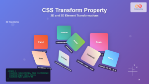
CSS Transform Property: Complete Guide to 2D and 3D Element Transformations
The CSS transform property is one of the most powerful tools in modern web development, allowing developers to manipulate HTML...
CSS Style textTransform Property: CSS Text Transform
CSS text-transform Property: A Comprehensive Guide The text-transform property in CSS is used to control the capitalization of text. It...
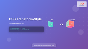
CSS Transform-Style: Complete Guide to Flat vs Preserve-3d for 3D Transformations
The CSS transform-style property is a powerful tool that controls how child elements are rendered in 3D space when their...
CSS Style transition Property: CSS Transition
CSS transition Property: A Comprehensive Guide The CSS transition property is a powerful tool for creating smooth animations when CSS...
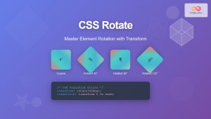
CSS Rotate: Complete Guide to Rotating Elements with Transform
CSS rotation is one of the most powerful and visually striking transformation effects available to web developers. The transform: rotate()...

CSS position Property: Mastering Layouts in CSS
Understanding the CSS position Property: A Comprehensive Guide The position property in CSS is a fundamental tool for controlling the...

CSS display Property: CSS Display
Understanding the CSS display Property: A Comprehensive Guide The display property in CSS is a cornerstone for controlling the layout...

CSS Style float Property: CSS Float
CSS float Property: A Comprehensive Guide The CSS float property is a fundamental tool for controlling the layout of elements...
CSS Resize Property: Controlling Element Resizability
Understanding the CSS Resize Property: Controlling Element Resizability The resize property in CSS allows you to control whether (and how)...
CSS Translate: Complete Guide to Moving Elements Along X and Y Axes
The CSS translate() function is one of the most powerful and versatile tools for moving elements on a webpage. Unlike...

CSS perspective Property: CSS Perspective
Understanding the CSS perspective Property The CSS perspective property allows you to give a 3D-positioned element some perspective. It defines...


