
Understanding the CSS maxWidth Property
The CSS maxWidth property is a fundamental tool in web development for controlling the maximum width of an element. It ensures that an element does not exceed a specified width, even if the available space would otherwise allow it to expand. This property is particularly useful in creating responsive layouts, preventing content from becoming too wide on larger screens and maintaining readability.
Purpose of maxWidth
The primary purpose of the maxWidth property is to:
- Prevent elements from becoming excessively wide on larger screens.
- Maintain readability and visual appeal by constraining content width.
- Enable flexible and responsive layouts that adapt to different screen sizes.
- Ensure a consistent user experience across various devices.
Syntax of the maxWidth Property
The maxWidth property is specified using the following syntax:
element {
  max-width: value;
}
Possible Values
The maxWidth property accepts several values, each serving a unique purpose:
| Value | Description |
|---|---|
| `none` | Specifies that there is no maximum width. The element can expand to fill available space. This is the default value. |
| `length` | Specifies the maximum width as a fixed value, such as `px`, `em`, `rem`, `vw`, or `vh`. For example: `200px`, `10em`, `50vw`. |
| `percentage` | Specifies the maximum width as a percentage of the containing block’s width. For example: `50%`, `75%`, `100%`. |
| `initial` | Sets the property to its default value, which is `none`. |
| `inherit` | Inherits the `maxWidth` value from its parent element. |
Basic Examples of maxWidth
Let’s explore some basic examples to illustrate how the maxWidth property works.
Setting a Fixed maxWidth
This example demonstrates setting a fixed maxWidth using pixel units.
<!DOCTYPE html>
<html>
<head>
  <style>
    .container_fixed {
      width: 100%;
      border: 1px solid #ddd;
      margin-bottom: 20px;
    }

    .content_fixed {
      max-width: 500px;
      margin: 0 auto;
      padding: 20px;
      background-color: #f9f9f9;
    }
  </style>
</head>
<body>
  <div class="container_fixed">
    <div class="content_fixed">
      This content will not exceed 500px in width, even on larger screens.
    </div>
  </div>
</body>
</html>
In this example, the .content_fixed class is set to a maxWidth of 500px. The content inside this element will never exceed this width, regardless of the screen size.
Using Percentage Values for maxWidth
This example shows how to use percentage values for maxWidth, making the element’s width relative to its parent container.
<!DOCTYPE html>
<html>
<head>
  <style>
    .container_percentage {
      width: 80%;
      border: 1px solid #ddd;
      margin-bottom: 20px;
    }

    .content_percentage {
      max-width: 75%;
      margin: 0 auto;
      padding: 20px;
      background-color: #f9f9f9;
    }
  </style>
</head>
<body>
  <div class="container_percentage">
    <div class="content_percentage">
      This content will not exceed 75% of its parent container's width.
    </div>
  </div>
</body>
</html>
Here, the .content_percentage class has a maxWidth of 75%. This means that the content will never be wider than 75% of the .container_percentage element’s width.
Setting maxWidth to none
This example demonstrates setting maxWidth to none, which allows the element to expand without any width restrictions.
<!DOCTYPE html>
<html>
<head>
  <style>
    .container_none {
      width: 100%;
      border: 1px solid #ddd;
      margin-bottom: 20px;
    }

    .content_none {
      max-width: none;
      padding: 20px;
      background-color: #f9f9f9;
    }
  </style>
</head>
<body>
  <div class="container_none">
    <div class="content_none">
      This content has no maximum width and can expand to fill the available space.
    </div>
  </div>
</body>
</html>
In this case, the .content_none class has its maxWidth set to none, allowing the content to expand as much as the parent container allows.
Advanced Techniques with maxWidth
Combining maxWidth with width
Combining maxWidth with the width property can be very powerful. The width property sets the preferred width of an element, while maxWidth sets the maximum width.
<!DOCTYPE html>
<html>
<head>
  <style>
    .container_width_max {
      width: 100%;
      border: 1px solid #ddd;
      margin-bottom: 20px;
    }

    .content_width_max {
      width: 50%;
      max-width: 600px;
      margin: 0 auto;
      padding: 20px;
      background-color: #f9f9f9;
    }
  </style>
</head>
<body>
  <div class="container_width_max">
    <div class="content_width_max">
      This content has a preferred width of 50%, but will not exceed 600px.
    </div>
  </div>
</body>
</html>
Here, the .content_width_max class has a width of 50% and a maxWidth of 600px. The element will initially take up 50% of its parent’s width but will stop expanding once it reaches 600px.
Responsive Images with maxWidth
The maxWidth property is commonly used with images to ensure they scale down on smaller screens but do not exceed their original size on larger screens.
<!DOCTYPE html>
<html>
<head>
  <style>
    .container_img {
      width: 100%;
      border: 1px solid #ddd;
      margin-bottom: 20px;
    }

    .responsive_image {
      max-width: 100%;
      height: auto;
      display: block;
      margin: 0 auto;
    }
  </style>
</head>
<body>
  <div class="container_img">
    <img
      src="https://dummyimage.com/800x400/000/fff"
      alt="Responsive Image"
      class="responsive_image"
    />
  </div>
</body>
</html>
In this example, the .responsive_image class has maxWidth: 100% and height: auto. This ensures that the image scales down to fit its container on smaller screens but never exceeds its original width on larger screens. The display:block; margin: 0 auto; is used to center the image in the container.
Using maxWidth in Media Queries
Media queries allow you to apply different styles based on the screen size. You can use maxWidth in media queries to create more refined responsive designs.
<!DOCTYPE html>
<html>
<head>
  <style>
    .container_media {
      width: 100%;
      border: 1px solid #ddd;
      margin-bottom: 20px;
    }

    .content_media {
      max-width: 900px;
      margin: 0 auto;
      padding: 20px;
      background-color: #f9f9f9;
    }

    /* Media query for smaller screens */
    @media (max-width: 600px) {
      .content_media {
        max-width: 100%;
      }
    }
  </style>
</head>
<body>
  <div class="container_media">
    <div class="content_media">
      This content has a maximum width of 900px, but on screens smaller than
      600px, it will expand to 100% of the container's width.
    </div>
  </div>
</body>
</html>
Here, the .content_media class has a maxWidth of 900px by default. However, when the screen width is 600px or less, the media query changes the maxWidth to 100%, allowing the content to fill the available space on smaller devices.
Real-World Applications of maxWidth
The maxWidth property is used extensively in modern web development:
- Responsive Layouts: Ensuring content remains readable and visually appealing across various screen sizes.
- Image Galleries: Maintaining image proportions and preventing distortion in galleries.
- Text Blocks: Limiting the width of text blocks for better readability.
- Modal Windows: Controlling the size of modal windows to fit different screen sizes.
- Navigation Menus: Adjusting the width of navigation menus for optimal display on different devices.
Browser Support
The maxWidth property is widely supported by all modern browsers, making it a reliable choice for web development.
| Browser | Version |
|---|---|
| Chrome | Yes |
| Edge | Yes |
| Firefox | Yes |
| Safari | Yes |
| Opera | Yes |
| Internet Explorer | 9+ |
Tips and Best Practices
- Use
maxWidthwithwidth: CombinemaxWidthwith thewidthproperty to create flexible and responsive layouts. - Apply
maxWidthto Images: Ensure images scale correctly on different screen sizes by usingmaxWidth: 100%andheight: auto. - Leverage Media Queries: Use media queries to adjust
maxWidthbased on screen size for a more refined responsive design. - Test Across Devices: Always test your layouts on different devices to ensure they look and function as expected.
- Consider Readability: Limit the width of text blocks to improve readability and user experience.
Conclusion
The CSS maxWidth property is a powerful and essential tool for creating responsive and visually appealing web layouts. By understanding its syntax, values, and advanced techniques, you can effectively control the maximum width of elements, ensuring a consistent and user-friendly experience across all devices. Whether you’re building a simple website or a complex web application, mastering the maxWidth property will undoubtedly enhance your web development skills.
Related Posts

CSS Width Property: Mastering Element Width in CSS
CSS Width Property: Mastering Element Width The width property in CSS defines the width of an element's content area. It's...
CSS Style maxHeight Property: CSS Max Height
Understanding the CSS max-height Property The CSS max-height property is a fundamental tool for controlling the maximum height of an...
CSS Style minWidth Property: CSS Min Width
CSS min-width Property: Controlling Element Size The CSS min-width property sets the minimum width of an element. It prevents the...
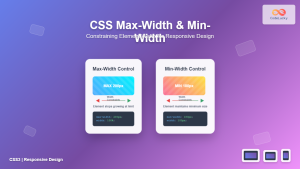
CSS Max-Width and Min-Width: Complete Guide to Responsive Width Constraints
When building responsive websites, controlling element widths is crucial for creating layouts that work across all devices. CSS provides two...

HTML Element clientWidth Property: Element Width
HTML Element clientWidth Property: Understanding Element Width The clientWidth property is a read-only property of an HTML element that returns...
CSS minHeight Property: CSS Min Height
Understanding the CSS minHeight Property The CSS minHeight property sets the minimum height of an element. It prevents the element's...

CSS overflowX Property: CSS Overflow X Explained with Examples
Understanding the CSS overflowX Property The overflowX property in CSS dictates how the browser handles content that overflows the horizontal...

CSS Width and Height: Complete Guide to Element Dimensions
Understanding how to control element dimensions is fundamental to creating well-structured web layouts. CSS width and height properties give you...

CSS Resize Property: Controlling Element Resizability
Understanding the CSS Resize Property: Controlling Element Resizability The resize property in CSS allows you to control whether (and how)...

CSS Max-Height and Min-Height: Complete Guide to Constraining Element Height
Understanding how to control element height is crucial for creating responsive and visually appealing web layouts. CSS provides powerful properties...
CSS Style height Property: CSS Height
Understanding the CSS height Property: A Comprehensive Guide The height property in CSS specifies the height of an element's content...

JavaScript screen.width Property: Screen Width
JavaScript screen.width Property: Screen Width The screen.width property in JavaScript is a read-only property that returns the total width of...


