
CSS float Property: A Comprehensive Guide
The CSS float property is a fundamental tool for controlling the layout of elements on a webpage. It allows you to push an element to the left or right side of its container, allowing other content, such as text, to wrap around it. This guide provides a detailed exploration of the float property, its values, and how to use it effectively.
What is the CSS float Property?
The float property in CSS specifies that an element should be taken from the normal flow and placed along the left or right side of its containing element. Other content will then wrap around the floated element. The float property is commonly used for creating multi-column layouts, wrapping text around images, and more.
Purpose of the float Property
The primary purpose of the float property is to:
- Create multi-column layouts.
- Wrap text around images or other elements.
- Position elements side by side.
- Achieve complex and dynamic page layouts.
Syntax
The syntax for the float property is straightforward:
element {
  float: value;
}
Possible Values
| Value | Description |
|---|---|
| `left` | The element floats to the left side of its container. |
| `right` | The element floats to the right side of its container. |
| `none` | The element does not float and appears in the normal flow of the document. This is the default value. |
| `inherit` | The element inherits the `float` value from its parent element. |
| `inline-start` | The element floats to the start edge of the line box in the direction that lines of text are laid out. |
| `inline-end` | The element floats to the end edge of the line box in the direction that lines of text are laid out. |
Basic Examples
Let’s explore some basic examples to illustrate how the float property works.
Floating an Image to the Left
This example demonstrates how to float an image to the left and wrap text around it.
<div style="width: 400px; border: 1px solid black; padding: 10px;">
  <img
    src="https://dummyimage.com/100x100/007bff/fff"
    alt="Dummy Image"
    style="float: left; margin-right: 10px;"
  />
  <p>
    Lorem ipsum dolor sit amet, consectetur adipiscing elit. Sed do eiusmod
    tempor incididunt ut labore et dolore magna aliqua. Ut enim ad minim veniam,
    quis nostrud exercitation ullamco laboris nisi ut aliquip ex ea commodo
    consequat. Duis aute irure dolor in reprehenderit in voluptate velit esse
    cillum dolore eu fugiat nulla pariatur. Excepteur sint occaecat cupidatat
    non proident, sunt in culpa qui officia deserunt mollit anim id est laborum.
  </p>
</div>
The output will show the image floated to the left, with the text wrapping around it.
Floating an Image to the Right
This example demonstrates how to float an image to the right and wrap text around it.
<div style="width: 400px; border: 1px solid black; padding: 10px;">
  <img
    src="https://dummyimage.com/100x100/007bff/fff"
    alt="Dummy Image"
    style="float: right; margin-left: 10px;"
  />
  <p>
    Lorem ipsum dolor sit amet, consectetur adipiscing elit. Sed do eiusmod
    tempor incididunt ut labore et dolore magna aliqua. Ut enim ad minim veniam,
    quis nostrud exercitation ullamco laboris nisi ut aliquip ex ea commodo
    consequat. Duis aute irure dolor in reprehenderit in voluptate velit esse
    cillum dolore eu fugiat nulla pariatur. Excepteur sint occaecat cupidatat
    non proident, sunt in culpa qui officia deserunt mollit anim id est laborum.
  </p>
</div>
The output will show the image floated to the right, with the text wrapping around it.
Clearing Floats
Sometimes, you need to prevent elements from wrapping around floated elements. This can be achieved using the clear property. Common values are left, right, and both.
<div style="width: 400px; border: 1px solid black; padding: 10px;">
  <img
    src="https://dummyimage.com/100x100/007bff/fff"
    alt="Dummy Image"
    style="float: left; margin-right: 10px;"
  />
  <p>
    Lorem ipsum dolor sit amet, consectetur adipiscing elit. Sed do eiusmod
    tempor incididunt ut labore et dolore magna aliqua. Ut enim ad minim veniam,
    quis nostrud exercitation ullamco laboris nisi ut aliquip ex ea commodo
    consequat.
  </p>
  <div style="clear: both;"></div>
  <p>
    This paragraph will not wrap around the image because the clear property is
    set to both.
  </p>
</div>
In this example, the clear: both; ensures that the second paragraph starts below the floated image.
Note: The clear property is essential for controlling the layout when using floats to prevent unexpected wrapping. 💡
Advanced Techniques
Creating Multi-Column Layouts
The float property can be used to create multi-column layouts. Here’s an example:
<div style="width: 600px; border: 1px solid black; overflow: hidden;">
  <div
    style="float: left; width: 30%; padding: 10px; box-sizing: border-box;"
  >
    Column 1: Lorem ipsum dolor sit amet.
  </div>
  <div
    style="float: left; width: 40%; padding: 10px; box-sizing: border-box;"
  >
    Column 2: Consectetur adipiscing elit.
  </div>
  <div
    style="float: left; width: 30%; padding: 10px; box-sizing: border-box;"
  >
    Column 3: Sed do eiusmod tempor incididunt.
  </div>
</div>
In this example, three div elements are floated left to create a three-column layout. The overflow: hidden; on the container ensures that it properly contains the floated elements.
Using the Clearfix Hack
When a container only contains floated elements, it can collapse, causing layout issues. The “clearfix hack” is a technique to prevent this collapse:
<style>
  .clearfix::after {
    content: "";
    display: table;
    clear: both;
  }
</style>

<div class="clearfix" style="width: 400px; border: 1px solid black;">
  <div style="float: left; width: 50%; padding: 10px;">Column 1</div>
  <div style="float: left; width: 50%; padding: 10px;">Column 2</div>
</div>
By adding the clearfix class to the container, you ensure that it properly contains the floated columns.
Styling Adjacent Elements
When working with floats, it’s common to style adjacent elements to maintain a clean layout. For example, adding margins or padding to floated elements can improve spacing.
<div style="width: 400px; border: 1px solid black; padding: 10px;">
  <img
    src="https://dummyimage.com/100x100/007bff/fff"
    alt="Dummy Image"
    style="float: left; margin: 10px;"
  />
  <p>
    Lorem ipsum dolor sit amet, consectetur adipiscing elit. Sed do eiusmod
    tempor incididunt ut labore et dolore magna aliqua. Ut enim ad minim veniam,
    quis nostrud exercitation ullamco laboris nisi ut aliquip ex ea commodo
    consequat.
  </p>
</div>
In this example, the margin property is added to the floated image to create spacing around it.
Real-World Applications
The float property is used in a variety of real-world applications, including:
- Magazine Layouts: Creating complex, multi-column layouts with images and text.
- Responsive Design: Adjusting layouts based on screen size.
- Navigation Menus: Positioning navigation items horizontally.
- Gallery Layouts: Arranging images in a grid or row.
Use Case Example: Creating a Responsive Image Gallery
Let’s create a practical example of a responsive image gallery using the float property. This example demonstrates how to combine floats with media queries to create a flexible and visually appealing image gallery.
<style>
  .gallery {
    width: 100%;
    overflow: hidden;
  }

  .gallery img {
    float: left;
    width: 25%; /* Default width for larger screens */
    padding: 5px;
    box-sizing: border-box;
  }

  /* Media query for smaller screens */
  @media (max-width: 600px) {
    .gallery img {
      width: 50%; /* Adjust width for smaller screens */
    }
  }

  /* Clearfix to prevent collapsing */
  .gallery::after {
    content: "";
    display: table;
    clear: both;
  }
</style>

<div class="gallery">
  <img src="https://dummyimage.com/200x150/007bff/fff" alt="Image 1" />
  <img src="https://dummyimage.com/200x150/007bff/fff" alt="Image 2" />
  <img src="https://dummyimage.com/200x150/007bff/fff" alt="Image 3" />
  <img src="https://dummyimage.com/200x150/007bff/fff" alt="Image 4" />
  <img src="https://dummyimage.com/200x150/007bff/fff" alt="Image 5" />
  <img src="https://dummyimage.com/200x150/007bff/fff" alt="Image 6" />
</div>
This example demonstrates several important concepts:
- Responsive Design: Using media queries to adjust the layout based on screen size.
- Clearfix: Preventing the container from collapsing by using the clearfix hack.
- Box-Sizing: Ensuring that padding doesn’t affect the overall width of the images.
- Consistent Spacing: Using padding to create consistent spacing around the images.
The result is a flexible image gallery that adapts to different screen sizes, providing a consistent and visually appealing experience across devices. This practical example shows how the float property can be used in combination with other CSS techniques to create robust and responsive layouts.
Browser Support
The float property is widely supported across all modern web browsers, ensuring consistent rendering across different platforms.
Alternatives to Float
While float has been a staple for layout creation, modern CSS offers more robust and flexible alternatives:
- Flexbox: Provides a more efficient way to align and distribute space among items in a container, making it ideal for complex layouts and responsive designs.
- Grid Layout: Offers a powerful, two-dimensional grid system that allows precise control over the placement and sizing of elements, suitable for creating complex page structures.
While floats are still useful in certain contexts, such as wrapping text around images, Flexbox and Grid Layout are generally preferred for building modern web layouts due to their superior flexibility and ease of use.
Conclusion
The CSS float property is a powerful tool for controlling the layout of elements on a webpage. By understanding its values and how to use it effectively, you can create complex and dynamic layouts that enhance the user experience. While modern alternatives like Flexbox and Grid Layout offer more advanced features, the float property remains a valuable tool in a web developer’s toolkit. Happy coding!
Related Posts
CSS Float Property: Complete Guide to Left, Right and None Float Values
The CSS float property is a fundamental layout tool that allows elements to be positioned to the left or right...
CSS display Property: CSS Display
Understanding the CSS display Property: A Comprehensive Guide The display property in CSS is a cornerstone for controlling the layout...
CSS clear Property: Mastering CSS Clear for Layout Control
Understanding the CSS clear Property: Mastering Layout Control The clear property in CSS is a powerful tool for controlling the...

CSS position Property: Mastering Layouts in CSS
Understanding the CSS position Property: A Comprehensive Guide The position property in CSS is a fundamental tool for controlling the...
CSS Style left Property: CSS Left
CSS left Property: A Comprehensive Guide The CSS left property is a fundamental tool for web developers, enabling precise horizontal...

CSS Style right Property: CSS Right
Understanding the CSS right Property The CSS right property plays a crucial role in positioning elements within a web page....
CSS Style top Property: CSS Top
Understanding the CSS top Property: A Comprehensive Guide The top property in CSS is used to specify the vertical position...
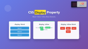
CSS Display Property: Complete Guide to Block, Inline, and Inline-Block Elements
The CSS display property is one of the most fundamental concepts in web development, controlling how elements are rendered and...
CSS Style height Property: CSS Height
Understanding the CSS height Property: A Comprehensive Guide The height property in CSS specifies the height of an element's content...

CSS Style grid Property: CSS Grid Layout
CSS grid Property: Mastering CSS Grid Layout The CSS grid property is a powerful tool for creating two-dimensional layouts on...
CSS Style marginLeft Property: CSS Margin Left
CSS marginLeft Property: Mastering the Left Margin The CSS marginLeft property is a fundamental tool for controlling the spacing around...
CSS Style marginRight Property: CSS Margin Right
Understanding the CSS marginRight Property The marginRight property in CSS is used to set the right margin of an element....


