
CSS filter Property: Enhance Your Web Graphics
The CSS filter property provides powerful visual effects to elements like images, backgrounds, and borders. It allows developers to apply graphical effects such as blurring, color shifting, and more, directly in CSS. This guide offers a comprehensive overview of the filter property, its syntax, values, and practical examples.
What is the CSS filter Property?
The filter property in CSS defines visual effects applied to an element before it is displayed. It’s a high-performance way to apply image processing without needing external libraries or tools. Key benefits include:
- Visual Effects: Apply blurs, color adjustments, and distortions.
- Performance: Hardware acceleration for smooth rendering.
- Flexibility: Combine multiple filters for complex effects.
- Accessibility: Enhancements without altering content structure.
Purpose of the CSS filter Property
The primary purpose of the filter property is to enhance the visual appearance of web content. By applying effects directly in CSS, developers can:
- Improve image aesthetics.
- Create engaging user interfaces.
- Achieve artistic and creative designs.
- Optimize visual performance.
Syntax and Values
The filter property accepts various function-like values that define specific visual effects. Here’s the basic syntax:
element {
  filter: filter-function(value);
}
Below is a table detailing commonly used filter-function values:
| Filter Function | Description | Example |
|---|---|---|
| `blur(radius)` | Applies a Gaussian blur to the element. | `filter: blur(5px);` |
| `brightness(amount)` | Adjusts the brightness of the element. | `filter: brightness(1.5);` |
| `contrast(amount)` | Adjusts the contrast of the element. | `filter: contrast(150%);` |
| `grayscale(amount)` | Converts the element to grayscale. | `filter: grayscale(100%);` |
| `hue-rotate(angle)` | Applies a hue rotation to the element. | `filter: hue-rotate(90deg);` |
| `invert(amount)` | Inverts the colors of the element. | `filter: invert(100%);` |
| `opacity(amount)` | Adjusts the transparency of the element. | `filter: opacity(0.5);` |
| `saturate(amount)` | Adjusts the saturation of the element. | `filter: saturate(200%);` |
| `sepia(amount)` | Applies a sepia tone to the element. | `filter: sepia(100%);` |
| `drop-shadow(h-shadow v-shadow blur spread color)` | Applies a drop shadow to the element. | `filter: drop-shadow(5px 5px 5px black);` |
| `url(#svg-filter)` | Applies an SVG filter defined by the URL. | `filter: url(#my-filter);` |
| `none` | Removes all filters from the element. | `filter: none;` |
Note: Values for amount are typically percentages or decimals, while radius and shadow distances are specified in pixels. Angles for hue-rotate are in degrees. 💡
Basic Examples of CSS Filters
Let’s dive into some basic examples to illustrate how CSS filters can be applied. Each example includes HTML and CSS code for clarity.
Applying a Blur Filter
The blur() filter softens the element by blurring its pixels.
<div class="container">
  <img
    id="imageBlur"
    src="https://dummyimage.com/200x150/87CEEB/000"
    alt="Blurred Image"
  />
</div>

<style>
  #imageBlur {
    filter: blur(5px);
  }
</style>
This will produce a blurred image:

Adjusting Brightness and Contrast
The brightness() and contrast() filters modify the luminance and tonal range of an element.
<div class="container">
  <img
    id="imageBrightnessContrast"
    src="https://dummyimage.com/200x150/FFD700/000"
    alt="Brightness Contrast Image"
  />
</div>

<style>
  #imageBrightnessContrast {
    filter: brightness(1.3) contrast(120%);
  }
</style>
This will adjust the image’s brightness and contrast:
Creating a Grayscale Image
The grayscale() filter converts an element’s colors to shades of gray.
<div class="container">
  <img
    id="imageGrayscale"
    src="https://dummyimage.com/200x150/32CD32/000"
    alt="Grayscale Image"
  />
</div>

<style>
  #imageGrayscale {
    filter: grayscale(100%);
  }
</style>
This will render the image in grayscale:
Applying a Sepia Tone
The sepia() filter adds a warm, brownish tint to the element, mimicking old photographs.
<div class="container">
  <img
    id="imageSepia"
    src="https://dummyimage.com/200x150/FA8072/000"
    alt="Sepia Image"
  />
</div>

<style>
  #imageSepia {
    filter: sepia(80%);
  }
</style>
This will give the image a sepia tone:
Rotating Hue
The hue-rotate() filter shifts the colors of an element along the color spectrum.
<div class="container">
  <img
    id="imageHueRotate"
    src="https://dummyimage.com/200x150/E6E6FA/000"
    alt="Hue Rotate Image"
  />
</div>

<style>
  #imageHueRotate {
    filter: hue-rotate(120deg);
  }
</style>
This will rotate the hue of the image:
Advanced Techniques with CSS Filters
Combining Multiple Filters
You can combine multiple filter functions to create more complex visual effects.
<div class="container">
  <img
    id="imageCombinedFilters"
    src="https://dummyimage.com/200x150/ADD8E6/000"
    alt="Combined Filters Image"
  />
</div>

<style>
  #imageCombinedFilters {
    filter: grayscale(50%) blur(3px) brightness(1.2);
  }
</style>
This will apply grayscale, blur, and brightness adjustments:
Using drop-shadow
The drop-shadow() filter adds a shadow effect that follows the shape of the element.
<div class="container">
  <img
    id="imageDropShadow"
    src="https://dummyimage.com/200x150/F08080/000"
    alt="Drop Shadow Image"
  />
</div>

<style>
  #imageDropShadow {
    filter: drop-shadow(8px 8px 10px rgba(0, 0, 0, 0.5));
  }
</style>
This will add a drop shadow to the image:
Note: Experiment with different combinations of filter functions to achieve unique and interesting effects. 🎨
Real-World Applications of CSS Filters
CSS filters can be used in a variety of real-world scenarios to enhance the visual appeal and user experience of web applications. Here are a few examples:
- Image Galleries: Applying grayscale or blur effects to inactive images.
- UI Enhancements: Adding subtle shadows or color adjustments to buttons and form elements.
- Artistic Effects: Creating unique visual styles for websites and landing pages.
- Accessibility: Improving readability by adjusting contrast or brightness.
Use Case Example: Hover Effects on Images
Let’s create a practical example that demonstrates how to use CSS filters to create interactive hover effects on images.
<style>
  .image-container_filter {
    display: inline-block;
    overflow: hidden;
  }

  .image-container_filter img {
    transition: filter 0.3s ease;
  }

  .image-container_filter:hover img {
    filter: brightness(1.2) contrast(110%) saturate(120%);
  }
</style>

<div class="image-container_filter">
  <img src="https://dummyimage.com/200x150/4682B4/fff" alt="Hover Effect Image" />
</div>
This will brighten, adjust the contrast and saturation of the image on hover:
<style>
.image-container_filter_example {
  display: inline-block;
  overflow: hidden;
}

.image-container_filter_example img {
  transition: filter 0.3s ease;
}

.image-container_filter_example:hover img {
  filter: brightness(1.2) contrast(110%) saturate(120%);
}
</style>

<div class="image-container_filter_example">
  <img src="https://dummyimage.com/200x150/4682B4/fff" alt="Hover Effect Image" />
</div>
Note: The transition property ensures a smooth visual transition when the hover effect is applied. ✨
Browser Support
The filter property is well-supported by modern browsers, including:
- Chrome
- Firefox
- Safari
- Edge
- Opera
Note: Always test your CSS filters across different browsers to ensure consistent rendering and performance. 🧐
Conclusion
The CSS filter property is a powerful tool for enhancing the visual appearance of web content. By applying effects such as blur, brightness, contrast, and more, developers can create engaging and visually appealing user experiences. This guide should provide you with a solid understanding of the filter property and its various functions, enabling you to create stunning web designs. Happy styling!
Related Posts
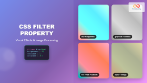
CSS Filter Property: Complete Guide to Visual Effects and Image Processing
The CSS filter property is a powerful tool that allows developers to apply visual effects and image processing techniques directly...
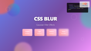
CSS Blur Filter: Complete Guide to Gaussian Blur Effects and Visual Applications
The CSS blur filter is one of the most versatile and visually appealing effects in modern web design. This powerful...

CSS Backdrop-Filter: Complete Guide to Background Blur and Visual Effects
What is CSS Backdrop-Filter? The backdrop-filter property in CSS allows you to apply graphical effects like blur, brightness, contrast, and...
CSS Style color Property: CSS Color
Understanding the CSS color Property: A Comprehensive Guide The CSS color property is fundamental for styling web pages. It specifies...

CSS Style background Property: CSS Background
CSS background Property: A Comprehensive Guide to Styling Web Page Backgrounds The CSS background property is a versatile shorthand property...
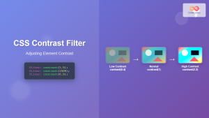
CSS Contrast Filter: Complete Guide to Adjusting Element Contrast for Better Visual Impact
The CSS contrast() filter function is a powerful tool that allows web developers to dynamically adjust the contrast of HTML...
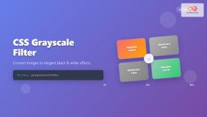
CSS Grayscale Filter: Master Black and White Image Effects with Complete Guide
The CSS grayscale filter is a powerful tool that transforms colorful images into elegant black and white versions. This filter...
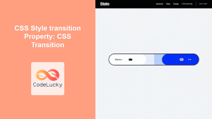
CSS Style transition Property: CSS Transition
CSS transition Property: A Comprehensive Guide The CSS transition property is a powerful tool for creating smooth animations when CSS...
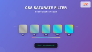
CSS Saturate Filter: Complete Guide to Color Saturation Control
The CSS saturate() filter function is a powerful tool that allows you to control the color saturation of HTML elements....
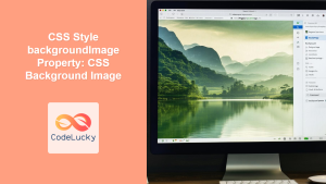
CSS Style backgroundImage Property: CSS Background Image
CSS backgroundImage Property: A Comprehensive Guide The backgroundImage property in CSS is used to set one or more background images...
CSS Style transform Property: CSS Transform
CSS transform Property: A Comprehensive Guide The CSS transform property is a powerful tool that allows you to modify the...

HTML style Property: Element Style
HTML style Property: Element Style The HTML style property allows you to apply inline CSS styles directly to individual HTML...


