
Understanding the CSS align-items Property
The align-items property in CSS is a powerful tool that defines how items are aligned along the cross axis of a flex or grid container. It dictates the alignment of items within their container, influencing their vertical positioning in flex containers and their block-axis alignment in grid containers. This property is essential for creating visually appealing and well-structured layouts.
Purpose of align-items
The primary purpose of the align-items property is to control the vertical (or block-axis) alignment of items within a flex or grid container. It ensures that items are positioned correctly relative to each other and the container’s boundaries, which is crucial for responsive and consistent designs.
Syntax
The syntax for the align-items property is straightforward:
align-items: value;
Where value can be one of the following:
normal: The default behavior. In Flexbox, items are stretched to fill the container’s height. In Grid, this behaves asstretch.stretch: Items are stretched to fill the container’s height (subject tomin-heightandmax-height).center: Items are centered within the container along the cross axis.flex-start: Items are aligned to the start of the cross axis.flex-end: Items are aligned to the end of the cross axis.start: Items are packed to the start edge of the alignment container in the cross axis. The precise alignment depends on the alignment context.end: Items are packed to the end edge of the alignment container in the cross axis. The precise alignment depends on the alignment context.self-start: Items are aligned to the start of the cross axis of the alignment container.self-end: Items are aligned to the end of the cross axis of the alignment container.baseline: Items are aligned based on their baselines.first baseline: Specifies participation in first-baseline alignment.last baseline: Specifies participation in last-baseline alignment.safe: If the specified alignment causes an overflow that could lead to data loss, the item is aligned tostart.unsafe: Regardless of overflow concerns, the specified alignment is honored.inherit: Inherits this property from its parent element.initial: Sets this property to its default value.revert: Reverts the property to the value defined by the user-agent stylesheet.unset: Resets the property to its inherited value if it inherits from its parent or to its initial value if not.
Applicable Elements
The align-items property applies to:
- Flex containers
- Grid containers
align-items Values Explained
| Value | Description |
|---|---|
| `normal` | The default behavior. In flexbox, items are stretched to fill the container’s height. In Grid Layout, this behaves as `stretch`. |
| `stretch` | Items are stretched to fill the container’s height (subject to `min-height` and `max-height`). |
| `center` | Items are centered within the container along the cross axis. |
| `flex-start` / `start` / `self-start` | Items are aligned to the start of the cross axis. `flex-start` is used in Flexbox. |
| `flex-end` / `end` / `self-end` | Items are aligned to the end of the cross axis. `flex-end` is used in Flexbox. |
| `baseline` | Items are aligned based on their baselines. |
| `safe` | If the specified alignment causes an overflow that could lead to data loss, the item is aligned to `start`. |
| `unsafe` | Regardless of overflow concerns, the specified alignment is honored. |
Examples of align-items in Action
Let’s explore how align-items works with both Flexbox and Grid layouts through practical examples.
Flexbox Example: Aligning Items Vertically
In this example, we’ll create a flex container with three items and demonstrate different align-items values.
<div class="flex-container-align-items">
  <div class="flex-item-align-items">Item 1</div>
  <div class="flex-item-align-items">Item 2<br>With More Content</div>
  <div class="flex-item-align-items">Item 3</div>
</div>

<style>
  .flex-container-align-items {
    display: flex;
    height: 200px;
    border: 2px solid #3498db;
    margin-bottom: 20px; /* Add margin for spacing between examples */
  }

  .flex-item-align-items {
    background-color: #f39c12;
    color: white;
    padding: 10px;
    margin: 5px;
    text-align: center;
  }

  /* Example 1: align-items: flex-start */
  .flex-container-align-items:nth-of-type(1) {
    align-items: flex-start;
  }

  /* Example 2: align-items: center */
  .flex-container-align-items:nth-of-type(2) {
    align-items: center;
  }

  /* Example 3: align-items: flex-end */
  .flex-container-align-items:nth-of-type(3) {
    align-items: flex-end;
  }

  /* Example 4: align-items: stretch */
  .flex-container-align-items:nth-of-type(4) {
    align-items: stretch;
  }

  /* Add more flex containers for different align-items values */
</style>
To demonstrate the different values, we can duplicate the HTML structure and apply different align-items values to each container using CSS.
<!-- Example 1: align-items: flex-start -->
<div class="flex-container-align-items" style="align-items: flex-start;">
  <div class="flex-item-align-items">Item 1</div>
  <div class="flex-item-align-items">Item 2<br>With More Content</div>
  <div class="flex-item-align-items">Item 3</div>
</div>

<!-- Example 2: align-items: center -->
<div class="flex-container-align-items" style="align-items: center;">
  <div class="flex-item-align-items">Item 1</div>
  <div class="flex-item-align-items">Item 2<br>With More Content</div>
  <div class="flex-item-align-items">Item 3</div>
</div>

<!-- Example 3: align-items: flex-end -->
<div class="flex-container-align-items" style="align-items: flex-end;">
  <div class="flex-item-align-items">Item 1</div>
  <div class="flex-item-align-items">Item 2<br>With More Content</div>
  <div class="flex-item-align-items">Item 3</div>
</div>

<!-- Example 4: align-items: stretch -->
<div class="flex-container-align-items" style="align-items: stretch;">
  <div class="flex-item-align-items">Item 1</div>
  <div class="flex-item-align-items">Item 2<br>With More Content</div>
  <div class="flex-item-align-items">Item 3</div>
</div>
With More Content
With More Content
With More Content
With More Content
Grid Example: Aligning Items Vertically
In this example, we’ll use a grid container with three rows and demonstrate different align-items values.
<div class="grid-container-align-items">
  <div class="grid-item-align-items">Item 1</div>
  <div class="grid-item-align-items">Item 2</div>
  <div class="grid-item-align-items">Item 3</div>
</div>

<style>
  .grid-container-align-items {
    display: grid;
    grid-template-rows: repeat(3, 1fr);
    height: 200px;
    border: 2px solid #27ae60;
    margin-bottom: 20px; /* Add margin for spacing between examples */
  }

  .grid-item-align-items {
    background-color: #e74c3c;
    color: white;
    padding: 10px;
    text-align: center;
  }

  /* Example 1: align-items: start */
  .grid-container-align-items:nth-of-type(1) {
    align-items: start;
  }

  /* Example 2: align-items: center */
  .grid-container-align-items:nth-of-type(2) {
    align-items: center;
  }

  /* Example 3: align-items: end */
  .grid-container-align-items:nth-of-type(3) {
    align-items: end;
  }

  /* Example 4: align-items: stretch */
  .grid-container-align-items:nth-of-type(4) {
    align-items: stretch;
  }

  /* Add more grid containers for different align-items values */
</style>
To demonstrate the different values, we can duplicate the HTML structure and apply different align-items values to each container using inline styles.
<!-- Example 1: align-items: start -->
<div class="grid-container-align-items" style="align-items: start; display: grid; grid-template-rows: repeat(3, 1fr); height: 200px; border: 2px solid #27ae60; margin-bottom: 20px;">
  <div class="grid-item-align-items" style="background-color: #e74c3c; color: white; padding: 10px; text-align: center;">Item 1</div>
  <div class="grid-item-align-items" style="background-color: #e74c3c; color: white; padding: 10px; text-align: center;">Item 2</div>
  <div class="grid-item-align-items" style="background-color: #e74c3c; color: white; padding: 10px; text-align: center;">Item 3</div>
</div>

<!-- Example 2: align-items: center -->
<div class="grid-container-align-items" style="align-items: center; display: grid; grid-template-rows: repeat(3, 1fr); height: 200px; border: 2px solid #27ae60; margin-bottom: 20px;">
  <div class="grid-item-align-items" style="background-color: #e74c3c; color: white; padding: 10px; text-align: center;">Item 1</div>
  <div class="grid-item-align-items" style="background-color: #e74c3c; color: white; padding: 10px; text-align: center;">Item 2</div>
  <div class="grid-item-align-items" style="background-color: #e74c3c; color: white; padding: 10px; text-align: center;">Item 3</div>
</div>

<!-- Example 3: align-items: end -->
<div class="grid-container-align-items" style="align-items: end; display: grid; grid-template-rows: repeat(3, 1fr); height: 200px; border: 2px solid #27ae60; margin-bottom: 20px;">
  <div class="grid-item-align-items" style="background-color: #e74c3c; color: white; padding: 10px; text-align: center;">Item 1</div>
  <div class="grid-item-align-items" style="background-color: #e74c3c; color: white; padding: 10px; text-align: center;">Item 2</div>
  <div class="grid-item-align-items" style="background-color: #e74c3c; color: white; padding: 10px; text-align: center;">Item 3</div>
</div>

<!-- Example 4: align-items: stretch -->
<div class="grid-container-align-items" style="align-items: stretch; display: grid; grid-template-rows: repeat(3, 1fr); height: 200px; border: 2px solid #27ae60; margin-bottom: 20px;">
  <div class="grid-item-align-items" style="background-color: #e74c3c; color: white; padding: 10px; text-align: center;">Item 1</div>
  <div class="grid-item-align-items" style="background-color: #e74c3c; color: white; padding: 10px; text-align: center;">Item 2</div>
  <div class="grid-item-align-items" style="background-color: #e74c3c; color: white; padding: 10px; text-align: center;">Item 3</div>
</div>
Baseline Alignment
Baseline alignment aligns the items based on the baseline of their text. This is particularly useful when you have items with varying font sizes.
<div class="baseline-container">
  <div class="baseline-item">Small Text</div>
  <div class="baseline-item" style="font-size: 2em;">Large Text</div>
  <div class="baseline-item">Medium Text</div>
</div>

<style>
  .baseline-container {
    display: flex;
    align-items: baseline;
    height: 100px;
    border: 1px solid #000;
  }

  .baseline-item {
    padding: 10px;
    border: 1px dashed #ccc;
  }
</style>
Tips and Best Practices
- Use Flexbox for One-Dimensional Layouts: Flexbox is ideal for aligning items in a single row or column.
- Use Grid for Two-Dimensional Layouts: Grid is more suitable for complex, two-dimensional layouts where you need control over both rows and columns.
- Combine with
justify-content: Usealign-itemsin conjunction withjustify-contentto control both vertical and horizontal alignment. - Consider Content Size: Be mindful of how the size and content of items affect alignment, especially when using
stretch. - Test Across Browsers: Ensure your layouts render correctly in different browsers to provide a consistent user experience. 🧐
Browser Support
The align-items property is well-supported across modern browsers, including Chrome, Firefox, Safari, and Edge. However, always test your layouts to ensure compatibility with older browsers if necessary. 🤓
Conclusion
The align-items property is a fundamental CSS tool for controlling the vertical alignment of items in flex and grid containers. By understanding its various values and how it interacts with other layout properties, you can create robust, responsive, and visually appealing web designs. 🎉
Related Posts
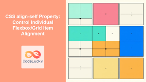
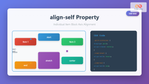
CSS align-self Property: Control Individual Flexbox/Grid Item Alignment
CSS align-self Property: Mastering Individual Item Alignment in Flexbox and Grid The CSS align-self property is a powerful tool for...

CSS Align-Items: Master Cross-Axis Alignment in Flexbox and Grid
The CSS align-items property is a fundamental tool for controlling cross-axis alignment in both flexbox and CSS Grid layouts. Understanding...

CSS align-content Property: CSS Align Content
CSS align-content Property: Mastering Content Alignment in Flexbox and Grid Layouts The CSS align-content property is a powerful tool for...
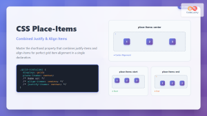
CSS Place-Items: Master Combined Justify and Align Items in One Property
The CSS place-items property is a powerful shorthand that combines justify-items and align-items into a single declaration. This property revolutionizes...
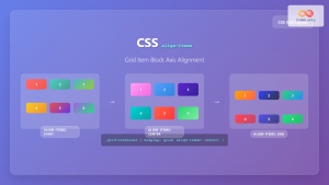
CSS Align-Items: Complete Guide to Grid Item Block Axis Alignment
Understanding CSS Align-Items in Grid Context The CSS align-items property is a powerful tool for controlling how grid items align...

CSS Align-Content: Master Grid Container Block Axis Alignment
The CSS align-content property is a powerful tool for controlling how grid items are distributed along the block axis (typically...
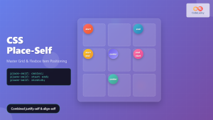
CSS Place-Self: Master Grid and Flexbox Item Positioning with One Property
The CSS place-self property is a powerful shorthand that combines justify-self and align-self into a single declaration, making it easier...
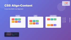
CSS Align-Content: Complete Guide to Cross-Axis Multi-Line Alignment
The align-content property is a powerful CSS tool that controls how multiple lines of content are distributed along the cross-axis...
CSS Align-Self: Master Individual Grid Item Block Axis Alignment
The CSS align-self property provides granular control over individual grid items' alignment along the block axis (vertical direction in horizontal...
CSS vertical-align Property: CSS Vertical Align
CSS vertical-align Property: Mastering Vertical Alignment The CSS vertical-align property specifies the vertical alignment of an inline or table-cell box....
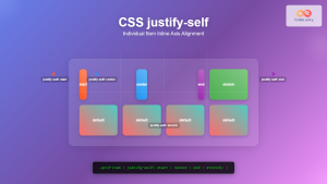
CSS Justify-Self: Master Individual Item Inline Axis Alignment
The justify-self property in CSS is a powerful alignment tool that allows you to control how individual items align themselves...

CSS Style justifyContent Property: CSS Justify Content
CSS justifyContent Property: Mastering Content Alignment The CSS justifyContent property defines how the browser distributes space between and around content...


