
Understanding the CSS position Property: A Comprehensive Guide
The position property in CSS is a fundamental tool for controlling the layout of elements on a webpage. It dictates how an element is positioned within its containing element or the viewport. Mastering the position property is crucial for creating complex and responsive designs. This comprehensive guide will walk you through the various values of the position property, providing practical examples and use cases.
What is the position Property?
The position property specifies the positioning method used for an element. It influences how an element is placed in the document and how it interacts with other elements. The position property can take one of five values:
static: The default value. The element is positioned according to the normal document flow.relative: The element is positioned relative to its normal position.absolute: The element is positioned relative to its nearest positioned ancestor.fixed: The element is positioned relative to the viewport and remains in place even when the page is scrolled.sticky: The element is positioned based on the user’s scroll position.
Syntax
The syntax for the position property is straightforward:
selector {
  position: value; /* static | relative | absolute | fixed | sticky | initial | inherit */
}
Detailed Explanation of position Values
| Value | Description |
|---|---|
| `static` | The default value. The element is positioned according to the normal document flow. `top`, `right`, `bottom`, and `left` properties have no effect. |
| `relative` | The element is positioned relative to its normal position. Setting `top`, `right`, `bottom`, and `left` properties will adjust the element’s position away from its normal spot without affecting the layout of surrounding elements. |
| `absolute` | The element is removed from the normal document flow and positioned relative to its nearest positioned ancestor (i.e., an ancestor with a `position` value other than `static`). If no such ancestor exists, it’s positioned relative to the initial containing block (the `` element). |
| `fixed` | The element is removed from the normal document flow and positioned relative to the viewport. It always stays in the same place even if the page is scrolled. `top`, `right`, `bottom`, and `left` properties are used to specify the offset from the viewport. |
| `sticky` | The element is positioned based on the user’s scroll position. It’s treated as `relative` until the scroll position reaches a specified threshold, at which point it’s treated as `fixed`. Requires `top`, `right`, `bottom`, or `left` to be set. |
| `initial` | Sets this property to its default value. |
| `inherit` | Inherits this property from its parent element. |
Examples of position in Action
Let’s explore each position value with practical examples. Each example includes HTML and CSS code, along with a clear explanation of the output.
position: static
The default value, static, means the element is positioned in the normal document flow. top, right, bottom, and left properties have no effect.
<div style="border: 1px solid black; padding: 10px; margin-bottom: 10px;">
  <div style="position: static; top: 20px; left: 30px; background-color: lightblue;">
    This is a static element.
  </div>
</div>
Output:
Explanation: The top and left properties have no effect on the static element. It is positioned according to the normal document flow.
position: relative
relative positioning shifts the element from its normal position based on the top, right, bottom, and left properties. Other elements are not affected by this shift.
<div style="border: 1px solid black; padding: 10px; margin-bottom: 10px;">
  <div style="position: relative; top: 20px; left: 30px; background-color: lightblue;">
    This is a relative element.
  </div>
  <div>
    This is another element.
  </div>
</div>
Output:
Explanation: The relatively positioned element is shifted 20px from the top and 30px from the left of its normal position. The second div remains unaffected.
position: absolute
absolute positioning removes the element from the normal document flow and positions it relative to its nearest positioned ancestor.
<div style="position: relative; border: 1px solid black; padding: 10px; margin-bottom: 10px; height: 150px;">
  <div style="position: absolute; top: 20px; left: 30px; background-color: lightblue;">
    This is an absolute element.
  </div>
  <div>
    This is another element.
  </div>
</div>
Output:
Explanation: The absolutely positioned element is positioned relative to the containing div (which has position: relative). It is removed from the normal flow, so the second div moves up.
position: fixed
fixed positioning removes the element from the normal document flow and positions it relative to the viewport. It stays in the same place even when the page is scrolled.
<div style="height: 200px; overflow: auto; border: 1px solid black;">
  <p>Scrollable Content. Scrollable Content. Scrollable Content. Scrollable Content.</p>
  <p>Scrollable Content. Scrollable Content. Scrollable Content. Scrollable Content.</p>
  <p>Scrollable Content. Scrollable Content. Scrollable Content. Scrollable Content.</p>
  <div style="position: fixed; bottom: 10px; right: 10px; background-color: lightblue;">
    This is a fixed element.
  </div>
</div>
Output:
Scrollable Content. Scrollable Content. Scrollable Content. Scrollable Content.
Scrollable Content. Scrollable Content. Scrollable Content. Scrollable Content.
Scrollable Content. Scrollable Content. Scrollable Content. Scrollable Content.
Explanation: The fixed element remains at the bottom-right corner of the viewport, even when the content is scrolled.
position: sticky
sticky positioning is a hybrid of relative and fixed. The element is treated as relative until the scroll position reaches a specified threshold, at which point it’s treated as fixed.
<div style="height: 200px; overflow: auto; border: 1px solid black;">
  <div style="position: sticky; top: 0; background-color: lightblue; padding: 5px;">
    This is a sticky element.
  </div>
  <p>Scrollable Content. Scrollable Content. Scrollable Content. Scrollable Content.</p>
  <p>Scrollable Content. Scrollable Content. Scrollable Content. Scrollable Content.</p>
  <p>Scrollable Content. Scrollable Content. Scrollable Content. Scrollable Content.</p>
</div>
Output:
Scrollable Content. Scrollable Content. Scrollable Content. Scrollable Content.
Scrollable Content. Scrollable Content. Scrollable Content. Scrollable Content.
Scrollable Content. Scrollable Content. Scrollable Content. Scrollable Content.
Explanation: The sticky element scrolls with the content until it reaches the top of the viewport, at which point it sticks to the top.
Real-World Applications
The position property is used extensively in web design for various purposes:
- Creating headers and footers:
fixedpositioning can be used to keep headers and footers visible while scrolling. - Implementing overlays and modals:
absolutepositioning is useful for creating overlays that cover the entire page. - Building sticky navigation menus:
stickypositioning can be used to create navigation menus that stick to the top of the page when scrolled. - Crafting complex layouts: Combining
relativeandabsolutepositioning allows for precise control over element placement.
Tips and Best Practices
- Understand the stacking context: Elements with a
positionvalue other thanstaticcreate a new stacking context, affecting the layering order of elements. - Use
relativepositioning for minor adjustments:relativepositioning is great for small adjustments without affecting the layout of surrounding elements. - Be mindful of performance: Overusing
absoluteandfixedpositioning can impact performance, especially with complex layouts. - Test on different devices: Ensure your layout works well on various screen sizes and devices.
Browser Support
The position property is widely supported across all modern browsers. However, some older browsers may have limited support for position: sticky. Always test your designs on a range of browsers to ensure compatibility. 🧐
Conclusion
The position property is a powerful CSS tool that enables precise control over element placement. By understanding the different values and their use cases, you can create complex, responsive, and visually appealing layouts. Experiment with the examples provided and explore the endless possibilities that the position property offers. Happy styling! 🎨
Related Posts

CSS Style right Property: CSS Right
Understanding the CSS right Property The CSS right property plays a crucial role in positioning elements within a web page....
CSS Style left Property: CSS Left
CSS left Property: A Comprehensive Guide The CSS left property is a fundamental tool for web developers, enabling precise horizontal...
CSS Style top Property: CSS Top
Understanding the CSS top Property: A Comprehensive Guide The top property in CSS is used to specify the vertical position...
CSS display Property: CSS Display
Understanding the CSS display Property: A Comprehensive Guide The display property in CSS is a cornerstone for controlling the layout...
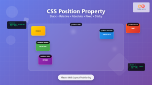
CSS Position Property: Complete Guide to Static, Relative, Absolute, Fixed & Sticky Positioning
The CSS position property is one of the most powerful tools for controlling element layout and creating sophisticated web designs....
CSS Style height Property: CSS Height
Understanding the CSS height Property: A Comprehensive Guide The height property in CSS specifies the height of an element's content...
CSS Style float Property: CSS Float
CSS float Property: A Comprehensive Guide The CSS float property is a fundamental tool for controlling the layout of elements...
CSS object-position Property: CSS Object Position
CSS object-position Property: Mastering Object Positioning The object-position property in CSS provides a way to specify the alignment of a...

CSS Margin: Mastering Spacing in Web Design
CSS Margin: Mastering Spacing in Web Design In CSS, the margin property is fundamental for controlling the space around HTML...
CSS Style marginRight Property: CSS Margin Right
Understanding the CSS marginRight Property The marginRight property in CSS is used to set the right margin of an element....
CSS clear Property: Mastering CSS Clear for Layout Control
Understanding the CSS clear Property: Mastering Layout Control The clear property in CSS is a powerful tool for controlling the...
CSS Style marginLeft Property: CSS Margin Left
CSS marginLeft Property: Mastering the Left Margin The CSS marginLeft property is a fundamental tool for controlling the spacing around...


