
Understanding the CSS perspective Property
The CSS perspective property allows you to give a 3D-positioned element some perspective. It defines how far the object is away from the user. The lower the value, the more intense the 3D effect.
Purpose of the perspective Property
The primary purpose of the perspective property is to:
- Create 3D effects on HTML elements.
- Control the depth and realism of 3D transformations.
- Enhance the visual appeal of web layouts and designs.
Syntax
The syntax for the perspective property is as follows:
perspective: length | none;
Values
| Value | Description |
|---|---|
| `length` | Specifies the distance from the viewer to the z=0 plane. It cannot be a negative value. |
| `none` | No perspective is applied. This is the default value. |
| `initial` | Sets this property to its default value. |
| `inherit` | Inherits this property from its parent element. |
Examples
Let’s explore some practical examples of using the perspective property to create 3D effects.
Basic Perspective Example
This example demonstrates how to apply a basic perspective to a rotated element.
<!DOCTYPE html>
<html>
  <head>
    <style>
      .perspective-container {
        width: 200px;
        height: 200px;
        border: 1px solid black;
        margin: 50px;
        perspective: 300px;
      }

      .perspective-box {
        width: 100%;
        height: 100%;
        background-color: lightblue;
        transform: rotateY(45deg);
        transform-origin: center;
      }
    </style>
  </head>
  <body>
    <div class="perspective-container">
      <div class="perspective-box">This is a box with perspective.</div>
    </div>
  </body>
</html>
Output:
A rotated box with a 3D perspective effect applied.
Adjusting Perspective Distance
This example shows how different perspective distances affect the 3D effect.
<!DOCTYPE html>
<html>
  <head>
    <style>
      .perspective-container-diff {
        width: 200px;
        height: 200px;
        border: 1px solid black;
        margin: 20px;
        display: inline-block;
      }

      .perspective-container-diff.short {
        perspective: 200px;
      }

      .perspective-container-diff.long {
        perspective: 600px;
      }

      .perspective-box-diff {
        width: 100%;
        height: 100%;
        background-color: lightblue;
        transform: rotateY(45deg);
        transform-origin: center;
        display: flex;
        justify-content: center;
        align-items: center;
        color: black;
      }
    </style>
  </head>
  <body>
    <div class="perspective-container-diff short">
      <div class="perspective-box-diff">Short (200px)</div>
    </div>
    <div class="perspective-container-diff long">
      <div class="perspective-box-diff">Long (600px)</div>
    </div>
  </body>
</html>
Output:
Two rotated boxes, one with a shorter perspective distance (200px) and the other with a longer perspective distance (600px), demonstrating the effect of perspective distance on the 3D transformation.
Combining with Other Transformations
The perspective property can be combined with other CSS transformations to create more complex 3D effects.
<!DOCTYPE html>
<html>
  <head>
    <style>
      .perspective-container-combine {
        width: 200px;
        height: 200px;
        border: 1px solid black;
        margin: 50px;
        perspective: 400px;
      }

      .perspective-box-combine {
        width: 100%;
        height: 100%;
        background-color: lightblue;
        transform: rotateX(45deg) rotateY(45deg) translateZ(50px);
        transform-origin: center;
      }
    </style>
  </head>
  <body>
    <div class="perspective-container-combine">
      <div class="perspective-box-combine">
        Combined Transformations
      </div>
    </div>
  </body>
</html>
Output:
A box with combined X and Y rotations, along with a Z translation, all viewed with a perspective effect.
Creating a 3D Card Effect
This example demonstrates how to create a 3D card effect using the perspective property.
<!DOCTYPE html>
<html>
  <head>
    <style>
      .card-container {
        width: 200px;
        height: 250px;
        margin: 50px;
        perspective: 500px;
      }

      .card {
        width: 100%;
        height: 100%;
        transition: transform 0.8s;
        transform-style: preserve-3d;
        position: relative;
      }

      .card:hover {
        transform: rotateY(180deg);
      }

      .card-face {
        position: absolute;
        width: 100%;
        height: 100%;
        backface-visibility: hidden;
        display: flex;
        justify-content: center;
        align-items: center;
        font-size: 20px;
        color: white;
      }

      .card-front {
        background-color: #4CAF50;
      }

      .card-back {
        background-color: #f44336;
        transform: rotateY(180deg);
      }
    </style>
  </head>
  <body>
    <div class="card-container">
      <div class="card">
        <div class="card-face card-front">Front</div>
        <div class="card-face card-back">Back</div>
      </div>
    </div>
  </body>
</html>
Output:
A card that flips on hover to reveal its back side, creating a 3D flipping effect.
Interactive 3D Cube
Here’s how to create an interactive 3D cube that rotates when you hover over it.
<!DOCTYPE html>
<html>
  <head>
    <style>
      .cube-container {
        width: 200px;
        height: 200px;
        margin: 100px;
        perspective: 400px;
      }

      .cube {
        width: 100%;
        height: 100%;
        transform-style: preserve-3d;
        transition: transform 1s;
        transform-origin: center center;
      }

      .cube-container:hover .cube {
        transform: rotateX(45deg) rotateY(45deg);
      }

      .cube-face {
        position: absolute;
        width: 100%;
        height: 100%;
        border: 1px solid black;
        font-size: 30px;
        display: flex;
        justify-content: center;
        align-items: center;
        background-color: rgba(255, 255, 255, 0.8);
      }

      .cube-face:nth-child(1) {
        transform: translateZ(100px);
      }
      .cube-face:nth-child(2) {
        transform: rotateY(90deg) translateZ(100px);
      }
      .cube-face:nth-child(3) {
        transform: rotateY(180deg) translateZ(100px);
      }
      .cube-face:nth-child(4) {
        transform: rotateY(270deg) translateZ(100px);
      }
      .cube-face:nth-child(5) {
        transform: rotateX(90deg) translateZ(100px);
      }
      .cube-face:nth-child(6) {
        transform: rotateX(-90deg) translateZ(100px);
      }
    </style>
  </head>
  <body>
    <div class="cube-container">
      <div class="cube">
        <div class="cube-face">1</div>
        <div class="cube-face">2</div>
        <div class="cube-face">3</div>
        <div class="cube-face">4</div>
        <div class="cube-face">5</div>
        <div class="cube-face">6</div>
      </div>
    </div>
  </body>
</html>
Output:
A 3D cube that rotates when you hover over the cube container, showing all six faces with numbers.
Tips and Best Practices
- Use
transform-style: preserve-3don the parent element to ensure 3D transformations are applied to child elements. - Adjust the
perspectivevalue to achieve the desired 3D effect. Lower values create a more intense effect. - Combine
perspectivewithperspective-originto control the vanishing point of the 3D scene. - Test your 3D transformations on different browsers and devices to ensure compatibility.
Browser Support
The perspective property is widely supported by modern browsers:
- Chrome
- Firefox
- Safari
- Edge
- Opera
Conclusion
The CSS perspective property is a powerful tool for creating 3D effects on the web. By understanding its syntax and experimenting with different values, you can create visually stunning and engaging web designs.
Related Posts
CSS Style perspectiveOrigin Property: CSS Perspective Origin
CSS perspective-origin Property: A Comprehensive Guide The perspective-origin property in CSS is used to set the vanishing point for 3D...
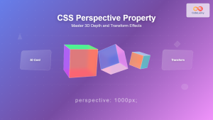
CSS Perspective Property: Master 3D Depth and Transform Effects
What is CSS Perspective Property? The CSS perspective property is a powerful tool that defines the distance between the user...

CSS position Property: Mastering Layouts in CSS
Understanding the CSS position Property: A Comprehensive Guide The position property in CSS is a fundamental tool for controlling the...

CSS Style right Property: CSS Right
Understanding the CSS right Property The CSS right property plays a crucial role in positioning elements within a web page....
CSS Style height Property: CSS Height
Understanding the CSS height Property: A Comprehensive Guide The height property in CSS specifies the height of an element's content...
CSS Style transform Property: CSS Transform
CSS transform Property: A Comprehensive Guide The CSS transform property is a powerful tool that allows you to modify the...
CSS display Property: CSS Display
Understanding the CSS display Property: A Comprehensive Guide The display property in CSS is a cornerstone for controlling the layout...
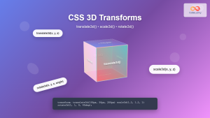
CSS 3D Transforms: Complete Guide to Translate3d, Scale3d, and Rotate3d Functions
CSS 3D transforms revolutionize how we create interactive and visually stunning web interfaces. By utilizing the power of translate3d(), scale3d(),...
CSS Style transformOrigin Property: CSS Transform Origin
CSS transformOrigin Property: Mastering Element Transformation Origins The transformOrigin property in CSS is a fundamental tool for controlling how transformations...
CSS Style maxHeight Property: CSS Max Height
Understanding the CSS max-height Property The CSS max-height property is a fundamental tool for controlling the maximum height of an...
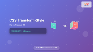
CSS Transform-Style: Complete Guide to Flat vs Preserve-3d for 3D Transformations
The CSS transform-style property is a powerful tool that controls how child elements are rendered in 3D space when their...
CSS Style top Property: CSS Top
Understanding the CSS top Property: A Comprehensive Guide The top property in CSS is used to specify the vertical position...


