
CSS overflow Property: Controlling Content Overflow
The CSS overflow property specifies how to handle content that overflows a container element. It allows you to control whether to clip the content, display scrollbars, or simply let the content overflow. This property is essential for creating responsive and well-structured web layouts.
Definition and Purpose
The overflow property determines what happens when an element’s content is too big to fit inside its block formatting context. It helps maintain the layout integrity and user experience by preventing content from breaking the design.
Syntax
The overflow property can accept one of the following values:
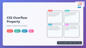
overflow: visible | hidden | scroll | auto | initial | inherit;
Values
| Value | Description |
|---|---|
| `visible` | Default value. Content is not clipped and may render outside the element’s box. |
| `hidden` | Content is clipped, and the overflowing content is not visible. |
| `scroll` | Content is clipped, and scrollbars are displayed to view the rest of the content. Scrollbars are always visible, even if the content does not overflow. |
| `auto` | Content is clipped, and scrollbars are displayed only when the content overflows. |
| `initial` | Sets the property to its default value (`visible`). |
| `inherit` | Inherits this property from its parent element. |
Examples
overflow: visible
The default behavior, where overflowing content is displayed outside the container.
<div style="width: 200px; height: 100px; border: 1px solid black;">
  <p style="overflow: visible;">
    This is some text that will overflow the container because the overflow
    property is set to visible.
  </p>
</div>
Output: The text overflows the container.
overflow: hidden
The overflowing content is clipped and not displayed.
<div style="width: 200px; height: 100px; border: 1px solid black;">
  <p style="overflow: hidden;">
    This is some text that will be clipped because the overflow property is set
    to hidden.
  </p>
</div>
Output: The text is clipped, and only the part that fits inside the container is visible.
overflow: scroll
Scrollbars are always displayed, regardless of whether the content overflows.
<div style="width: 200px; height: 100px; border: 1px solid black;">
  <p style="overflow: scroll;">
    This is some text. Scrollbars are always visible.
  </p>
</div>
Output: Scrollbars are displayed, even if the text fits inside the container.
overflow: auto
Scrollbars are displayed only when the content overflows.
<div style="width: 200px; height: 100px; border: 1px solid black;">
  <p style="overflow: auto;">
    This is some text. Scrollbars appear only if the content overflows.
  </p>
</div>
Output: Scrollbars appear only when the text overflows the container.
Real-World Example: Creating a Scrollable News Feed
Here’s a practical example of using the overflow property to create a scrollable news feed section on a webpage.
<div
  style="
    width: 300px;
    height: 200px;
    border: 1px solid #ccc;
    overflow: auto;
    padding: 10px;
  "
>
  <h4>Latest News</h4>
  <ul>
    <li>News item 1: This is the first news article.</li>
    <li>News item 2: Another important update.</li>
    <li>News item 3: Breaking news!</li>
    <li>News item 4: More content to fill the space.</li>
    <li>News item 5: Even more news to display.</li>
    <li>News item 6: The final news item.</li>
  </ul>
</div>
This code creates a news feed container with a fixed width and height. The overflow: auto; property ensures that scrollbars appear only when the content exceeds the container’s height, providing a clean and user-friendly experience. 📰
Advanced Usage: Combining with Other Properties
The overflow property can be combined with other CSS properties to create more complex layouts.
Using with max-height
Combining overflow with max-height is useful for limiting the height of a container while allowing content to scroll if it exceeds the limit.
<div
  style="
    width: 300px;
    max-height: 150px;
    border: 1px solid #ccc;
    overflow: auto;
    padding: 10px;
  "
>
  <p>
    This container has a max-height of 150px. If the content exceeds this
    height, scrollbars will appear.
  </p>
  <p>Additional content to demonstrate scrolling.</p>
  <p>Even more content to make it scroll.</p>
</div>
This code sets a maximum height for the container. If the content exceeds this height, the overflow: auto; property will enable scrollbars. 📐
Using with Flexbox
When using flexbox layouts, overflow can control how flex items behave when they exceed the container’s size.
<div
  style="
    display: flex;
    width: 300px;
    height: 100px;
    border: 1px solid #ccc;
    overflow: auto;
  "
>
  <div style="flex: 1; padding: 10px;">
    This is a flex item with overflowing content.
    This is a flex item with overflowing content.
    This is a flex item with overflowing content.
    This is a flex item with overflowing content.
  </div>
</div>
In this example, the flex item’s content can overflow, and the overflow: auto; property ensures that scrollbars appear as needed. 🧰
Tips and Best Practices
- Avoid using
overflow: visible;: This can break your layout, as content may render outside its container. - Use
overflow: auto;: This is generally the best option, as it only shows scrollbars when necessary, providing a cleaner user interface. - Test across browsers: Ensure consistent rendering across different browsers, as scrollbar styling can vary.
- Consider accessibility: Ensure that content is still accessible when using
overflow: hidden;.
Conclusion
The CSS overflow property is a powerful tool for managing content that exceeds its container. By understanding its values and how to use it effectively, you can create more robust and visually appealing web layouts. Whether you need to clip content, provide scrollable areas, or maintain layout integrity, the overflow property is an essential part of your CSS toolkit. 🚀
Related Posts
CSS Style overflowY Property: CSS Overflow Y
CSS overflowY Property: Controlling Vertical Content Overflow The CSS overflowY property specifies what happens when content overflows an element's block-level...

CSS overflowX Property: CSS Overflow X Explained with Examples
Understanding the CSS overflowX Property The overflowX property in CSS dictates how the browser handles content that overflows the horizontal...

CSS Style textOverflow Property: CSS Text Overflow
CSS text-overflow Property: Managing Overflowing Text The CSS text-overflow property specifies how overflowed content that is not displayed should be...
CSS Overflow Property: Complete Guide to Visible, Hidden, Scroll & Auto Values
The CSS overflow property is a fundamental tool for controlling how content behaves when it exceeds the boundaries of its...

CSS Overflow-X and Overflow-Y: Complete Guide to Horizontal and Vertical Overflow Control
When building web layouts, content doesn't always fit perfectly within its container. CSS overflow properties provide precise control over how...

CSS Style maxWidth Property: CSS Max Width
Understanding the CSS maxWidth Property The CSS maxWidth property is a fundamental tool in web development for controlling the maximum...

CSS display Property: CSS Display
Understanding the CSS display Property: A Comprehensive Guide The display property in CSS is a cornerstone for controlling the layout...
CSS Style minWidth Property: CSS Min Width
CSS min-width Property: Controlling Element Size The CSS min-width property sets the minimum width of an element. It prevents the...

HTML Element scrollLeft Property: Element Scroll Left
HTML Element scrollLeft Property: Controlling Horizontal Scroll The scrollLeft property of an HTML element is a read-write property that specifies...

CSS Width Property: Mastering Element Width in CSS
CSS Width Property: Mastering Element Width The width property in CSS defines the width of an element's content area. It's...
CSS clear Property: Mastering CSS Clear for Layout Control
Understanding the CSS clear Property: Mastering Layout Control The clear property in CSS is a powerful tool for controlling the...

CSS Style float Property: CSS Float
CSS float Property: A Comprehensive Guide The CSS float property is a fundamental tool for controlling the layout of elements...


