The CSS order property is a powerful flexbox feature that allows you to change the visual order of flex items without modifying the HTML structure. This property provides developers with unprecedented control over layout arrangement, making it invaluable for responsive design and dynamic content organization.
What is the CSS Order Property?
The order property specifies the order in which flex items appear within their flex container. By default, all flex items have an order value of 0, which means they appear in the same sequence as they’re written in the HTML. By changing this value, you can visually reposition elements without touching the markup.
Syntax and Values
The basic syntax for the order property is straightforward:
order: <integer>;The property accepts any integer value, including negative numbers:
- Positive integers: Move items toward the end
- Zero (default): Maintains original HTML order
- Negative integers: Move items toward the beginning
Basic Order Property Example
Let’s start with a simple example to understand how the order property works:
HTML Structure:
<div class="flex-container">
  <div class="item item-1">Item 1</div>
  <div class="item item-2">Item 2</div>
  <div class="item item-3">Item 3</div>
  <div class="item item-4">Item 4</div>
</div>
CSS with Order Property:
.flex-container {
  display: flex;
  gap: 10px;
  padding: 20px;
  background-color: #e9ecef;
}

.item {
  padding: 20px;
  background-color: #007bff;
  color: white;
  text-align: center;
  border-radius: 4px;
  font-weight: bold;
}

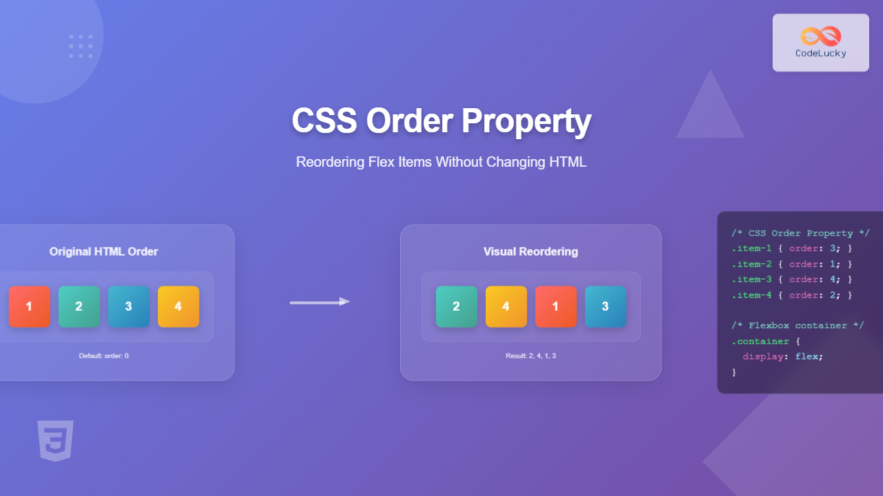
.item-1 { order: 3; }
.item-2 { order: 1; }
.item-3 { order: 4; }
.item-4 { order: 2; }
Visual Result:
As you can see, despite the HTML order being 1-2-3-4, the visual order becomes 2-4-1-3 based on the order values assigned.
Understanding Order Value Behavior
Default Behavior (Order: 0)
When no order property is specified, all flex items have an implicit order value of 0. Items with the same order value appear in their source order (the order they appear in the HTML).
Example: Mixed Order Values
Result: A (-1), B (0), C (0), D (1) – Items B and C maintain their HTML order since they have the same order value.
Practical Use Cases
1. Responsive Navigation Reordering
One common use case is reordering navigation elements for different screen sizes:
.navbar {
  display: flex;
  flex-wrap: wrap;
}

.logo { order: 1; }
.nav-links { order: 2; }
.search-box { order: 3; }
.user-menu { order: 4; }

/* Mobile responsive */
@media (max-width: 768px) {
  .logo { order: 1; }
  .user-menu { order: 2; }
  .search-box { order: 3; }
  .nav-links { order: 4; }
}
2. Content Priority Reordering
Reorder content based on importance or user preferences:
Example: Article Layout
Most important content appears first
Primary content in the middle
Supporting content at the end
Interactive Example: Dynamic Reordering
Click buttons to reorder items:
Advanced Techniques
Combining Order with Other Flex Properties
The order property works seamlessly with other flexbox properties like flex-grow, flex-shrink, and align-self:
.flex-item {
  order: 2;
  flex-grow: 1;
  align-self: center;
}

.priority-item {
  order: -1;
  flex-grow: 2;
  align-self: flex-start;
}
Order in Grid vs Flexbox
While this article focuses on flexbox, it’s worth noting that CSS Grid also has an order property with similar behavior:
Note: The order property works in both flexbox and CSS Grid contexts, but this article specifically covers its flexbox implementation.
Browser Support and Compatibility
The CSS order property enjoys excellent browser support:
- Chrome: Supported since version 21
- Firefox: Supported since version 18
- Safari: Supported since version 7
- Edge: Supported since version 12
- Internet Explorer: Supported since version 11
For older browser support, you may need to use vendor prefixes, though they’re rarely necessary for modern development.
Best Practices and Accessibility Considerations
1. Maintain Logical Reading Order
Remember that the order property only affects visual presentation. Screen readers and keyboard navigation still follow the HTML source order:
Accessibility Tip: Ensure your HTML structure maintains logical reading order for screen readers, even when using visual reordering.
2. Use Semantic Order Values
Instead of using random numbers, consider using meaningful order values:
/* Good: Semantic ordering */
.header { order: -100; }
.main-content { order: 0; }
.sidebar { order: 100; }
.footer { order: 200; }

/* Avoid: Random numbers */
.item-1 { order: 47; }
.item-2 { order: 3; }
.item-3 { order: 891; }
3. Document Your Order Logic
When using complex ordering schemes, document your approach:
/*
  Order hierarchy:
  -100 to -1: Priority items (headers, alerts)
  0: Default content order
  1 to 100: Secondary content
  100+: Footer and supporting elements
*/
Common Pitfalls to Avoid
1. Over-relying on Visual Order
Don’t use the order property as a substitute for proper HTML structure. The markup should still make logical sense without CSS.
2. Forgetting About Focus Order
Keyboard navigation follows the HTML order, not the visual order. Test your interfaces with keyboard navigation.
3. Performance Considerations
Excessive use of the order property can impact rendering performance. Use it judiciously for significant layout changes rather than minor adjustments.
Real-World Example: Responsive Card Layout
Here’s a practical example showing how to reorder cards based on priority and screen size:
HTML Structure:
<div class="card-container">
  <div class="card featured">Featured Article</div>
  <div class="card recent">Recent Post</div>
  <div class="card popular">Popular Content</div>
  <div class="card archived">Archived Content</div>
</div>
CSS Implementation:
.card-container {
  display: flex;
  flex-wrap: wrap;
  gap: 20px;
}

.card {
  flex: 1 1 250px;
  padding: 20px;
  border-radius: 8px;
  background-color: white;
  box-shadow: 0 2px 4px rgba(0,0,0,0.1);
}

/* Desktop order */
.featured { order: 1; }
.recent { order: 2; }
.popular { order: 3; }
.archived { order: 4; }

/* Mobile order - prioritize popular content */
@media (max-width: 768px) {
  .featured { order: 1; }
  .popular { order: 2; }
  .recent { order: 3; }
  .archived { order: 4; }
}
Visual Result:
Order: 1 (Priority content)
Order: 2 (Fresh content)
Order: 3 (Engaging content)
Order: 4 (Historical content)
Conclusion
The CSS order property is an essential tool for modern web development, offering powerful control over visual layout without compromising HTML semantics. By understanding its behavior, browser support, and accessibility implications, you can create more flexible and responsive designs.
Key takeaways:
- Use integer values to control visual order of flex items
- Remember that HTML structure remains unchanged for accessibility
- Combine with media queries for responsive reordering
- Use semantic order values for maintainable code
- Always test keyboard navigation and screen reader compatibility
The order property, when used thoughtfully, can significantly enhance user experience by presenting content in the most logical and contextually appropriate sequence for different devices and use cases.
- What is the CSS Order Property?
- Basic Order Property Example
- Understanding Order Value Behavior
- Practical Use Cases
- Interactive Example: Dynamic Reordering
- Advanced Techniques
- Browser Support and Compatibility
- Best Practices and Accessibility Considerations
- Common Pitfalls to Avoid
- Real-World Example: Responsive Card Layout
- Conclusion

