
CSS order Property: Mastering Element Reordering in Flexbox and Grid Layouts
The CSS order property is a powerful tool that allows you to control the visual order of items within a flexbox or grid container without altering the underlying HTML structure. This property is particularly useful for responsive design, where you might want to rearrange elements based on screen size or other conditions. This comprehensive guide will walk you through the essentials of the order property, its syntax, practical examples, and browser support.
What is the CSS order Property?
The order property specifies the order in which a flex or grid item appears within its container. By default, items are laid out in the order they appear in the HTML source. The order property allows you to override this default ordering, providing flexibility in how elements are visually arranged.
Purpose of the order Property
The primary purpose of the order property is to enable developers to:
- Visually Reorder Elements: Change the display order of items without modifying the HTML structure.
- Responsive Design: Adapt layouts for different screen sizes by reordering elements based on media queries.
- Accessibility Considerations: Ensure that visual reordering does not negatively impact the logical document order for screen readers and keyboard navigation.
Syntax of the order Property
The order property accepts a single integer value. Elements are ordered by the value of this integer, with lower values appearing earlier in the container.
.item {
  order: <integer>;
}
Possible Values
| Value | Description |
|---|---|
| ` |
An integer value representing the order of the item. Can be positive, negative, or zero. |
| `initial` | Sets the property to its default value (0). |
| `inherit` | Inherits the property from its parent element. |
Note: Elements with the same order value are displayed in the order they appear in the HTML source. 💡
Using the order Property with Flexbox
The order property is commonly used with flexbox layouts to rearrange items within a flex container.
Basic Example: Reordering Flex Items
In this example, we’ll create a simple flex container with three items and use the order property to change their visual order.
<div class="flex-container-basic">
  <div class="flex-item" style="background-color: #f00;">Item 1</div>
  <div class="flex-item" style="background-color: #0f0;">Item 2</div>
  <div class="flex-item" style="background-color: #00f;">Item 3</div>
</div>

<style>
  .flex-container-basic {
    display: flex;
    width: 300px;
    border: 1px solid black;
  }

  .flex-item {
    padding: 10px;
    text-align: center;
    color: white;
  }

  .flex-container-basic .flex-item:nth-child(1) {
    order: 3; /* Moves Item 1 to the end */
  }

  .flex-container-basic .flex-item:nth-child(2) {
    order: 1; /* Moves Item 2 to the beginning */
  }

  .flex-container-basic .flex-item:nth-child(3) {
    order: 2; /* Moves Item 3 to the middle */
  }
</style>
The output shows Item 2 first, followed by Item 3, and then Item 1.
Real-World Example: Responsive Reordering
Let’s consider a scenario where you want to reorder elements in a navigation bar based on the screen size.
<div class="flex-container-responsive">
  <div class="flex-item logo">Logo</div>
  <div class="flex-item nav1">Nav 1</div>
  <div class="flex-item nav2">Nav 2</div>
  <div class="flex-item nav3">Nav 3</div>
</div>

<style>
  .flex-container-responsive {
    display: flex;
    width: 100%;
    border: 1px solid black;
    padding: 10px;
  }

  .flex-item {
    padding: 10px;
    text-align: center;
    color: black;
    flex: 1;
  }

  /* Default order */
  .logo {
    order: 1;
  }

  .nav1 {
    order: 2;
  }

  .nav2 {
    order: 3;
  }

  .nav3 {
    order: 4;
  }

  /* Reorder on smaller screens */
  @media (max-width: 600px) {
    .logo {
      order: 2; /* Move logo to the middle */
    }

    .nav1 {
      order: 1; /* Move Nav 1 to the beginning */
    }

    .nav2 {
      order: 3;
    }

    .nav3 {
      order: 4;
    }
  }
</style>
On smaller screens (less than 600px), the logo moves to the middle of the navigation bar, while Nav 1 moves to the beginning.
Complex Example: Dynamic Reordering with JavaScript
For more advanced scenarios, you can dynamically change the order property using JavaScript based on user interactions or other conditions.
<div class="flex-container-dynamic">
  <div class="flex-item" id="item1" style="background-color: #f00;">Item 1</div>
  <div class="flex-item" id="item2" style="background-color: #0f0;">Item 2</div>
  <div class="flex-item" id="item3" style="background-color: #00f;">Item 3</div>
</div>
<button id="reorderButton">Reorder Items</button>

<style>
  .flex-container-dynamic {
    display: flex;
    width: 300px;
    border: 1px solid black;
  }

  .flex-item {
    padding: 10px;
    text-align: center;
    color: white;
  }
</style>

<script>
  document.getElementById("reorderButton").addEventListener("click", function() {
    const item1 = document.getElementById("item1");
    const item2 = document.getElementById("item2");
    const item3 = document.getElementById("item3");

    // Swap order values of Item 1 and Item 3
    const tempOrder = item1.style.order || "0";
    item1.style.order = item3.style.order || "0";
    item3.style.order = tempOrder;
  });
</script>
Clicking the “Reorder Items” button swaps the positions of Item 1 and Item 3 by changing their order values.
Using the order Property with Grid Layout
The order property also works with CSS Grid layouts, allowing you to rearrange grid items within a grid container.
Basic Example: Reordering Grid Items
<div class="grid-container-basic">
  <div class="grid-item" style="background-color: #f00;">Item 1</div>
  <div class="grid-item" style="background-color: #0f0;">Item 2</div>
  <div class="grid-item" style="background-color: #00f;">Item 3</div>
</div>

<style>
  .grid-container-basic {
    display: grid;
    grid-template-columns: repeat(3, 1fr);
    width: 300px;
    border: 1px solid black;
  }

  .grid-item {
    padding: 10px;
    text-align: center;
    color: white;
  }

  .grid-container-basic .grid-item:nth-child(1) {
    order: 3; /* Moves Item 1 to the end */
  }

  .grid-container-basic .grid-item:nth-child(2) {
    order: 1; /* Moves Item 2 to the beginning */
  }

  .grid-container-basic .grid-item:nth-child(3) {
    order: 2; /* Moves Item 3 to the middle */
  }
</style>
The output shows Item 2 first, followed by Item 3, and then Item 1, demonstrating the reordering of grid items.
Accessibility Considerations
When using the order property, it’s crucial to ensure that the visual reordering does not negatively impact the accessibility of your content. Screen readers and keyboard navigation typically follow the HTML source order, so if the visual order deviates significantly from the source order, users may have difficulty navigating the content.
Best Practices
- Use Sparingly: Only use the
orderproperty when necessary for visual presentation. - Maintain Logical Order: Ensure that the underlying HTML structure maintains a logical reading order.
- Test with Screen Readers: Verify that the content is still accessible to users with disabilities.
Warning: Avoid using order to fix layout issues that could be better addressed by modifying the HTML structure. ⚠️
Browser Support
The order property is well-supported across all modern web browsers.
Conclusion
The CSS order property is a valuable tool for controlling the visual order of items in flexbox and grid layouts. By understanding its syntax, usage, and accessibility considerations, you can effectively use this property to create responsive and visually appealing layouts without altering the underlying HTML structure. Always ensure that visual reordering does not negatively impact the accessibility of your content, and use the order property judiciously to enhance the user experience.
Related Posts
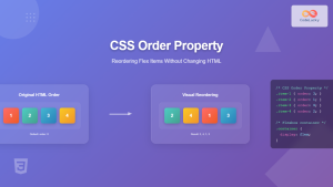
CSS Order Property: Complete Guide to Reordering Flex Items Visually
The CSS order property is a powerful flexbox feature that allows you to change the visual order of flex items...
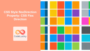
CSS Style flexDirection Property: CSS Flex Direction
CSS flexDirection Property: Mastering Flex Item Arrangement The CSS flexDirection property is a crucial aspect of Flexbox layout, determining the...
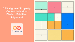
CSS align-self Property: Control Individual Flexbox/Grid Item Alignment
CSS align-self Property: Mastering Individual Item Alignment in Flexbox and Grid The CSS align-self property is a powerful tool for...
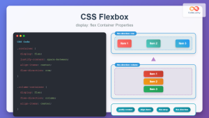
CSS Flexbox: Complete Guide to display: flex Container Properties and Layout Control
CSS Flexbox revolutionized web layout by providing a powerful, flexible way to arrange elements within containers. The display: flex property...

CSS Align-Items: Master Cross-Axis Alignment in Flexbox and Grid
The CSS align-items property is a fundamental tool for controlling cross-axis alignment in both flexbox and CSS Grid layouts. Understanding...
CSS Style alignItems Property: CSS Align Items
Understanding the CSS align-items Property The align-items property in CSS is a powerful tool that defines how items are aligned...

CSS Grid Auto Flow: Master Item Placement Algorithm Control for Responsive Layouts
Understanding CSS Grid Auto Flow The grid-auto-flow property is a powerful CSS Grid feature that controls how auto-placed items are...

CSS Style flexFlow Property: CSS Flex Flow
CSS flex-flow Property: A Comprehensive Guide The CSS flex-flow property is a shorthand property for setting both the flex-direction and...

CSS Style justifyContent Property: CSS Justify Content
CSS justifyContent Property: Mastering Content Alignment The CSS justifyContent property defines how the browser distributes space between and around content...
CSS flexShrink Property: CSS Flex Shrink
CSS flexShrink Property: Controlling the Shrink Factor of Flex Items The CSS flexShrink property is a crucial component of the...
CSS Place-Self: Master Grid and Flexbox Item Positioning with One Property
The CSS place-self property is a powerful shorthand that combines justify-self and align-self into a single declaration, making it easier...
CSS Align-Self: Master Individual Grid Item Block Axis Alignment
The CSS align-self property provides granular control over individual grid items' alignment along the block axis (vertical direction in horizontal...


