
CSS object-position Property: Mastering Object Positioning
The object-position property in CSS provides a way to specify the alignment of a replaced element’s content, such as an <img> or <video>, within its container. This property is particularly useful when the object-fit property is used to resize the content, allowing precise control over how the object is positioned within its frame. This guide will cover the syntax, values, and practical examples of the object-position property to help you enhance your web design.
What is the object-position Property?
The object-position property determines how the content of a replaced element should be positioned within its content box. It works similarly to background-position, allowing you to specify the horizontal and vertical alignment.
Purpose of the object-position Property
The primary purpose of the object-position property is to:
- Control the alignment of images and videos within their containers.
- Ensure important parts of the content are always visible, even when the content is resized.
- Fine-tune the visual presentation of replaced elements to fit specific design requirements.
Syntax of object-position
The object-position property accepts one or two values that define the horizontal and vertical position of the content within its container.
object-position: horizontal vertical;
Where:
horizontal: Specifies the horizontal position. Possible values includeleft,right,center,top,bottom,percentage, orlength.vertical: Specifies the vertical position. Possible values includetop,bottom,center,left,right,percentage, orlength.
Key Values for object-position
Understanding the possible values for the object-position property is crucial for effective use:
| Value | Description |
|---|---|
| `top` | Aligns the content to the top of the container. |
| `bottom` | Aligns the content to the bottom of the container. |
| `left` | Aligns the content to the left of the container. |
| `right` | Aligns the content to the right of the container. |
| `center` | Centers the content both horizontally and vertically within the container. |
| `percentage` | Specifies the position as a percentage of the container’s width and height. The first value is the horizontal offset, and the second value is the vertical offset. |
| `length` | Specifies the position as a fixed length (e.g., pixels, ems). The first value is the horizontal offset, and the second value is the vertical offset. |
| `initial` | Sets the property to its default value. |
| `inherit` | Inherits the property from its parent element. |
Note: If only one value is specified, it applies to the horizontal position, and the vertical position defaults to center. ⚠️
Basic Examples of object-position
Let’s explore some basic examples of the object-position property. Each example below includes the necessary HTML and CSS code to demonstrate how to position an image within a container.
Aligning to the Top Left
This example demonstrates how to align an image to the top-left corner of its container.
<div style="width: 200px; height: 150px; border: 1px solid black;">
  <img
    id="imageTopLeft"
    src="https://dummyimage.com/300x200/007bff/fff"
    alt="Dummy Image"
    style="width: 100%; height: 100%; object-fit: cover; object-position: top left;"
  />
</div>

Centering the Image
This example demonstrates how to center an image both horizontally and vertically within its container.
<div style="width: 200px; height: 150px; border: 1px solid black;">
  <img
    id="imageCenter"
    src="https://dummyimage.com/300x200/007bff/fff"
    alt="Dummy Image"
    style="width: 100%; height: 100%; object-fit: cover; object-position: center;"
  />
</div>
Aligning to the Bottom Right
This example demonstrates how to align an image to the bottom-right corner of its container.
<div style="width: 200px; height: 150px; border: 1px solid black;">
  <img
    id="imageBottomRight"
    src="https://dummyimage.com/300x200/007bff/fff"
    alt="Dummy Image"
    style="width: 100%; height: 100%; object-fit: cover; object-position: bottom right;"
  />
</div>
Using Percentage Values
This example demonstrates how to use percentage values to position an image within its container.
<div style="width: 200px; height: 150px; border: 1px solid black;">
  <img
    id="imagePercentage"
    src="https://dummyimage.com/300x200/007bff/fff"
    alt="Dummy Image"
    style="width: 100%; height: 100%; object-fit: cover; object-position: 25% 75%;"
  />
</div>
Using Length Values
This example demonstrates how to use length values (pixels) to position an image within its container.
<div style="width: 200px; height: 150px; border: 1px solid black;">
  <img
    id="imageLength"
    src="https://dummyimage.com/300x200/007bff/fff"
    alt="Dummy Image"
    style="width: 100%; height: 100%; object-fit: cover; object-position: 20px 30px;"
  />
</div>
Advanced Techniques with object-position
Combining object-position with object-fit
The object-position property is most effective when used in conjunction with the object-fit property. The object-fit property determines how the image should be resized to fit its container, while object-position controls its alignment.
<div style="width: 200px; height: 150px; border: 1px solid black;">
  <img
    id="imageCombined"
    src="https://dummyimage.com/400x300/007bff/fff"
    alt="Dummy Image"
    style="width: 100%; height: 100%; object-fit: cover; object-position: 30% 40%;"
  />
</div>
Real-World Applications of object-position
The object-position property is useful in several scenarios:
- Image Galleries: Ensuring important parts of images are always visible.
- Video Thumbnails: Controlling the focal point of video previews.
- Responsive Design: Adapting image alignment based on screen size.
Use Case Example: Creating a Responsive Image Grid
Let’s create a practical example that demonstrates how to use the object-position property to build a responsive image grid where the key part of each image remains visible, regardless of the container size.
<style>
  .image-grid {
    display: grid;
    grid-template-columns: repeat(auto-fill, minmax(200px, 1fr));
    gap: 10px;
  }

  .image-container {
    width: 100%;
    height: 200px;
    overflow: hidden;
    border: 1px solid #ddd;
  }

  .image-container img {
    width: 100%;
    height: 100%;
    object-fit: cover;
    object-position: center; /* Ensure the center of the image is always visible */
    display: block; /* Fixes extra space below the image */
  }
</style>

<div class="image-grid">
  <div class="image-container">
    <img
      src="https://dummyimage.com/600x400/007bff/fff&text=Image+1"
      alt="Image 1"
    />
  </div>
  <div class="image-container">
    <img
      src="https://dummyimage.com/600x400/28a745/fff&text=Image+2"
      alt="Image 2"
    />
  </div>
  <div class="image-container">
    <img
      src="https://dummyimage.com/600x400/dc3545/fff&text=Image+3"
      alt="Image 3"
    />
  </div>
  <div class="image-container">
    <img
      src="https://dummyimage.com/600x400/ffc107/000&text=Image+4"
      alt="Image 4"
    />
  </div>
</div>
This example demonstrates:
- Responsive Grid Layout: Using CSS Grid for a flexible image layout.
- Consistent Image Display: Ensuring images fill their containers while maintaining aspect ratio.
- Focal Point Visibility: Keeping the center of each image visible.
Browser Support
The object-position property is supported by all modern browsers, ensuring consistent behavior across different platforms.
Note: Always test your implementations across different browsers to ensure compatibility and a seamless user experience. 🧐
Conclusion
The object-position property is a valuable tool for controlling the alignment of replaced content within its container. By understanding its syntax, values, and how it works with object-fit, you can create visually appealing and responsive designs that adapt to different screen sizes and devices. This comprehensive guide should provide you with the knowledge to effectively use the object-position property in your web projects. Happy coding!
Related Posts
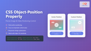
CSS Object-Position Property: Complete Guide to Precise Image and Video Positioning
The CSS object-position property is a powerful tool that allows developers to precisely control how images, videos, and other replaced...
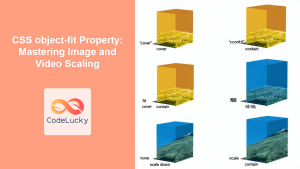
CSS object-fit Property: Mastering Image and Video Scaling
Understanding the CSS object-fit Property: A Comprehensive Guide The CSS object-fit property specifies how the content of a replaced element,...

CSS position Property: Mastering Layouts in CSS
Understanding the CSS position Property: A Comprehensive Guide The position property in CSS is a fundamental tool for controlling the...

CSS Style right Property: CSS Right
Understanding the CSS right Property The CSS right property plays a crucial role in positioning elements within a web page....
CSS Style left Property: CSS Left
CSS left Property: A Comprehensive Guide The CSS left property is a fundamental tool for web developers, enabling precise horizontal...
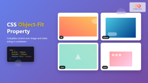
CSS Object-Fit Property: Complete Guide to Image and Video Sizing Control
The CSS object-fit property is a powerful tool that controls how replaced elements like images and videos are resized to...
CSS Style backgroundPosition Property: CSS Background Position
CSS background-position Property: Mastering Background Image Placement The CSS background-position property allows you to precisely control the initial position of...
CSS Position Property: Complete Guide to Static, Relative, Absolute, Fixed & Sticky Positioning
The CSS position property is one of the most powerful tools for controlling element layout and creating sophisticated web designs....
CSS Style top Property: CSS Top
Understanding the CSS top Property: A Comprehensive Guide The top property in CSS is used to specify the vertical position...
HTML Object width Property: Object Width
HTML Object width Property: Mastering Object Width The HTML <object> tag is a versatile element used to embed various types...
CSS Relative Positioning: Master Element Offset and Layout Control
Understanding CSS Relative Positioning CSS relative positioning is a fundamental layout technique that allows you to move elements from their...
CSS vertical-align Property: CSS Vertical Align
CSS vertical-align Property: Mastering Vertical Alignment The CSS vertical-align property specifies the vertical alignment of an inline or table-cell box....


