
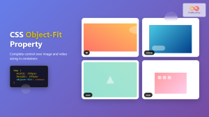
Understanding the CSS object-fit Property: A Comprehensive Guide
The CSS object-fit property specifies how the content of a replaced element, such as an <img> or <video>, should be resized to fit its container. It offers control over how images and videos adapt to different container sizes, maintaining aspect ratios, cropping, or stretching as needed. This property is essential for creating responsive and visually appealing layouts.
What is the object-fit Property?
The object-fit property determines how an element’s content (typically an image or video) should be scaled or cropped to fit its containing box. It’s particularly useful when dealing with responsive designs where content must adapt to various screen sizes and aspect ratios. Without object-fit, images and videos may appear stretched, distorted, or cropped inappropriately.
Purpose of the object-fit Property
The primary purpose of the object-fit property is to:
- Control how images and videos are resized to fit their containers.
- Maintain aspect ratios to prevent distortion.
- Determine whether content should be cropped or stretched.
- Enable responsive and visually consistent layouts.
Syntax and Values
The object-fit property takes one of the following values:
object-fit: fill | contain | cover | none | scale-down | initial | inherit;
Values Explained
| Value | Description |
|---|---|
| `fill` | This is the default value. The content is sized to fill the entire container. If necessary, the content will be stretched or squashed to fit. This may result in distortion. |
| `contain` | The content is scaled to fit within the container while preserving its aspect ratio. The entire content will be visible, and the container may have empty areas (letterboxing or pillarboxing) if the aspect ratio of the content does not match the container. |
| `cover` | The content is scaled to fill the entire container while preserving its aspect ratio. The content will be cropped to fit if its aspect ratio doesn’t match the container, ensuring no empty areas. |
| `none` | The content is displayed at its original size. If the content is larger than the container, it will be clipped. No scaling occurs. |
| `scale-down` | The content is scaled down to `contain` or `none`, whichever results in a smaller concrete object size. If the content is smaller than the container, it will be displayed at its original size (`none`). If it’s larger, it will be scaled down to fit (`contain`). |
| `initial` | Sets the property to its default value (`fill`). |
| `inherit` | Inherits the value of the `object-fit` property from its parent element. |
Practical Examples
Let’s explore practical examples demonstrating the use of the object-fit property. Each example includes the necessary HTML and CSS code to showcase different values of object-fit.
Example 1: object-fit: fill
The fill value stretches or squashes the image to fit the container, potentially distorting the image.
<div style="width: 200px; height: 150px; border: 1px solid black;">
  <img
    id="imageFill"
    src="https://dummyimage.com/300x200/007bff/fff"
    alt="Fill"
    style="width: 100%; height: 100%; object-fit: fill;"
  />
</div>
This code will stretch the image to fill the 200x150px container, which may distort the image if its original aspect ratio is different.
Example 2: object-fit: contain
The contain value scales the image to fit within the container while preserving its aspect ratio. Empty spaces may appear if the aspect ratios don’t match.
<div style="width: 200px; height: 150px; border: 1px solid black;">
  <img
    id="imageContain"
    src="https://dummyimage.com/300x200/007bff/fff"
    alt="Contain"
    style="width: 100%; height: 100%; object-fit: contain;"
  />
</div>
In this case, the image will scale to fit within the 200x150px container, maintaining its aspect ratio. Letterboxing (horizontal empty spaces) or pillarboxing (vertical empty spaces) may occur.
Example 3: object-fit: cover
The cover value scales the image to fill the container while preserving its aspect ratio. The image will be cropped if necessary to avoid empty spaces.
<div style="width: 200px; height: 150px; border: 1px solid black;">
  <img
    id="imageCover"
    src="https://dummyimage.com/300x200/007bff/fff"
    alt="Cover"
    style="width: 100%; height: 100%; object-fit: cover;"
  />
</div>
The image will scale to fill the 200x150px container, and parts of the image will be cropped to fit without any empty spaces.
Example 4: object-fit: none
The none value displays the image at its original size. If the image is larger than the container, it will be clipped.
<div style="width: 200px; height: 150px; border: 1px solid black; overflow: hidden;">
  <img
    id="imageNone"
    src="https://dummyimage.com/300x200/007bff/fff"
    alt="None"
    style="width: 100%; height: 100%; object-fit: none;"
  />
</div>
Here, the image will display at its original size (300x200px). Since the container is 200x150px, the image will be clipped. Setting overflow:hidden on the container ensures that the overflow is not visible.
Example 5: object-fit: scale-down
The scale-down value scales the image down to contain or none, whichever results in a smaller concrete object size.
<div style="width: 200px; height: 150px; border: 1px solid black;">
  <img
    id="imageScaleDown"
    src="https://dummyimage.com/300x200/007bff/fff"
    alt="Scale Down"
    style="width: 100%; height: 100%; object-fit: scale-down;"
  />
</div>
In this case, the image will scale down to contain because the original size (300x200px) is larger than the container. If the image were smaller than the container, it would display at its original size (none).
Real-World Applications of the object-fit Property
The object-fit property is used in various scenarios, including:
- Responsive Image Galleries: Maintaining the aspect ratio of images in galleries that adapt to different screen sizes.
- Video Players: Ensuring videos scale correctly within their containers without distortion.
- Product Listings: Displaying product images consistently, regardless of their original dimensions.
- Hero Sections: Fitting background images to cover the entire hero section without stretching or skewing.
Use Case Example: Responsive Image Gallery
Let’s create a responsive image gallery that demonstrates the use of the object-fit property to maintain image aspect ratios.
<div style="display: flex; flex-wrap: wrap; justify-content: space-around;">
  <div style="width: 200px; height: 150px; border: 1px solid #ddd; margin: 10px;">
    <img
      id="galleryImage1"
      src="https://dummyimage.com/300x200/007bff/fff"
      alt="Gallery Image 1"
      style="width: 100%; height: 100%; object-fit: cover;"
    />
  </div>
  <div style="width: 200px; height: 150px; border: 1px solid #ddd; margin: 10px;">
    <img
      id="galleryImage2"
      src="https://dummyimage.com/200x300/007bff/fff"
      alt="Gallery Image 2"
      style="width: 100%; height: 100%; object-fit: cover;"
    />
  </div>
  <div style="width: 200px; height: 150px; border: 1px solid #ddd; margin: 10px;">
    <img
      id="galleryImage3"
      src="https://dummyimage.com/400x200/007bff/fff"
      alt="Gallery Image 3"
      style="width: 100%; height: 100%; object-fit: cover;"
    />
  </div>
</div>
This example creates a responsive image gallery with three images. The object-fit: cover property ensures that each image fills its container while maintaining its aspect ratio and cropping as necessary.
Browser Support
The object-fit property is well-supported across modern web browsers, ensuring consistent behavior across different platforms.
Note: While object-fit has excellent support, it’s always a good practice to test your layouts across different browsers and devices to ensure a consistent user experience. 🧐
Conclusion
The CSS object-fit property is a powerful tool for controlling how images and videos are resized to fit their containers. By understanding the different values of object-fit, you can create responsive and visually appealing layouts that maintain the aspect ratio and visual integrity of your media. This comprehensive guide should equip you with the knowledge and skills necessary to effectively use the object-fit property in your web development projects. Happy coding! 🚀
Related Posts
CSS Object-Fit Property: Complete Guide to Image and Video Sizing Control
The CSS object-fit property is a powerful tool that controls how replaced elements like images and videos are resized to...
CSS object-position Property: CSS Object Position
CSS object-position Property: Mastering Object Positioning The object-position property in CSS provides a way to specify the alignment of a...
CSS Object-Position Property: Complete Guide to Precise Image and Video Positioning
The CSS object-position property is a powerful tool that allows developers to precisely control how images, videos, and other replaced...
CSS Style backgroundSize Property: CSS Background Size
CSS background-size Property: Mastering Background Image Scaling The CSS background-size property specifies the size of background images. Controlling the size...
HTML Object width Property: Object Width
HTML Object width Property: Mastering Object Width The HTML <object> tag is a versatile element used to embed various types...
CSS boxSizing Property: Understanding the CSS Box Model
Understanding the CSS boxSizing Property The boxSizing property in CSS is a fundamental tool for controlling how the total width...

HTML Img height Property: Image Height
HTML <img> height Property: Controlling Image Height The height attribute of the HTML <img> tag specifies the height of the...
CSS Resize Property: Controlling Element Resizability
Understanding the CSS Resize Property: Controlling Element Resizability The resize property in CSS allows you to control whether (and how)...

CSS Width Property: Mastering Element Width in CSS
CSS Width Property: Mastering Element Width The width property in CSS defines the width of an element's content area. It's...
HTML Img naturalHeight Property: Image Natural Height
HTML <img> naturalHeight Property: Understanding Image Natural Height The naturalHeight property of the HTML <img> element provides the intrinsic (original)...

CSS Style maxWidth Property: CSS Max Width
Understanding the CSS maxWidth Property The CSS maxWidth property is a fundamental tool in web development for controlling the maximum...

HTML Source media Property: Source Media Query
HTML Source media Property: Source Media Query The HTML <source> element is used within <picture> and <video> elements to provide...


