Understanding the CSS minHeight Property
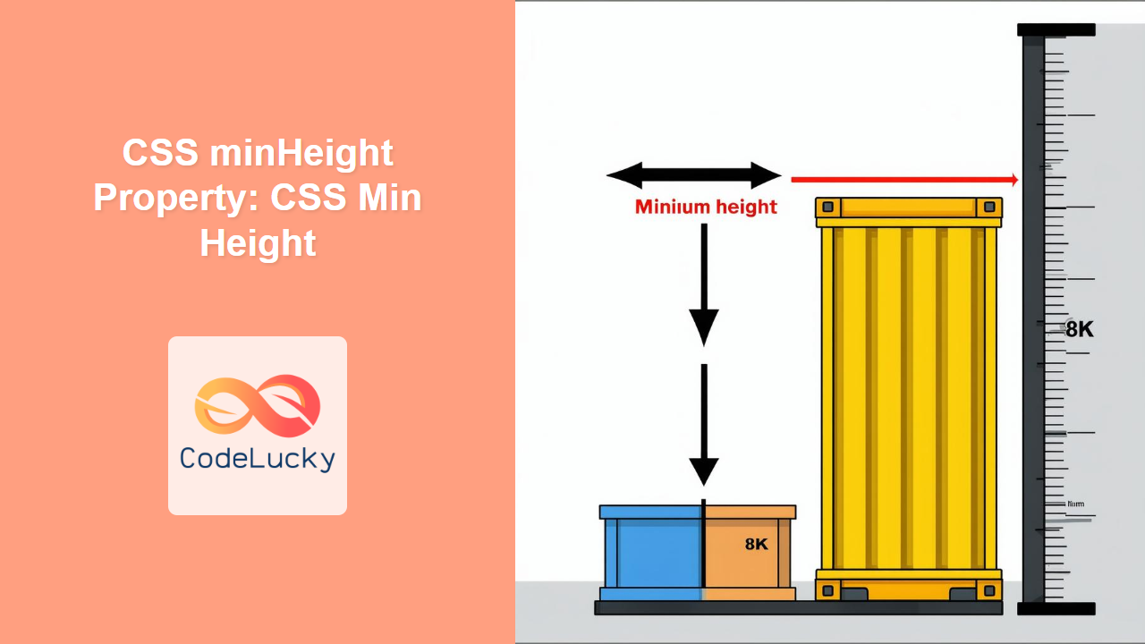
The CSS minHeight property sets the minimum height of an element. It prevents the element’s height from becoming smaller than the specified value, even if the content inside would otherwise dictate a smaller height. This property is invaluable for creating responsive layouts and ensuring elements maintain a certain size regardless of their content.
Purpose of the minHeight Property
The primary purpose of the minHeight property is to:
- Ensure an element always occupies a minimum vertical space.
- Prevent elements from collapsing when they contain little or no content.
- Create flexible layouts that adapt to different screen sizes and content volumes.
- Maintain consistent visual proportions across different devices.
Syntax
The minHeight property is defined using the following syntax:
element {
  min-height: value;
}
Where value can be one of the following:
| Value | Description |
|---|---|
| `length` |
Specifies a fixed minimum height in px, em, rem, vh, vw, etc. For example: `100px`, `5em`, `20vh`. |
| `percentage` |
Specifies a minimum height as a percentage of the containing block’s height. The containing block’s height must be explicitly specified. For example: `50%`. |
| `auto` |
The default value. The element’s minimum height is determined by the content. |
| `initial` | Sets the property to its default value (`auto`). |
| `inherit` | Inherits the property value from its parent element. |
Examples
Let’s explore some practical examples of using the minHeight property.
Example 1: Setting a Fixed Minimum Height
This example sets a fixed minimum height for a div element.
<!DOCTYPE html>
<html>
  <head>
    <title>CSS minHeight Example</title>
    <style>
      .min-height-fixed {
        min-height: 100px;
        background-color: #f0f0f0;
        border: 1px solid #ccc;
        padding: 10px;
      }
    </style>
  </head>
  <body>
    <div class="min-height-fixed">
      This div has a minimum height of 100px.
    </div>
  </body>
</html>
Output:
The div will always be at least 100 pixels tall, regardless of the amount of content inside.
Example 2: Using Percentage Values
This example sets the minimum height of a div to 50% of its parent’s height.
<!DOCTYPE html>
<html>
  <head>
    <title>CSS minHeight Percentage Example</title>
    <style>
      .parent-percentage {
        height: 400px; /* Parent must have an explicit height */
        background-color: #e0e0e0;
        border: 1px solid #bbb;
        padding: 10px;
      }

      .min-height-percentage {
        min-height: 50%;
        background-color: #f0f0f0;
        border: 1px solid #ccc;
        padding: 10px;
      }
    </style>
  </head>
  <body>
    <div class="parent-percentage">
      <div class="min-height-percentage">
        This div has a minimum height of 50% of its parent's height.
      </div>
    </div>
  </body>
</html>
Output:
The inner div will always be at least 200 pixels tall (50% of the parent’s 400px height).
Example 3: Ensuring a Minimum Height for a Container with Dynamic Content
This example ensures a container maintains a minimum height, even if its content is dynamically loaded or changes.
<!DOCTYPE html>
<html>
  <head>
    <title>CSS minHeight Dynamic Content Example</title>
    <style>
      .min-height-dynamic {
        min-height: 200px;
        background-color: #f0f0f0;
        border: 1px solid #ccc;
        padding: 10px;
      }
    </style>
  </head>
  <body>
    <div class="min-height-dynamic" id="dynamicContent">
      Loading content...
    </div>

    <script>
      document.addEventListener("DOMContentLoaded", function () {
        setTimeout(function () {
          document.getElementById("dynamicContent").innerHTML =
            "Content loaded dynamically after 2 seconds.";
        }, 2000);
      });
    </script>
  </body>
</html>
Output:
Initially, the div will display “Loading content…” and have a minimum height of 200px. After 2 seconds, the content will be replaced with the dynamically loaded text, but the div will still maintain its minimum height.
Example 4: Using minHeight for Responsive Layouts
In responsive design, minHeight can be used to ensure that sections of a page remain visible even on smaller screens.
<!DOCTYPE html>
<html>
  <head>
    <title>CSS minHeight Responsive Layout Example</title>
    <style>
      .responsive-section {
        min-height: 30vh; /* Minimum height relative to the viewport height */
        background-color: #f0f0f0;
        border: 1px solid #ccc;
        padding: 20px;
        margin-bottom: 20px;
      }
    </style>
  </head>
  <body>
    <div class="responsive-section">
      This section has a minimum height of 30vh, ensuring it's always visible,
      even on smaller screens.
    </div>

    <div class="responsive-section">
      Another section with the same minimum height.
    </div>
  </body>
</html>
Output:
Each section will have a minimum height that is 30% of the viewport height, ensuring they are always visible, regardless of screen size.
Tips and Notes
- Parent Height: When using percentage values, ensure the parent element has a defined height; otherwise, the
minHeightwill not work as expected. - Content Overflow: If the content exceeds the
minHeight, the element will expand to accommodate the content. UsemaxHeightin conjunction withminHeightfor more controlled sizing. - Responsive Design: Use viewport units (e.g.,
vh) to create responsive layouts that adapt to different screen sizes. - Combination with Other Properties:
minHeightcan be combined withheightandmaxHeightto create flexible and robust layouts. For instance, usingminHeightandmaxHeighttogether can define a range of heights within which an element can expand or contract based on its content.
Real-World Applications of the minHeight Property
The minHeight property is useful in various scenarios:
- Footer Placement: Ensuring a footer stays at the bottom of the viewport, even when the content is short.
- Form Fields: Maintaining consistent height for form fields, regardless of the amount of input.
- Card Layouts: Ensuring cards in a grid layout have a minimum height to maintain visual consistency.
- Sidebar Navigation: Keeping a sidebar visible, even with minimal content.
Browser Support
The minHeight property is well-supported across all modern web browsers:
- Chrome
- Firefox
- Safari
- Edge
- Opera
Conclusion
The CSS minHeight property is a powerful tool for controlling the minimum vertical space occupied by an element. By understanding its syntax, values, and practical applications, you can create more flexible, responsive, and visually consistent layouts. Whether you’re building dynamic web applications or static websites, the minHeight property is an essential part of modern CSS layout techniques.

