
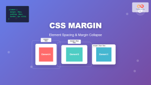
CSS Margin: Mastering Spacing in Web Design
In CSS, the margin property is fundamental for controlling the space around HTML elements. It defines the space between an element and its adjacent elements. This spacing is essential for creating visually appealing and well-structured web layouts. Understanding how to use the margin property effectively is crucial for any web developer. This comprehensive guide covers all aspects of the CSS margin property, from basic syntax to advanced techniques.
What is the CSS Margin Property?
The margin property sets the margin area on all four sides of an element. It’s a shorthand property for setting margin-top, margin-right, margin-bottom, and margin-left in a single declaration. Margins clear an area around an element, outside the border. Unlike padding, which adds space inside an element’s border, margins add space outside the border.
Purpose of the CSS Margin Property
The primary purpose of the CSS margin property is to:
- Control the spacing between HTML elements.
- Create visual separation and hierarchy in web layouts.
- Improve the readability and aesthetics of web pages.
- Manage the overall structure and alignment of content.
Syntax of the margin Property
The margin property can accept one to four values, each representing a different side of the element.
margin: value; /* All four sides */
margin: value1 value2; /* Top and bottom | Left and right */
margin: value1 value2 value3; /* Top | Left and right | Bottom */
margin: value1 value2 value3 value4; /* Top | Right | Bottom | Left */
Possible Values
| Value | Description |
|---|---|
| `auto` | The browser calculates the margin. Often used to horizontally center block-level elements. |
| `length` | Specifies the margin in pixels (`px`), points (`pt`), ems (`em`), rems (`rem`), or other CSS units. Negative values are allowed. |
| `%` | Specifies the margin as a percentage of the width of the containing element. |
| `inherit` | Specifies that the margin should be inherited from the parent element. |
Basic Examples of the margin Property
Let’s explore some basic examples of how to use the margin property.
Setting Margin on All Four Sides
This example sets a margin of 20 pixels on all four sides of a <div> element.
<!DOCTYPE html>
<html>
  <head>
    <style>
      #marginAllSides {
        margin: 20px;
        border: 1px solid black;
        background-color: #f0f0f0;
        padding: 10px;
      }
    </style>
  </head>
  <body>
    <div id="marginAllSides">This div has a 20px margin on all sides.</div>
  </body>
</html>
Output:
<div id="marginAllSides" style="margin: 20px; border: 1px solid black; background-color: rgb(240, 240, 240); padding: 10px;">
  This div has a 20px margin on all sides.
</div>
Setting Different Margins for Top, Right, Bottom, and Left
This example sets different margins for each side of a <div> element.
<!DOCTYPE html>
<html>
  <head>
    <style>
      #marginDifferentSides {
        margin-top: 10px;
        margin-right: 20px;
        margin-bottom: 30px;
        margin-left: 40px;
        border: 1px solid black;
        background-color: #f0f0f0;
        padding: 10px;
      }
    </style>
  </head>
  <body>
    <div id="marginDifferentSides">
      This div has different margins on each side.
    </div>
  </body>
</html>
Output:
<div id="marginDifferentSides" style="margin-top: 10px; margin-right: 20px; margin-bottom: 30px; margin-left: 40px; border: 1px solid black; background-color: rgb(240, 240, 240); padding: 10px;">
  This div has different margins on each side.
</div>
Using auto to Center an Element Horizontally
This example uses margin: auto to horizontally center a <div> element within its parent.
<!DOCTYPE html>
<html>
  <head>
    <style>
      #marginAuto {
        width: 50%;
        margin: auto;
        border: 1px solid black;
        background-color: #f0f0f0;
        padding: 10px;
        text-align: center;
      }
    </style>
  </head>
  <body>
    <div id="marginAuto">This div is horizontally centered using margin: auto.</div>
  </body>
</html>
Output:
<div id="marginAuto" style="width: 50%; margin: auto; border: 1px solid black; background-color: rgb(240, 240, 240); padding: 10px; text-align: center;">This div is horizontally centered using margin: auto.</div>
Using Percentage Values for Margin
This example uses percentage values to set the margin relative to the width of the parent element.
<!DOCTYPE html>
<html>
  <head>
    <style>
      #marginPercentage {
        width: 50%;
        margin: 10% 20%;
        border: 1px solid black;
        background-color: #f0f0f0;
        padding: 10px;
      }
    </style>
  </head>
  <body>
    <div id="marginPercentage">This div has margins set as percentages.</div>
  </body>
</html>
Output:
<div id="marginPercentage" style="width: 50%; margin: 10% 20%; border: 1px solid black; background-color: rgb(240, 240, 240); padding: 10px;">This div has margins set as percentages.</div>
Using inherit to Inherit Margin from the Parent Element
This example demonstrates how an element can inherit the margin values from its parent element using margin: inherit.
<!DOCTYPE html>
<html>
  <head>
    <style>
      #parentElement {
        margin: 30px;
        border: 1px solid black;
        background-color: #f0f0f0;
        padding: 10px;
      }
      #childElement {
        margin: inherit;
        border: 1px solid black;
        background-color: #e0e0e0;
        padding: 10px;
      }
    </style>
  </head>
  <body>
    <div id="parentElement">
      Parent Element
      <div id="childElement">Child Element (inherits margin)</div>
    </div>
  </body>
</html>
Output:
<div id="parentElement" style="margin: 30px; border: 1px solid black; background-color: rgb(240, 240, 240); padding: 10px;">
  Parent Element
  <div id="childElement" style="margin: inherit; border: 1px solid black; background-color: rgb(224, 224, 224); padding: 10px;">Child Element (inherits margin)</div>
</div>
Advanced Techniques
Margin Collapsing
Margin collapsing is a behavior in CSS where the top and bottom margins of vertically adjacent elements (block-level) can collapse into a single margin, equal to the larger of the two margins. This behavior can sometimes be unexpected, but understanding it is crucial for precise layout control.
<!DOCTYPE html>
<html>
  <head>
    <style>
      #element1 {
        margin-bottom: 30px;
        background-color: #f0f0f0;
        padding: 10px;
      }
      #element2 {
        margin-top: 20px;
        background-color: #e0e0e0;
        padding: 10px;
      }
    </style>
  </head>
  <body>
    <div id="element1">Element 1 (margin-bottom: 30px)</div>
    <div id="element2">Element 2 (margin-top: 20px)</div>
  </body>
</html>
In this example, the margin between element1 and element2 will be 30px, not 50px, due to margin collapsing. ⚠️
Negative Margins
Negative margins can be used to create overlapping elements or pull elements closer together. They can be useful in creating complex layouts and visual effects.
<!DOCTYPE html>
<html>
  <head>
    <style>
      #negativeMargin {
        width: 200px;
        height: 100px;
        margin-bottom: -50px; /* Overlap the next element */
        background-color: #f0f0f0;
        border: 1px solid black;
        padding: 10px;
      }
      #nextElement {
        background-color: #e0e0e0;
        border: 1px solid black;
        padding: 10px;
      }
    </style>
  </head>
  <body>
    <div id="negativeMargin">This div has a negative bottom margin.</div>
    <div id="nextElement">This div is overlapped by the previous div.</div>
  </body>
</html>
Output:
<div id="negativeMargin" style="width: 200px; height: 100px; margin-bottom: -50px; background-color: rgb(240, 240, 240); border: 1px solid black; padding: 10px;">This div has a negative bottom margin.</div>
<div id="nextElement" style="background-color: rgb(224, 224, 224); border: 1px solid black; padding: 10px;">This div is overlapped by the previous div.</div>
Using Margins with Flexbox and Grid Layouts
Margins can be used effectively with flexbox and grid layouts to control spacing between items. In flexbox, the margin property can be used to control the space around flex items. In grid layouts, margin can be used to create spacing between grid items and the grid container.
Flexbox Example:
<!DOCTYPE html>
<html>
  <head>
    <style>
      #flexContainer {
        display: flex;
        background-color: #f0f0f0;
        padding: 10px;
      }
      .flexItem {
        margin: 10px;
        padding: 10px;
        background-color: #e0e0e0;
        border: 1px solid black;
      }
    </style>
  </head>
  <body>
    <div id="flexContainer">
      <div class="flexItem">Flex Item 1</div>
      <div class="flexItem">Flex Item 2</div>
      <div class="flexItem">Flex Item 3</div>
    </div>
  </body>
</html>
Output:
<div id="flexContainer" style="display: flex; background-color: rgb(240, 240, 240); padding: 10px;">
  <div class="flexItem" style="margin: 10px; padding: 10px; background-color: rgb(224, 224, 224); border: 1px solid black;">Flex Item 1</div>
  <div class="flexItem" style="margin: 10px; padding: 10px; background-color: rgb(224, 224, 224); border: 1px solid black;">Flex Item 2</div>
  <div class="flexItem" style="margin: 10px; padding: 10px; background-color: rgb(224, 224, 224); border: 1px solid black;">Flex Item 3</div>
</div>
Tips and Best Practices
- Use Consistent Spacing: Maintain consistent spacing throughout your design to create a polished and professional look.
- Understand Margin Collapsing: Be aware of margin collapsing behavior and how it affects your layouts.
- Use Developer Tools: Use browser developer tools to inspect and adjust margins for precise control.
- Consider Responsiveness: Ensure your margins work well on different screen sizes by using relative units like percentages or
ems. - Avoid Overuse: Don’t overuse margins; use them strategically to create visual hierarchy and separation.
Real-World Applications of the CSS Margin Property
The CSS margin property is used extensively in web development for:
- Layout Design: Creating overall page layouts and structures.
- Component Spacing: Adding space around UI components like buttons, forms, and navigation elements.
- Text Formatting: Improving the readability of text by adding margins around paragraphs and headings.
- Responsive Design: Adjusting spacing based on screen size to ensure a consistent user experience.
Conclusion
The CSS margin property is a fundamental tool for creating well-structured and visually appealing web layouts. By understanding its syntax, values, and advanced techniques, you can effectively control the spacing around HTML elements and create professional-looking web pages. Whether you’re designing a simple blog or a complex web application, mastering the margin property is essential for any web developer. 🚀
Related Posts
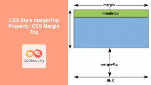
CSS Style marginTop Property: CSS Margin Top
Understanding the CSS marginTop Property: A Comprehensive Guide The marginTop property in CSS is used to set the top margin...
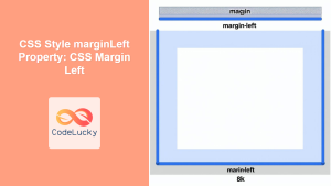
CSS Style marginLeft Property: CSS Margin Left
CSS marginLeft Property: Mastering the Left Margin The CSS marginLeft property is a fundamental tool for controlling the spacing around...
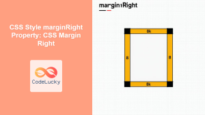
CSS Style marginRight Property: CSS Margin Right
Understanding the CSS marginRight Property The marginRight property in CSS is used to set the right margin of an element....
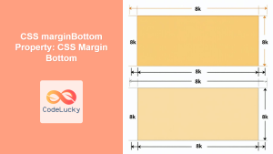
CSS marginBottom Property: CSS Margin Bottom
Understanding the CSS margin-bottom Property The margin-bottom property in CSS defines the space below an element. This margin is added...
CSS Style padding Property: CSS Padding
CSS Padding Property: A Comprehensive Guide The CSS padding property is a fundamental tool in web development, allowing you to...
CSS Style paddingTop Property: CSS Padding Top
Understanding the CSS padding-top Property The padding-top property in CSS defines the amount of space between the top edge of...
CSS Style paddingRight Property: CSS Padding Right
Understanding the CSS padding-right Property The padding-right property in CSS is used to set the amount of space between the...
CSS Margin: Complete Guide to Element Spacing and Margin Collapse
Understanding CSS Margin: The Foundation of Element Spacing CSS margin is one of the most fundamental properties for controlling spacing...
CSS Style borderLeft Property: CSS Border Left
CSS border-left Property: A Comprehensive Guide The border-left property in CSS is a shorthand property used to set the width,...
CSS Style paddingLeft Property: CSS Padding Left
CSS padding-left Property: A Comprehensive Guide The padding-left property in CSS is used to set the amount of padding space...
CSS Style height Property: CSS Height
Understanding the CSS height Property: A Comprehensive Guide The height property in CSS specifies the height of an element's content...
CSS Style left Property: CSS Left
CSS left Property: A Comprehensive Guide The CSS left property is a fundamental tool for web developers, enabling precise horizontal...


