
CSS justifyContent Property: Mastering Content Alignment
The CSS justifyContent property defines how the browser distributes space between and around content items along the main axis of a flex container or grid container. This property is crucial for creating flexible and responsive layouts, allowing you to align items in various ways within their container. Understanding and utilizing justifyContent effectively is essential for achieving precise control over the visual arrangement of your web page elements.
What is the justifyContent Property?
The justifyContent property is a key aspect of both Flexbox and Grid layouts in CSS. It dictates how space is allocated among items within a container, influencing their horizontal alignment in a row (for Flexbox with flex-direction: row) or their vertical alignment in a column (for Flexbox with flex-direction: column). In Grid layouts, justifyContent affects the alignment of grid tracks (rows or columns) within the grid container.
Purpose of the justifyContent Property
The primary purposes of the justifyContent property are to:
- Control the alignment of items along the main axis of a container.
- Distribute space between items, affecting their positioning.
- Create flexible and responsive layouts that adapt to different screen sizes.
- Precisely manage the visual arrangement of content within web pages.
Syntax of justifyContent
The justifyContent property is applied to the container element (either a flex container or a grid container). Here’s the basic syntax:
.container {
  display: flex; /* or display: grid; */
  justify-content: value;
}
Where value can be one of the following:
| Value | Description |
|---|---|
| `start` (default) | Items are packed toward the start of the container. |
| `end` | Items are packed toward the end of the container. |
| `center` | Items are centered within the container. |
| `space-between` | Items are evenly distributed; the first item is flush with the start, and the last item is flush with the end. |
| `space-around` | Items are evenly distributed with equal space around each item. Note that visually the spaces aren’t equal, since each item has space applied to both sides. |
| `space-evenly` | Items are distributed so that the spacing between any two adjacent items (and the space to the edge of the container) is the same. |
| `initial` | Sets the property to its default value. |
| `inherit` | Inherits this property from its parent element. |
Examples of justifyContent in Flexbox
Let’s explore how justifyContent works within a Flexbox layout.
justifyContent: start
The start value aligns items to the beginning of the container.
<div class="container-start">
  <div class="item">Item 1</div>
  <div class="item">Item 2</div>
  <div class="item">Item 3</div>
</div>

<style>
  .container-start {
    display: flex;
    justify-content: start;
    width: 300px;
    height: 100px;
    border: 1px solid black;
  }

  .item {
    width: 80px;
    height: 50px;
    background-color: lightblue;
    margin: 5px;
    text-align: center;
  }
</style>
justifyContent: end
The end value aligns items to the end of the container.
<div class="container-end">
  <div class="item">Item 1</div>
  <div class="item">Item 2</div>
  <div class="item">Item 3</div>
</div>

<style>
  .container-end {
    display: flex;
    justify-content: end;
    width: 300px;
    height: 100px;
    border: 1px solid black;
  }

  .item {
    width: 80px;
    height: 50px;
    background-color: lightblue;
    margin: 5px;
    text-align: center;
  }
</style>
justifyContent: center
The center value aligns items to the center of the container.
<div class="container-center">
  <div class="item">Item 1</div>
  <div class="item">Item 2</div>
  <div class="item">Item 3</div>
</div>

<style>
  .container-center {
    display: flex;
    justify-content: center;
    width: 300px;
    height: 100px;
    border: 1px solid black;
  }

  .item {
    width: 80px;
    height: 50px;
    background-color: lightblue;
    margin: 5px;
    text-align: center;
  }
</style>
justifyContent: space-between
The space-between value evenly distributes items with the first item at the start and the last item at the end.
<div class="container-space-between">
  <div class="item">Item 1</div>
  <div class="item">Item 2</div>
  <div class="item">Item 3</div>
</div>

<style>
  .container-space-between {
    display: flex;
    justify-content: space-between;
    width: 300px;
    height: 100px;
    border: 1px solid black;
  }

  .item {
    width: 80px;
    height: 50px;
    background-color: lightblue;
    margin: 5px;
    text-align: center;
  }
</style>
justifyContent: space-around
The space-around value evenly distributes items with equal space around each item.
<div class="container-space-around">
  <div class="item">Item 1</div>
  <div class="item">Item 2</div>
  <div class="item">Item 3</div>
</div>

<style>
  .container-space-around {
    display: flex;
    justify-content: space-around;
    width: 300px;
    height: 100px;
    border: 1px solid black;
  }

  .item {
    width: 80px;
    height: 50px;
    background-color: lightblue;
    margin: 5px;
    text-align: center;
  }
</style>
justifyContent: space-evenly
The space-evenly value distributes items so that the spacing between any two adjacent items (and the space to the edge of the container) is the same.
<div class="container-space-evenly">
  <div class="item">Item 1</div>
  <div class="item">Item 2</div>
  <div class="item">Item 3</div>
</div>

<style>
  .container-space-evenly {
    display: flex;
    justify-content: space-evenly;
    width: 300px;
    height: 100px;
    border: 1px solid black;
  }

  .item {
    width: 80px;
    height: 50px;
    background-color: lightblue;
    margin: 5px;
    text-align: center;
  }
</style>
Examples of justifyContent in Grid
Let’s explore how justifyContent works within a Grid layout.
<div class="grid-container">
  <div class="grid-item">Item 1</div>
  <div class="grid-item">Item 2</div>
  <div class="grid-item">Item 3</div>
</div>

<style>
  .grid-container {
    display: grid;
    grid-template-columns: repeat(3, 100px);
    grid-gap: 10px;
    justify-content: space-around; /* Try other values like start, end, center */
    width: 400px;
    height: 200px;
    border: 1px solid black;
  }

  .grid-item {
    background-color: lightgreen;
    padding: 20px;
    text-align: center;
  }
</style>
Note: When using justifyContent in Grid, make sure that the total width of the grid tracks is less than the width of the grid container for the property to have a visible effect. 💡
Real-World Applications of justifyContent
The justifyContent property is valuable in various real-world scenarios:
- Navigation Menus: Distributing navigation links evenly across the menu bar.
- Product Listings: Aligning product cards in an e-commerce layout.
- Footer Layouts: Positioning footer elements consistently across the bottom of the page.
- Form Elements: Arranging form labels and input fields for a clean and organized look.
Tips and Best Practices
- Flex Direction: Be mindful of the
flex-directionproperty, as it determines the main axis along whichjustifyContentoperates. - Container Width: Ensure the container has enough space for
justifyContentto have a visible effect, especially when using values likespace-betweenorspace-around. - Responsiveness: Combine
justifyContentwith media queries to create responsive layouts that adapt to different screen sizes.
Browser Support
The justifyContent property is well-supported across all modern browsers, including Chrome, Firefox, Safari, and Edge. 🎉
Conclusion
The justifyContent CSS property is a powerful tool for controlling the alignment and distribution of items within flex and grid containers. By understanding its various values and how they interact with different layout configurations, you can create more flexible, responsive, and visually appealing web designs. Mastering justifyContent is a key skill for any web developer looking to create modern and dynamic user interfaces.
Related Posts
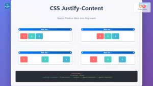
CSS Justify-Content: Complete Guide to Flexbox Main Axis Alignment
The justify-content property is one of the most powerful tools in CSS Flexbox for controlling how flex items are distributed...

CSS align-content Property: CSS Align Content
CSS align-content Property: Mastering Content Alignment in Flexbox and Grid Layouts The CSS align-content property is a powerful tool for...

CSS Justify-Content: Master Grid Container Inline Axis Alignment with Examples
The justify-content property is a powerful CSS tool for controlling how grid items are aligned along the inline axis (horizontal...
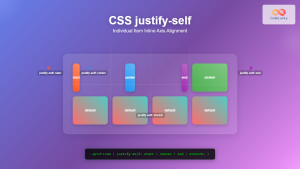
CSS Justify-Self: Master Individual Item Inline Axis Alignment
The justify-self property in CSS is a powerful alignment tool that allows you to control how individual items align themselves...
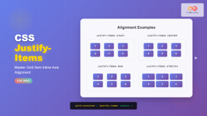
CSS Justify-Items: Complete Guide to Grid Item Inline Axis Alignment
The justify-items property is a powerful CSS Grid feature that controls how grid items are aligned along the inline axis...
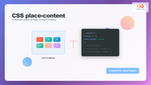
CSS Place-Content: Complete Guide to Combined Justify and Align Content Properties
The place-content property in CSS is a powerful shorthand that combines both justify-content and align-content properties into a single declaration....
CSS Style alignItems Property: CSS Align Items
Understanding the CSS align-items Property The align-items property in CSS is a powerful tool that defines how items are aligned...
CSS Place-Items: Master Combined Justify and Align Items in One Property
The CSS place-items property is a powerful shorthand that combines justify-items and align-items into a single declaration. This property revolutionizes...

CSS Style grid Property: CSS Grid Layout
CSS grid Property: Mastering CSS Grid Layout The CSS grid property is a powerful tool for creating two-dimensional layouts on...
CSS Style flexDirection Property: CSS Flex Direction
CSS flexDirection Property: Mastering Flex Item Arrangement The CSS flexDirection property is a crucial aspect of Flexbox layout, determining the...
CSS align-self Property: Control Individual Flexbox/Grid Item Alignment
CSS align-self Property: Mastering Individual Item Alignment in Flexbox and Grid The CSS align-self property is a powerful tool for...

CSS Align-Items: Master Cross-Axis Alignment in Flexbox and Grid
The CSS align-items property is a fundamental tool for controlling cross-axis alignment in both flexbox and CSS Grid layouts. Understanding...


