
CSS Grid has revolutionized web layout design, offering developers unprecedented control over two-dimensional layouts. Among its most powerful features are the grid functions: repeat(), minmax(), and fit-content(). These functions enable you to create flexible, responsive layouts with minimal code while maintaining precise control over grid behavior.
In this comprehensive guide, we’ll explore each function in detail, understand their syntax, use cases, and see them in action through practical examples and interactive demonstrations.
Understanding CSS Grid Functions
CSS Grid functions are specialized utilities that work within the grid-template-columns and grid-template-rows properties. They provide dynamic ways to define grid track sizes, making your layouts more flexible and maintainable.
These functions solve common layout challenges:
- Creating repeating column or row patterns
- Setting minimum and maximum constraints for grid tracks
- Automatically sizing content based on its intrinsic dimensions
- Building responsive layouts without media queries
The repeat() Function: Streamlining Grid Definitions
The repeat() function eliminates repetitive code when defining multiple grid tracks with similar sizing. Instead of writing the same values multiple times, you can use repeat() to create patterns efficiently.
Basic Syntax
repeat(count, track-size)Where:
- count: Number of repetitions (positive integer or keywords like
auto-fit,auto-fill) - track-size: Size specification for each track (can be multiple values for complex patterns)
Simple repeat() Examples
Example 1: Equal Column Grid
.grid-container {
  display: grid;
  grid-template-columns: repeat(4, 1fr);
  gap: 10px;
}
Example 2: Fixed Width Columns
.fixed-grid {
  display: grid;
  grid-template-columns: repeat(3, 150px);
  gap: 15px;
}
Advanced repeat() Patterns
The repeat() function becomes even more powerful when you create complex patterns by specifying multiple track sizes:
Example 3: Pattern Repetition
.pattern-grid {
  display: grid;
  grid-template-columns: repeat(2, 100px 200px 150px);
  gap: 10px;
}
Auto-fit and Auto-fill Keywords
The auto-fit and auto-fill keywords make repeat() truly responsive, automatically adjusting the number of columns based on available space.
Auto-fill vs Auto-fit Demonstration
Auto-fill: Creates empty columns when space allows
Auto-fit: Collapses empty columns
/* Auto-fill */
.auto-fill-grid {
  display: grid;
  grid-template-columns: repeat(auto-fill, minmax(150px, 1fr));
  gap: 10px;
}

/* Auto-fit */
.auto-fit-grid {
  display: grid;
  grid-template-columns: repeat(auto-fit, minmax(150px, 1fr));
  gap: 10px;
}
The minmax() Function: Flexible Constraints
The minmax() function defines a size range for grid tracks, specifying both minimum and maximum values. This creates flexible layouts that adapt to content and available space while maintaining design constraints.
Basic Syntax
minmax(min-size, max-size)Where:
- min-size: Minimum track size (length, percentage, or keyword)
- max-size: Maximum track size (length, percentage, fraction, or keyword)
Practical minmax() Examples
Example 1: Responsive Sidebar Layout
Min: 200px
Max: 1fr
Fixed at 3fr
.sidebar-layout {
  display: grid;
  grid-template-columns: minmax(200px, 1fr) 3fr;
  gap: 20px;
}
Example 2: Content-Based Sizing
.content-sizing {
  display: grid;
  grid-template-columns:
    minmax(min-content, max-content)
    1fr
    minmax(100px, 200px);
  gap: 15px;
}
Common minmax() Use Cases
Responsive Card Grid
Card 1
Minimum 250px width, grows to fill available space
Card 2
Automatically wraps when space is insufficient
Card 3
Perfect for responsive design patterns
.card-grid {
  display: grid;
  grid-template-columns: repeat(auto-fit, minmax(250px, 1fr));
  gap: 20px;
}
The fit-content() Function: Content-Driven Sizing
The fit-content() function sizes tracks based on their content, with an optional maximum size constraint. It’s equivalent to using minmax(min-content, max-content) but with a size limit.
Basic Syntax
fit-content(max-size)The function works as:
- If content is smaller than max-size: uses content size
- If content is larger than max-size: uses max-size and content wraps
fit-content() Examples
Example 1: Dynamic Navigation
.navigation {
  display: grid;
  grid-template-columns:
    fit-content(200px)
    1fr
    fit-content(150px);
  gap: 15px;
}
Example 2: Form Layout
.form-grid {
  display: grid;
  grid-template-columns: fit-content(120px) 1fr;
  gap: 10px;
  align-items: center;
}
Combining Grid Functions
The real power of CSS Grid functions emerges when you combine them strategically. Here are some advanced patterns that showcase their synergy:
Complex Dashboard Layout
fit-content(200px)
minmax(200px, 1fr)
minmax(200px, 1fr)
fit-content(150px)
.dashboard {
  display: grid;
  grid-template-columns:
    fit-content(200px)
    repeat(auto-fit, minmax(200px, 1fr))
    fit-content(150px);
  gap: 15px;
}
Interactive Demo: Grid Function Playground
Try Different Grid Configurations
Performance and Browser Support
CSS Grid functions enjoy excellent browser support across modern browsers. All major browsers including Chrome, Firefox, Safari, and Edge support these functions completely. Internet Explorer 11 has partial support for CSS Grid but lacks support for these specific functions.
- Use
auto-fitoverauto-fillwhen you want items to grow - Combine functions thoughtfully to avoid overly complex calculations
- Test responsive behavior across different screen sizes
- Consider using CSS custom properties for dynamic values
Common Pitfalls and Solutions
1. auto-fit vs auto-fill Confusion
Problem: Not understanding when empty columns collapse
Solution: Use auto-fit when you want remaining items to grow, auto-fill when you want to maintain column count
2. minmax() Overflow Issues
Problem: Content overflowing when min-content is larger than container
Solution: Use appropriate minimum values and test with various content lengths
3. fit-content() Unexpected Behavior
Problem: Content not sizing as expected with fit-content()
Solution: Remember fit-content() respects both content size and the maximum constraint
Real-World Applications
These grid functions shine in practical scenarios:
E-commerce Product Grid
.product-grid {
  display: grid;
  grid-template-columns: repeat(auto-fill, minmax(280px, 1fr));
  gap: 20px;
}

/* Ensures products maintain minimum size while filling available space */
Blog Layout with Sidebar
.blog-layout {
  display: grid;
  grid-template-columns:
    minmax(300px, 1fr)
    fit-content(250px);
  gap: 30px;
}

/* Main content flexible, sidebar sized to content with max width */
Advanced Techniques
CSS Custom Properties Integration
:root {
  --min-column-width: 250px;
  --sidebar-max: 300px;
}

.dynamic-grid {
  display: grid;
  grid-template-columns:
    fit-content(var(--sidebar-max))
    repeat(auto-fit, minmax(var(--min-column-width), 1fr));
  gap: 20px;
}
Media Query Combinations
@media (max-width: 768px) {
  .responsive-grid {
    grid-template-columns: repeat(auto-fit, minmax(200px, 1fr));
  }
}

@media (min-width: 1200px) {
  .responsive-grid {
    grid-template-columns: repeat(auto-fit, minmax(300px, 1fr));
  }
}
Conclusion
CSS Grid functions—repeat(), minmax(), and fit-content()—are essential tools for modern web layout design. They provide the flexibility and control needed to create responsive, maintainable layouts that adapt to both content and viewport constraints.
Key takeaways:
- repeat() simplifies grid definitions and enables responsive column counts
- minmax() provides flexible constraints for grid tracks
- fit-content() sizes tracks based on content with optional limits
- Combining these functions creates powerful, flexible layout systems
- Understanding auto-fit vs auto-fill behavior is crucial for responsive design
Master these functions, and you’ll have the tools to build sophisticated grid layouts that work beautifully across all devices and screen sizes. The examples and techniques covered here provide a solid foundation for implementing CSS Grid in your projects, whether you’re building simple card layouts or complex dashboard interfaces.
Related Posts

CSS Style grid Property: CSS Grid Layout
CSS grid Property: Mastering CSS Grid Layout The CSS grid property is a powerful tool for creating two-dimensional layouts on...
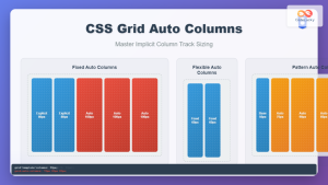
CSS Grid Auto Columns: Master Implicit Column Track Sizing for Dynamic Layouts
CSS Grid Layout revolutionized web design by providing a powerful two-dimensional layout system. While explicit grid tracks defined with grid-template-columns...

CSS Grid: Display Grid Container Property – Complete Guide with Examples
CSS Grid revolutionized web layout design by providing a two-dimensional grid system that allows developers to create complex, responsive layouts...
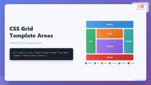
CSS Grid Template Areas: Master Named Grid Layouts with Visual Examples
CSS Grid revolutionized web layout design, and one of its most powerful features is grid-template-areas. This property allows you to...
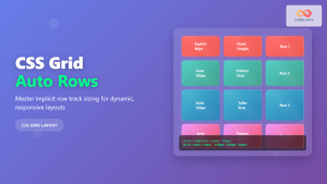
CSS Grid Auto Rows: Master Implicit Row Track Sizing for Dynamic Layouts
CSS Grid revolutionized web layout design, offering unprecedented control over both rows and columns. While you explicitly define grid tracks...
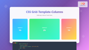
CSS Grid-Template-Columns: Complete Guide to Defining Column Track Sizes
The grid-template-columns property is one of the most fundamental aspects of CSS Grid Layout, allowing developers to define the size...
CSS Grid-Template-Rows: Master Row Track Sizing with Complete Examples
The grid-template-rows property is a fundamental building block of CSS Grid Layout that allows you to define the size of...
CSS Grid-Column-Start and Grid-Column-End: Complete Guide to Precise Item Column Placement
CSS Grid revolutionized web layout by providing precise control over both rows and columns. Among its most powerful features are...
CSS Grid auto-fit vs auto-fill: Master Dynamic Responsive Layouts
CSS Grid's auto-fit and auto-fill are two powerful keywords that enable dynamic track creation in grid layouts. While they might...
CSS Grid Template Shorthand: Master Rows, Columns, and Areas in One Property
The CSS grid-template shorthand property is a powerful tool that allows you to define your grid's structure in a single...

CSS Grid Shorthand: Template and Auto Properties Combined for Efficient Layouts
CSS Grid has revolutionized web layout design, offering powerful tools for creating complex, responsive layouts. Among its most valuable features...

CSS Align-Content: Master Grid Container Block Axis Alignment
The CSS align-content property is a powerful tool for controlling how grid items are distributed along the block axis (typically...


