
CSS Grid revolutionized web layout design by providing a two-dimensional grid system that allows developers to create complex, responsive layouts with unprecedented control. The display: grid property is the foundation that transforms any HTML element into a grid container, enabling powerful layout capabilities that were previously impossible or extremely difficult to achieve.
What is CSS Grid Display Property?
The display: grid property establishes a new grid formatting context for an element, making it a grid container. When you apply this property, the direct children of that element automatically become grid items, which can then be positioned and sized using various grid properties.
Key Point: Unlike Flexbox which is one-dimensional (either row or column), CSS Grid is two-dimensional, allowing you to control both rows and columns simultaneously.
Basic Syntax and Usage
The fundamental syntax for creating a grid container is straightforward:
.grid-container {
  display: grid;
}
However, simply adding display: grid won’t immediately create a visible grid layout. You need to define the grid structure using additional properties like grid-template-columns and grid-template-rows.
Creating Your First Grid
Let’s start with a practical example that demonstrates the basic grid setup:
Example: Simple 3-Column Grid
.grid-container {
  display: grid;
  grid-template-columns: 1fr 1fr 1fr;
  gap: 15px;
}

.grid-item {
  background: #4299e1;
  padding: 20px;
  text-align: center;
  border-radius: 4px;
}
Essential Grid Container Properties
Once you’ve established a grid container with display: grid, several properties become available to define the grid structure and behavior:
1. Grid Template Columns
The grid-template-columns property defines the number and size of columns in your grid:
Different Column Sizing Methods
Fixed Width Columns
grid-template-columns: 200px 150px 100px;
Flexible Columns (fr units)
grid-template-columns: 2fr 1fr 1fr;
Percentage-based Columns
grid-template-columns: 50% 30% 20%;
2. Grid Template Rows
Similar to columns, grid-template-rows defines the size of grid rows:
Row Height Control
.grid-container {
  display: grid;
  grid-template-columns: repeat(3, 1fr);
  grid-template-rows: 80px 120px 60px;
  gap: 10px;
}
3. Gap Property
The gap property (formerly grid-gap) creates space between grid items:
Different Gap Configurations
Uniform Gap
gap: 20px;
Different Row and Column Gaps
gap: 30px 10px; /* row-gap column-gap */
Advanced Grid Container Properties
1. Grid Auto Columns and Rows
When grid items are placed outside the explicitly defined grid, grid-auto-columns and grid-auto-rows determine their size:
Auto-sizing Grid Tracks
.grid-container {
  display: grid;
  grid-template-columns: repeat(2, 100px);
  grid-auto-columns: 150px;
  grid-auto-rows: 80px;
  gap: 10px;
}
2. Grid Auto Flow
The grid-auto-flow property controls how auto-placed items flow through the grid:
Flow Direction Examples
Row Flow (Default)
grid-auto-flow: row;
Column Flow
grid-auto-flow: column;
Practical Layout Examples
1. Responsive Card Layout
Auto-fit Card Grid
Card Title 1
This is a responsive card that adapts to different screen sizes using CSS Grid’s auto-fit functionality.
Card Title 2
Each card maintains a minimum width of 250px and grows to fill available space proportionally.
Card Title 3
Perfect for product galleries, blog posts, or any content that needs to be displayed in a flexible grid.
.card-grid {
display: grid;
grid-template-columns: repeat(auto-fit, minmax(250px, 1fr));
gap: 20px;
}
.card {
background: white;
border: 1px solid #e2e8f0;
border-radius: 8px;
padding: 20px;
box-shadow: 0 2px 4px rgba(0,0,0,0.1);
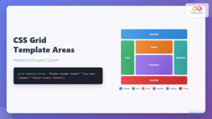
}2. Holy Grail Layout
Classic Web Layout with Grid
.holy-grail {
  display: grid;
  grid-template-areas:
    "header header header"
    "sidebar main aside"
    "footer footer footer";
  grid-template-columns: 200px 1fr 150px;
  grid-template-rows: 80px 1fr 60px;
  gap: 10px;
  height: 100vh;
}
Common Grid Units and Functions
Understanding Grid Units
Grid Unit Reference
- fr (fraction): Represents a fraction of available space
- px (pixels): Fixed pixel values for precise control
- % (percentage): Percentage of container width/height
- auto: Content-based sizing
- min-content: Minimum size needed for content
- max-content: Maximum size content would prefer
Useful Grid Functions
repeat() Function
The repeat() function helps create repetitive track patterns:
/* Create 4 equal columns */
grid-template-columns: repeat(4, 1fr);

/* Create 3 columns of 200px each */
grid-template-columns: repeat(3, 200px);

/* Create alternating pattern */
grid-template-columns: repeat(2, 100px 200px);
minmax() Function
The minmax() function sets minimum and maximum track sizes:
/* Columns: minimum 150px, maximum 1fr */
grid-template-columns: repeat(3, minmax(150px, 1fr));
Best Practices and Tips
Performance Considerations
Use CSS Grid when you need two-dimensional layout control. For simple one-dimensional layouts, Flexbox might be more appropriate and performant.
Avoid excessive nesting of grid containers. While possible, deeply nested grids can impact performance and maintainability.
Leverage implicit grid behavior. Let CSS Grid handle item placement automatically when possible rather than explicitly positioning every item.
Accessibility Guidelines
Maintain logical source order. While CSS Grid allows visual reordering, screen readers follow the HTML source order.
Test with keyboard navigation. Ensure that focus order makes sense regardless of visual grid positioning.
Use semantic HTML elements. Grid layout should enhance, not replace, semantic markup.
Browser Support and Fallbacks
CSS Grid enjoys excellent modern browser support, but you may need fallbacks for older browsers:
/* Fallback for older browsers */
.grid-container {
  display: flex;
  flex-wrap: wrap;
}

.grid-container > * {
  flex: 1 1 300px;
  margin: 10px;
}

/* Modern browsers with grid support */
@supports (display: grid) {
  .grid-container {
    display: grid;
    grid-template-columns: repeat(auto-fit, minmax(300px, 1fr));
    gap: 20px;
  }

  .grid-container > * {
    margin: 0;
  }
}
Conclusion
The display: grid property opens up a world of layout possibilities that were previously complex or impossible to achieve with CSS. By understanding grid containers and their properties, you can create sophisticated, responsive layouts that adapt to different screen sizes and content requirements.
Remember that CSS Grid works best when combined with other modern CSS techniques like Flexbox for component-level layout, CSS Custom Properties for dynamic theming, and CSS Container Queries for truly responsive design patterns.
Start experimenting with these grid concepts in your projects, and you’ll quickly discover how CSS Grid can simplify your layout code while providing more flexible and maintainable solutions than traditional layout methods.
Related Posts

CSS Style grid Property: CSS Grid Layout
CSS grid Property: Mastering CSS Grid Layout The CSS grid property is a powerful tool for creating two-dimensional layouts on...
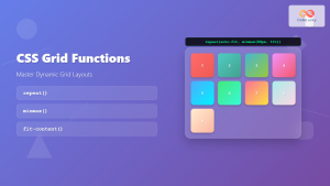
CSS Grid Functions: Complete Guide to repeat(), minmax(), and fit-content()
CSS Grid has revolutionized web layout design, offering developers unprecedented control over two-dimensional layouts. Among its most powerful features are...
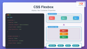
CSS Flexbox: Complete Guide to display: flex Container Properties and Layout Control
CSS Flexbox revolutionized web layout by providing a powerful, flexible way to arrange elements within containers. The display: flex property...
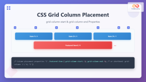
CSS Grid-Column-Start and Grid-Column-End: Complete Guide to Precise Item Column Placement
CSS Grid revolutionized web layout by providing precise control over both rows and columns. Among its most powerful features are...

CSS Align-Content: Master Grid Container Block Axis Alignment
The CSS align-content property is a powerful tool for controlling how grid items are distributed along the block axis (typically...
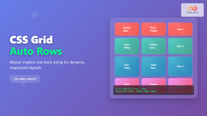
CSS Grid Auto Rows: Master Implicit Row Track Sizing for Dynamic Layouts
CSS Grid revolutionized web layout design, offering unprecedented control over both rows and columns. While you explicitly define grid tracks...
HTML Block and Inline Elements: Understanding Display Properties
Introduction Have you ever wondered why some HTML elements stack vertically while others flow horizontally? Understanding the difference between block-level...
CSS Grid-Gap Shorthand: Master Combined Row and Column Spacing
CSS Grid has revolutionized how we create layouts on the web, and one of its most useful features is the...
CSS Grid Auto Flow: Master Item Placement Algorithm Control for Responsive Layouts
Understanding CSS Grid Auto Flow The grid-auto-flow property is a powerful CSS Grid feature that controls how auto-placed items are...
CSS Subgrid: Complete Guide to Inheriting Parent Grid Lines
CSS Subgrid is a powerful feature that extends CSS Grid Layout by allowing child grids to inherit the track sizing...
CSS Grid Template Areas: Master Named Grid Layouts with Visual Examples
CSS Grid revolutionized web layout design, and one of its most powerful features is grid-template-areas. This property allows you to...
CSS Grid-Area: Master Item Placement in Named Grid Areas
What is CSS Grid-Area? The grid-area property in CSS is a powerful shorthand that allows you to place grid items...


