CSS Grid’s auto-fit and auto-fill are two powerful keywords that enable dynamic track creation in grid layouts. While they might seem similar at first glance, understanding their differences is crucial for creating responsive, flexible layouts that adapt beautifully to different screen sizes and content amounts.
Understanding CSS Grid Dynamic Track Creation
Before diving into the specifics of auto-fit and auto-fill, let’s understand what dynamic track creation means in CSS Grid. Both keywords work with the repeat() function to automatically create grid tracks based on the available space and the minimum track size you specify.
The basic syntax looks like this:
grid-template-columns: repeat(auto-fit, minmax(200px, 1fr));
grid-template-columns: repeat(auto-fill, minmax(200px, 1fr));
CSS Grid auto-fill: Creating Tracks Even When Empty
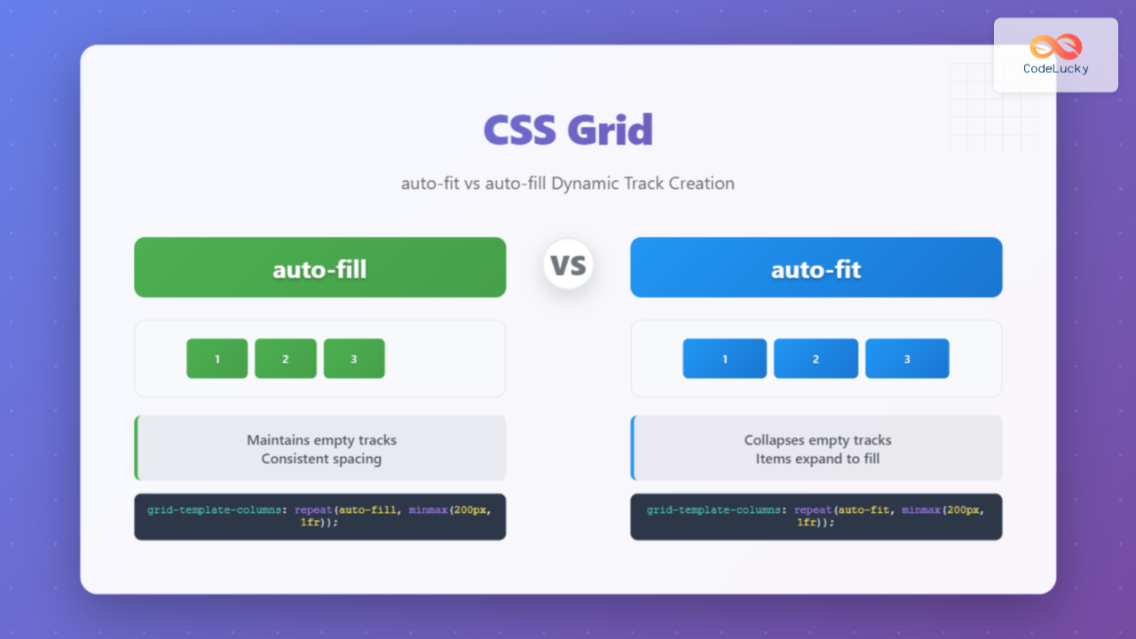
The auto-fill keyword creates as many tracks as possible to fill the available space, even if those tracks remain empty. This means that if you have a container that’s 1000px wide and each track has a minimum size of 200px, auto-fill will create 5 tracks (1000px ÷ 200px = 5), regardless of how many grid items you actually have.
auto-fill Example
CSS Code:
.grid-auto-fill {
  display: grid;
  grid-template-columns: repeat(auto-fill, minmax(150px, 1fr));
  gap: 15px;
  background-color: #f0f0f0;
  padding: 20px;
}

.grid-item {
  background-color: #4CAF50;
  color: white;
  padding: 20px;
  text-align: center;
  border-radius: 5px;
}
Visual Output:
Notice how the grid maintains empty tracks on the right side, creating space for potential additional items.
CSS Grid auto-fit: Collapsing Empty Tracks
The auto-fit keyword behaves differently. It creates tracks to fit the available space but collapses any empty tracks to zero width. This means that existing grid items will expand to fill the entire available space when there are fewer items than the maximum possible tracks.
auto-fit Example
CSS Code:
.grid-auto-fit {
  display: grid;
  grid-template-columns: repeat(auto-fit, minmax(150px, 1fr));
  gap: 15px;
  background-color: #f0f0f0;
  padding: 20px;
}

.grid-item {
  background-color: #2196F3;
  color: white;
  padding: 20px;
  text-align: center;
  border-radius: 5px;
}
Visual Output:
Notice how the items stretch to fill the entire available width, with no empty space on the right.
Key Differences Between auto-fit and auto-fill
| Aspect | auto-fill | auto-fit |
|---|---|---|
| Empty Tracks | Maintains empty tracks | Collapses empty tracks |
| Item Stretching | Items maintain minimum size | Items expand to fill space |
| Use Case | Fixed item sizes, ready for new content | Flexible layouts, maximize space usage |
Practical Use Cases
When to Use auto-fill
Use auto-fill when you want to maintain consistent spacing and prepare for dynamic content addition. This is ideal for:
- Card layouts where new items might be added dynamically
- Gallery grids where you want consistent item spacing
- Dashboard widgets where empty slots should remain visible
- Product listings where items should maintain uniform size
When to Use auto-fit
Use auto-fit when you want items to expand and utilize all available space. This works well for:
- Responsive layouts where content should fill the screen
- Feature sections where items should be prominent
- Navigation menus where items should stretch evenly
- Content blocks where maximum space utilization is desired
Interactive Comparison Demo
Interactive Demo: Resize your browser window to see the difference
auto-fill (maintains empty tracks):
auto-fit (collapses empty tracks):
Tip: Try resizing your browser window to see how the layouts behave differently!
Advanced Techniques and Best Practices
Combining with minmax() for Better Control
The real power of auto-fit and auto-fill comes when combined with the minmax() function. This allows you to set both minimum and maximum sizes for your tracks:
/* Responsive card layout with auto-fit */
.responsive-cards {
  display: grid;
  grid-template-columns: repeat(auto-fit, minmax(250px, 1fr));
  gap: 20px;
}

/* Gallery with consistent sizing using auto-fill */
.gallery {
  display: grid;
  grid-template-columns: repeat(auto-fill, minmax(200px, 200px));
  gap: 15px;
  justify-content: center;
}
Handling Edge Cases
Consider these scenarios when choosing between auto-fit and auto-fill:
Single Item Behavior:
auto-fill with one item:
Item maintains minimum size, empty tracks remain
auto-fit with one item:
Item expands to fill entire width
Common Pitfalls and Solutions
Pitfall 1: Unexpected Item Stretching
When using auto-fit, items might stretch beyond their intended size. To prevent this, set a maximum width:
/* Solution: Set max-width to prevent over-stretching */
.grid-item {
  max-width: 300px;
  justify-self: center;
}
Pitfall 2: Empty Space with auto-fill
If you have too much empty space with auto-fill, consider adjusting the minimum track size or using auto-fit instead:
/* Reduce minimum size to fit more items */
grid-template-columns: repeat(auto-fill, minmax(180px, 1fr));

/* Or switch to auto-fit for better space utilization */
grid-template-columns: repeat(auto-fit, minmax(200px, 1fr));
Browser Support and Fallbacks
CSS Grid with auto-fit and auto-fill is well-supported in modern browsers. However, for older browser support, consider providing fallbacks:
/* Fallback for older browsers */
.grid-container {
  display: flex;
  flex-wrap: wrap;
  gap: 20px;
}

.grid-item {
  flex: 1 1 250px;
  min-width: 0;
}

/* Enhanced with CSS Grid */
@supports (display: grid) {
  .grid-container {
    display: grid;
    grid-template-columns: repeat(auto-fit, minmax(250px, 1fr));
  }

  .grid-item {
    flex: none;
  }
}
Performance Considerations
Both auto-fit and auto-fill are performant, but consider these optimization tips:
- Use reasonable minimum sizes to avoid creating too many tracks
- Combine with content-based sizing when appropriate
- Test on various screen sizes to ensure optimal performance
- Consider using container queries for more complex responsive behavior
Real-World Implementation Examples
Responsive Product Grid
.product-grid {
  display: grid;
  grid-template-columns: repeat(auto-fill, minmax(280px, 1fr));
  gap: 24px;
  padding: 24px;
}

.product-card {
  background: white;
  border-radius: 8px;
  box-shadow: 0 2px 8px rgba(0,0,0,0.1);
  overflow: hidden;
  transition: transform 0.2s;
}

.product-card:hover {
  transform: translateY(-4px);
}
Flexible Feature Section
.features {
  display: grid;
  grid-template-columns: repeat(auto-fit, minmax(300px, 1fr));
  gap: 40px;
  padding: 60px 0;
}

.feature-item {
  text-align: center;
  padding: 30px;
}
Conclusion
Understanding the difference between auto-fit and auto-fill is essential for creating flexible, responsive CSS Grid layouts. Use auto-fill when you want to maintain consistent spacing and prepare for dynamic content, and use auto-fit when you want items to expand and utilize all available space.
The choice between these two keywords depends on your specific design requirements and user experience goals. auto-fill provides predictable layouts with consistent spacing, while auto-fit offers maximum space utilization and flexibility.
By mastering these concepts and applying the techniques covered in this guide, you’ll be able to create sophisticated, responsive layouts that adapt beautifully to any screen size or content amount. Remember to test your implementations across different viewport sizes and consider the user experience implications of your choice.
Whether you’re building a product catalog, a portfolio gallery, or a complex dashboard, the dynamic track creation capabilities of CSS Grid with auto-fit and auto-fill will help you create layouts that are both beautiful and functional.

